Browsing Tag

color story

0 In Color Story

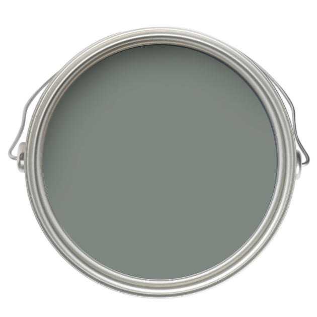
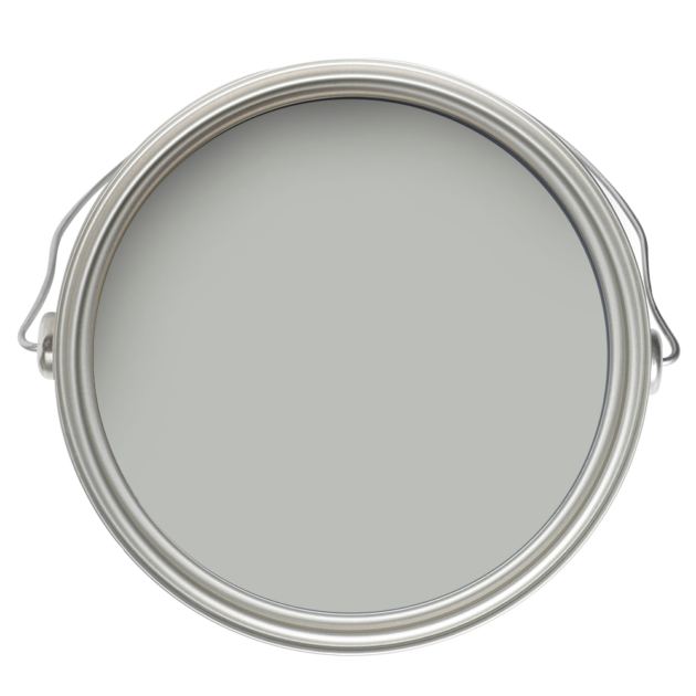
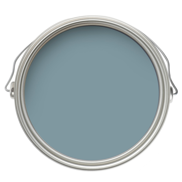
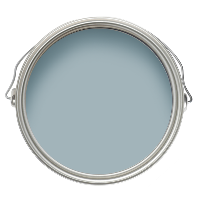
Color Story: Soft Blues

Have you noticed more soft blues in your feeds lately? We have. Whether in a kitchen or a cocktail room or a bedroom, soft blue has been making its case as a go-to neutral, and this is one trend we wholeheartedly endorse.
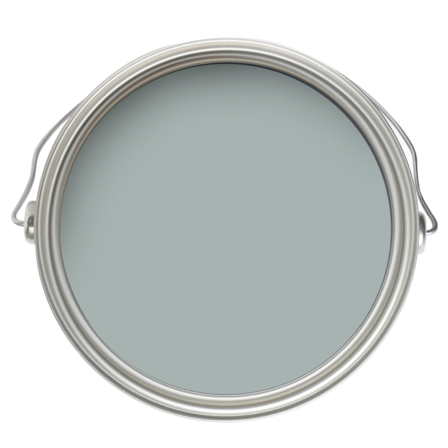
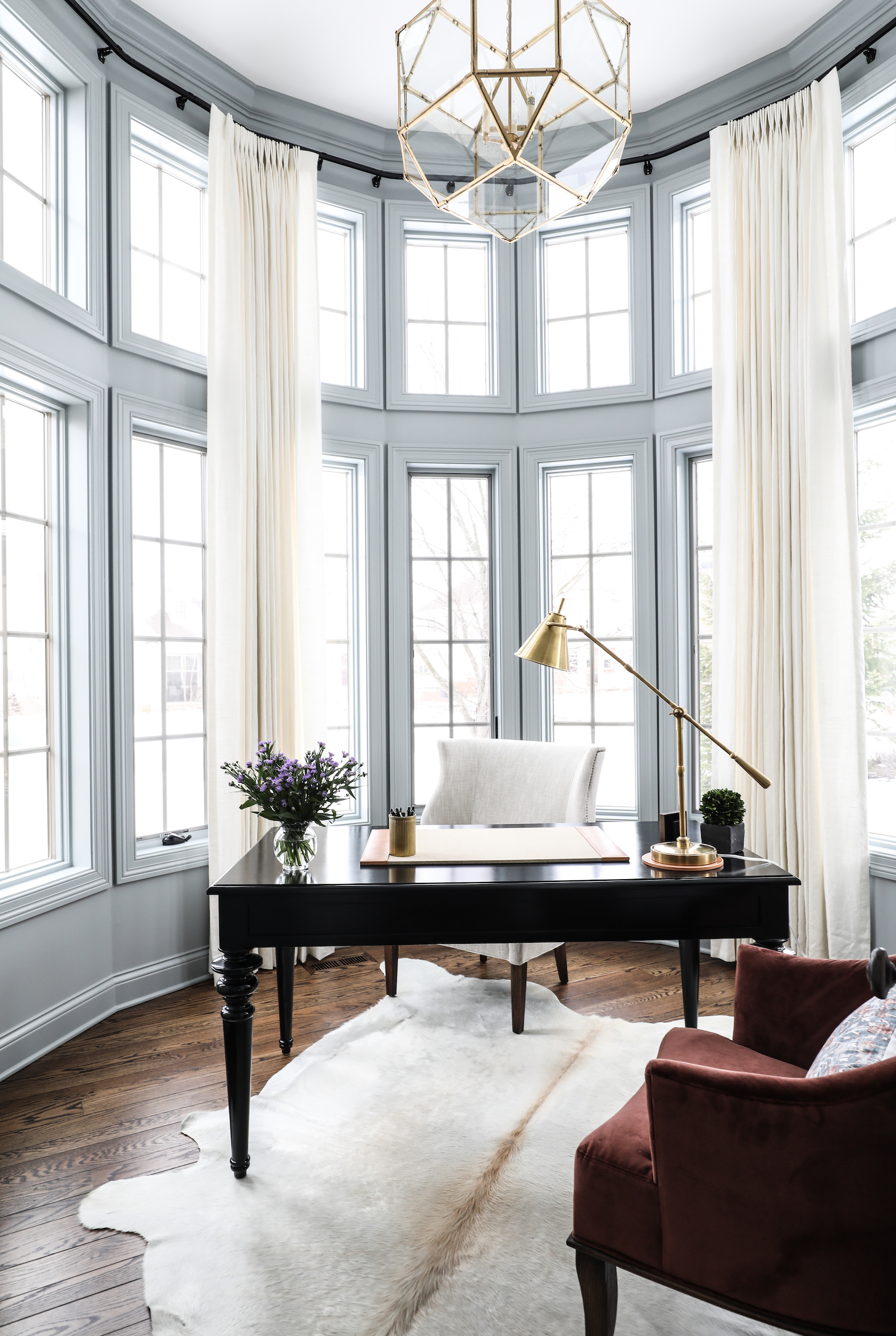
We have turned to soft blues like those pictured above in many homes throughout the life of Park & Oak, and if you’ve been following for awhile, you probably recognize some of our frequently shared projects.

Here’s one from the early years, featuring Boothbay Gray, which our designers love for its balance of warm and cool undertones, and perfect saturation level.
via Park & Oak

This is another earlier project, also in Boothbay Gray.
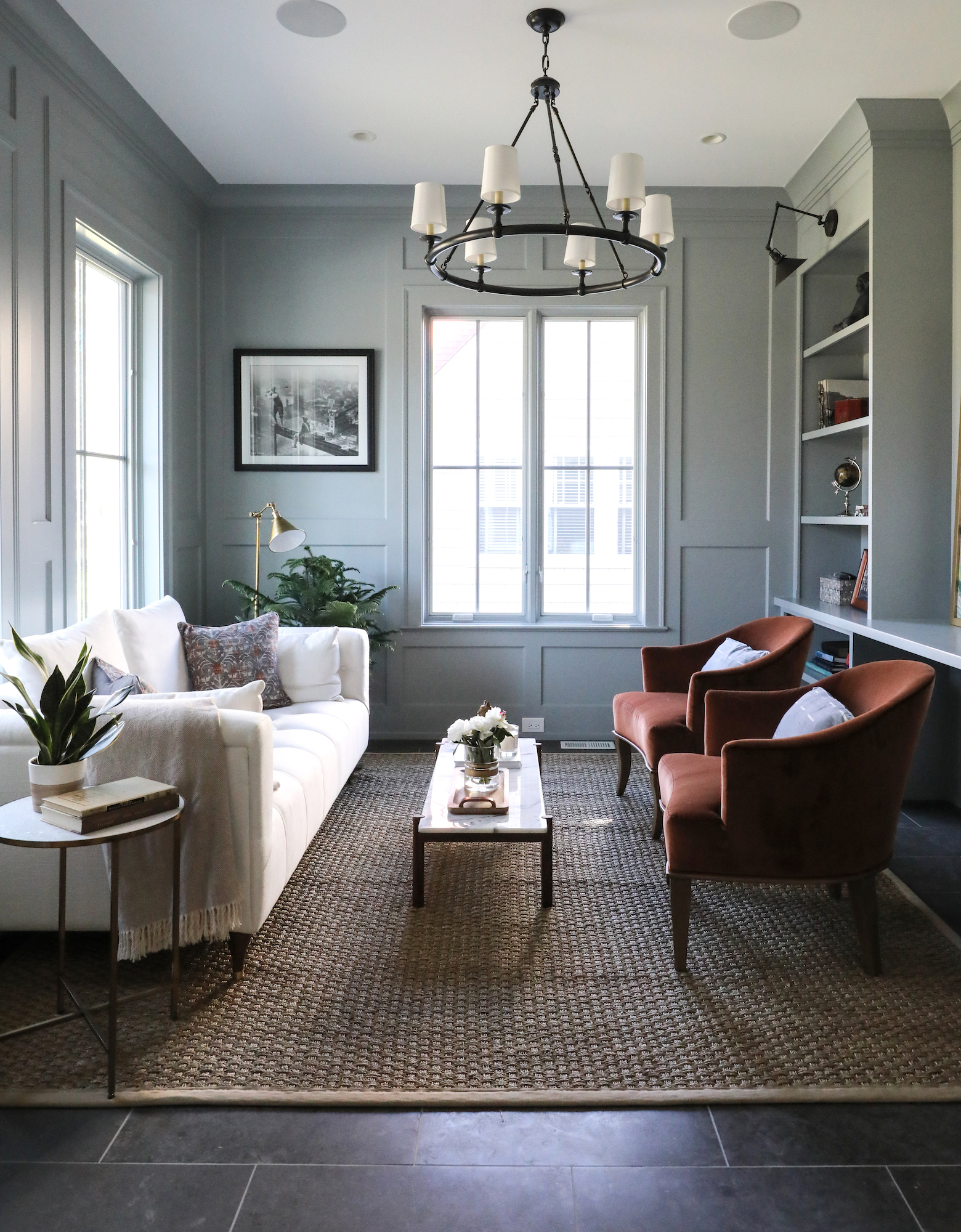
via Park & Oak

More recently, we used Boothbay in this impossibly charming kitchen.
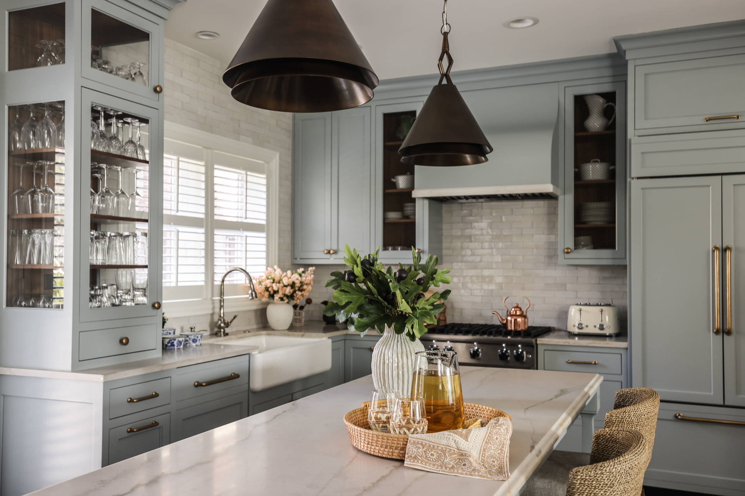
via Park & Oak

And in this sophisticated dining room.
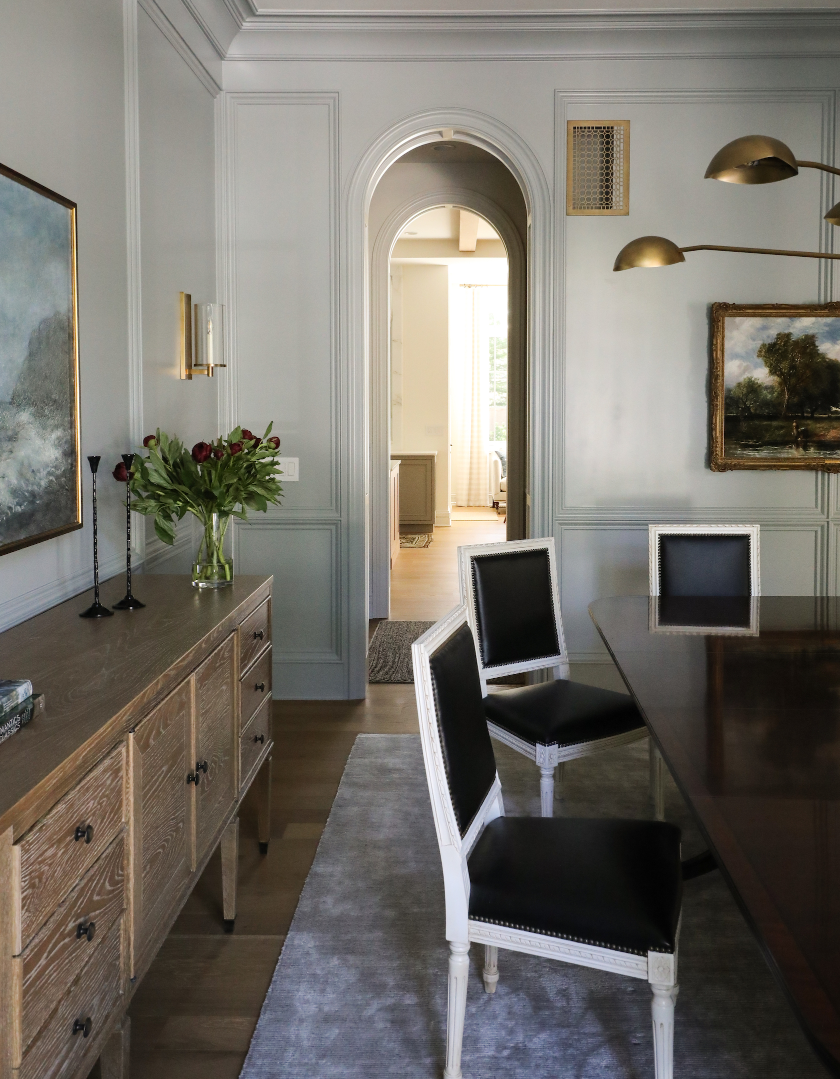
via Park & Oak

But it can also be perfect in a kids’ bedroom.
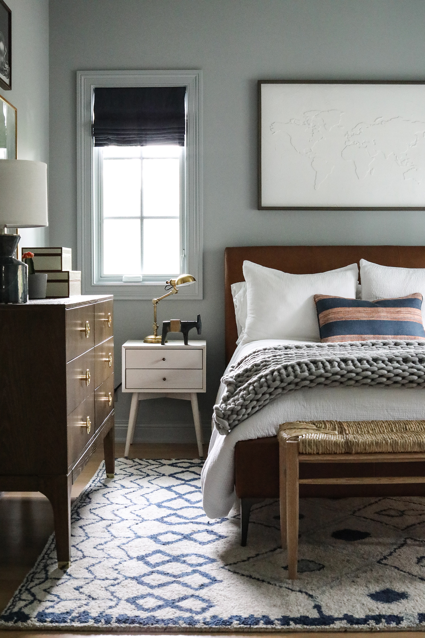
via Park & Oak

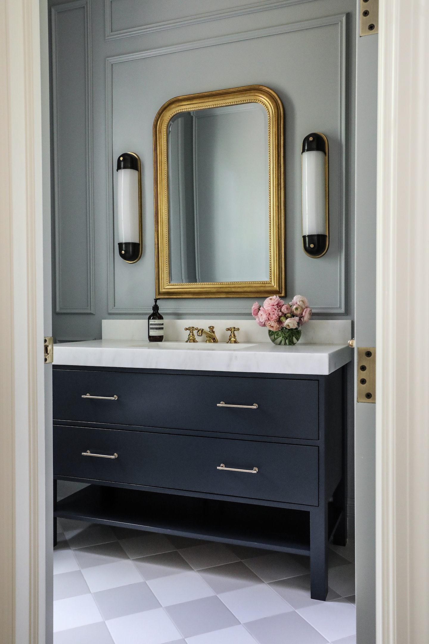
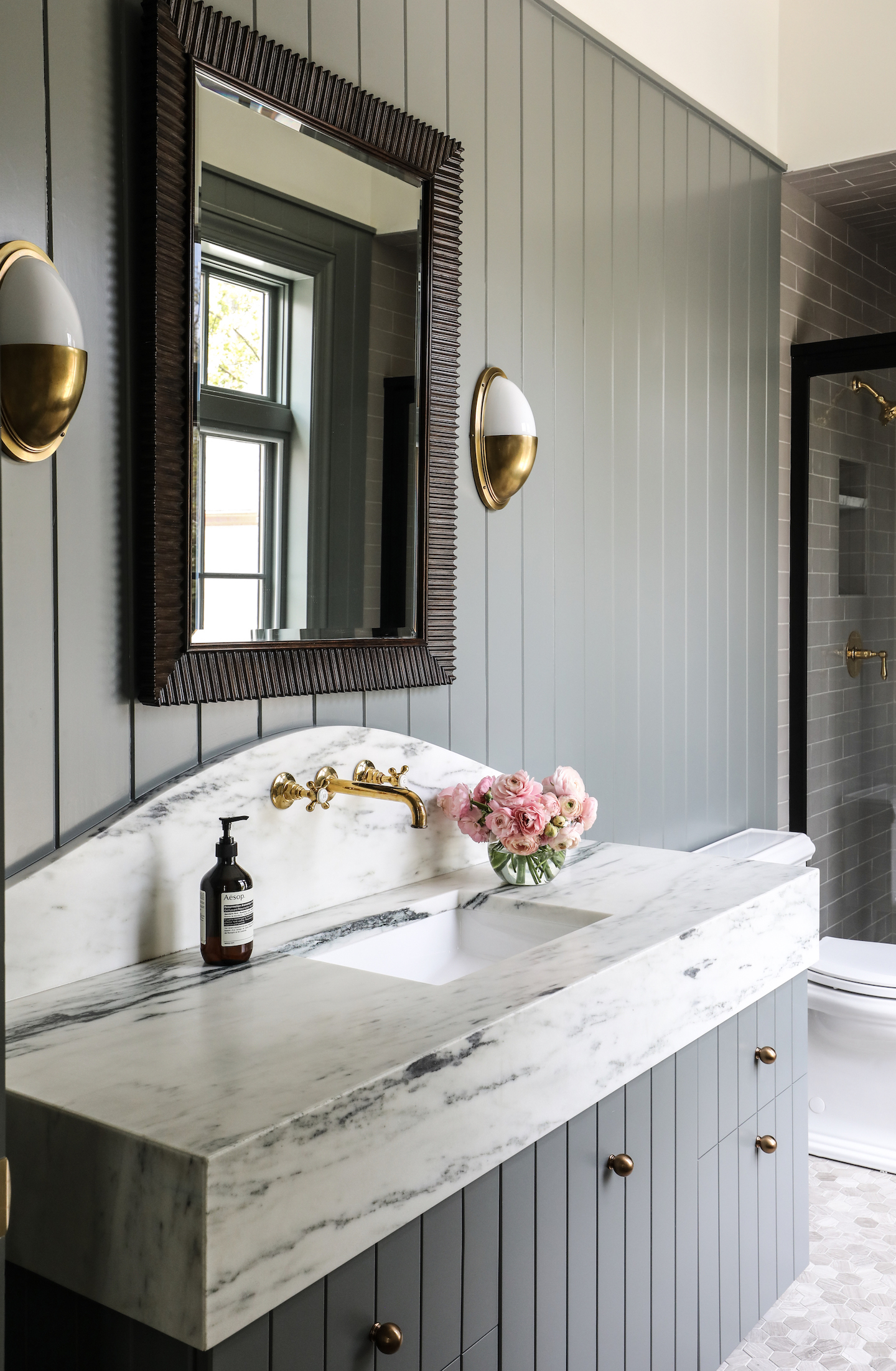
Or a bath.

via Park & Oak

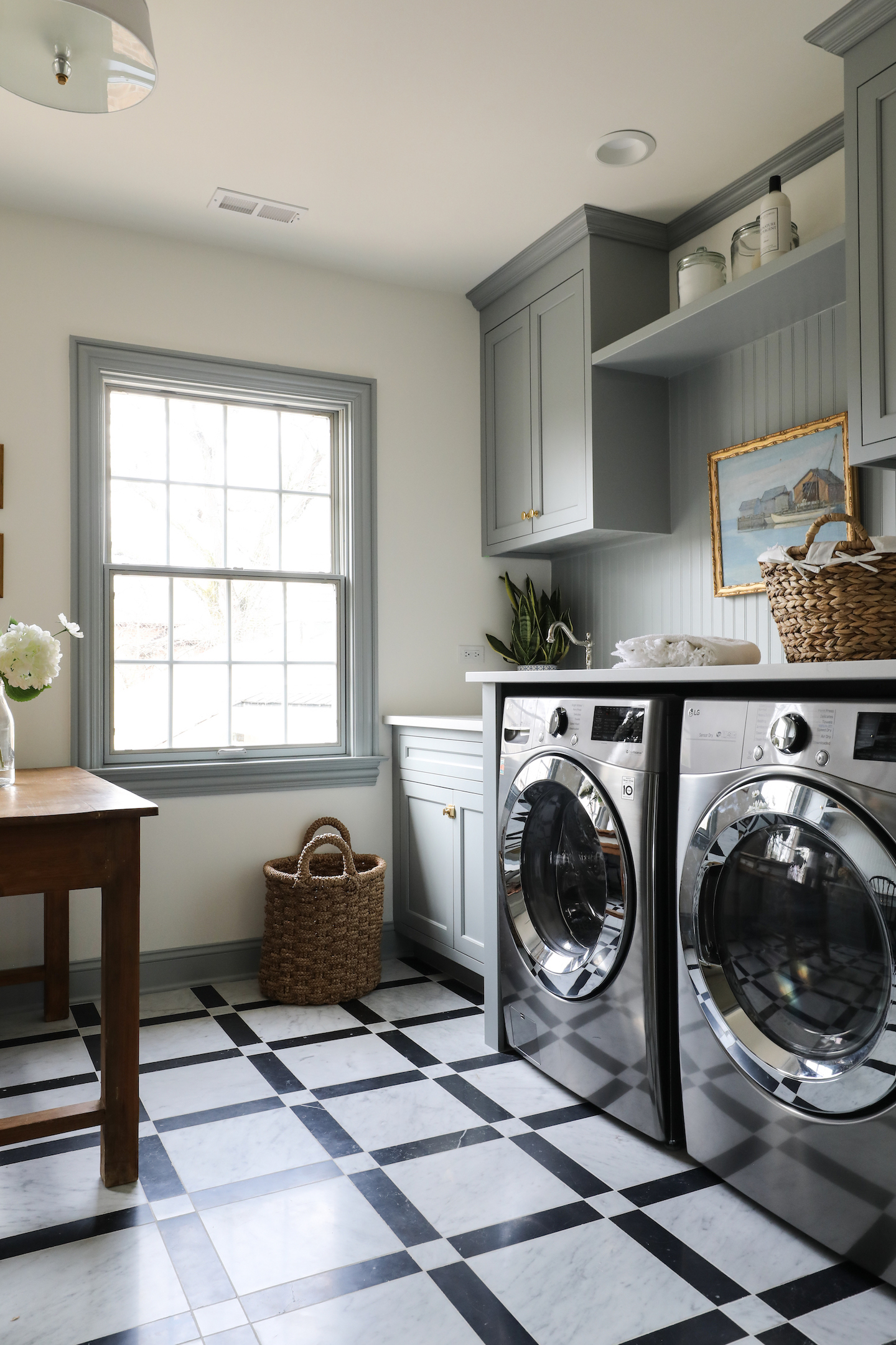
And even a laundry room.

via Park & Oak

Looking for something with just a little more warmth? Try Duxbury Gray.
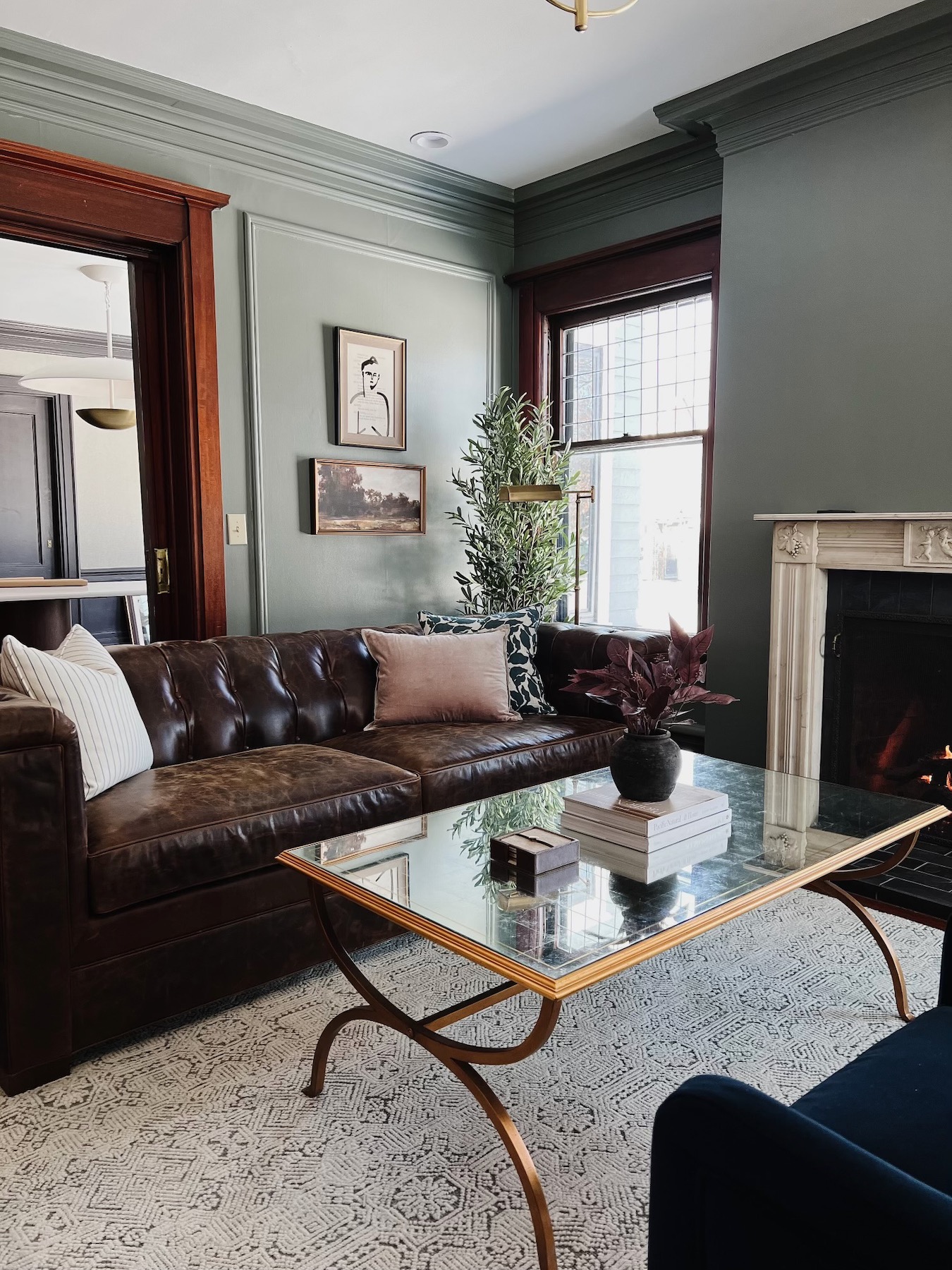
via Park & Oak
via Park & Oak

Metropolitan is an even softer option, and contrast trim makes such an impact.
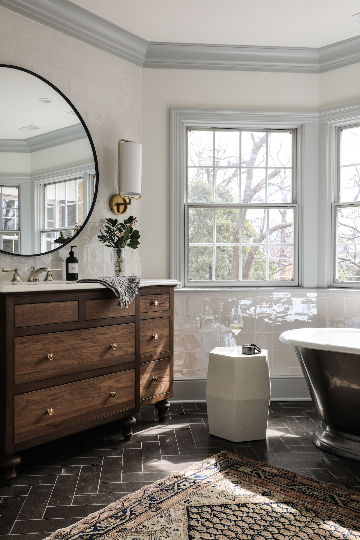
via Park & Oak

Van Courtland Blue is probably the purest blue in the soft blue lineup, and it really makes this kitchen shine.
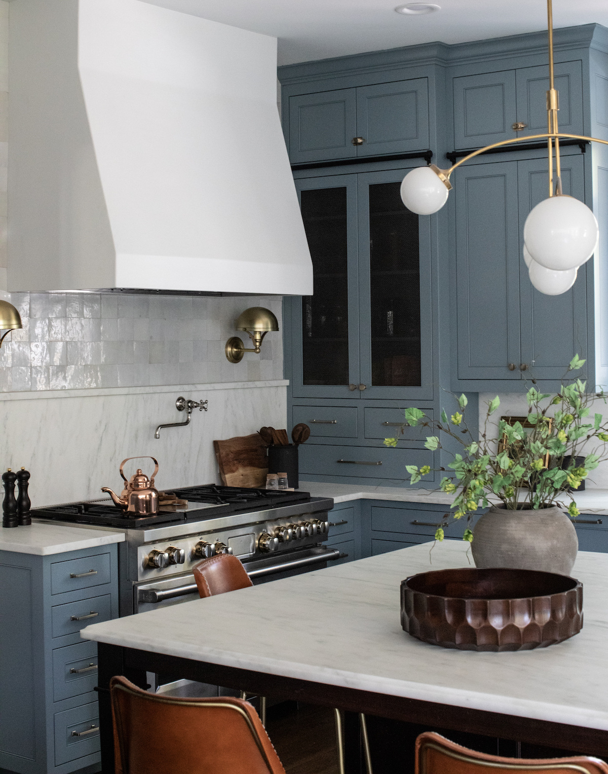
via Park & Oak

And finally, Santorini Blue was just perfect in the boys’ bedroom.
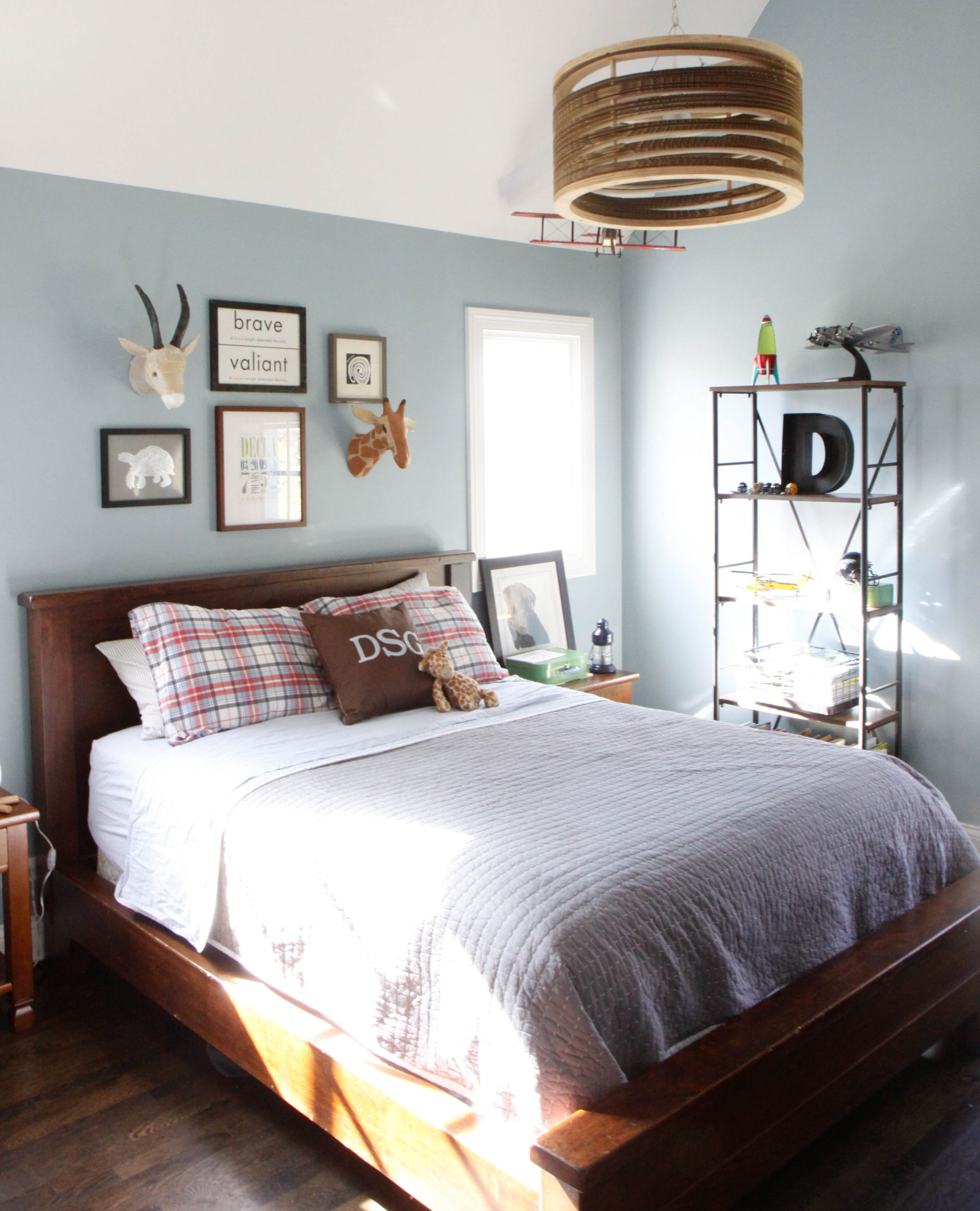
via Park & Oak
0 In Color Story

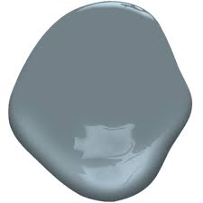
Color Story: Benjamin Moore Montpelier

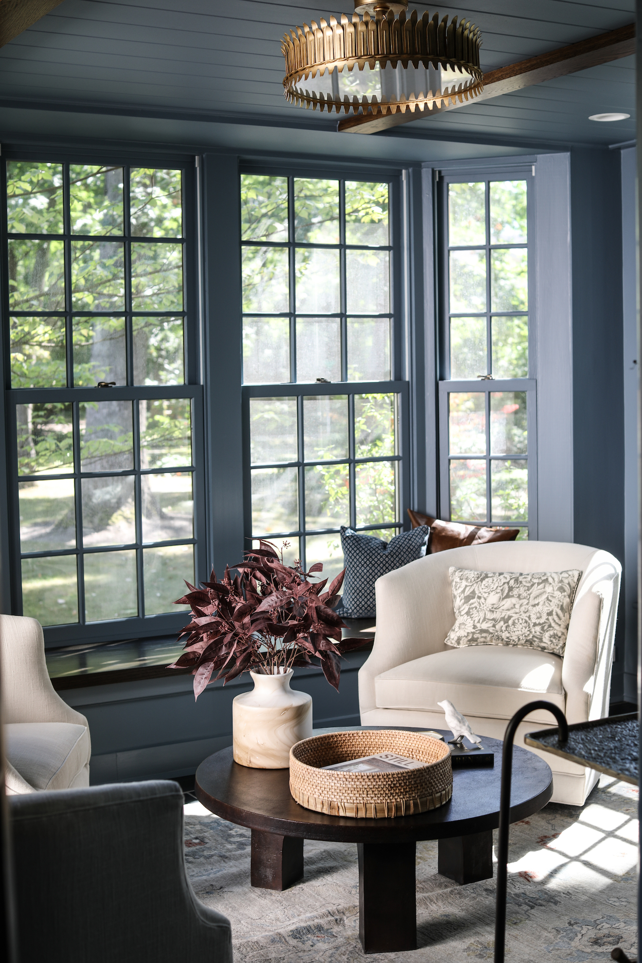
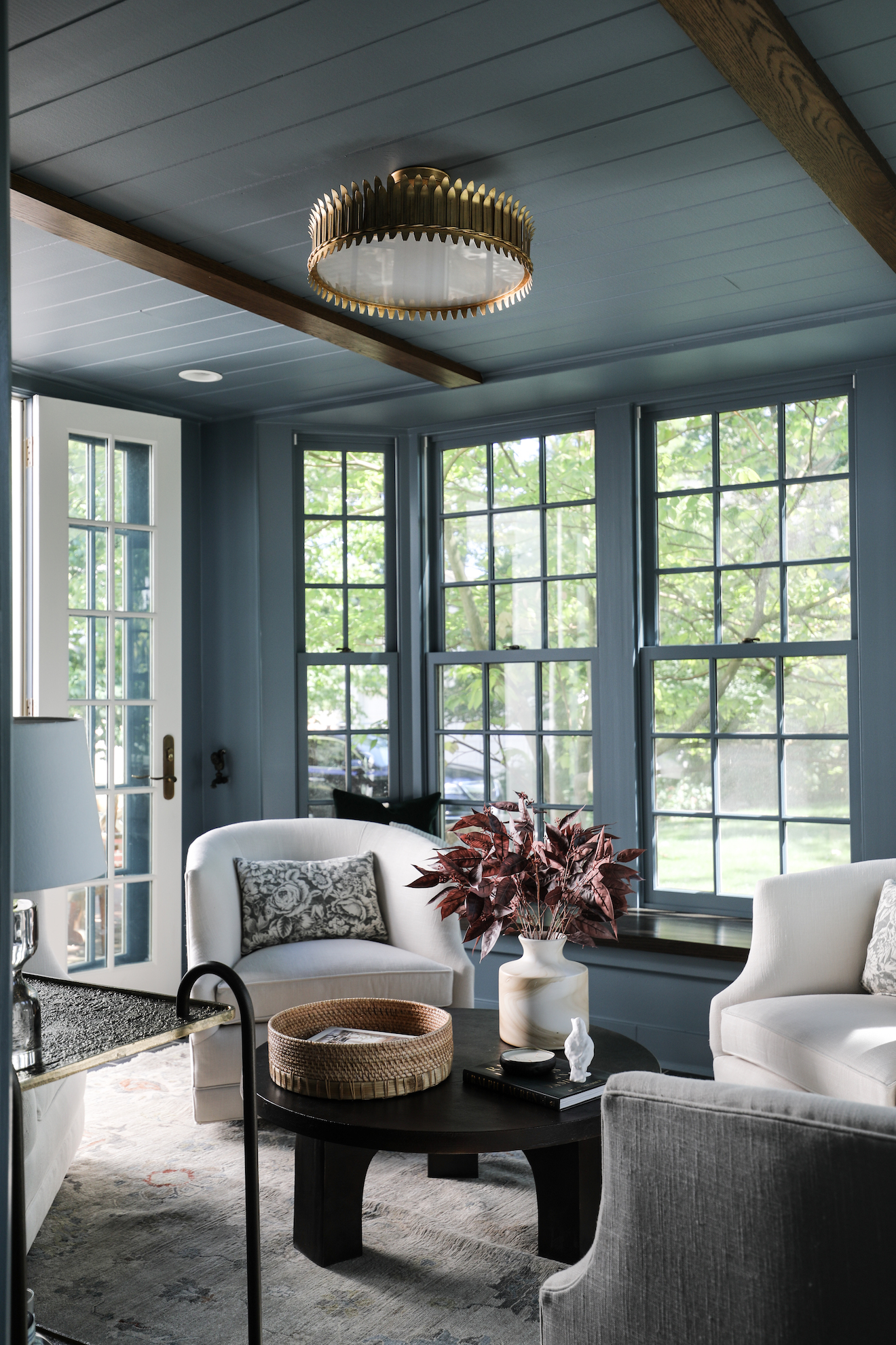
We loved working with this color so much on our recent Winnetka project, so we thought it deserved a highlight here on the blog.

It may come as a surprise that paint is not always the first thing we think about. Once a budget is set for a project, we want to make sure we are selecting the best possible finishes for the space. Often, this means waiting to choose a paint color until we have a rug, lighting, upholstery. In this project in particular, the abundant natural light in the room meant that the color story could wait a bit – virtually any shade would work here.

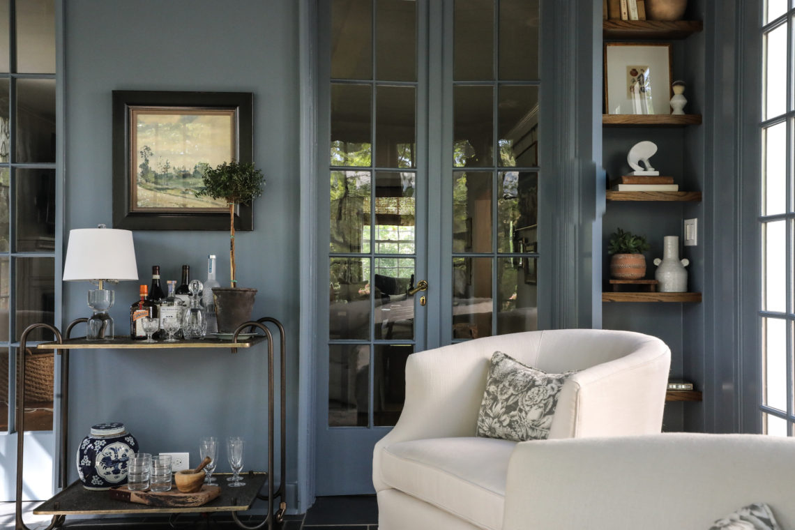
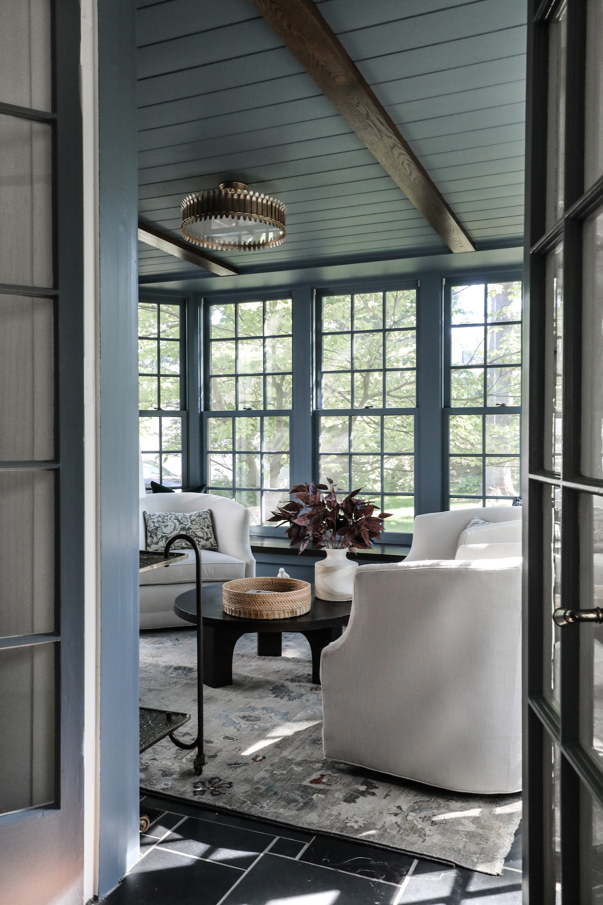
What we did know was that we wanted some wow factor in this space. As you move through the entry of the home, and into the living room, this room beckons from the back. We wanted guests to spy a glimpse of this room and think…”oooo, what’s back there?” A jewel-box cocktail room was a natural choice here, the question was just, what color?

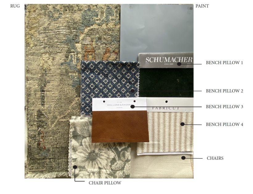
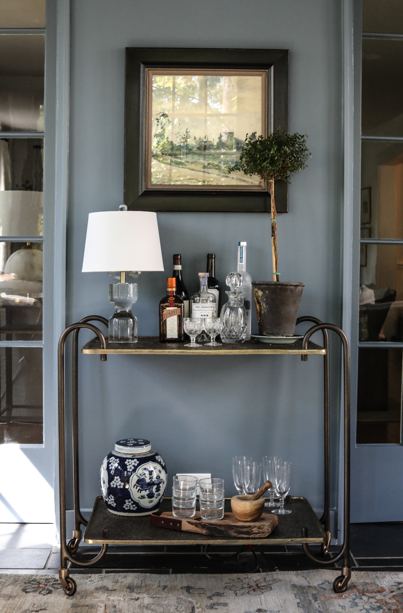
We kept coming back to the Montpelier swatch in other color research, so when the rug and upholstery were chosen for this cocktail room, after also considering the black floors, and warm wood stain for the built-ins, we knew that Montpelier would be the perfect complement.

See how it came it together!