Blog :: Color Story
Color Story: Soft Blues
Have you noticed more soft blues in your feeds lately? We have. Whether in a kitchen or a cocktail room or a bedroom, soft blue has been making its case as a go-to neutral, and this is one trend we wholeheartedly endorse.
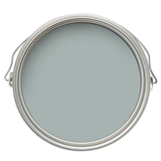
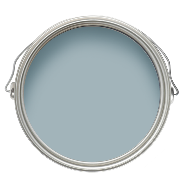
Benjamin Moore
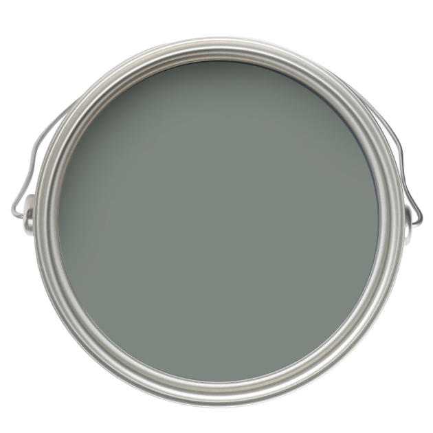
Benjamin Moore
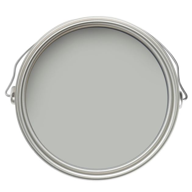
Benjamin Moore
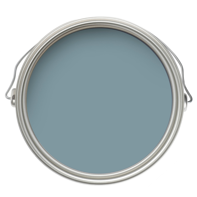
Benjamin Moore
Benjamin Moore
We have turned to soft blues like those pictured above in many homes throughout the life of Park & Oak, and if you’ve been following for awhile, you probably recognize some of our frequently shared projects.
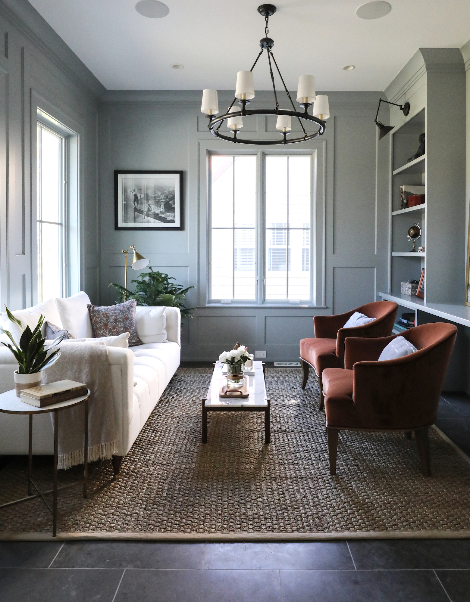
Here’s one from the early years, featuring Boothbay Gray, which our designers love for its balance of warm and cool undertones, and perfect saturation level.

This is another earlier project, also in Boothbay Gray.
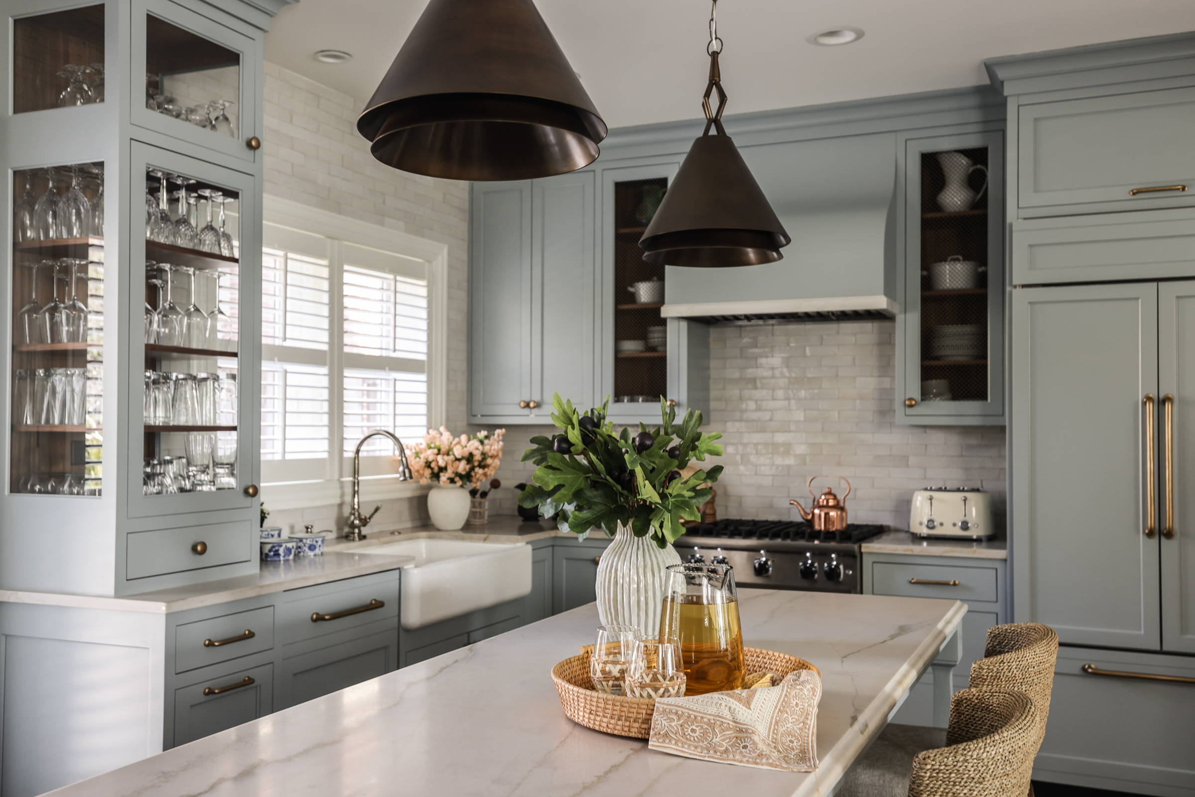
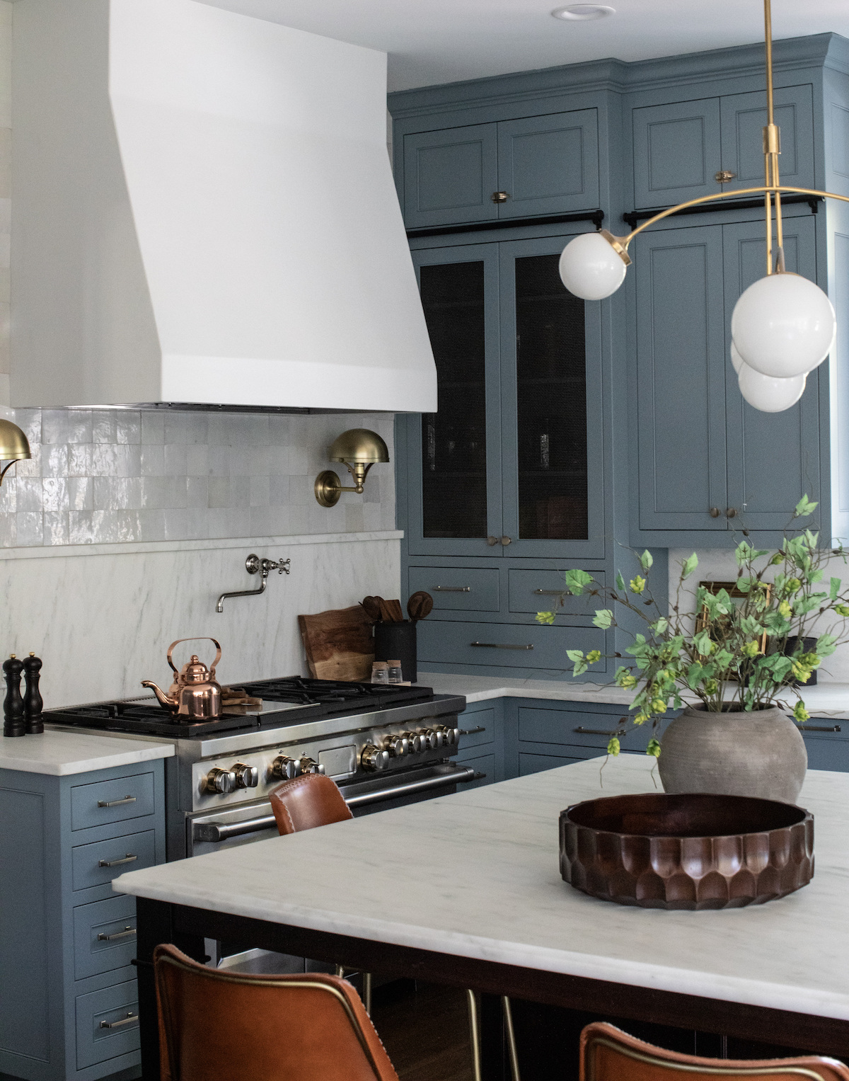
More recently, we used Boothbay in this impossibly charming kitchen.
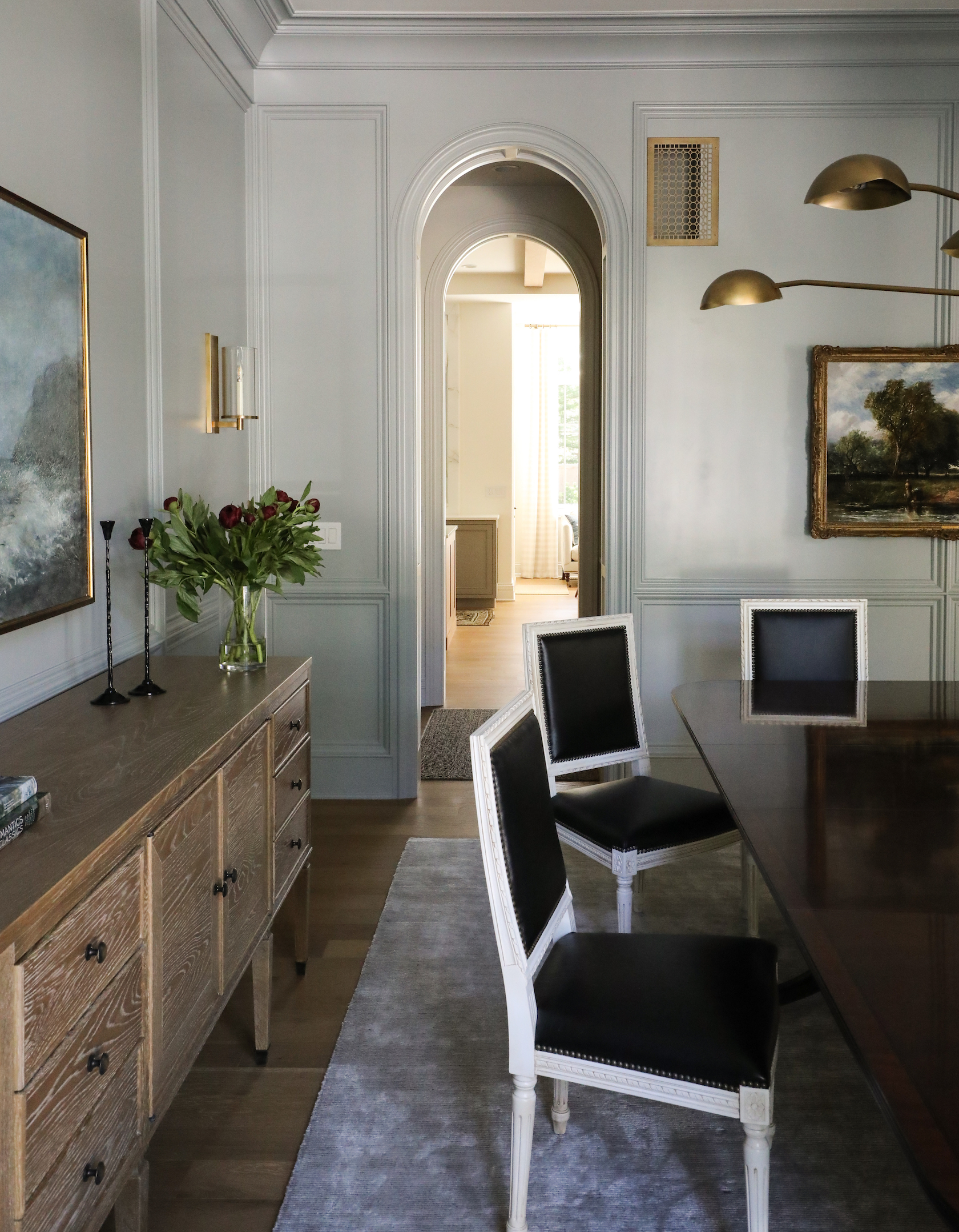
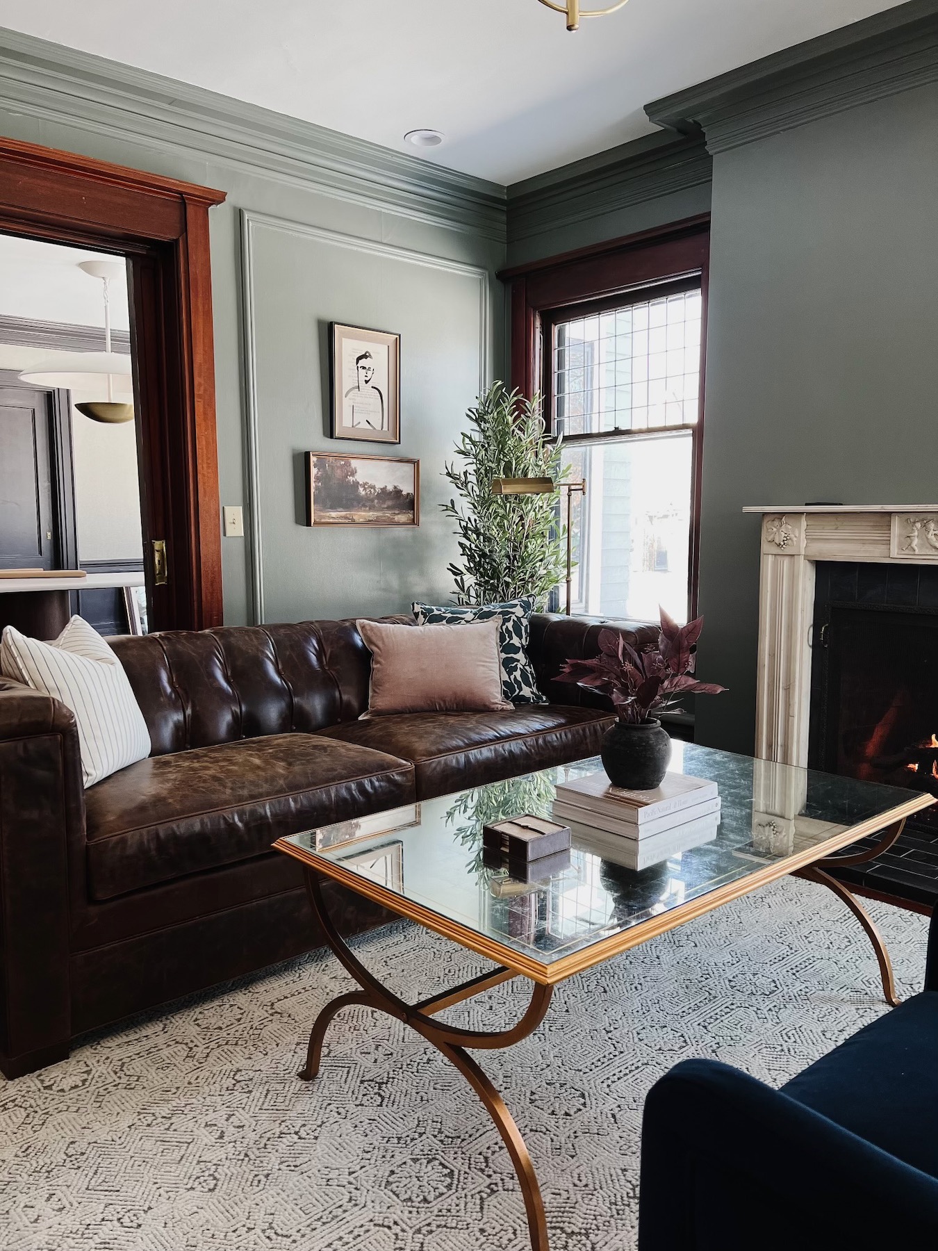
And in this sophisticated dining room.
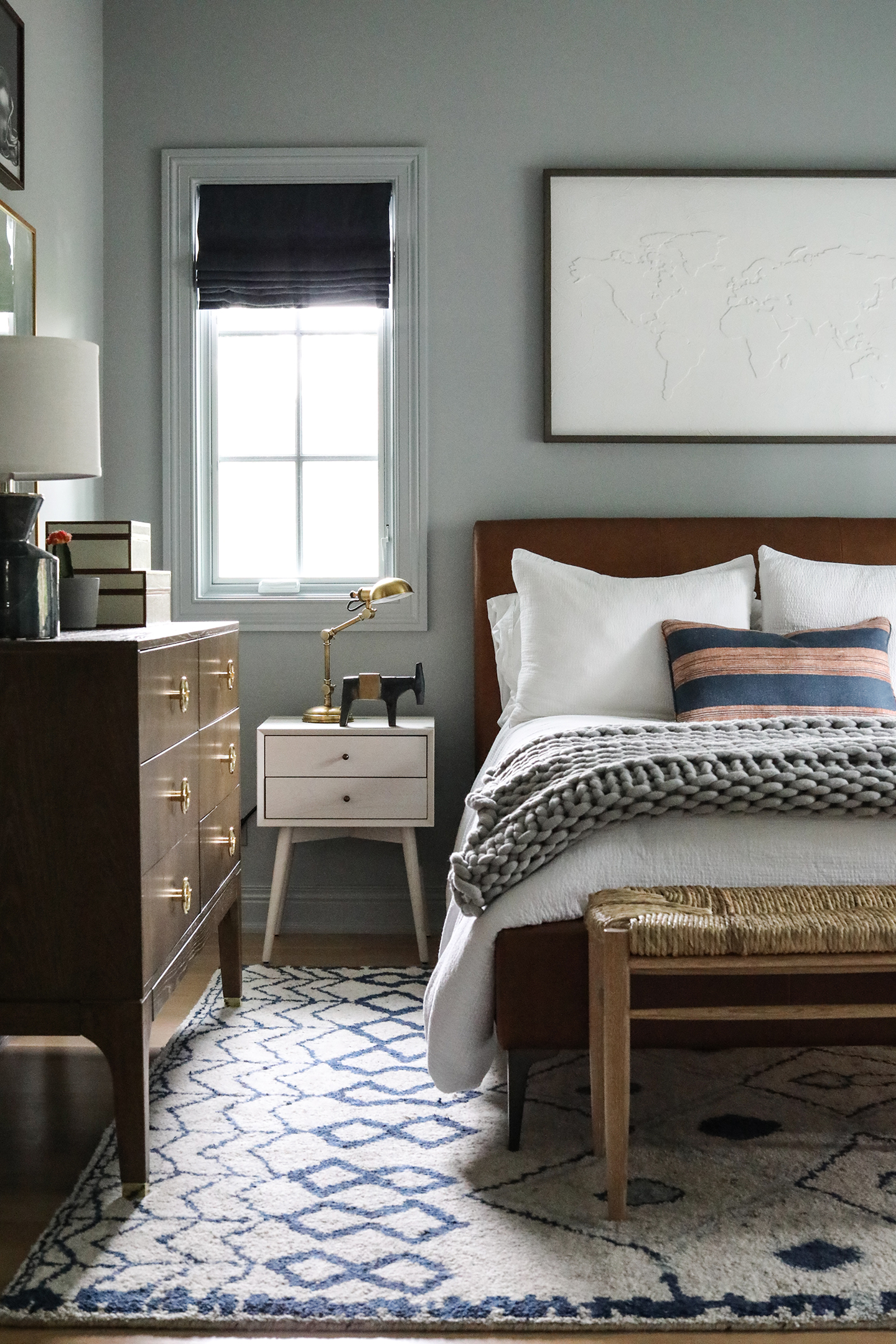
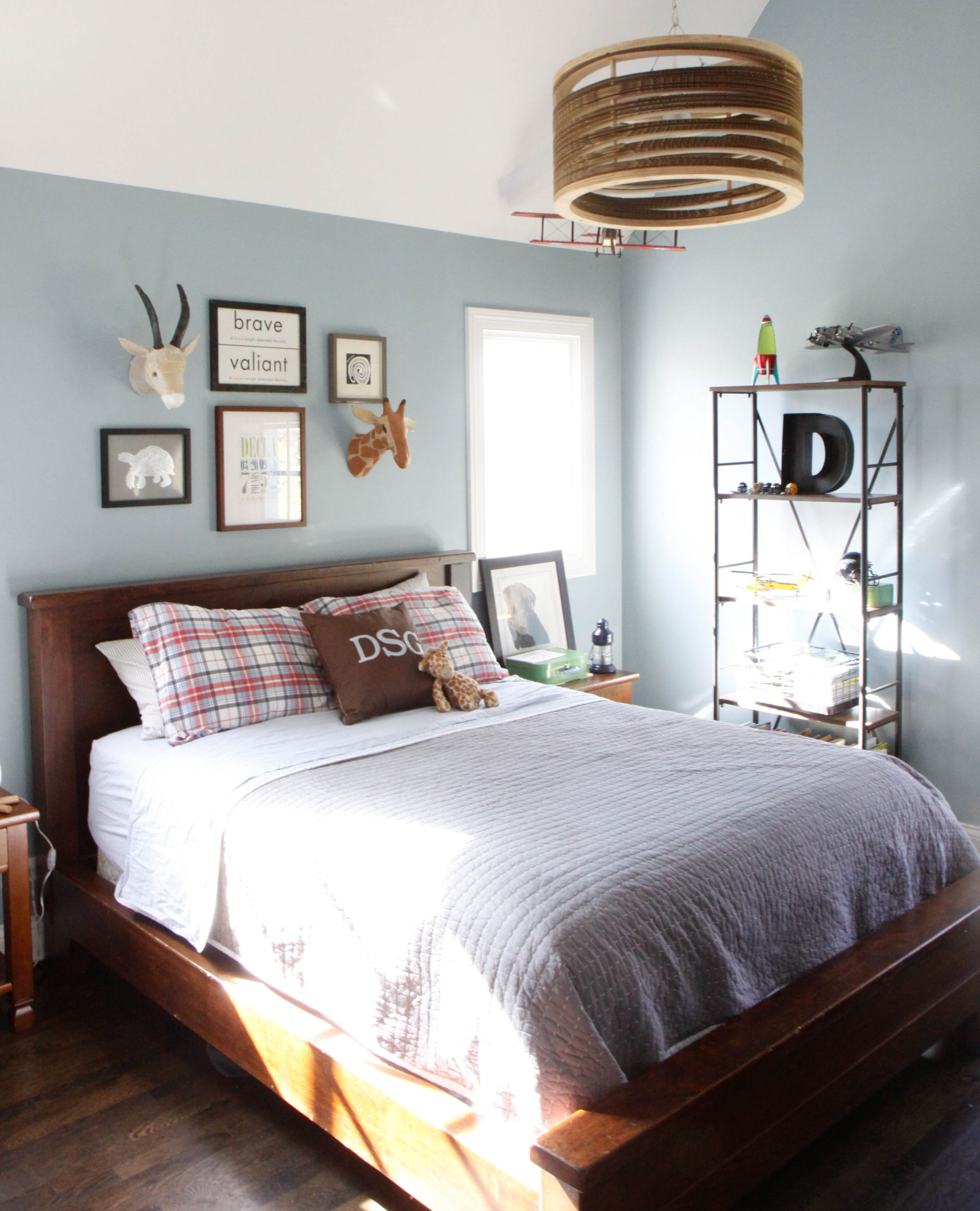
But it can also be perfect in a kids’ bedroom.
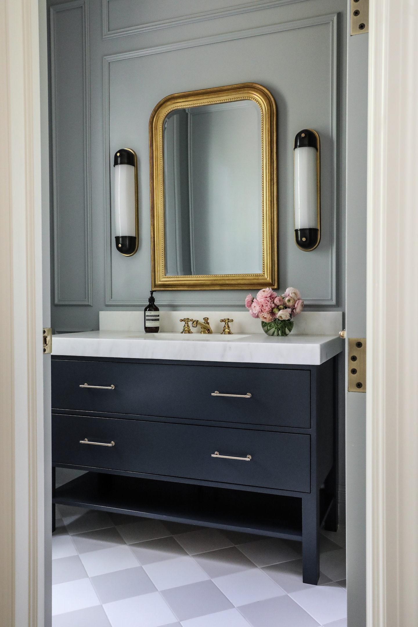
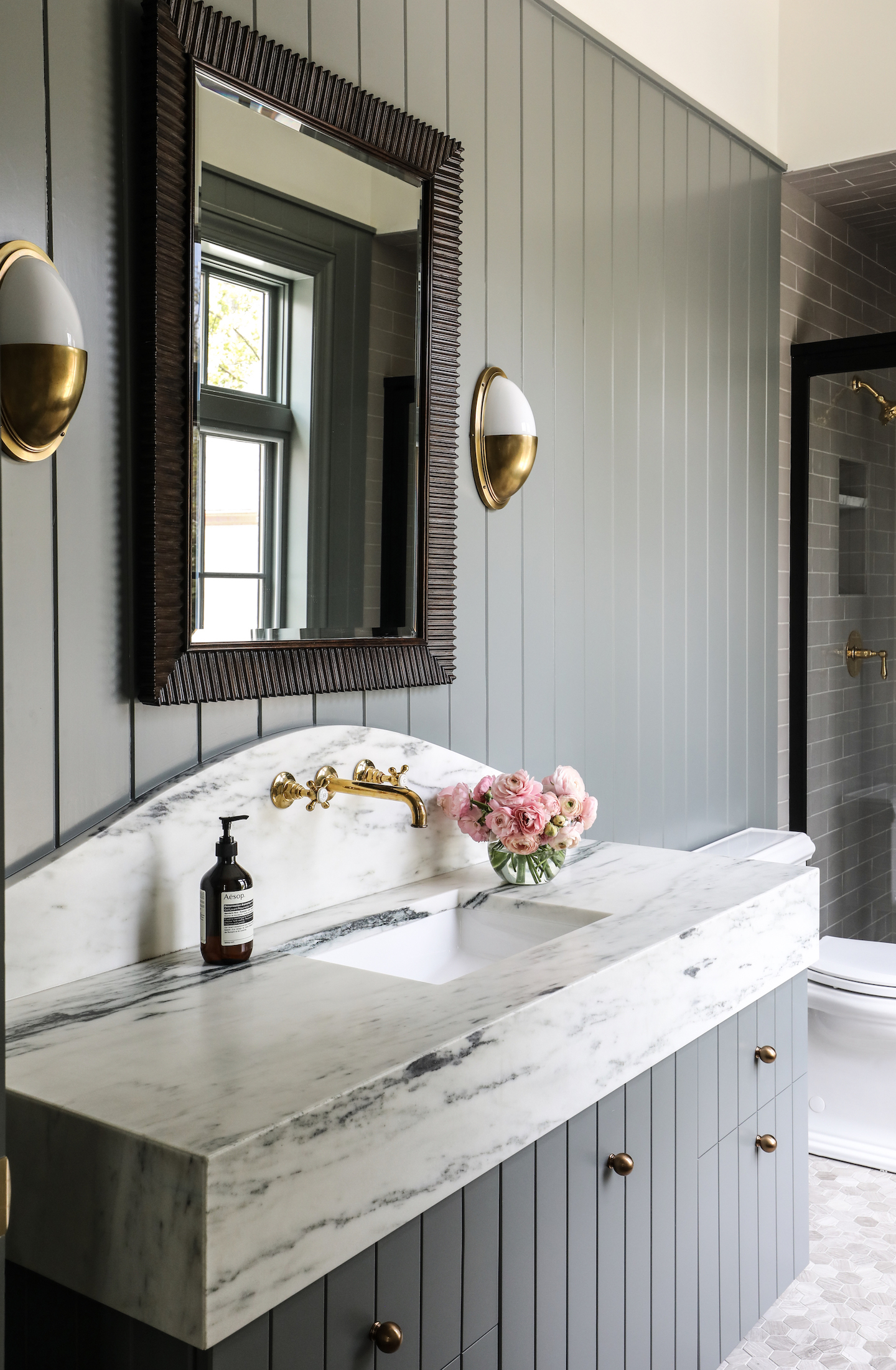
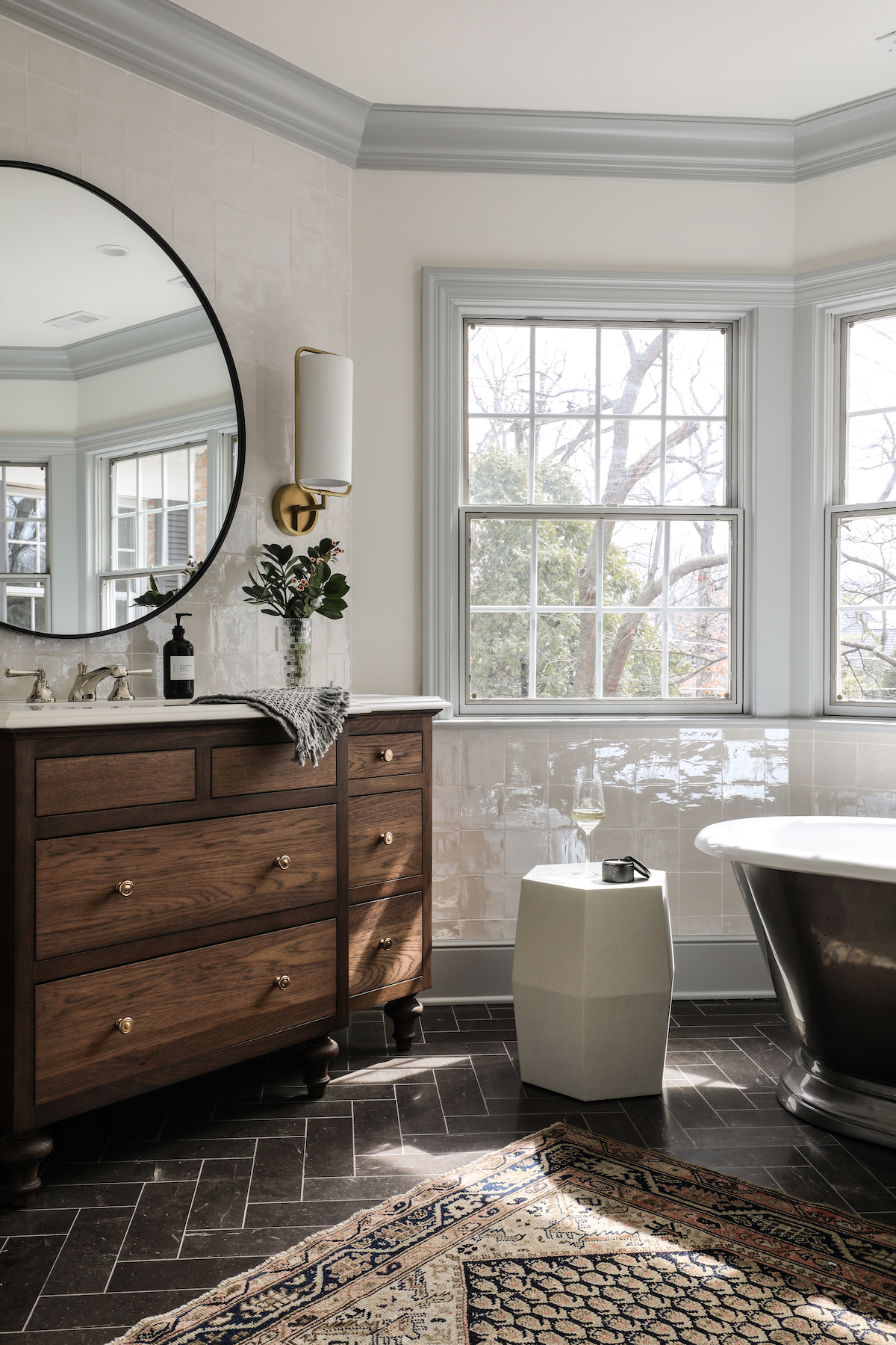
Or a bath.
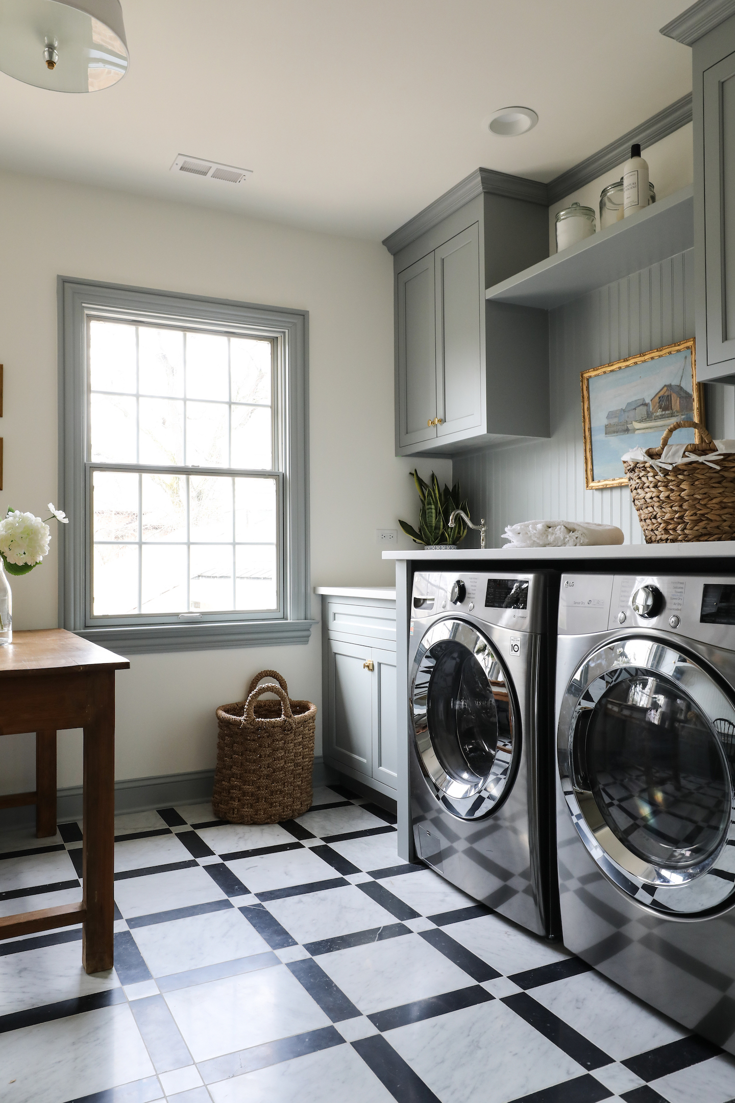
And even a laundry room.
Looking for something with just a little more warmth? Try Duxbury Gray.
Metropolitan is an even softer option, and contrast trim makes such an impact.
Van Courtland Blue is probably the purest blue in the soft blue lineup, and it really makes this kitchen shine.
And finally, Santorini Blue was just perfect in the boys’ bedroom.

Welcome to Park & Oak
We’re a full-service interior design firm creating timeless, comfortable homes across the U.S. Our work blends beauty with livability—crafted with care, inspired by you.
Whether you're building your forever home or refreshing a single space, we're here to make the process feel joyful and effortless.