Blog :: Room Reveals
Reveal: Historic Wilmette Home
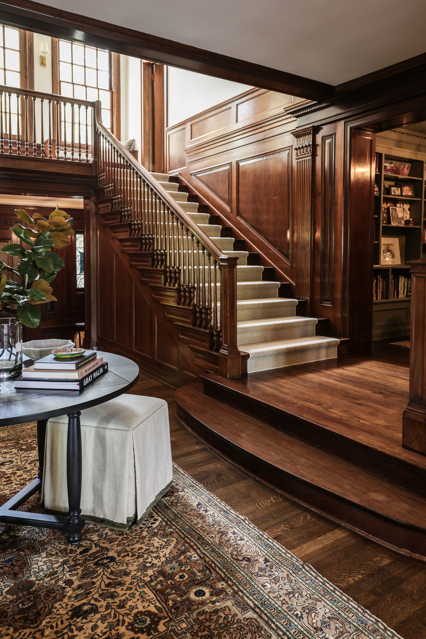
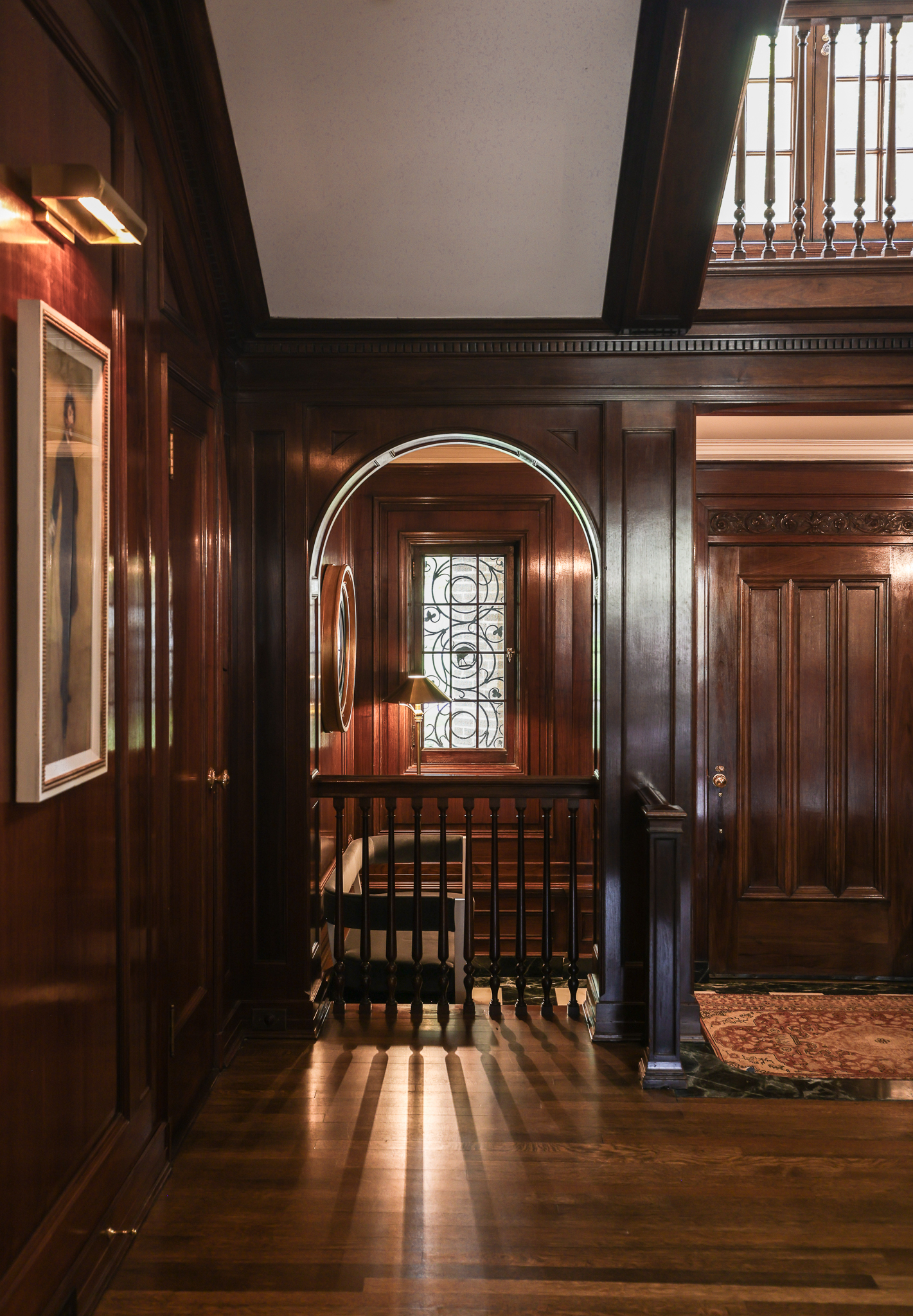
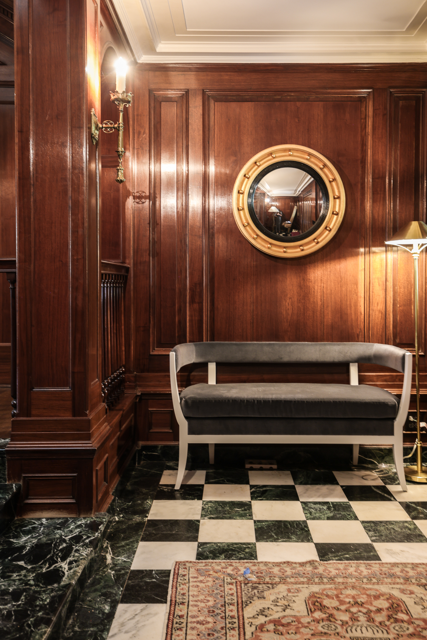
Learning the stories behind the historic houses we work in, and how our clients wound up there, can be such a fun part of the job. For example, this 1927 home has a twin sister next door, built for real-life, early 20th century sisters. Our clients initially bought a house down the street, even though they had been eyeing these twin homes for years. When this one hit the market, they knew they had to make the move…again. And we can see why. This home has such beautiful bones: intricate woodwork throughout, checkered tile floors, that grand staircase. It was easy to understand why our clients had been admiring it for so long.
Our job was to enhance the original details and maintain the historic feel of #POwilmetterefresh, while also updating it for modern-day living. The end result is a finished home that is a true testament to the value of furnishings, careful accessorizing and attention to detail. Let’s take a tour!
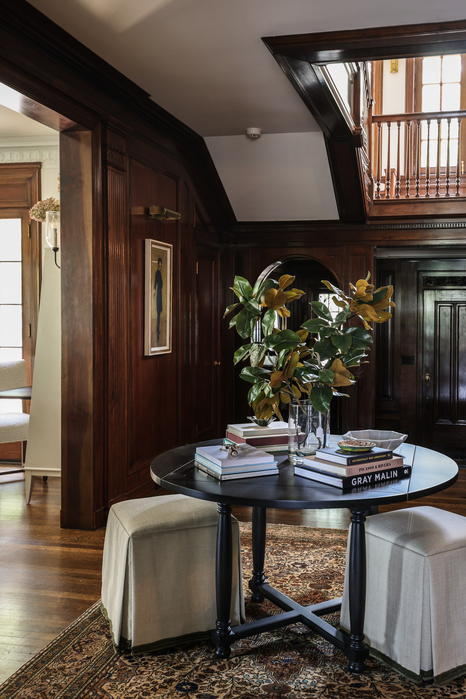
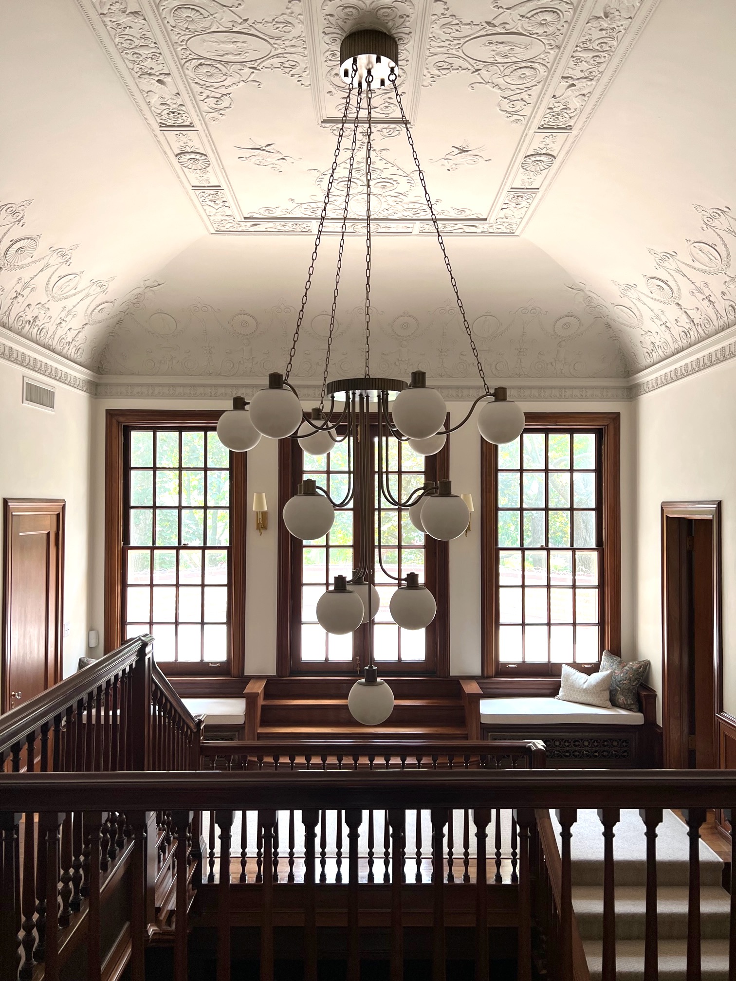
It was important to create a grand entry moment to match the magnificent details in the home’s foyer. A gorgeous table (styled by Collected stylists!) and vintage rug fill the space beautifully, and allow guests a stopping point to marvel at the beautiful architecture and build details. There is a lot to take in here, from the staircase to the detailed wall moulding to the checkered marble entry flooring. One thing the home needed, though, was additional lighting throughout. Brightening it up with strategic and beautiful lighting was a very important element to our client. In addition to adding sconces, picture lights and a floor lamp in the foyer, our team custom-designed a showstopping chandelier for the center of the staircase. Be sure to check out the video of us raising it!
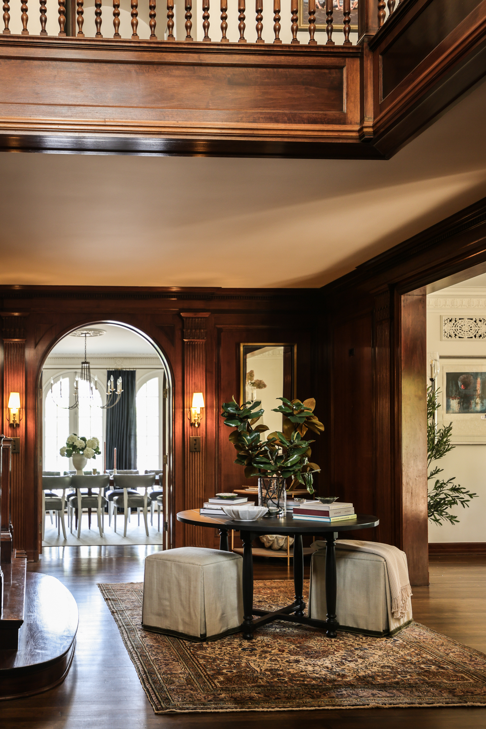
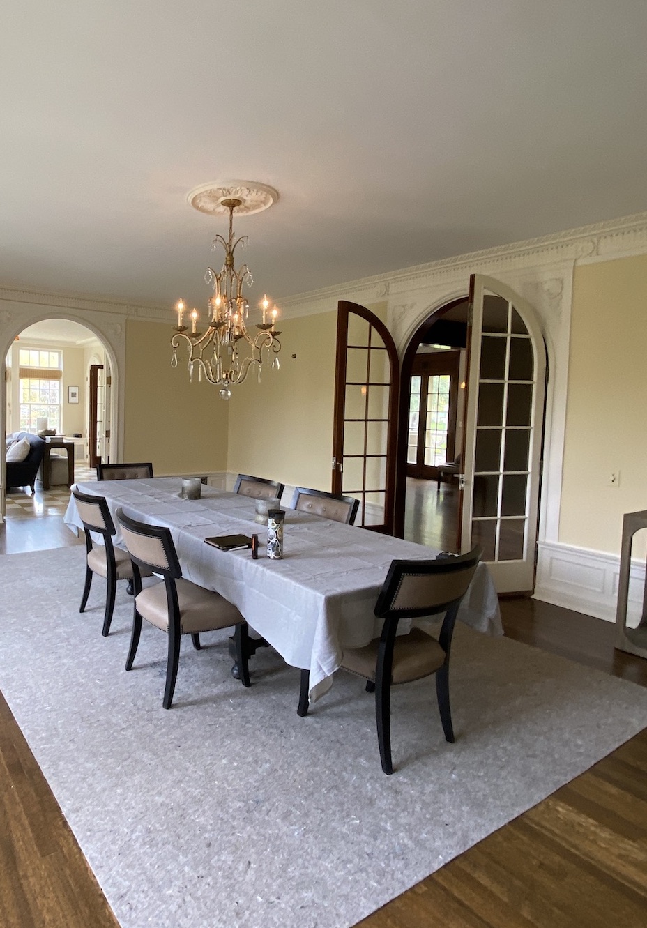
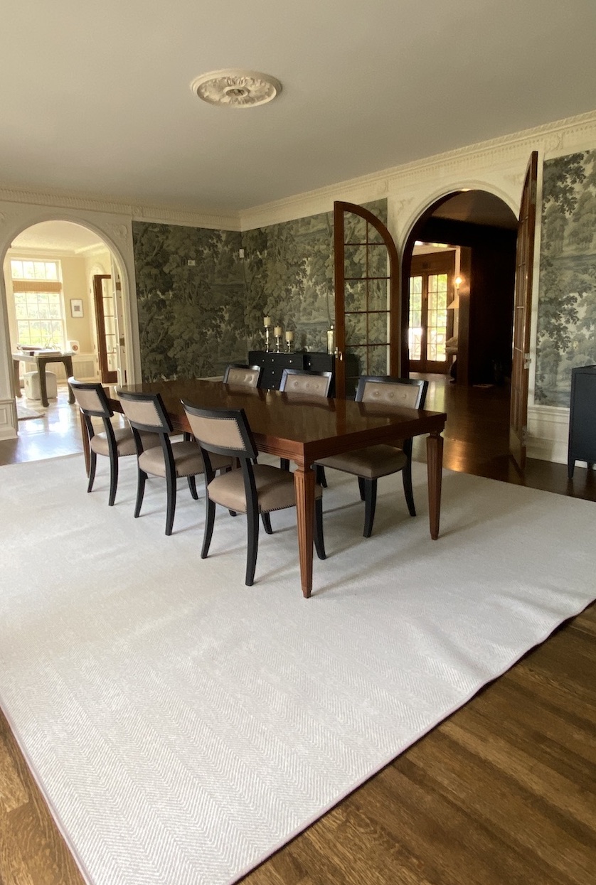
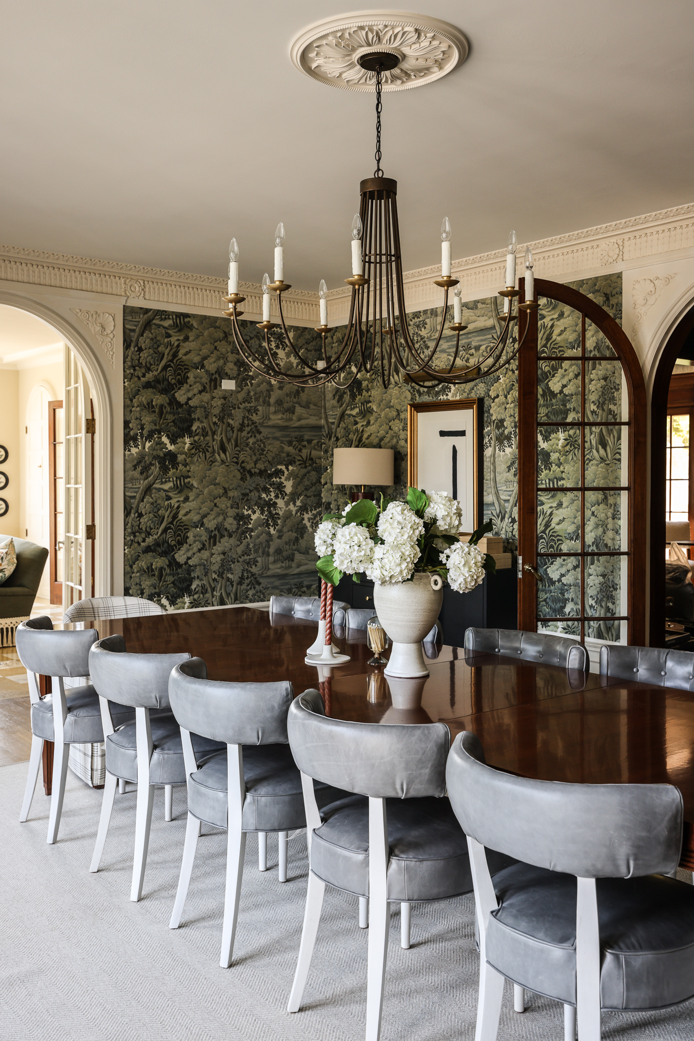
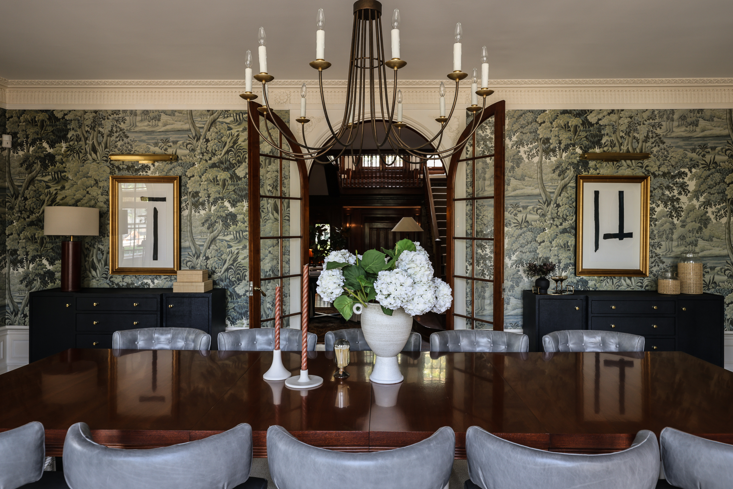
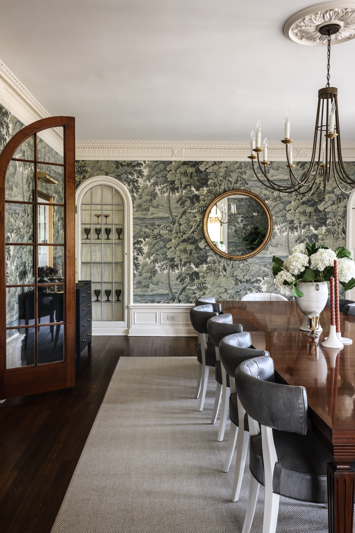
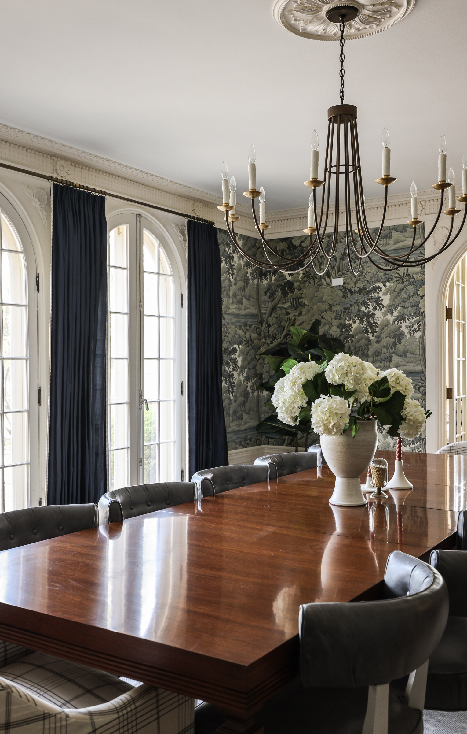
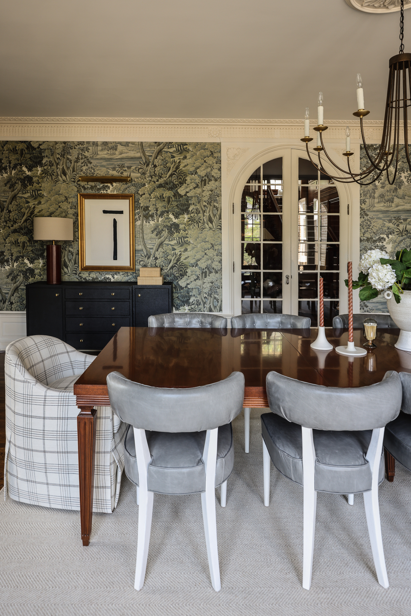
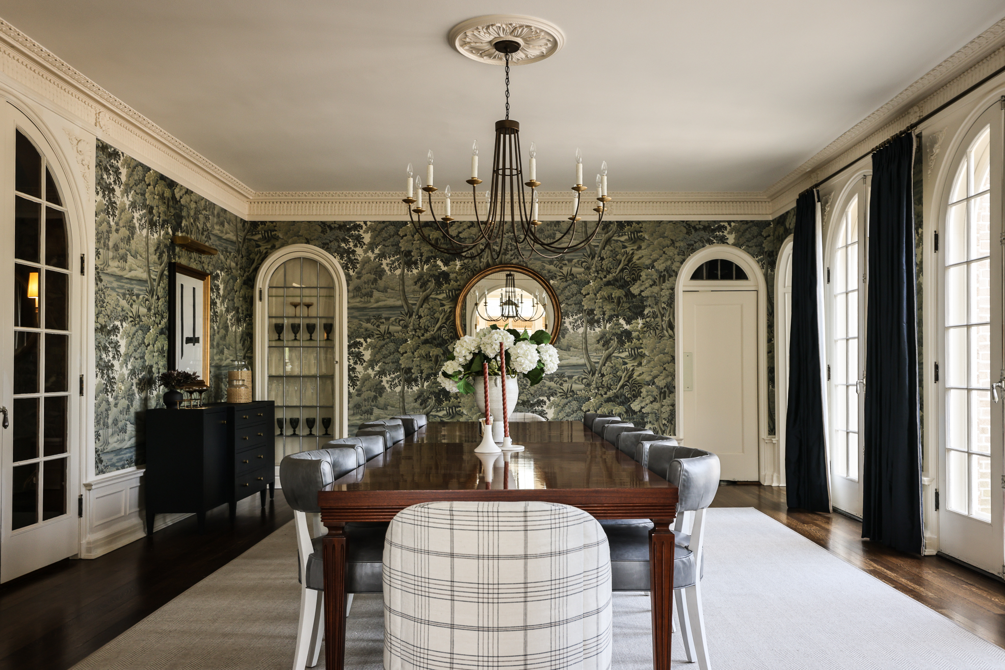
Catching a glimpse of the dining room through the arched doorway from the foyer lets you know something special is in store there. Our client really hope for a “wow” moment here. They frequently entertain large groups of family and friends, and wanted a room for dining with them that felt grand but not stuffy. Enter: comfy custom chairs with performance fabric, a large table to seat up to 12, an elegant Julie Neill chandelier, and of course, that mural wallpaper. (Wallpaper is House of Hackney, Plantasia) Window treatments highlight the arched windows and a neutral rug grounds the space and keeps the room from feeling too dark. Here is a room where accessories really do heavy lifting to help to finish the space and tell a story. The room had magnificent original details: intricate trimwork and moulding, arched windows and doors, a classic ceiling medallion. But even with those beautiful bones, it was lacking impact. Every piece we added was carefully considered to make this room the focal point it deserved to be, and to revisit its distinctive historic character.
A progression showing the impact of furnishings and accessories:
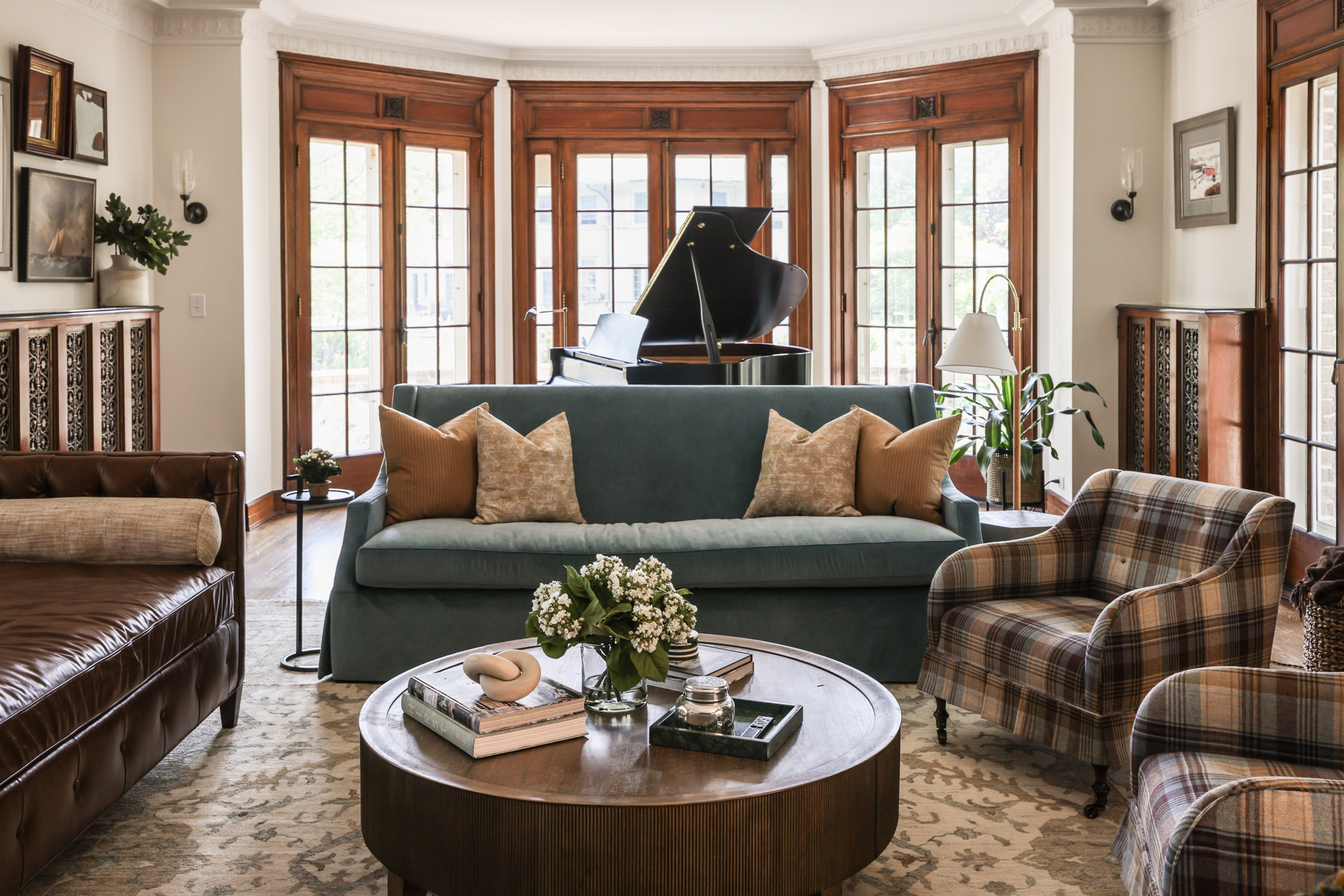
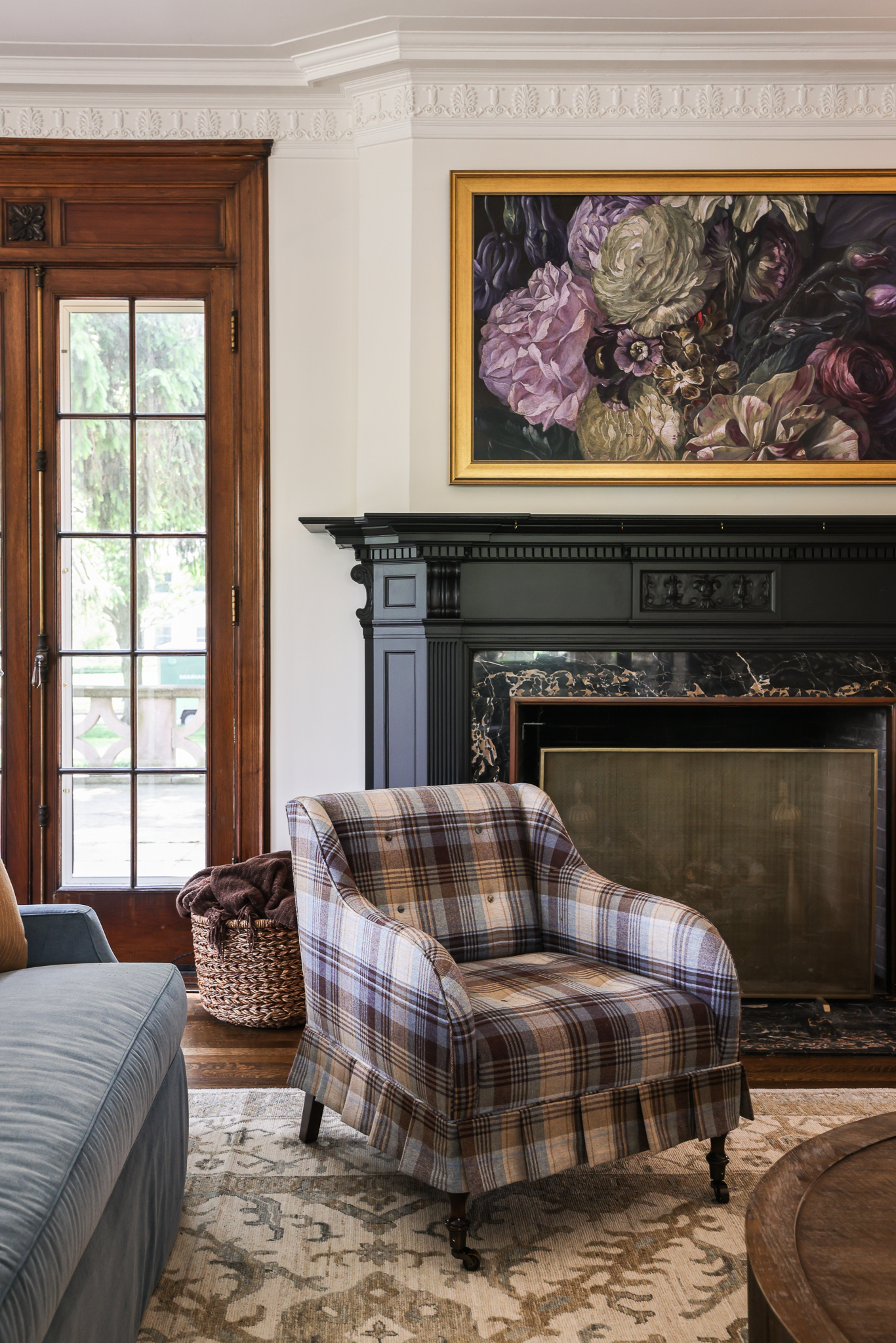
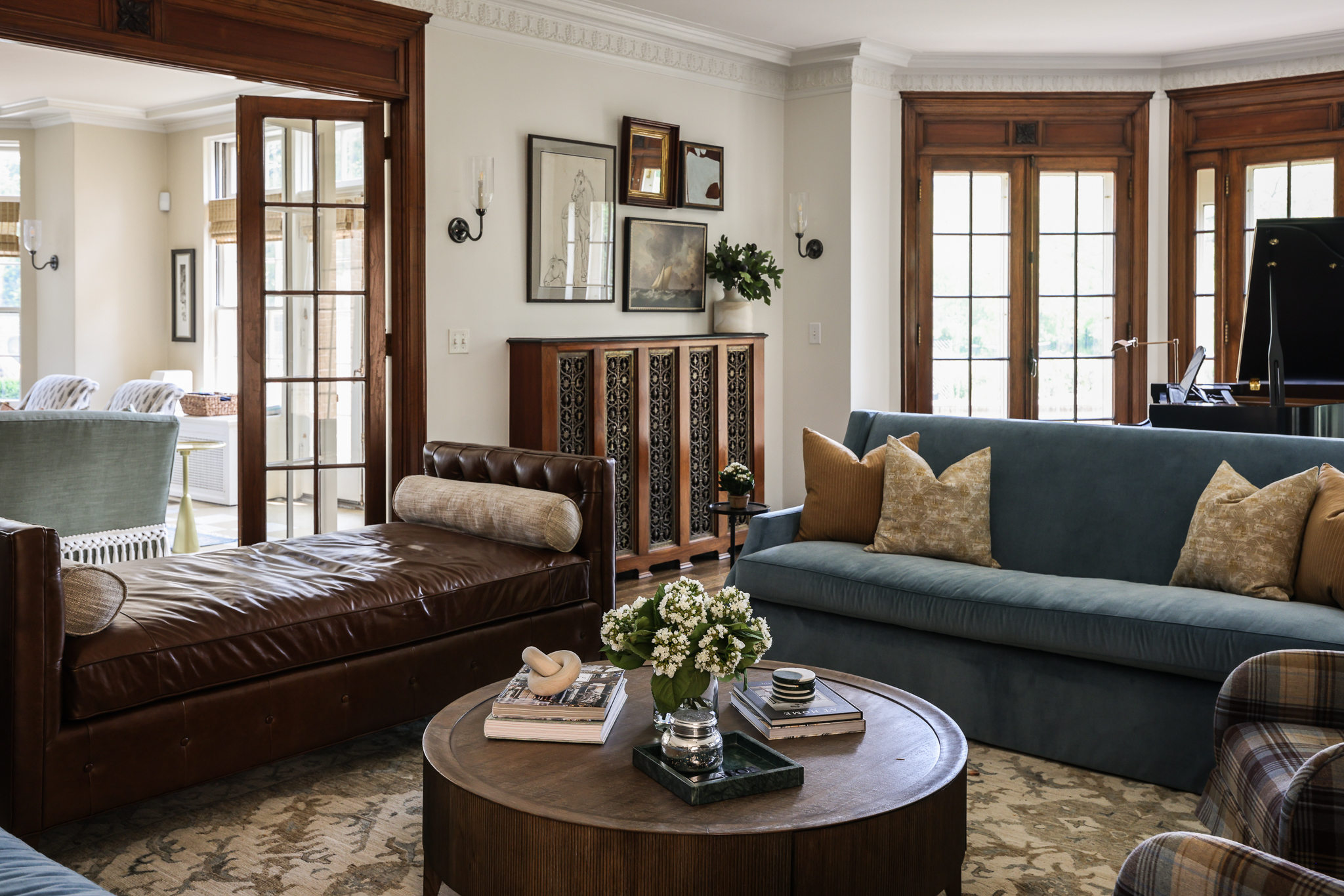
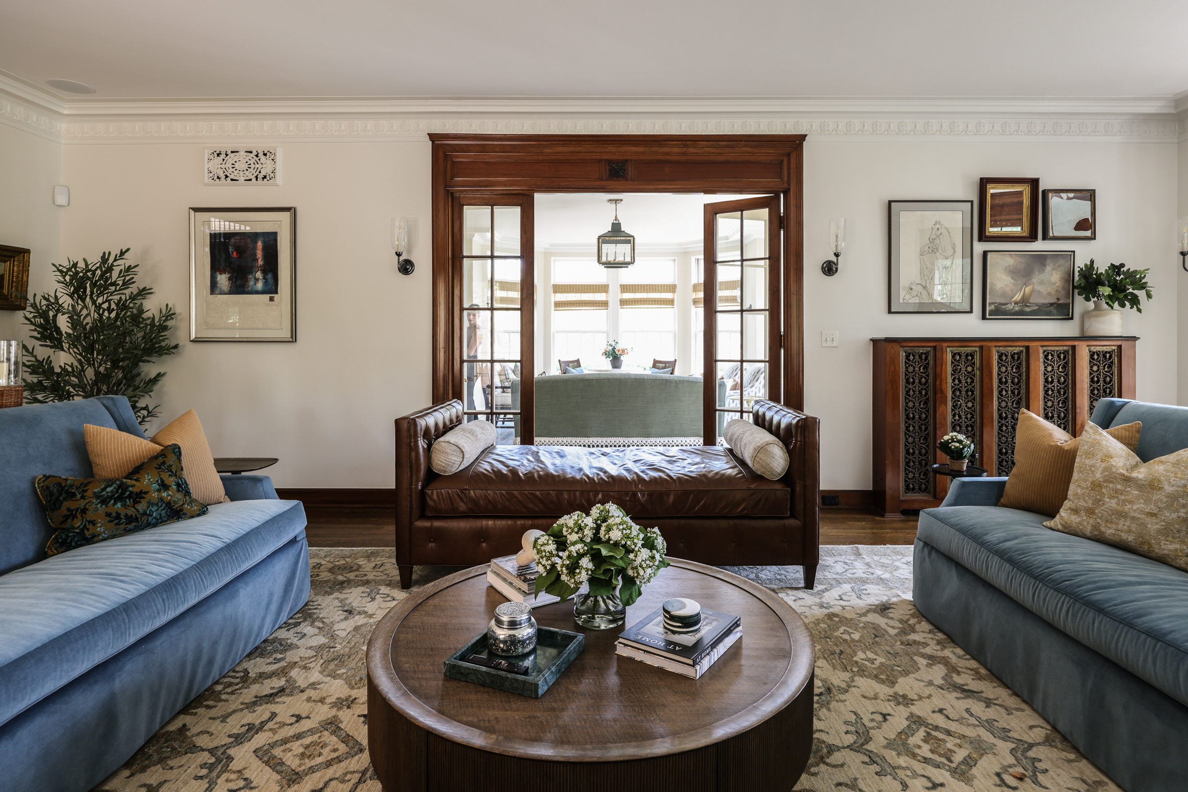
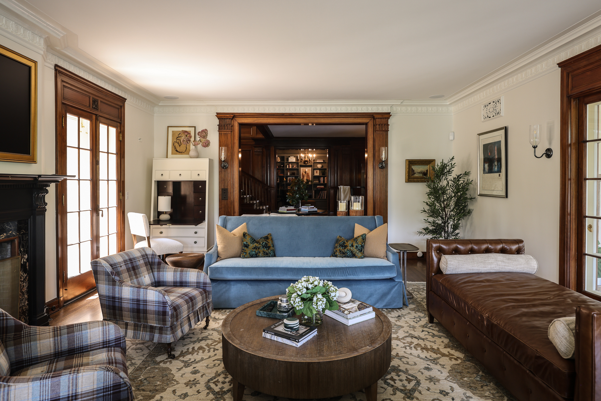
Look closely at the photos below and you can see all the special details in the #POwilmetterefresh family room: doors and trim with intricate carvings, custom radiator covers with elaborate metal grates, a fireplace designed to mimic the doors. Here we wanted to highlight these details, but also needed to brighten up the room a bit. We added sconces strategically around the room to add a layer of ambient light beyond the recessed ceiling fixtures. Their design echos the history of the home. We kept furnishings classic, with plaid and leather, plus matching blue sofas that behave like a neutral while also bringing additional color to the space. The bay window was a perfect spot for the family’s baby grand piano, which all the kids play. The home was painted before listing, and we kept that color in the living room, though we did paint the fireplace surround in Benjamin Moore Black Beauty to draw attention to it.
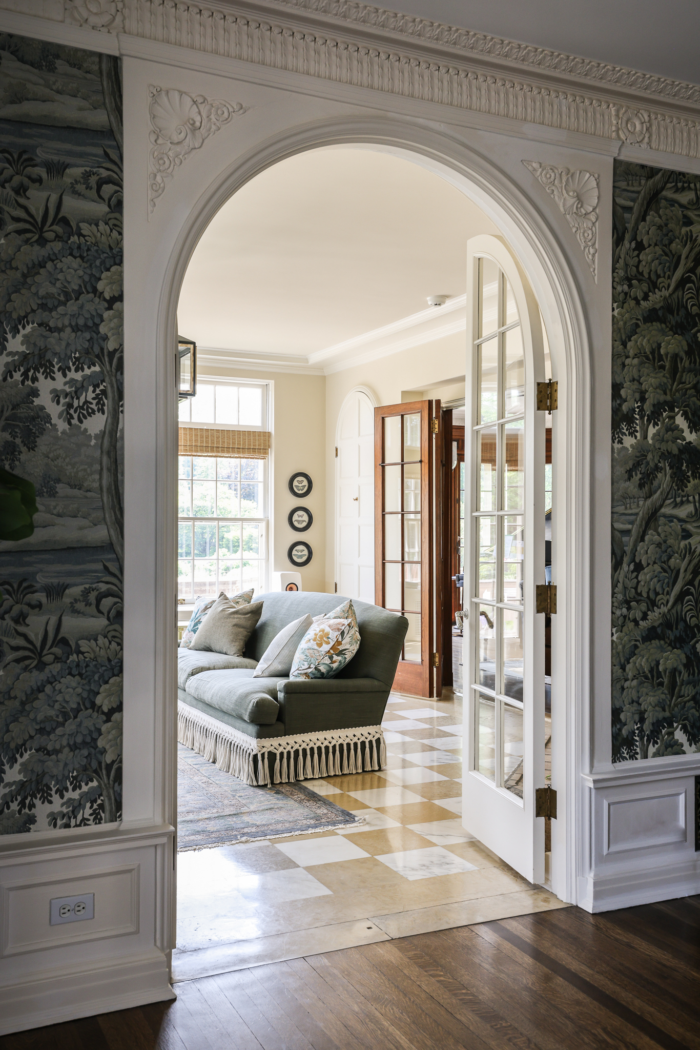
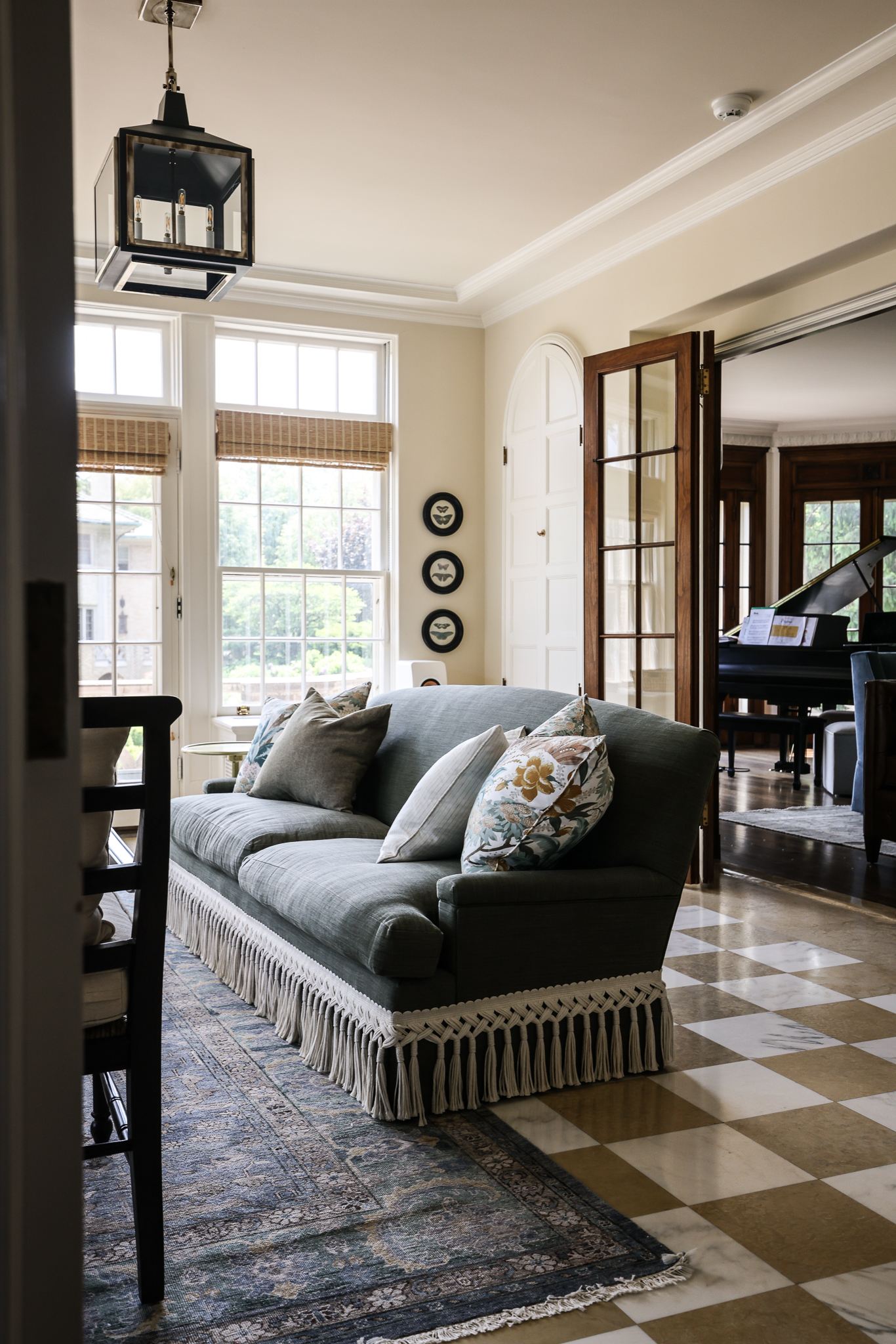
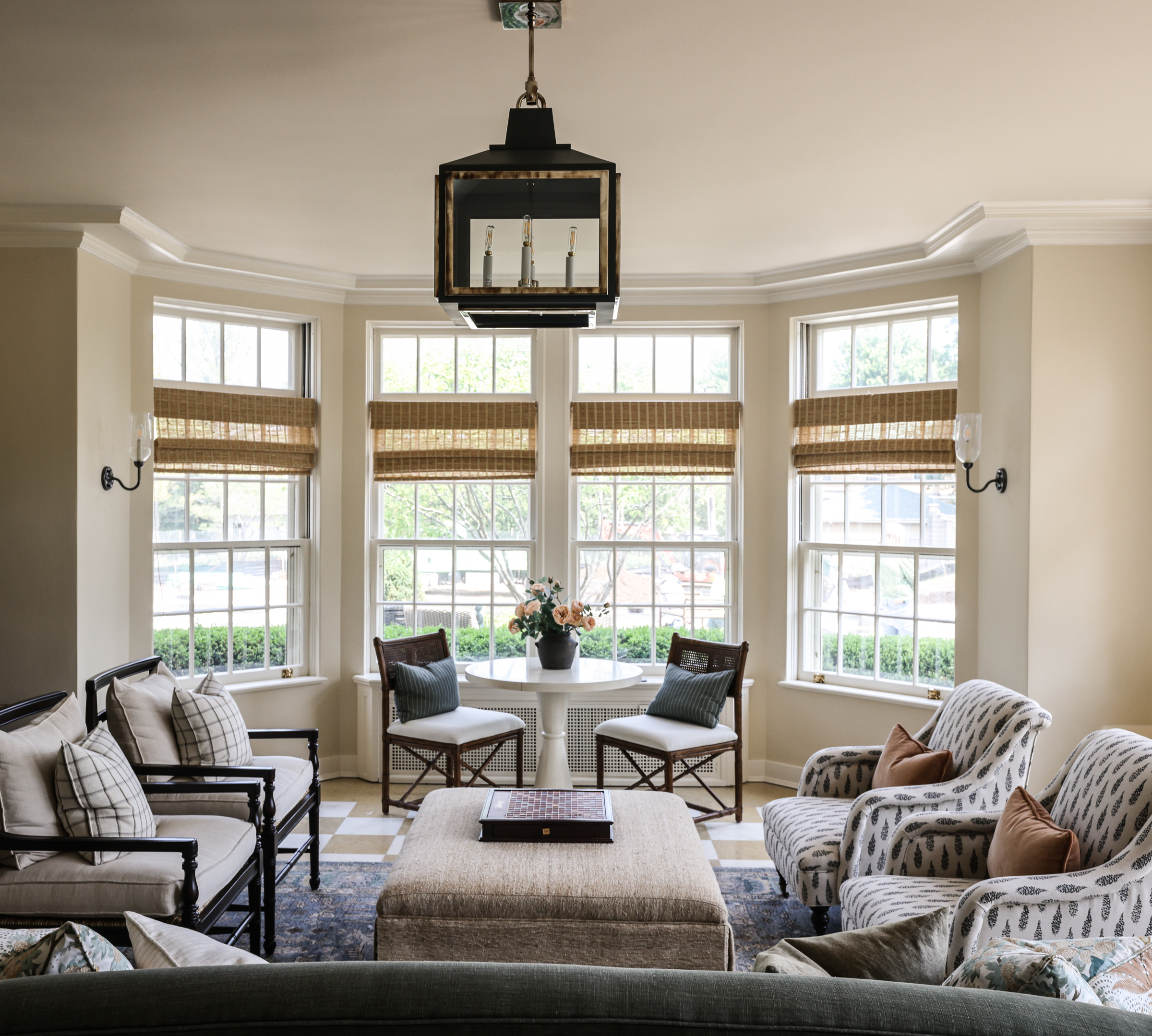
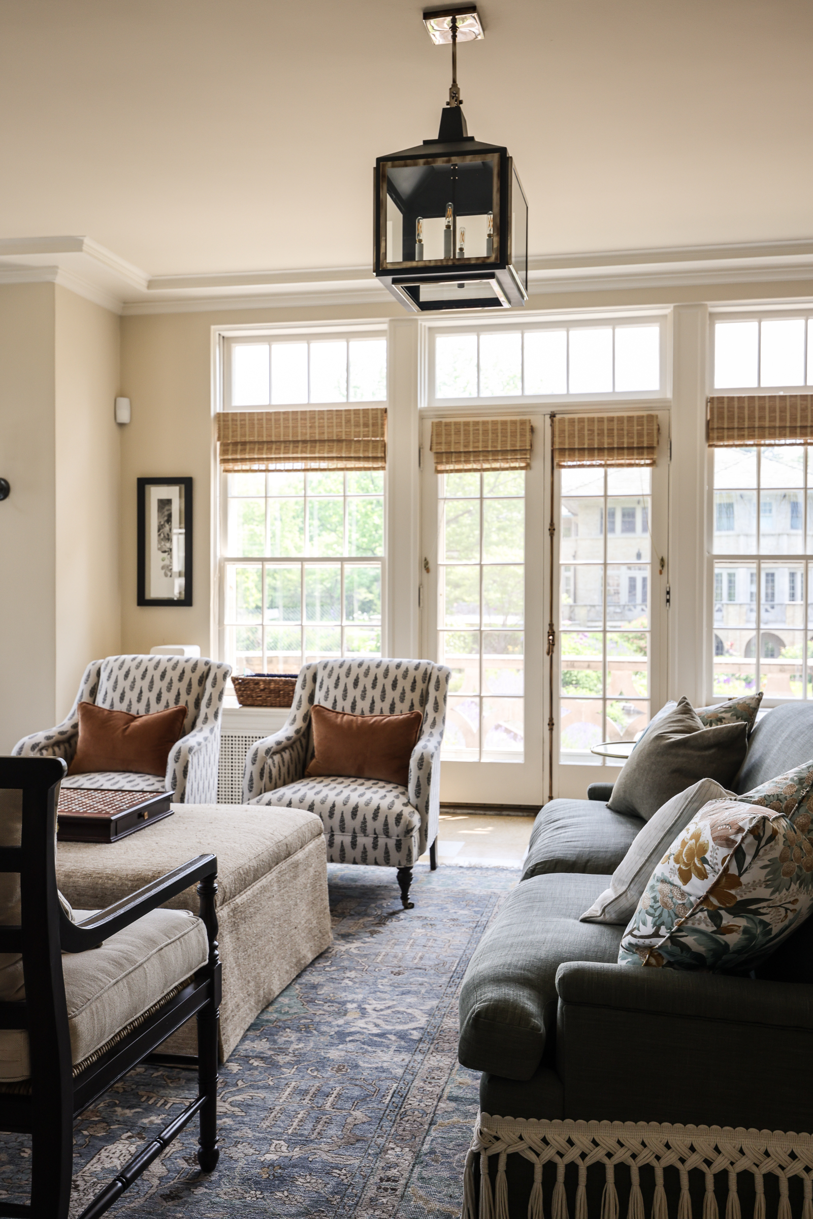
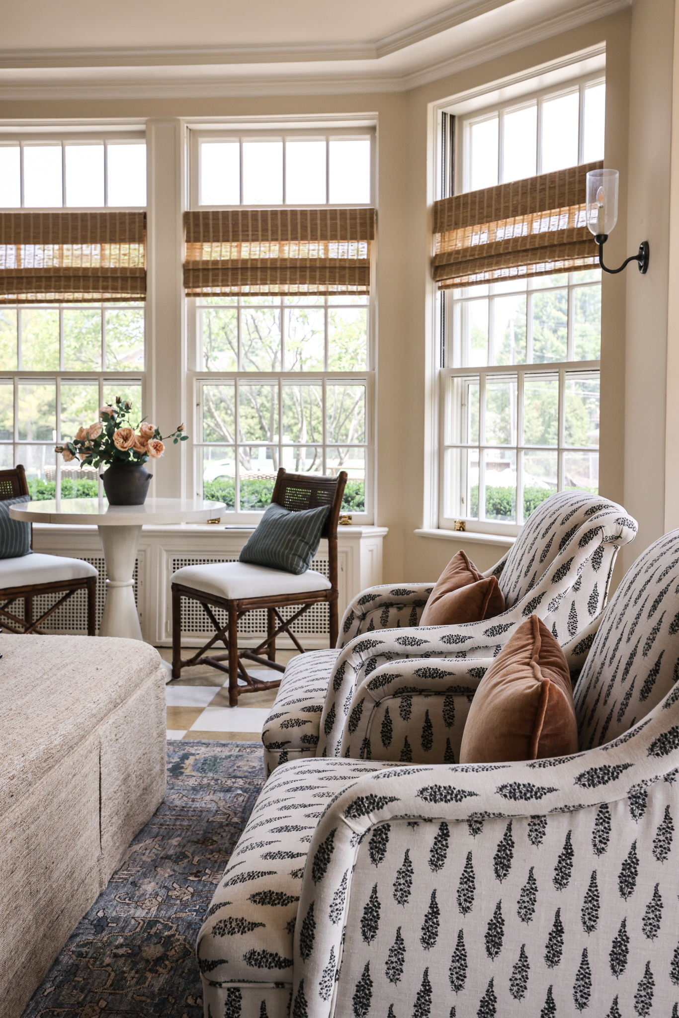
Off one end of the family room lies the sunroom. This room leads out to the grand main lawn of the home, so the family anticipates spending a lot of time here. The original checkered tile floors were the launching point for the design of the room. We expected this shade of yellow to be a little tricky, but the recovered sofa and blue-grey tones of the rug, combined with other neutral upholstery, helps balance out the yellow and brown tones beautifully.
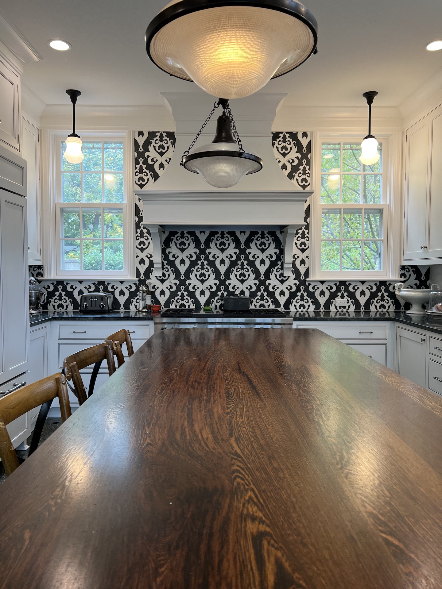
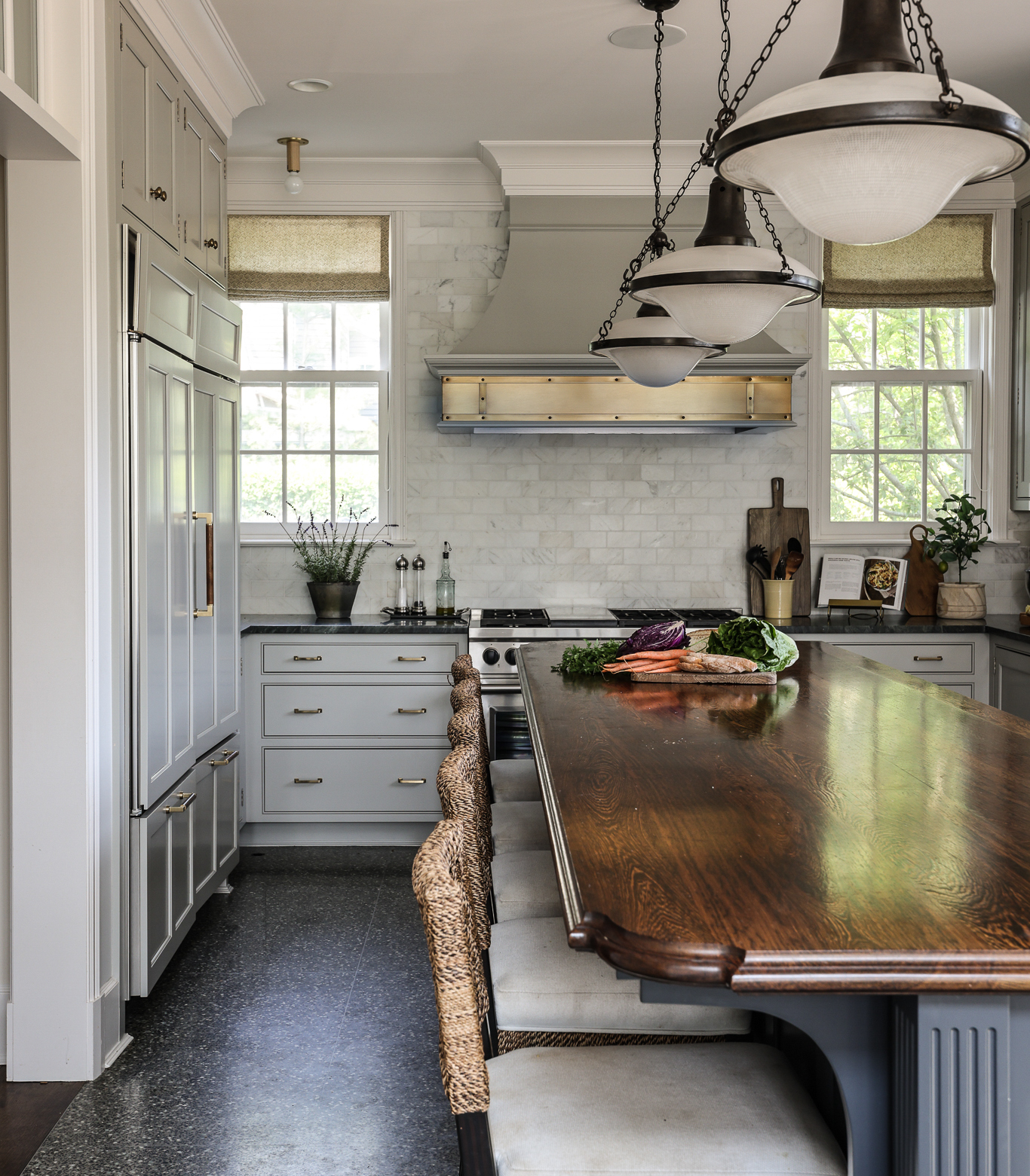
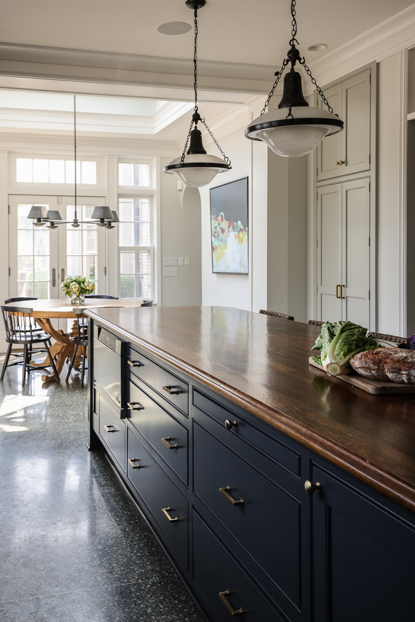
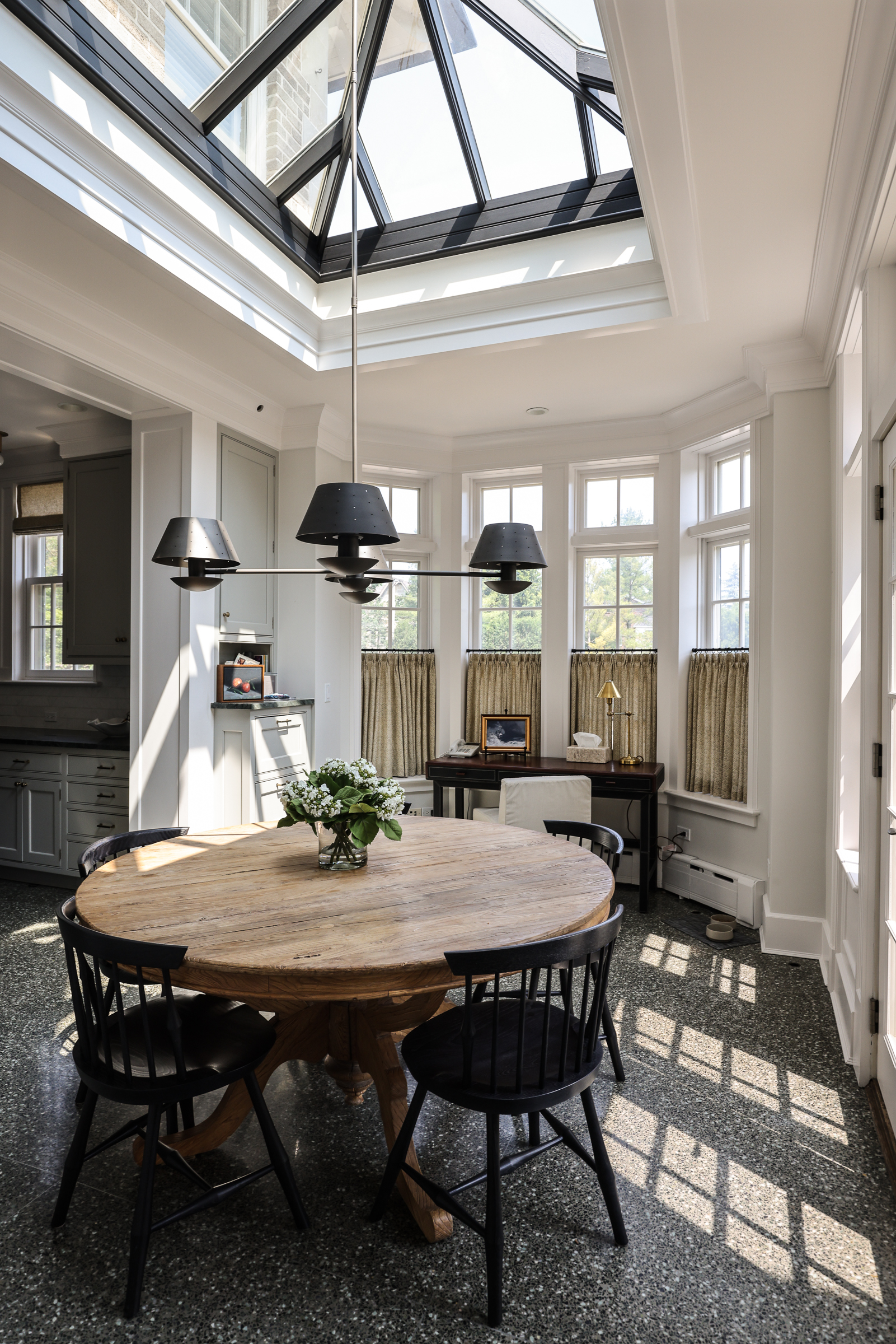
In the kitchen, small changes brought the overall design in line with the rest of the home. An ornate and busy tile backsplash had been added behind the range at some point in the home’s life. It wasn’t in line with the home’s traditional, classic feel, so we replaced it with a more timeless marble tile. Banding the range hood in brass adds interest and another layer of texture to the room. We painted the island in Farrow & Ball Railings, and all other cabinetry in Sherwin Williams Mindful Grey. The sunny, peaceful breakfast nook got a classic table and chairs, with lighting and window treatments to finish the space.

Welcome to Park & Oak
We’re a full-service interior design firm creating timeless, comfortable homes across the U.S. Our work blends beauty with livability—crafted with care, inspired by you.
Whether you're building your forever home or refreshing a single space, we're here to make the process feel joyful and effortless.

