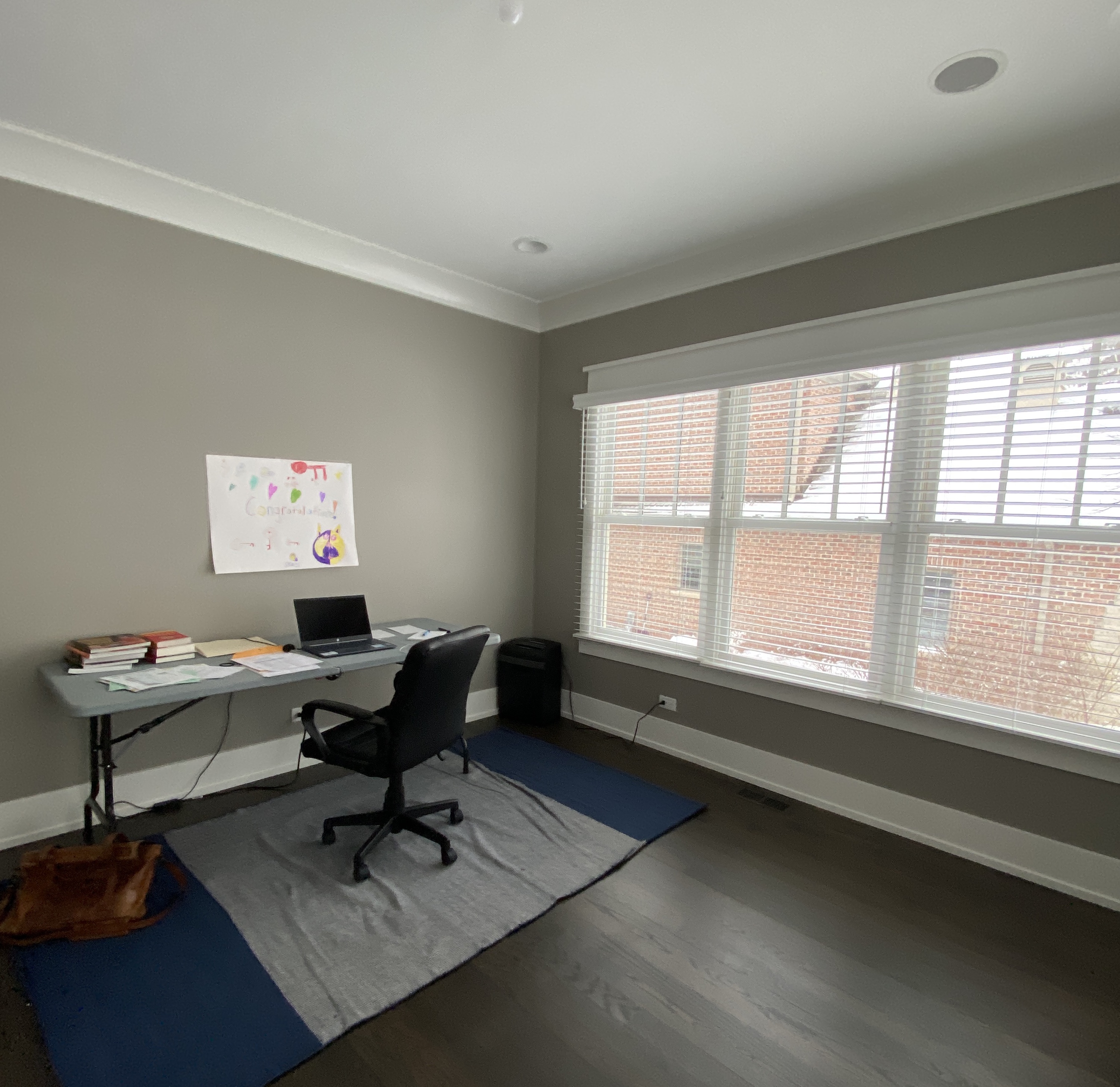
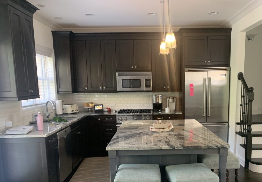
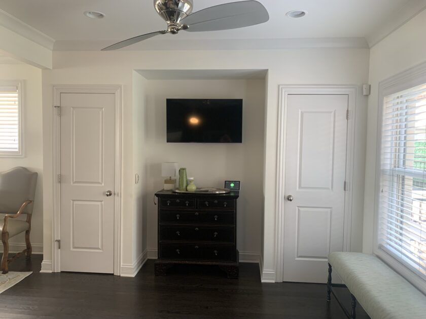
When we met with with this family in the summer of 2021, they were wanting to breathe new life into their home. And the biggest assignment was turning their very dark, builder-grade kitchen into a bright but sophisticated hub — with much more storage! — for their open-concept home. We’ll get into details below, but first…
Before & After
The Details
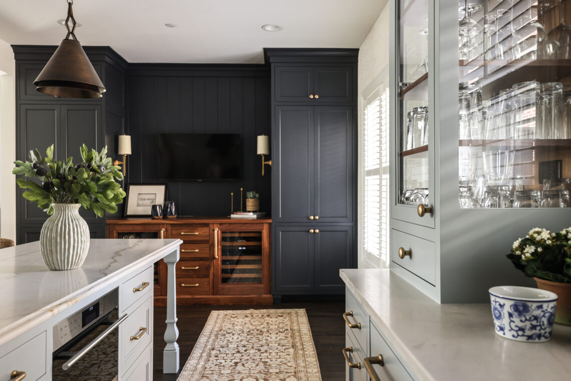
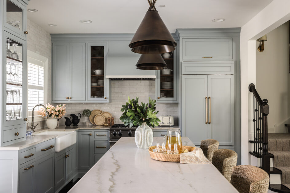
We started from scratch, with quality Amish cabinetry floor to ceiling, finished in Benjamin Moore’s Boothbay Gray, one of our favorite neutrals with personality. Incorporating panel-ready appliances gives the kitchen more of a seamless feel and helps it read as one cohesive space. A glass-paneled cabinet with walnut interior stain at the kitchen’s edge improves sightlines and allows light to filter through from the window and door beyond. Quartzite countertops are low-maintenance and easy on the eyes. If you like closely, you can see we gave the island an ogee edge to add a touch of sophistication. Teak and seagrass stools — with textured crypton performance fabric! — bring a natural element to the kitchen and help soften all the hard lines inevitably in any kitchen. Handmade aluminum, iron and brass pendants ground the space from above.


via Park & Oak
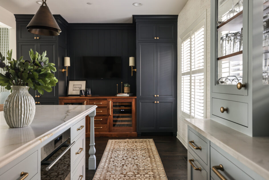
Across the kitchen we created a coffee bar with tons of cabinetry for storage, painted in Benjamin Moore Soot, because no matter the size of your kitchen, you’ll always need more storage! Here, the family also has a built-in wine chiller and beverage cooler with a custom stain designed to complement the existing floors and add additional tone and softness to this end of the kitchen. And, we still managed to keep that tv, now flanked by beautiful Visual Comfort Edie sconces!
We are so proud of this transformation!


via Park & Oak
