Browsing Tag

park and oak

0 In Room Reveals

Reveal: Hinsdale Outdoor Oasis

Gosh, we love this home’s outdoor living spaces. Everything came together here in just the right ways for an end result that feels relaxing, special and purposeful.


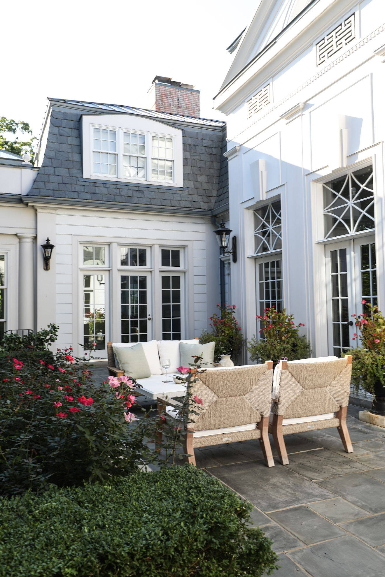
In this project, we were lucky to start with gorgeous exterior architecture and expert landscaping, providing a striking backdrop in the outdoor living areas. This is such an excellent example of the impact landscaping can have on a project, as it lends natural beauty to the space, while also serving the critical function of creating privacy for the homeowners, as you’ll notice in the photos.


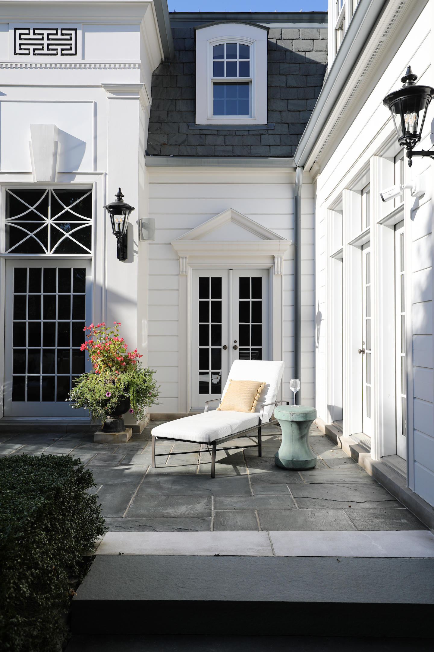
There are two distinct zones to the outdoor living areas for this home, the main patio and living room patio.

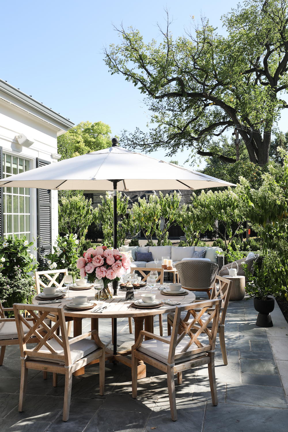
Main Patio via Park & Oak
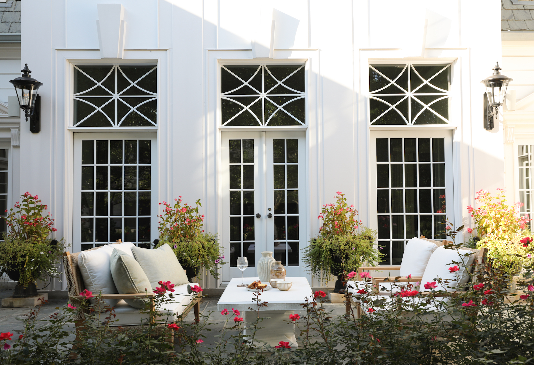
Living Room Patio via Park & Oak

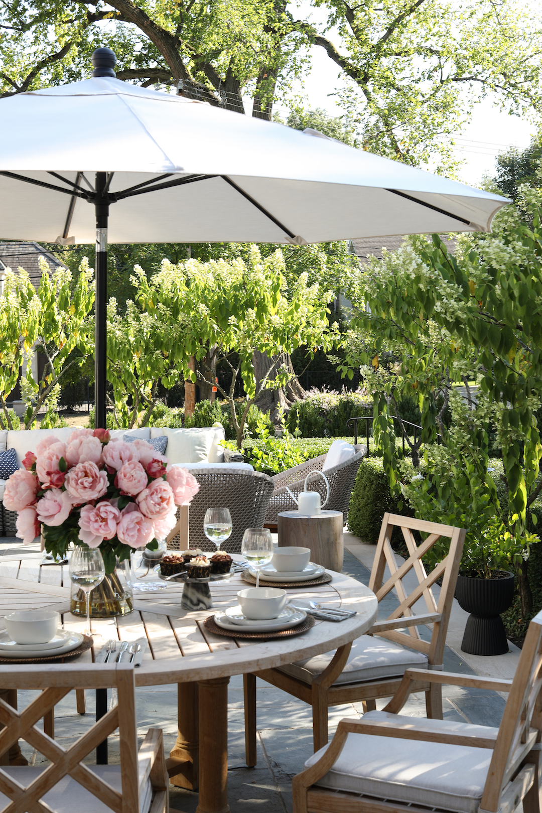
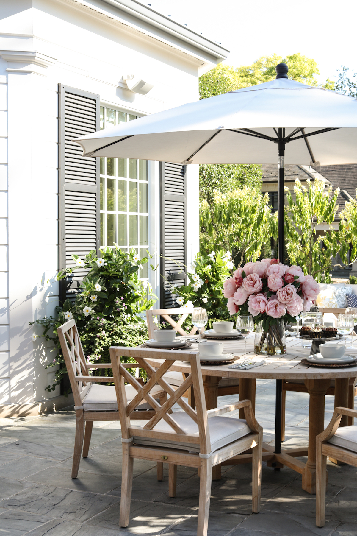
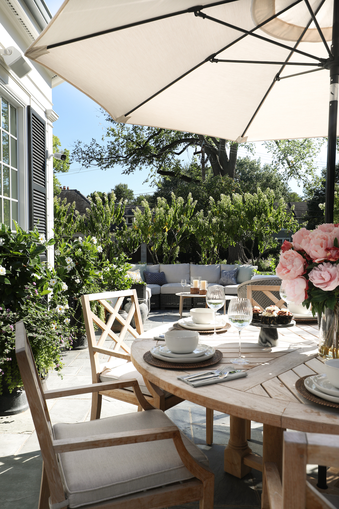
The main patio serves as a spot for entertaining guests, and also to relax while watching kids at play in the yard beyond. It’s accessible through the home’s kitchen and main family room, making for easy transitions when guests are over. Orientation of furniture in this space was carefully considered to allow the homeowners to entertain guests while also keeping an eye on kids.

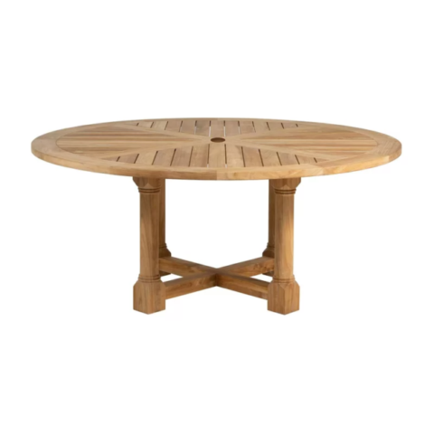
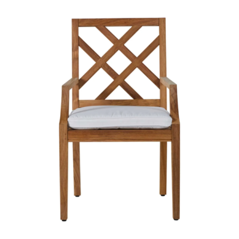
We love the Summer Classics teak dining table and chairs for the warmth they lend to the space, and performance fabric cushions means guests can linger at the table and relax.

via Park & Oak
via Park & Oak

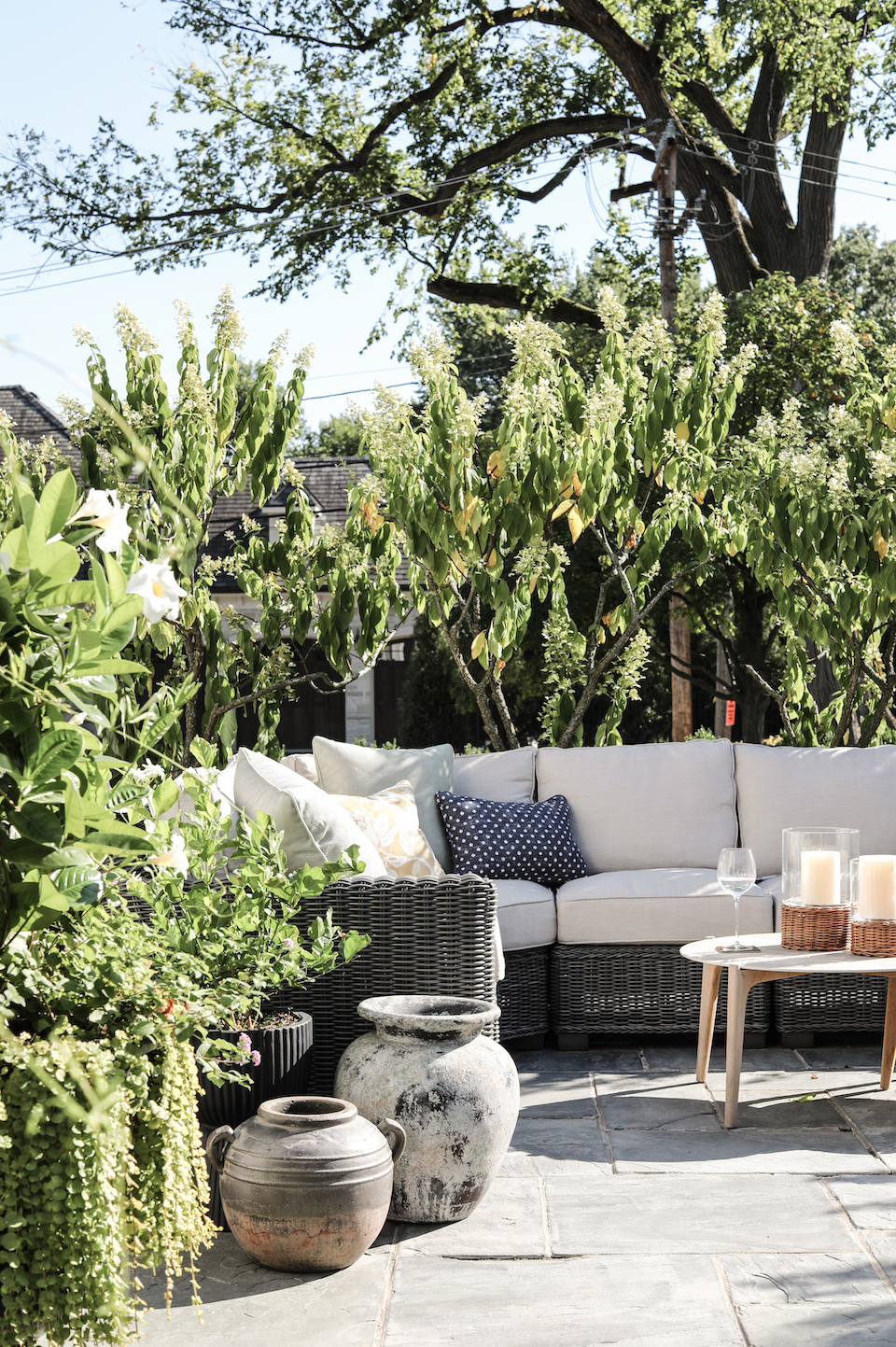
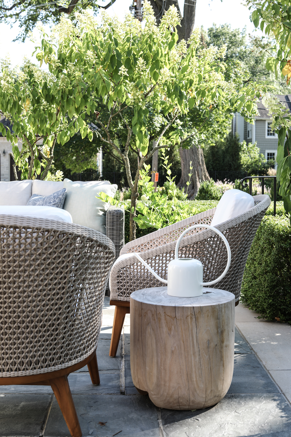
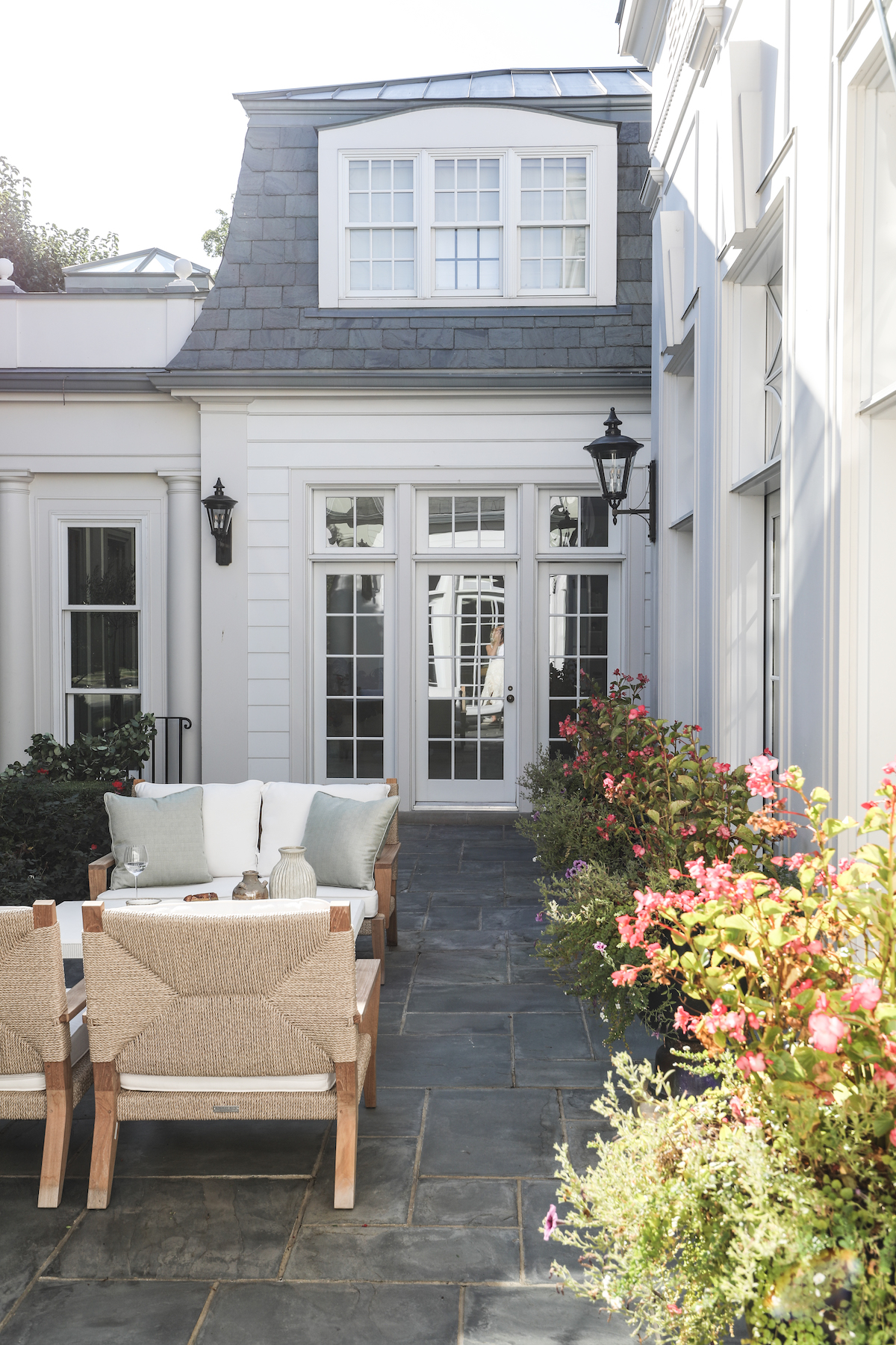
When the meal concludes, everyone can retreat to the sofa and chairs beyond, tucked into their own little alcove.

via Park & Oak
via Park & Oak

Where the main patio is meant for guests and everyday living, the living room patio is designed as a private retreat for the homeowners. It is surrounded on three sides by the home, and the beautiful architecture and privacy landscaping makes lounging in this space a treat. The homeowners can step onto this patio via “her” office, the living room or the sunroom, which means there are ample opportunities to duck outside for a few minutes of sunshine and respite throughout a busy day.

via Park & Oak
via Park & Oak
via Park & Oak

We are so glad the season of outdoor living is finally arriving in the Chicago area. Go enjoy those outdoor living spaces!


Shop the Look

0 In Travel

Spotlight Destination: Puerto Vallarta

Many of us just returned from spring break – we know some of you still have breaks upcoming – but we are already dreaming of our next vacations. So, this week, consider this a travel blog as we highlight a few of the places our team escaped to recently!

We talked a lot about the women on our team last week, in honor of Women’s History Month. But Park & Oak also employs two very talented men, who help balance the scales a bit here. Martino is our man-of-many-hats Studio Manager and Design Assistant, and David is our Web Developer. They just returned from a group trip to Puerto Vallarta, with photos that are the envy of the rest of us. We thought you might like to live vicariously through them as well!


The Accommodations

This stunning Airbnb did not disappoint!


The Village of Amapas


The Eating & Drinking

Cafe de Artistes


Mar Y Vino


Noroc


Go book your trip!

0 In Updates

In Honor of Women

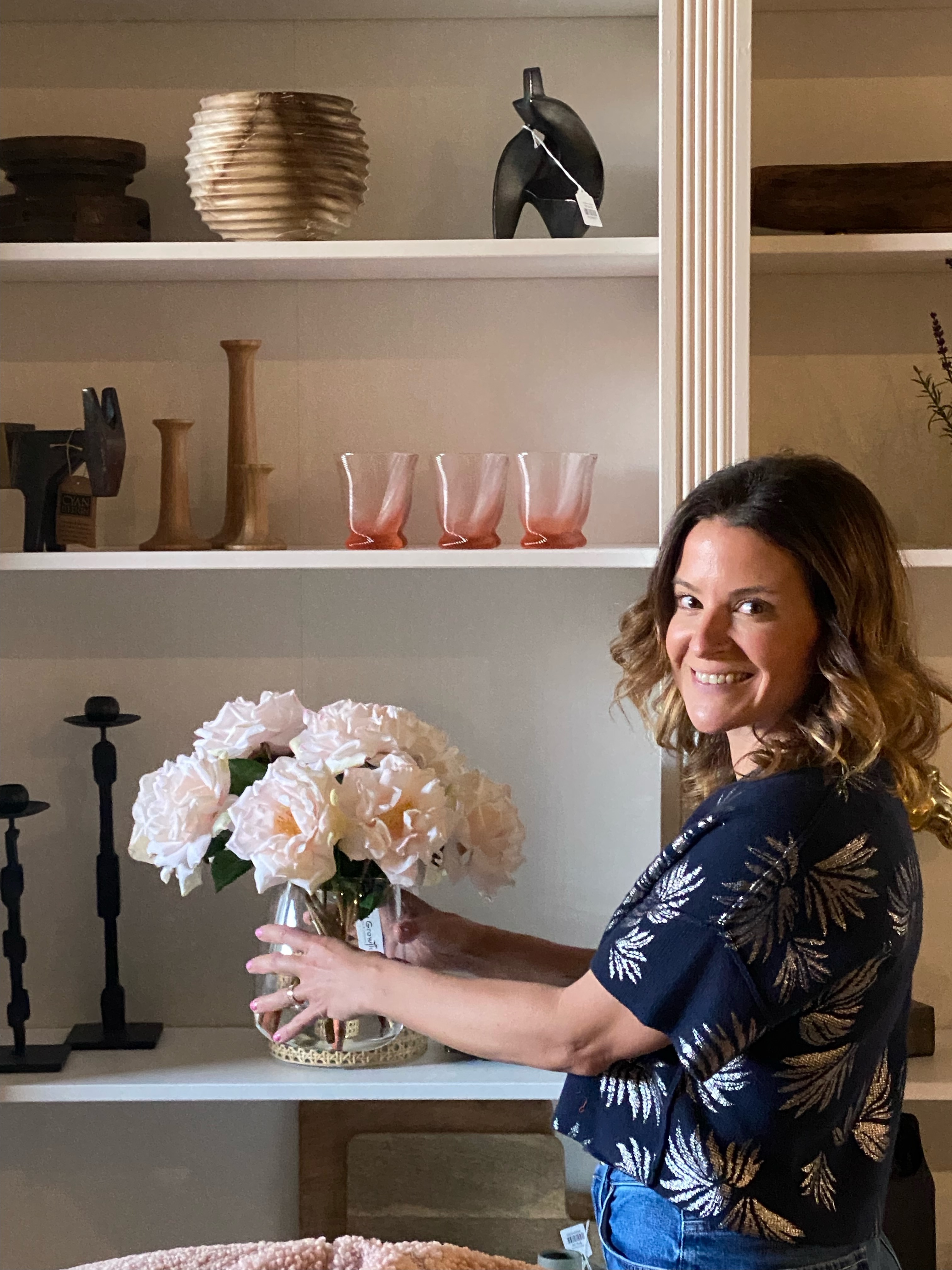
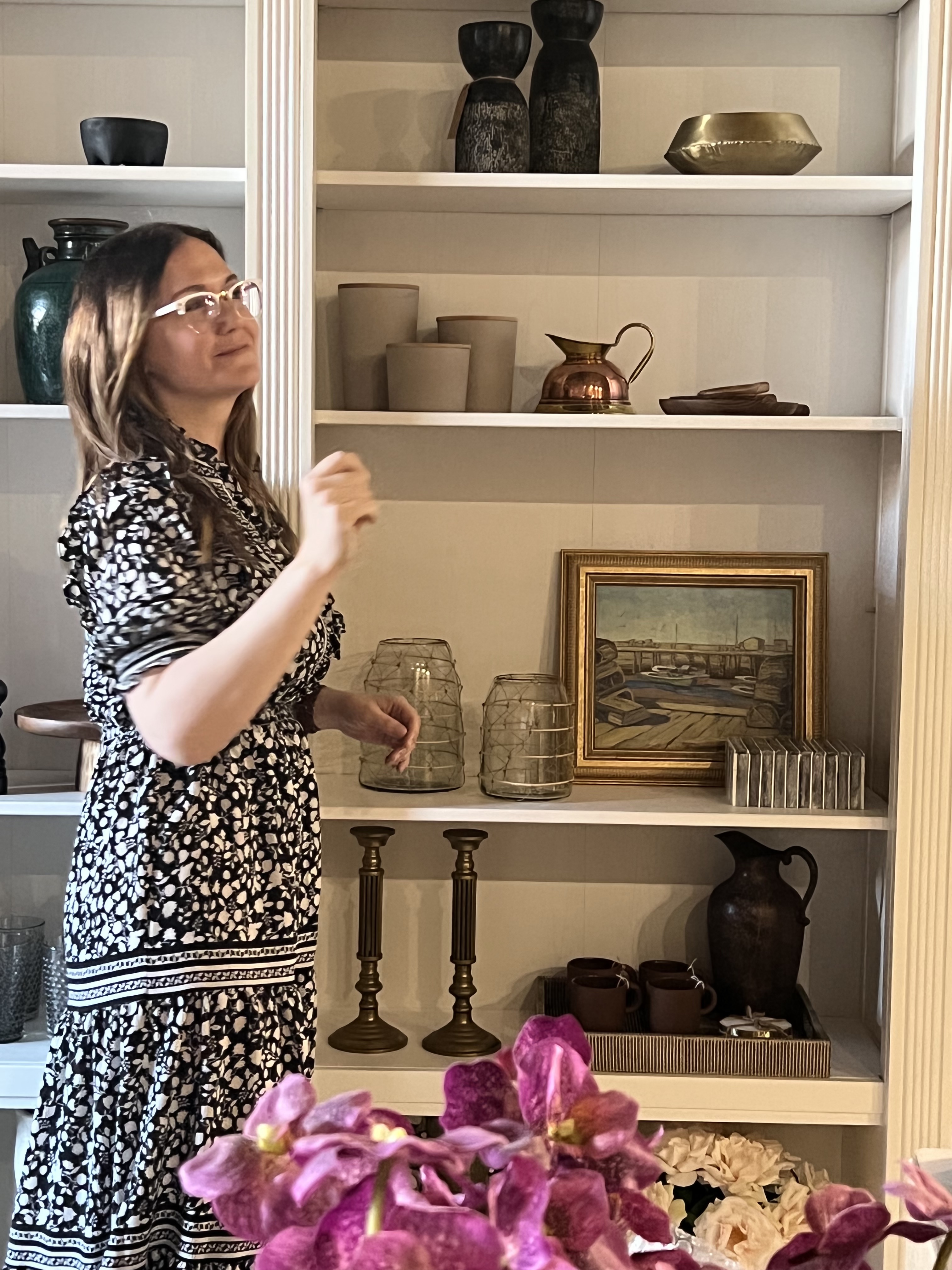
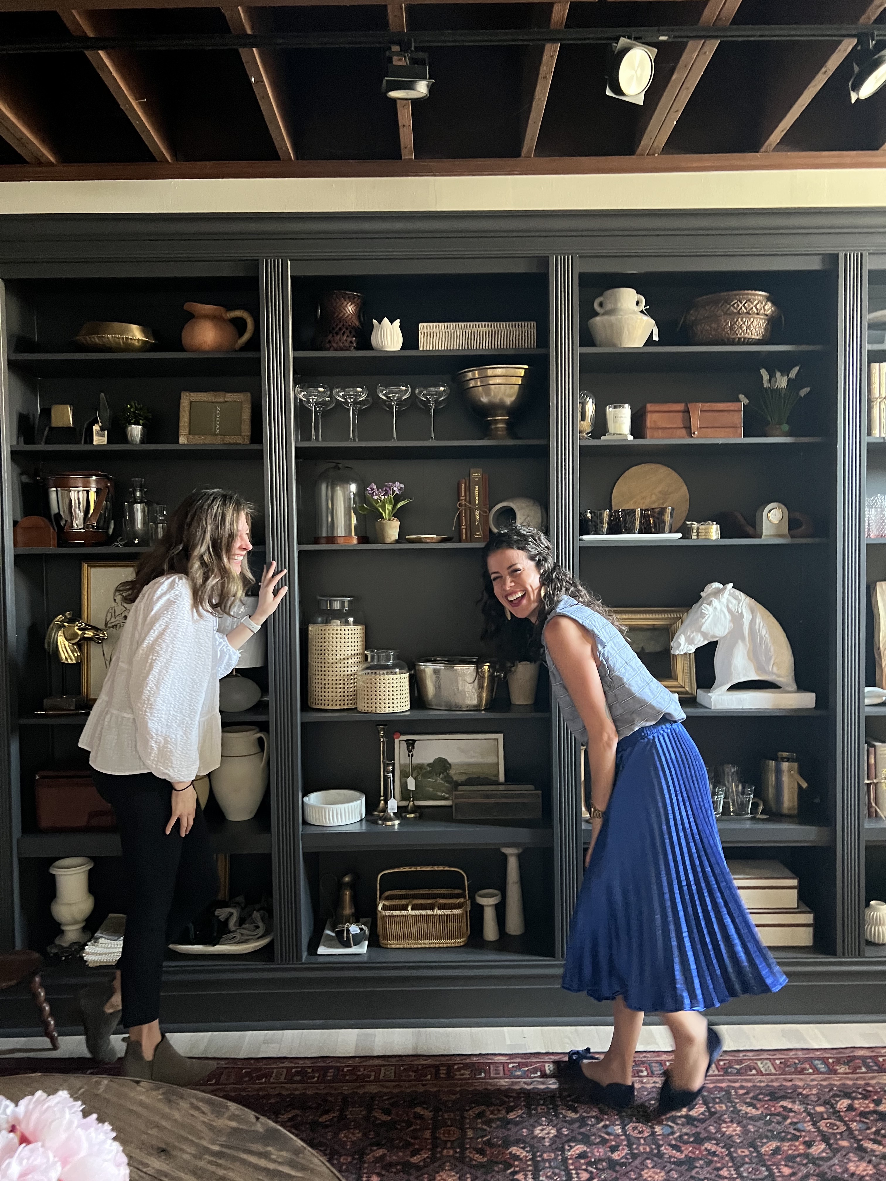
This is our outstanding team (most of them). And these women? They make everything possible. Yesterday, we featured women throughout history that we admire, but on this final day of Women’s History Month, it’s all about the 18 women on the Park & Oak team.


When Chris and I started Park & Oak, we learned, as all new business owners do, that to succeed, you must go all in. And as working mothers, we had to have each other’s backs to do so. We took turns doing school pickups and running activity carpools, making sure both sets of kids got where they needed to go while still attending to the needs of a growing business. And as we’ve grown, we’ve tried never to lose sight of how critical that kind of flexibility and support was for us, and to extend it to the entire Park & Oak team. It truly does take a village, and the women here are OUR village. – Renee

I’ve always believed women make the best teammates. They are natural multitaskers who know they have a finite amount of time to get something done before heading home to their “second job”. I am forever grateful for the diverse group of women on our team who show up daily and own their role and MSH (make (beautiful) sh*t happen). The environment of women supporting women is so rare and special and deserves to be celebrated. – Chris


The team had some things to say about each other, too…

It’s a true gift to be surrounded by so many talented women who support one another, inspire one another and who together are better as a team than they would be alone.  – Tiff


I think the reason we are so successful in collaboration is because our personalities are heavily considered along with our portfolios during the hiring process. I always hear, “She/He would get along so well with our team!” whenever a new person is hired. The other great thing about Park & Oak’s team is that we all have such different strengths. There is always someone to ask, whether it comes to building standards, design programs, lighting specifications, construction, new vendors, or styling. Our desks face each other, which allows us to constantly ask for help, opinions, and curate collected designs.  – Susie


While working with such a talented and wonderful group of people, it is quite amazing being on a team of women who wear a number of hats that have nothing to do with interior design. Many of us are mothers, many of us are artists, many of us are travelers and collectors who continue our crafts outside of interior design, while still maintaining the project management needed for all of our projects/clients. Women are a resilient force, and the women I work with are an incredible example of such. ❤️ – Patricia


The best part about working on a team with so many women is that you get to raise each other up and channel the power of collaboration in such a different way. Everyone’s strengths make the table better! – Emma


Working on a team with mostly women feels right! There’s a sense of hustle with compassion. I feel supported in both my career and personal life.  – Joanna H.

As a mother, I appreciate working for other working moms. There’s a respect level that’s understood and a non-judgment for the time us women have to be mothers. Not to mention, the ladies at Park and Oak are girl’s girls, and as the new hire, I’ve been welcome with open arms. – JoAnna B.


I adore these women—it’s like having 15 sisters but whom you don’t argue with! Working so closely and collaboratively with so many talented minds and such a highly creative team adds so much joy to my week.  – Erica


I think my favorite part of working with the women at Park & Oak is the collaborative and helpful nature of everyone on the team. No one is competing but just working together to create the best work that we can. I also love that everyone brings a unique perspective and personality to the studio—and we have lots of fun together! I love what I do because of this group!  – Vanessa


I think what I like the most about working with other women, especially moms, is the fact that they all understand what it is like to be a mom and a working woman at the same time! I am part-time and everyone is so understanding about it, it’s a very flexible and chill environment and that is so motivating!  – Olivia


I’ve worked in many industries, in a lot of different capacities. For demanding bosses and disinterested bosses; with dynamic teams and dysfunctional ones. No one has ever understood the demands on my time and my need for work flexibility – and supported it without reservation – the way Chris and Renee do. And no team is as engaged in their work as the women at Park & Oak. It’s truly a special place. – Kelly
0 In Room Reveals

Reveal: Hinsdale Refresh

This one has its own special place in our Park & Oak hearts since the client ultimately became one of our team members!!

Lisa and her family had already made great strides in updating their new home, but needed some help getting to the finish line, especially in the living spaces of the home. She echoed sentiments we’ve heard from homeowners before: that they had made some costly mistakes and wanted to get it right the second time around. We loved helping Lisa and her family refresh these spaces and give them the home they had dreamed of!


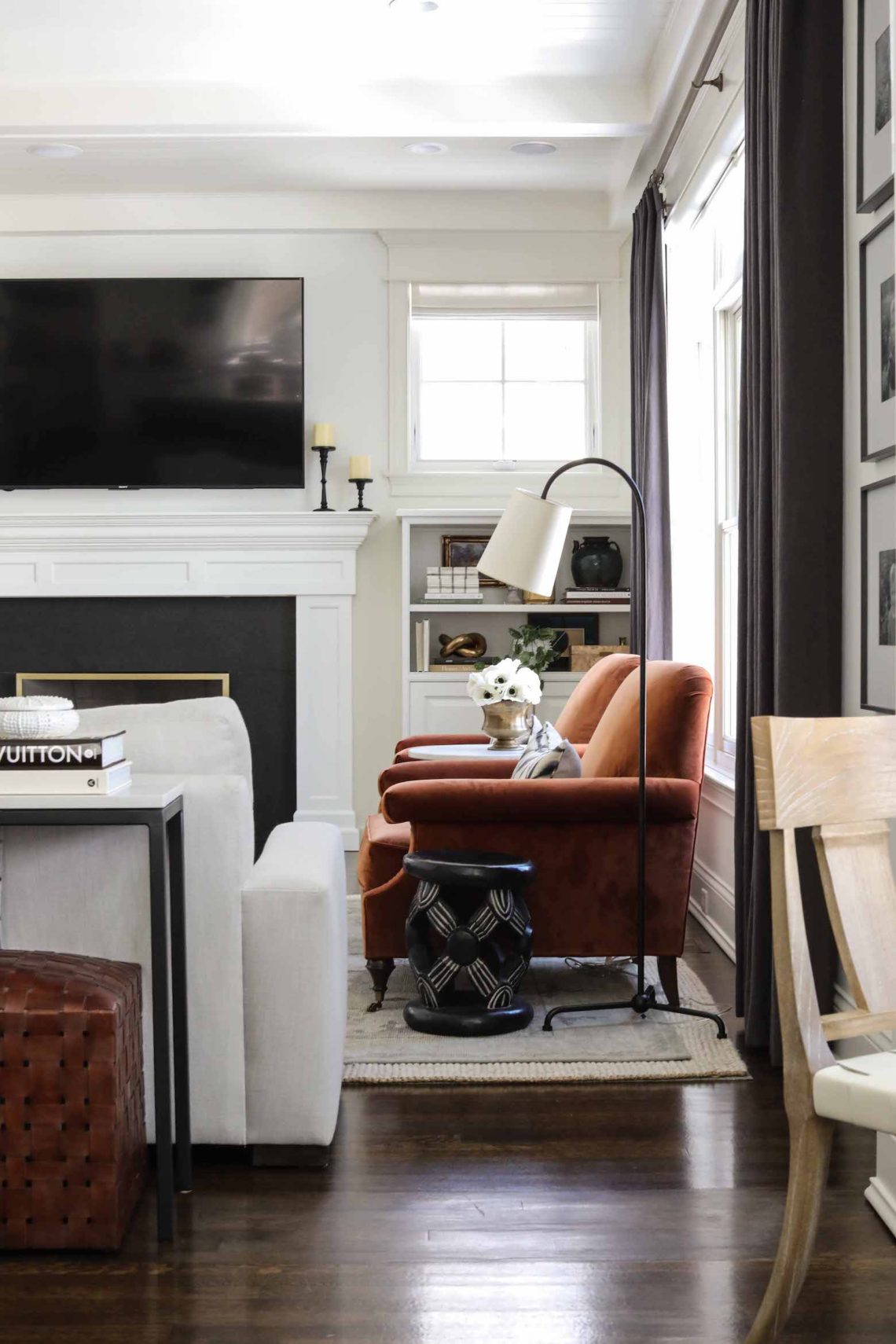
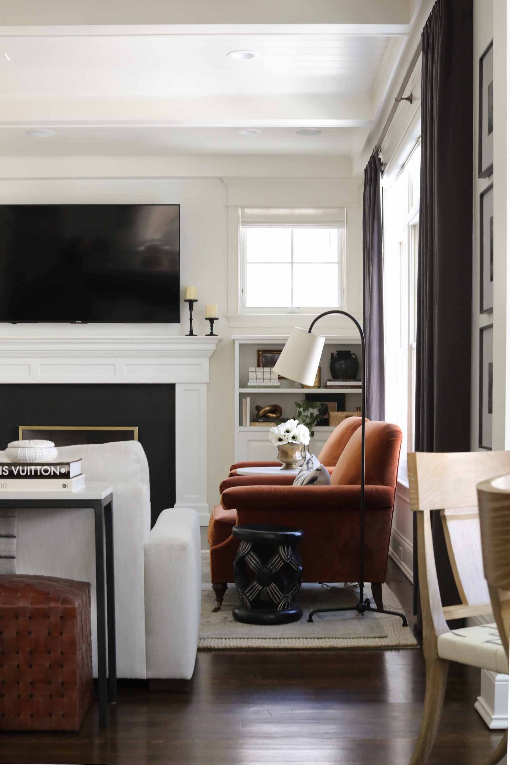
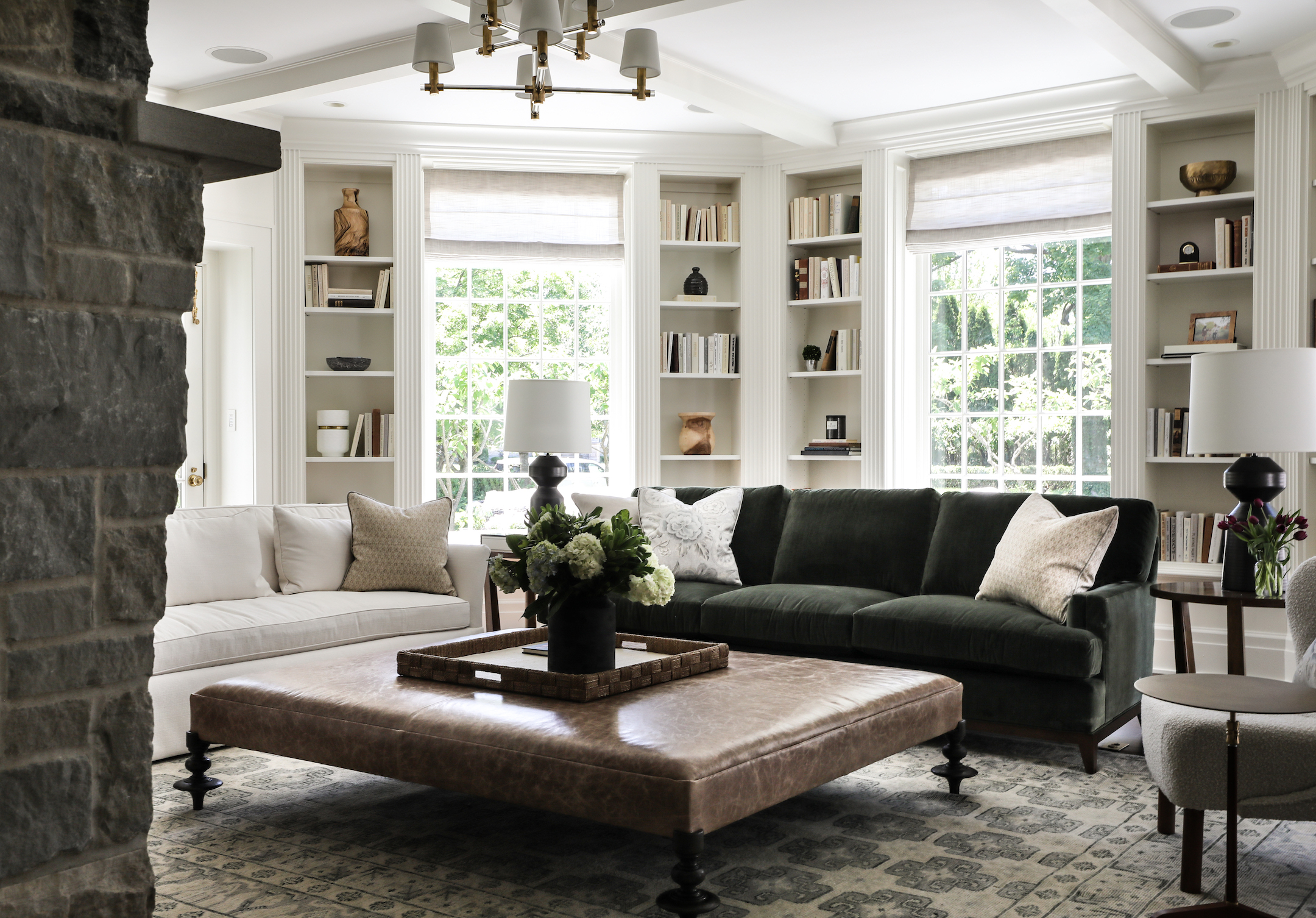
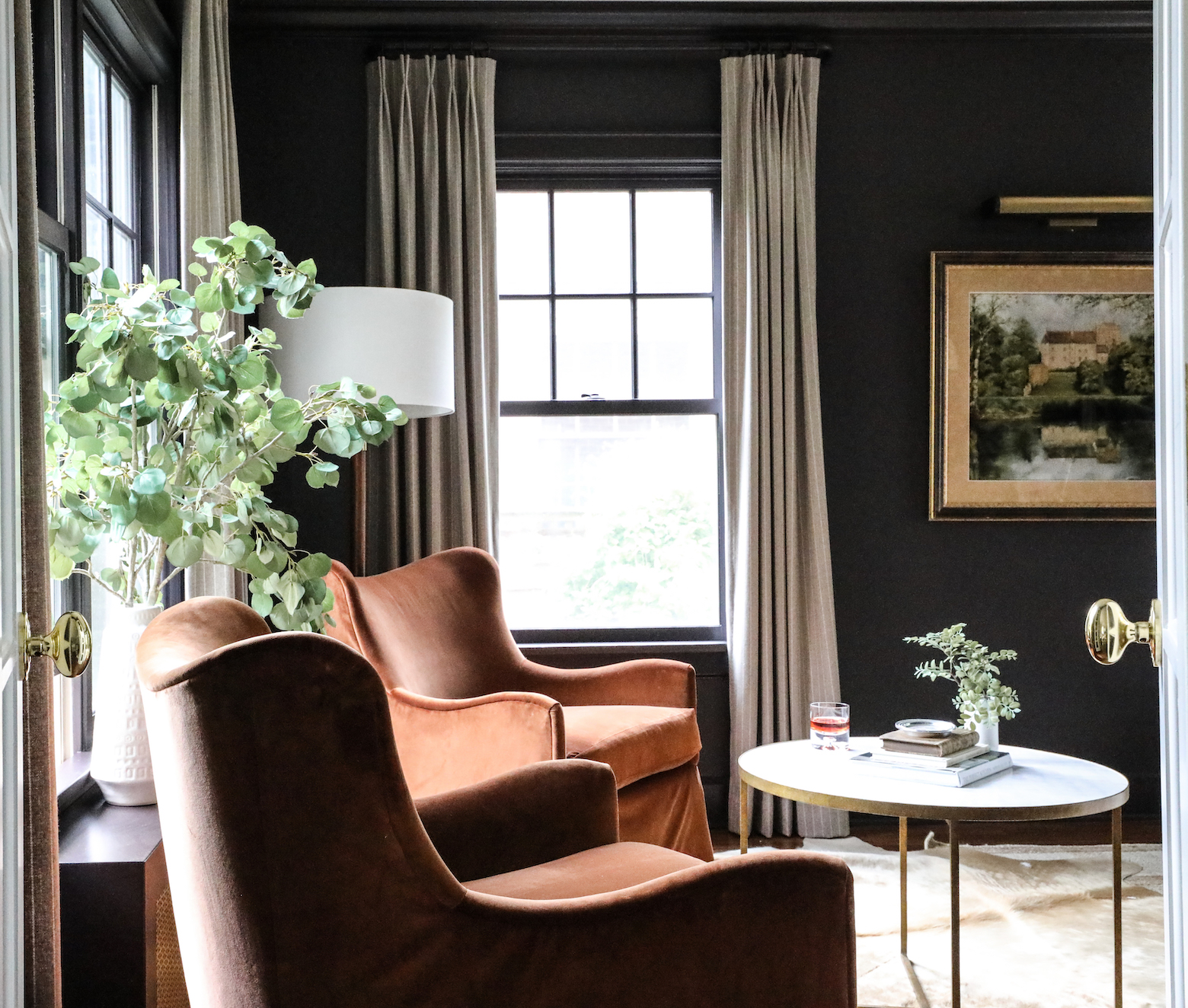
The light, bright room pictured below, their family room, just needed a little grounding. Substantial linen window treatments help balance the dark fireplace surround and draw attention to the detailed ceiling molding. We brought in custom rust lounge chairs for a comfy pop of color, and used some of the clients’ own vintage finds throughout the space.

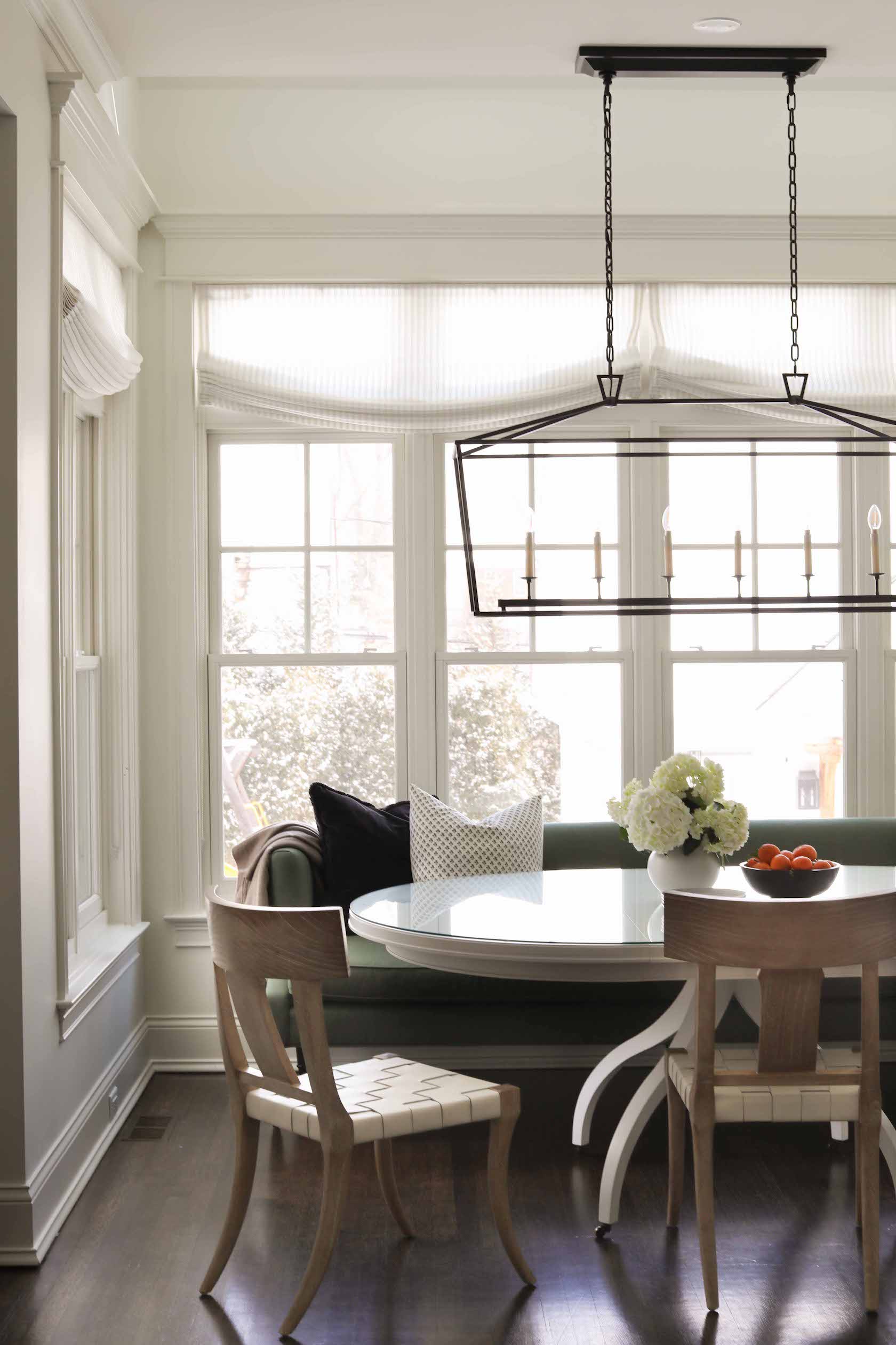
Peeking out from the right side of the above photo is one of the chairs in the refreshed breakfast nook. A large, built-in banquette in this space was not really working for Lisa’s family’s needs. One of our intentions in kitchens – and their adjacent spaces – is to make things warm and cozy; a happy, homey place not just to cook, but to live your life. A sage green settee here extends this concept to the breakfast nook, giving Lisa and her family a comfy place to sit not just for meals, but throughout the day in this hub of the home. Sturdy, wipeable chairs are practical (but still pretty!) for this family with young children. Relaxed roman drapes help break up all the horizontal lines and add an elegant touch.
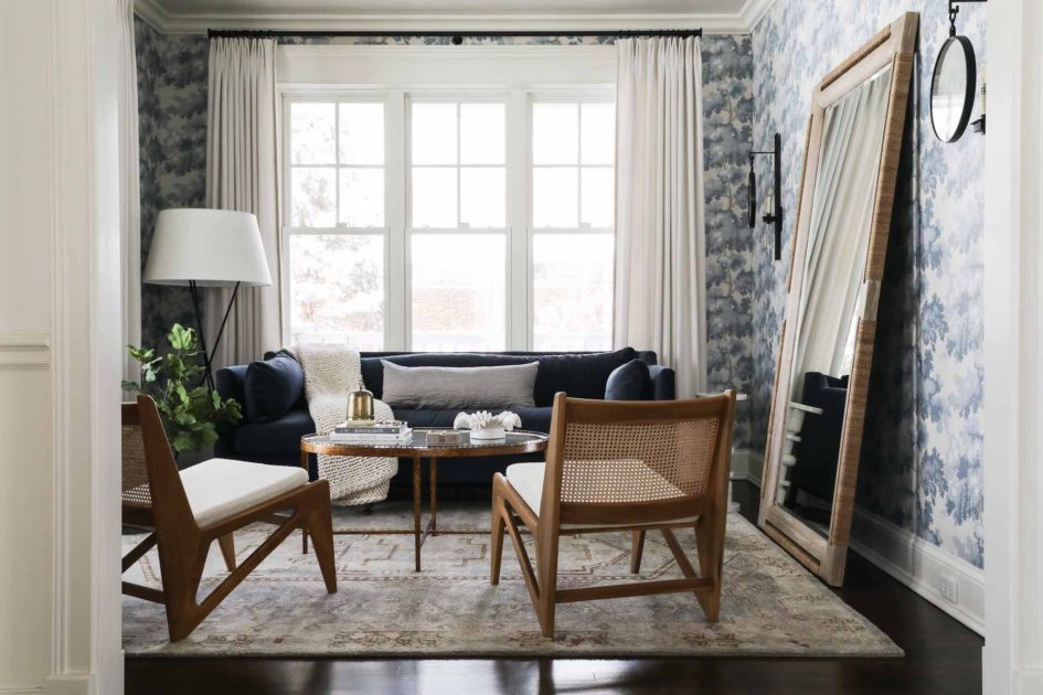
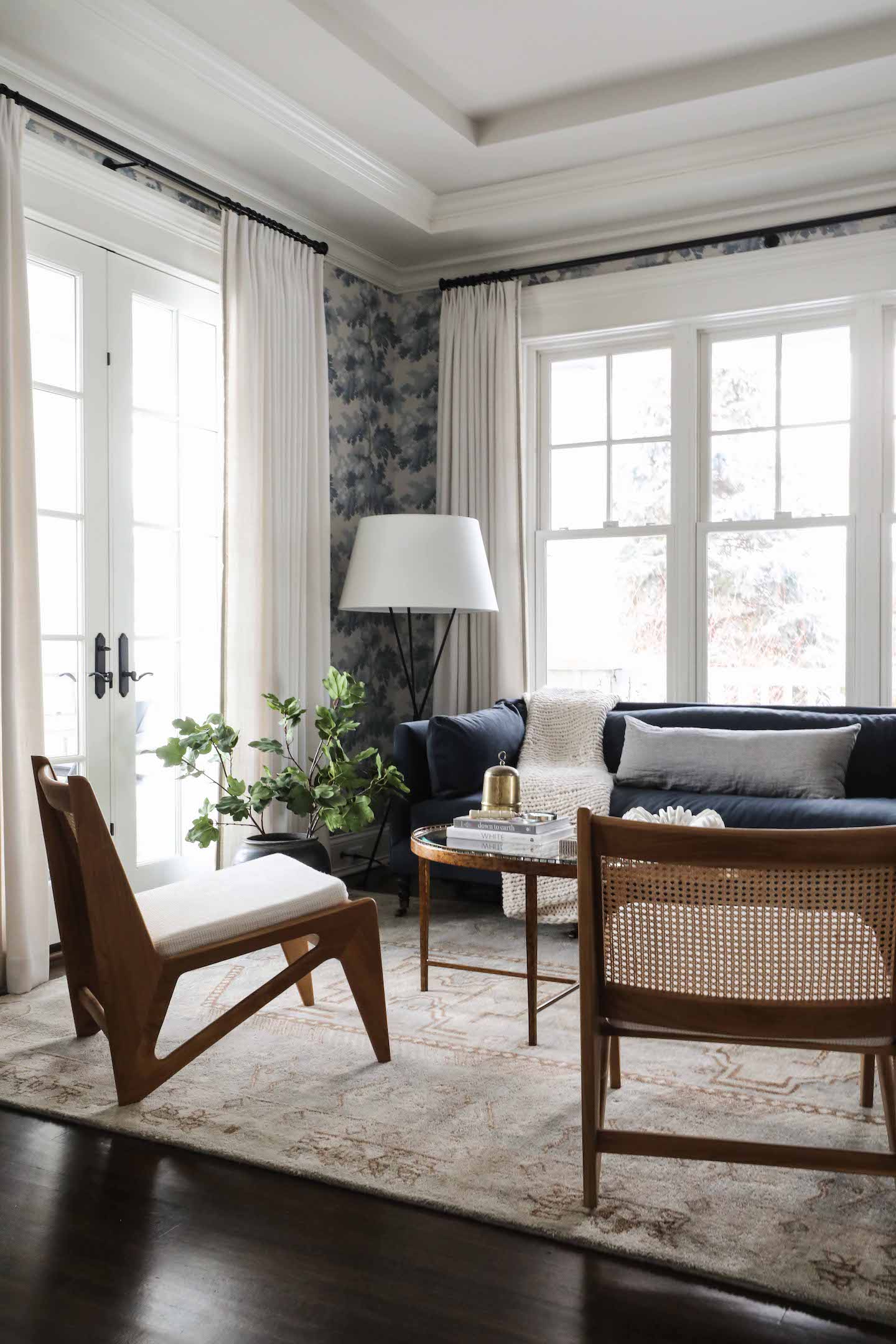
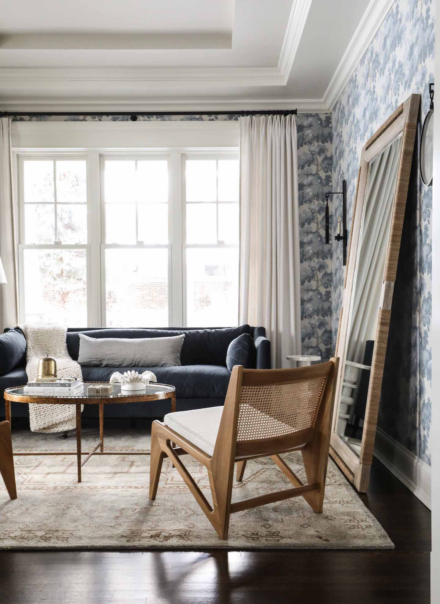
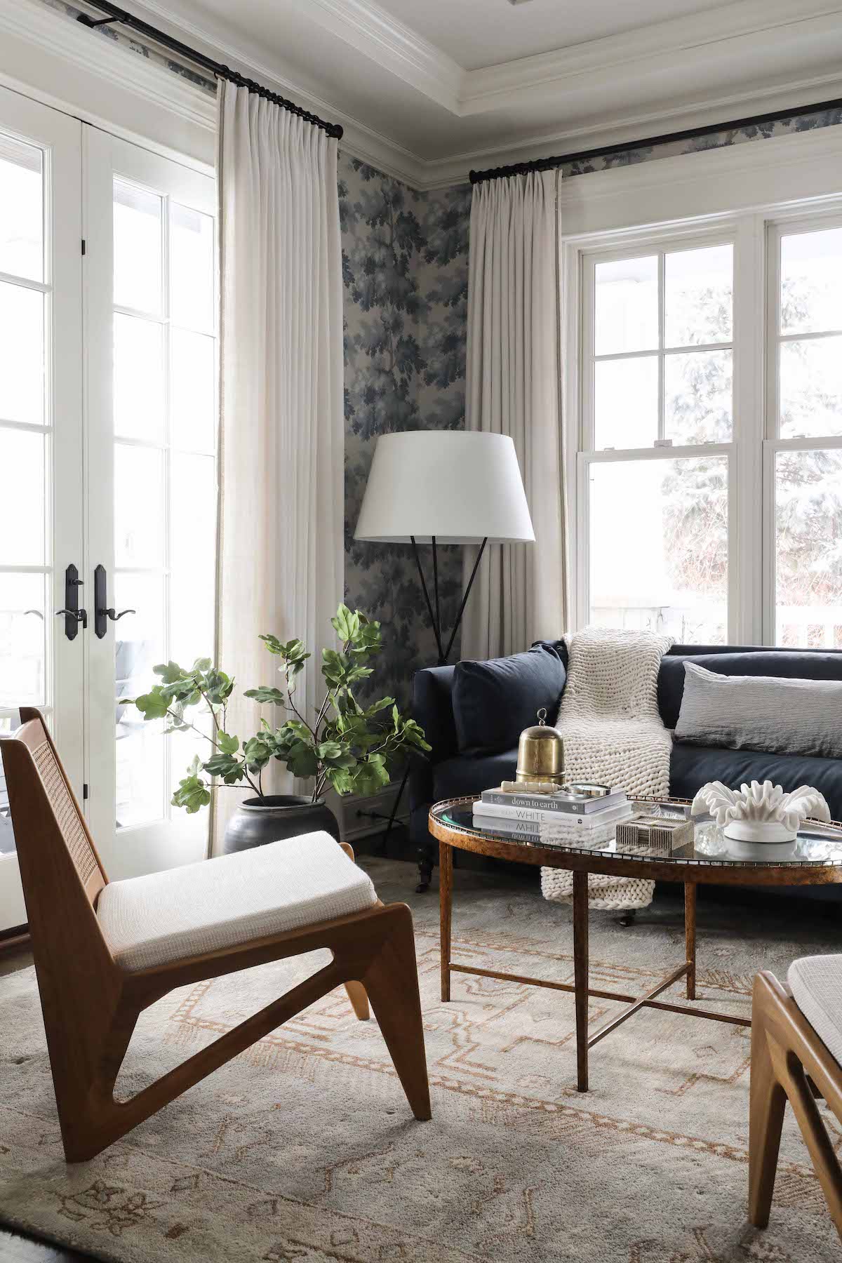
Lisa’s favorite room – her oasis – is the sitting room we created in the front of the home. As we’ve all discovered in the last couple years, it can be nice to have a place in your home to get away. For Lisa, this is now the place. We wanted the room to stand apart – to draw the eye of visitors and be an enticing destination – so we started with a bold wallpaper, Sandberg Raphael, in the Light Blue colourway. Lisa would be the first to tell you this choice made her nervous when she saw it on the design board, but can’t imagine it any other way now that the room is complete. The wallpaper makes an elegant backdrop for the navy sofa, kangaroo style chairs and Lisa’s own mirror. Custom window treatments with a pretty trim detail help highlight the beautiful windows and french doors.

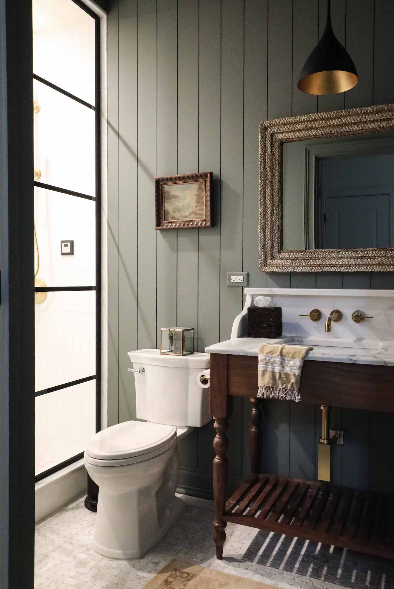
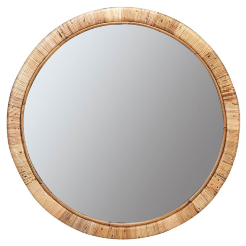
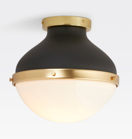
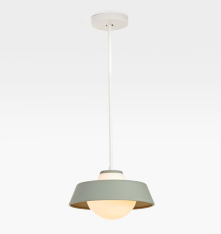
Lisa’s family uses their home gym frequently, and wanted the nearby bath renovated for convenience after workouts. The only wishlist item was for a steam shower, which we highlighted with steel and glass doors. The paint we chose here – Benjamin Moore Duxbury Gray – has a spa-like quality and the right tone offset for the custom vanity and counter/backsplash/ledge we designed. A pendant light with a brass interior adds a pretty and unexpected detail, and the rattan mirror brings a natural element. Lisa’s own vintage art finishes off the space.

0 In Room Reveals

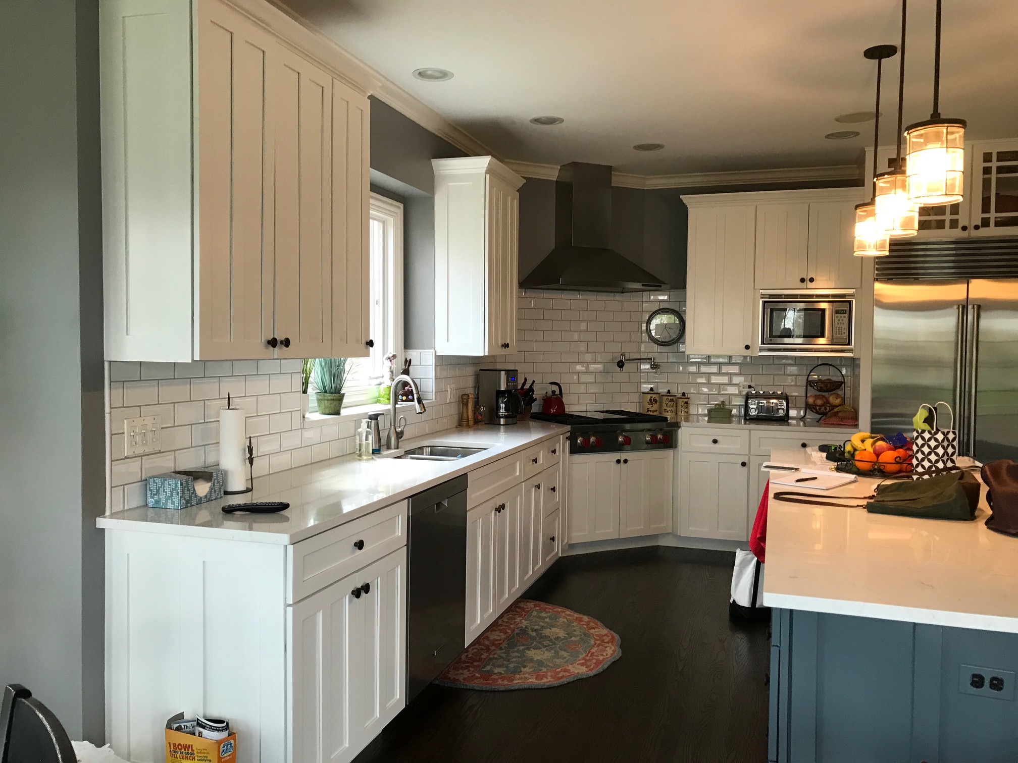
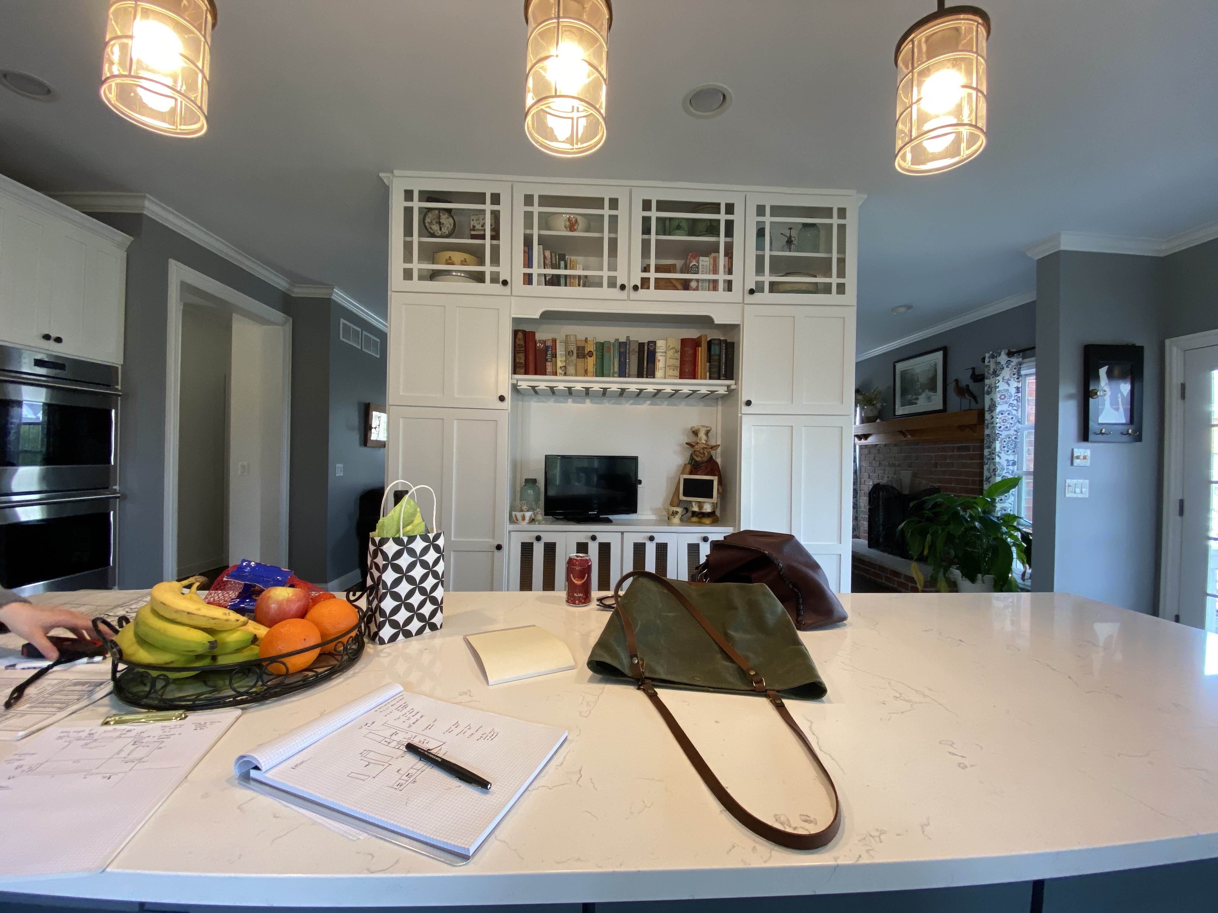
Before & After: Glen Ellyn Kitchen

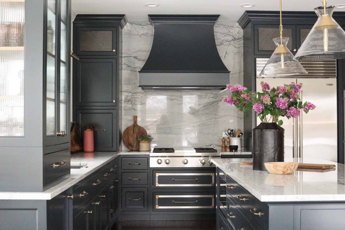
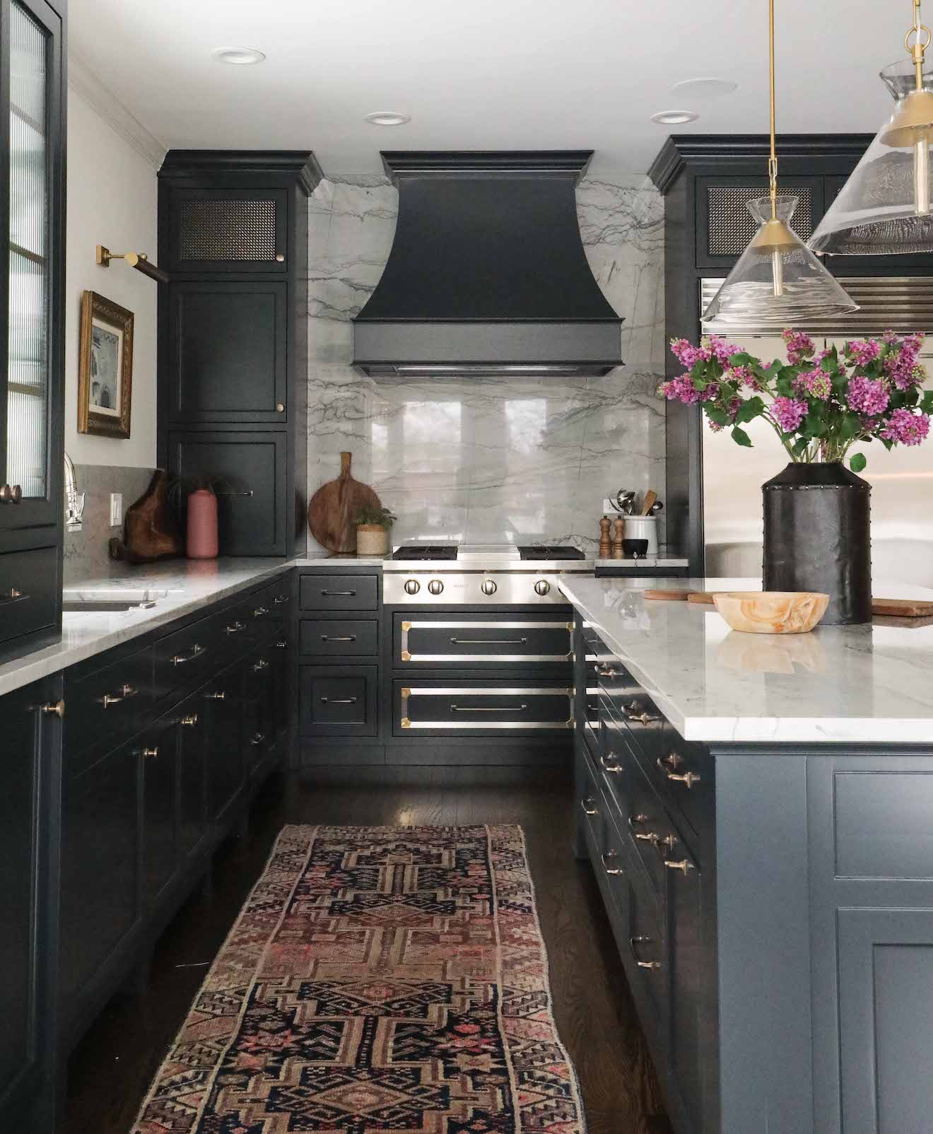
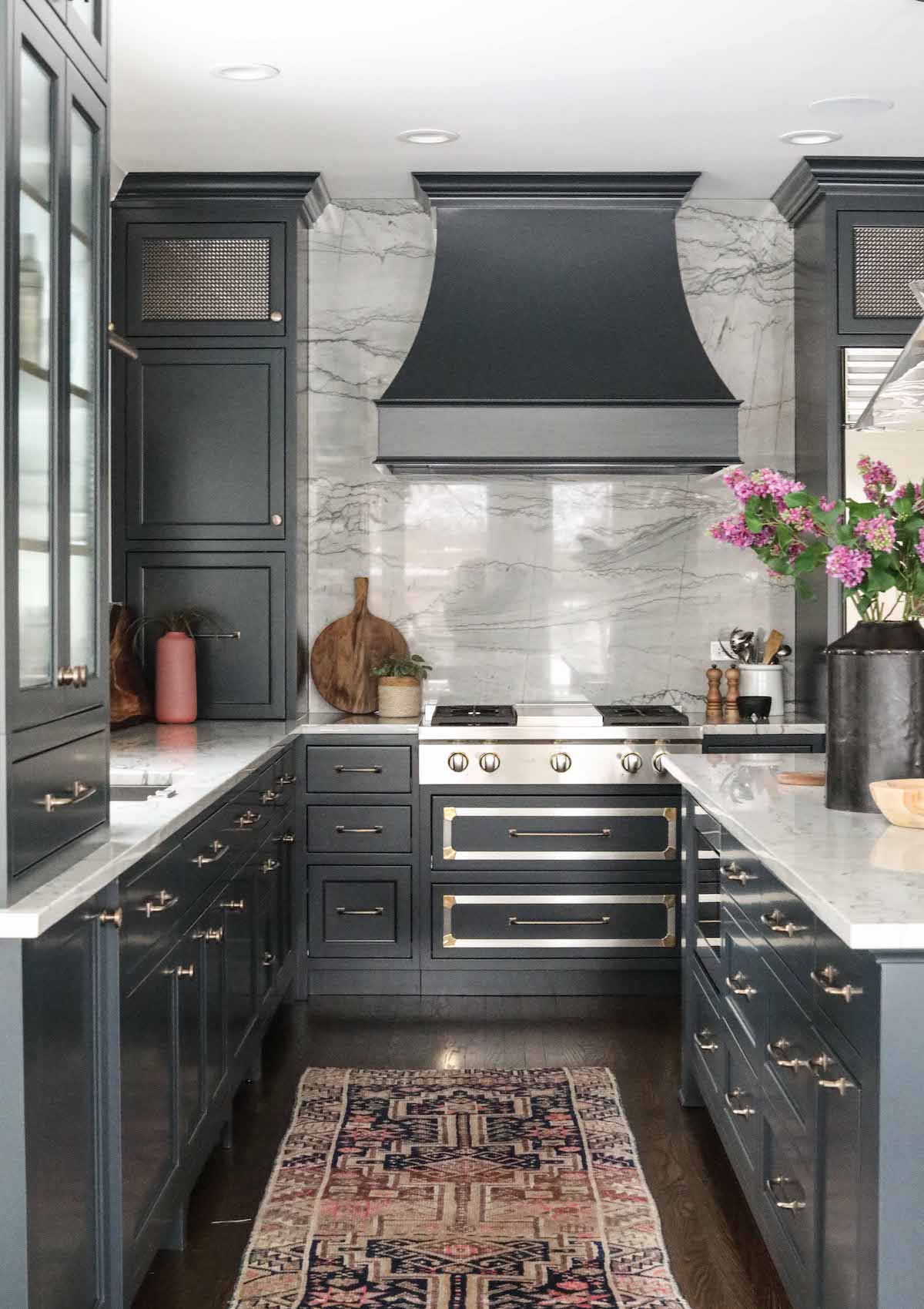
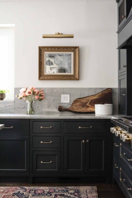
With our client needing to move into their new home on a short timeline, time was of the essence in the renovation of this Glen Ellyn kitchen. While significant structural changes were not necessary, you’ll see in the before & after shots that we made some tweaks that had big impact in making the space feel more balanced. Most notably, we squared off the corner where the original range was situated, and moved the range to the center of the wall where the refrigerator was situated. That small change went a long way in giving the eye sensible places to rest.

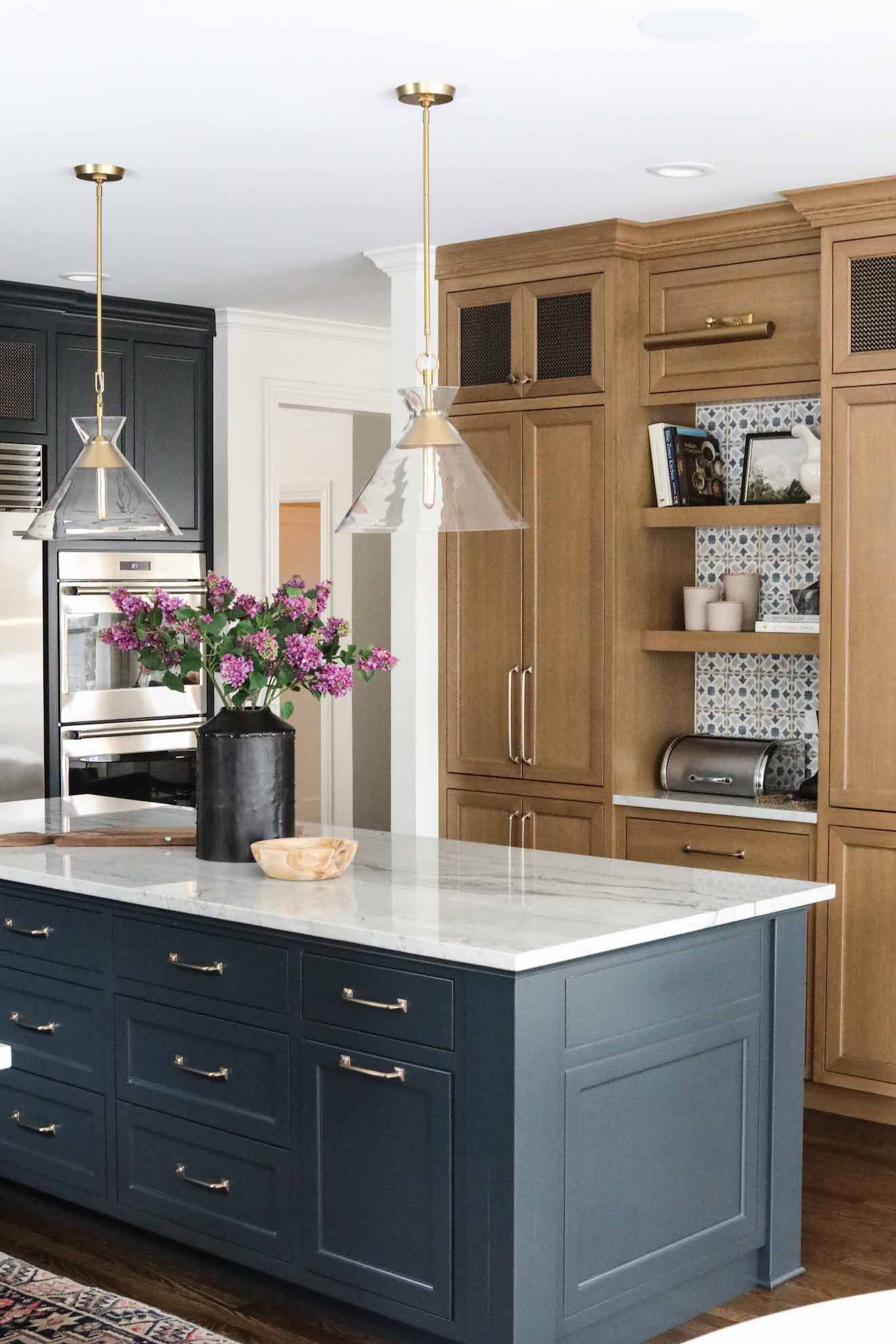
The new cabinetry and island, painted with Farrow & Ball Black Blue, are custom designed for the family’s specific kitchen needs. Reeded glass on the upper cabinet in the forefront of the kitchen has the effect of lightening up the space – as clear glass would – but diffuses the light and doesn’t require vigilant cabinet organization from the homeowner. The same is true of the mesh inserts used in the top cabinets on either side of the range. The mesh helps break up the cabinetry, and adds texture, detail and lightness. A larger island allows for more storage, and gives the family a place to gather.

In lieu of replacing the already new range, we opted to add a custom metal detail to the drawer fronts, giving this area its own special interest. Quartzite counters and backsplash make for durable, easy cleanup – a must with three teenage boys in the home.

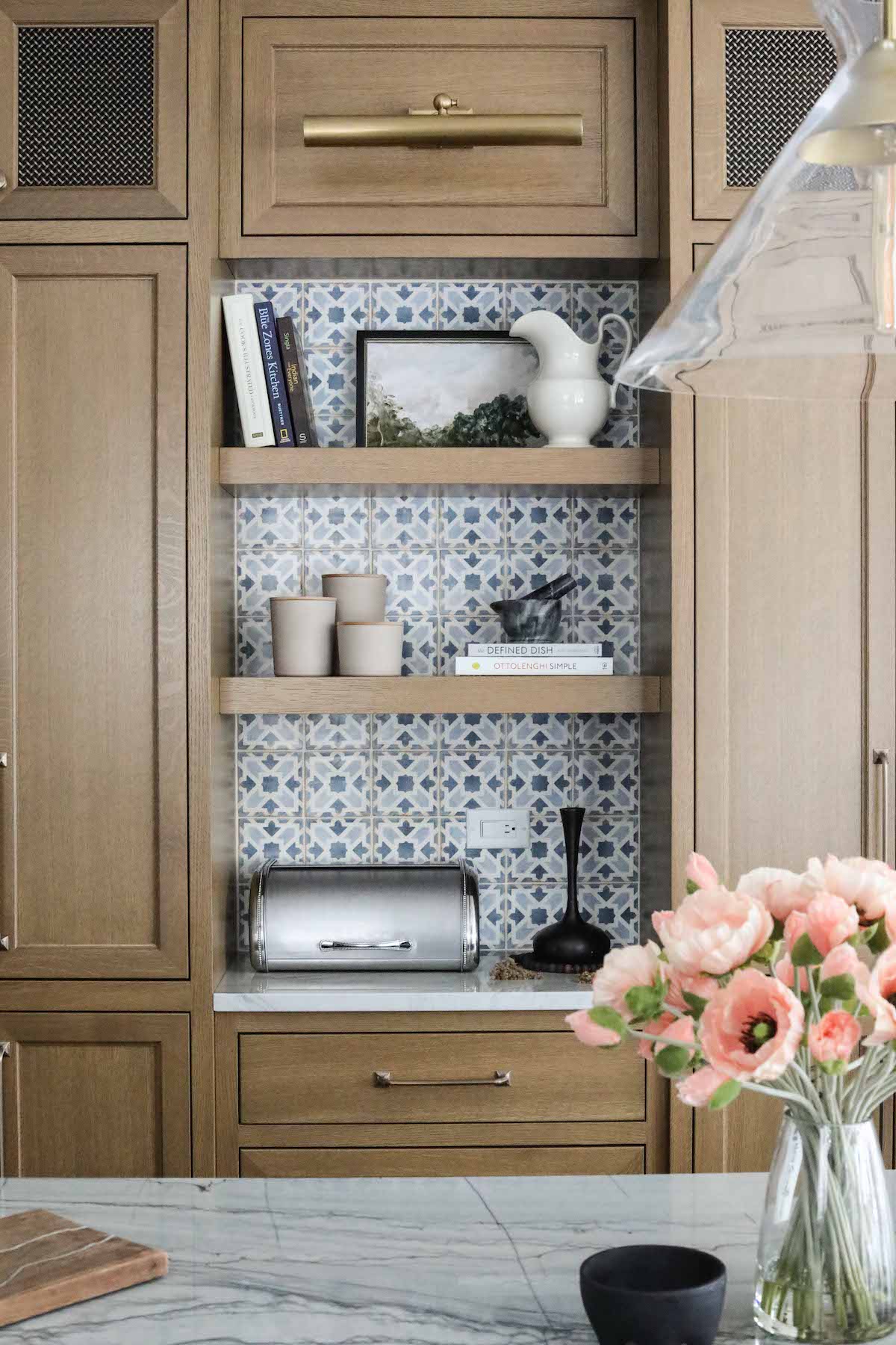
The original pantry wall felt a bit like it was floating in the space, so we cased the new pantry to give it more permanence, and made it larger to help accommodate the storage needs of the family. Wanting to give the kitchen a rich, lived in quality, and help break up the space as well as connect it to the family room beyond, we opted to stain the pantry versus painting. The tile is Casablanca ceramic from Bedrosian’s Tile & Stone, chosen for our color-loving client to bring some additional interest to the kitchen.

Finally, adding art is one of our favorite ways to make a kitchen – the place where many families spend the bulk of their time – feel like a comfortable living space. The art here is vintage, curated by our team, and we styled the shelves with some of our favorite accessories. We added a library light not just above the artwork, but in the pantry coffee bar, as well, to really drive home the idea that this is a cozy, welcoming space.

0 In Research

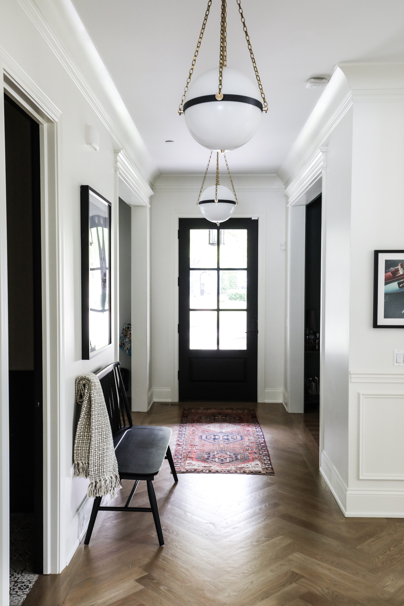
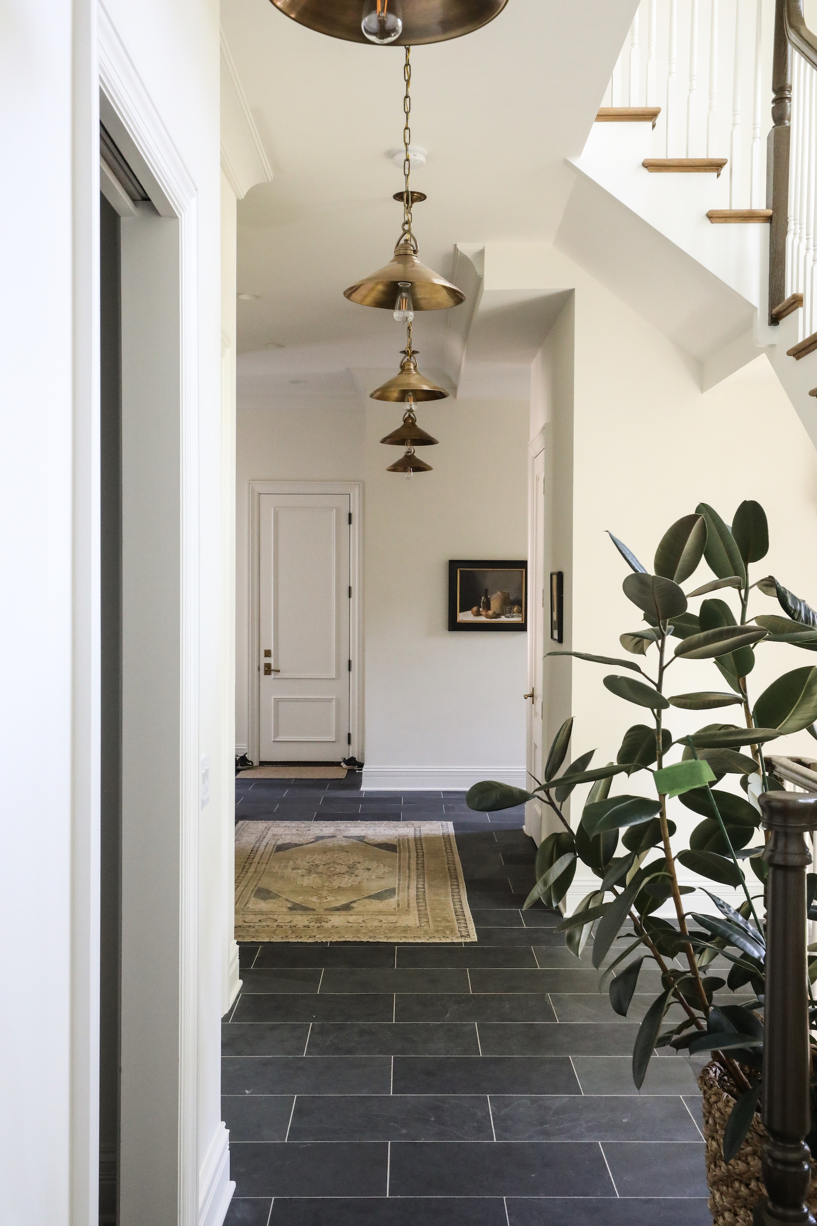
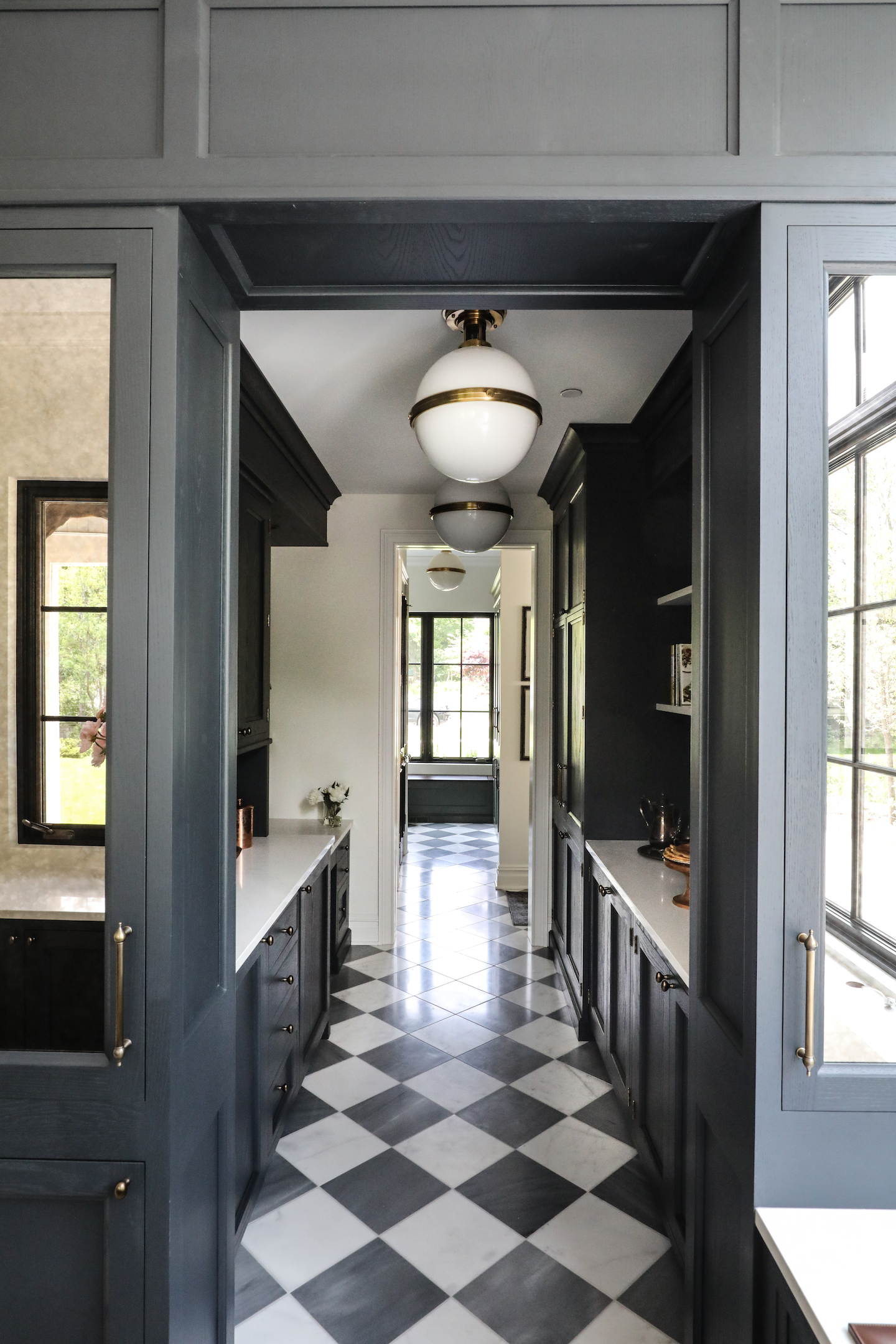
P&O Tips: Hall Lighting

The next installment of an occasional series where we share tips and tricks of the trade to help you navigate sometimes puzzling home design questions.

Today’s Question: How high should I hang lighting in my hallway?

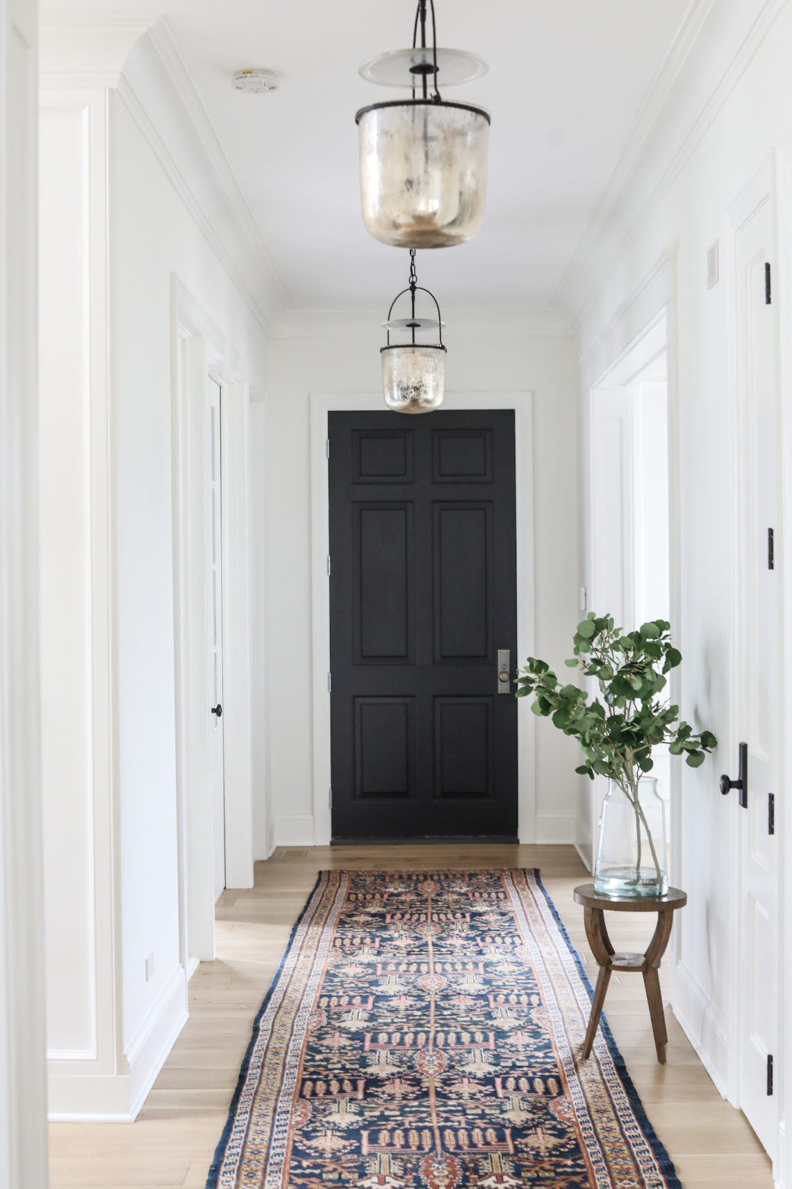
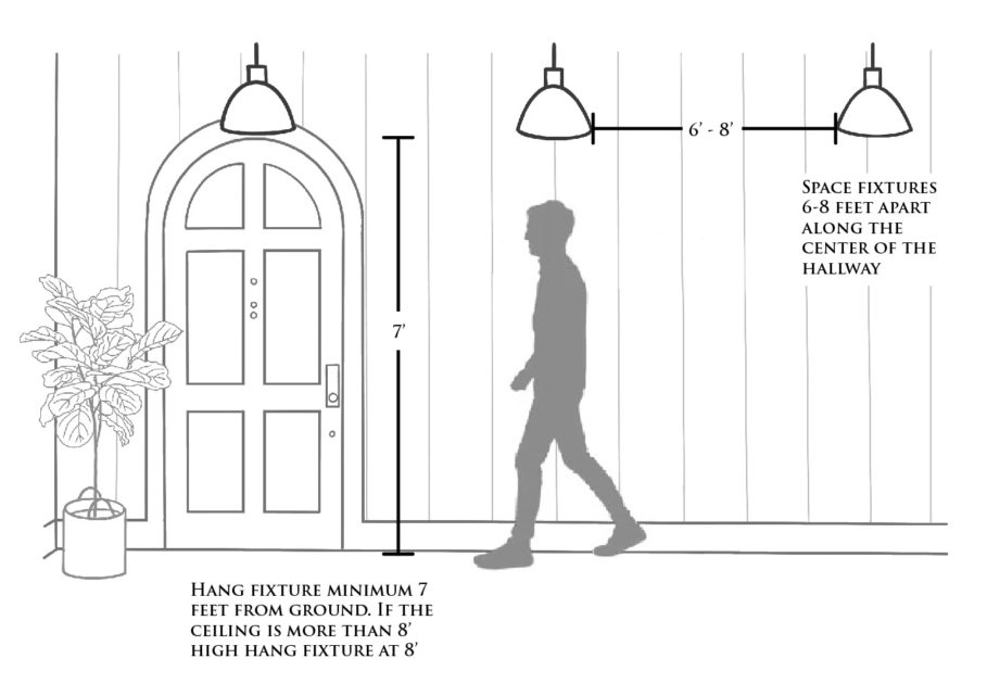
Hallway lighting can feel tricky since no two hallways are created equal. Different heights, lengths and shapes of a hall may make the options feel dizzying, but if you follow two main rules, all will be well:

  1. Fixtures should be 6-8 feet apart along the hallway.
  2. Fixtures should be hung a minimum of 7 feet from the ground. For taller ceilings, hang at 8 feet above the ground.

By following these two basic rules, you can ensure that light will be plentiful, balanced and, most importantly, not in danger of bonking any heads!

Inspiration

0 In Inspiration

Mudrooms

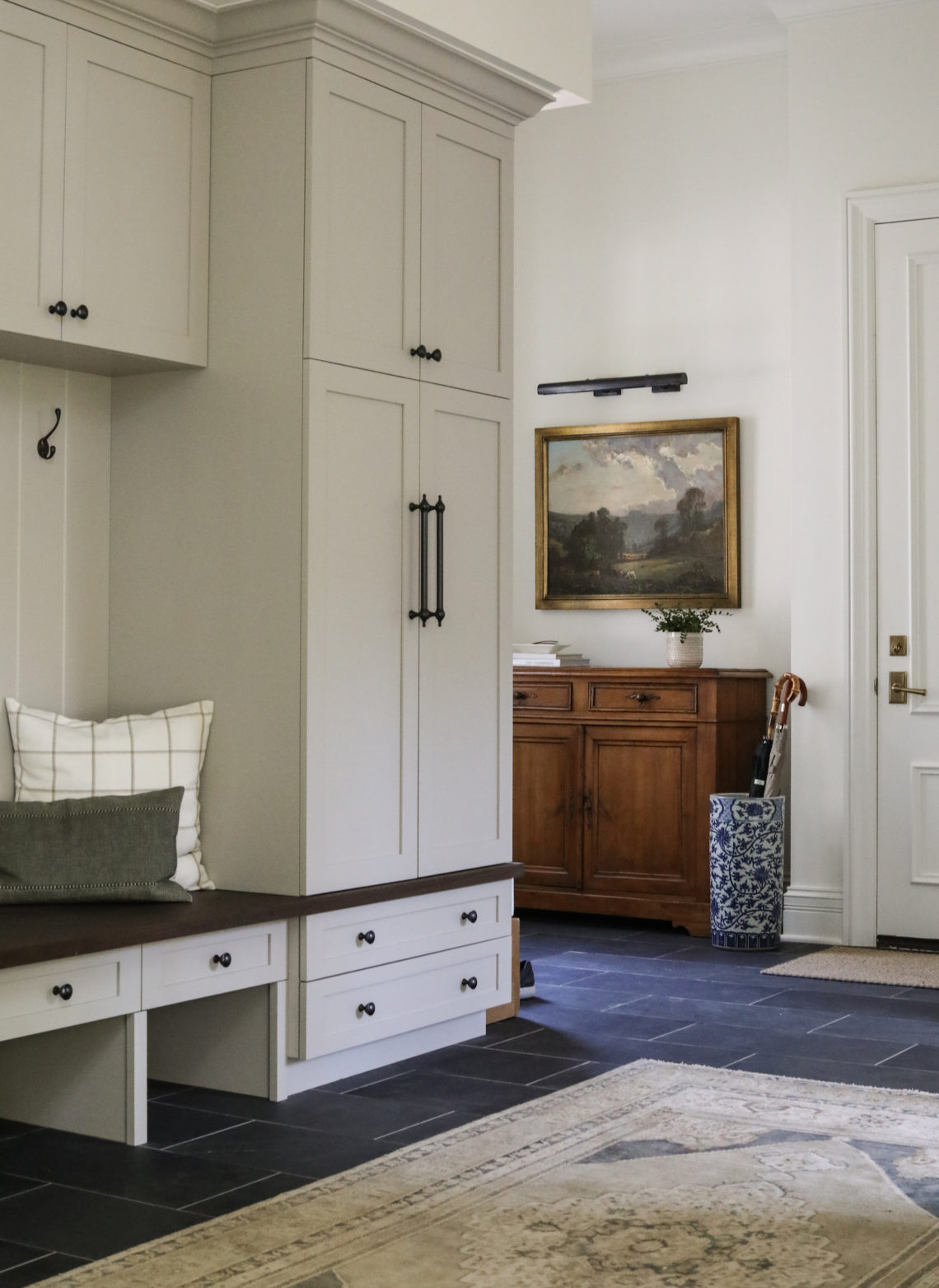
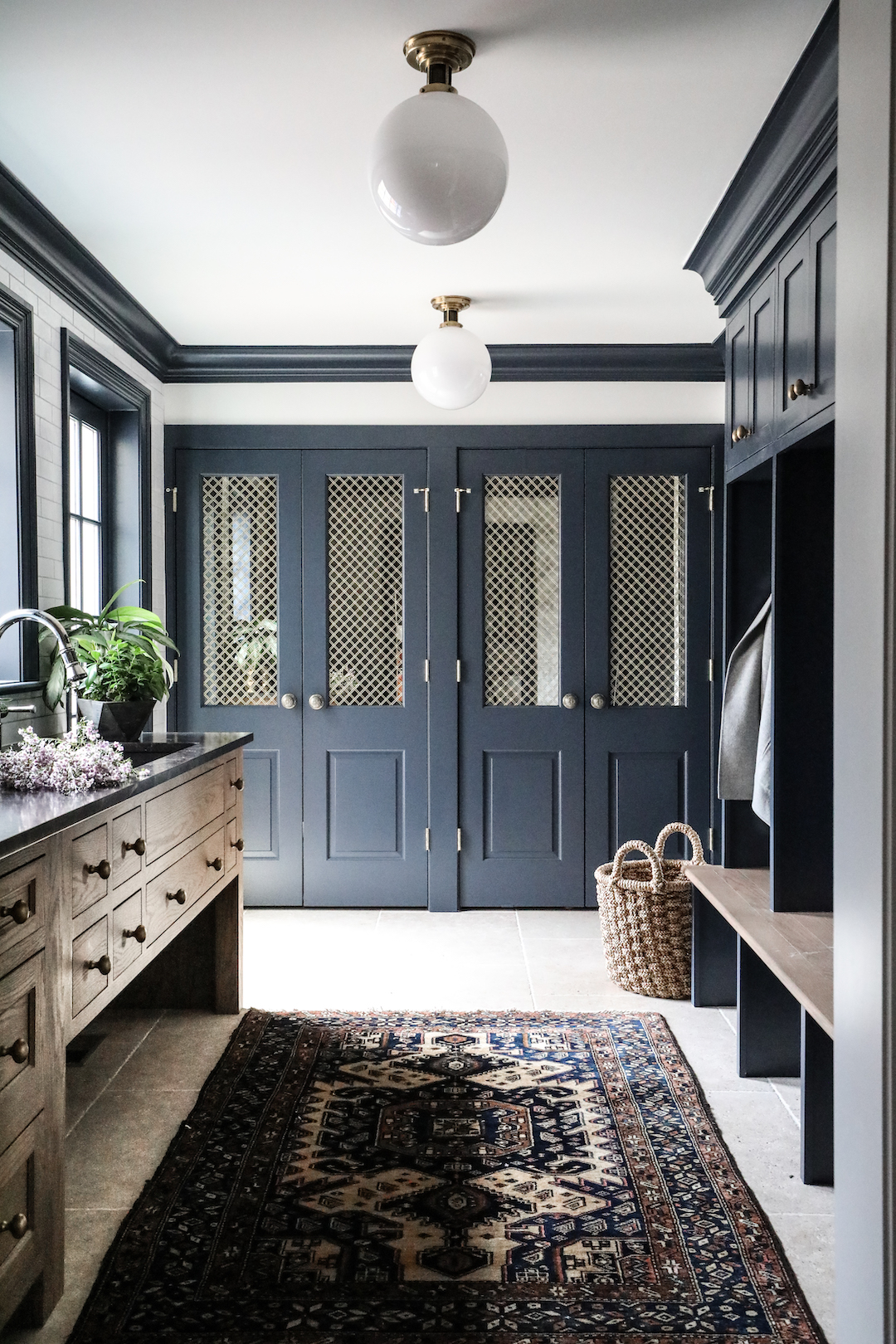
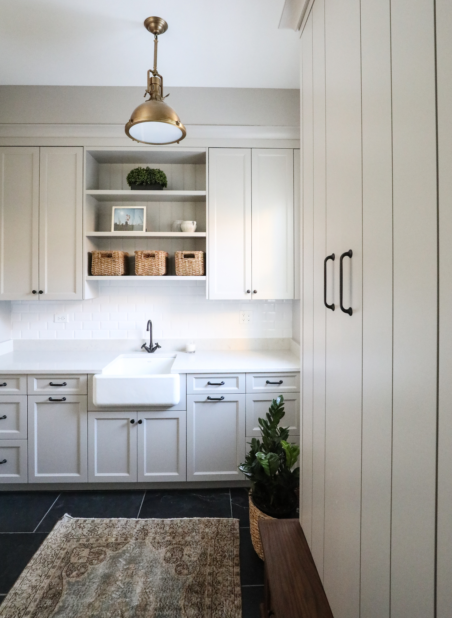
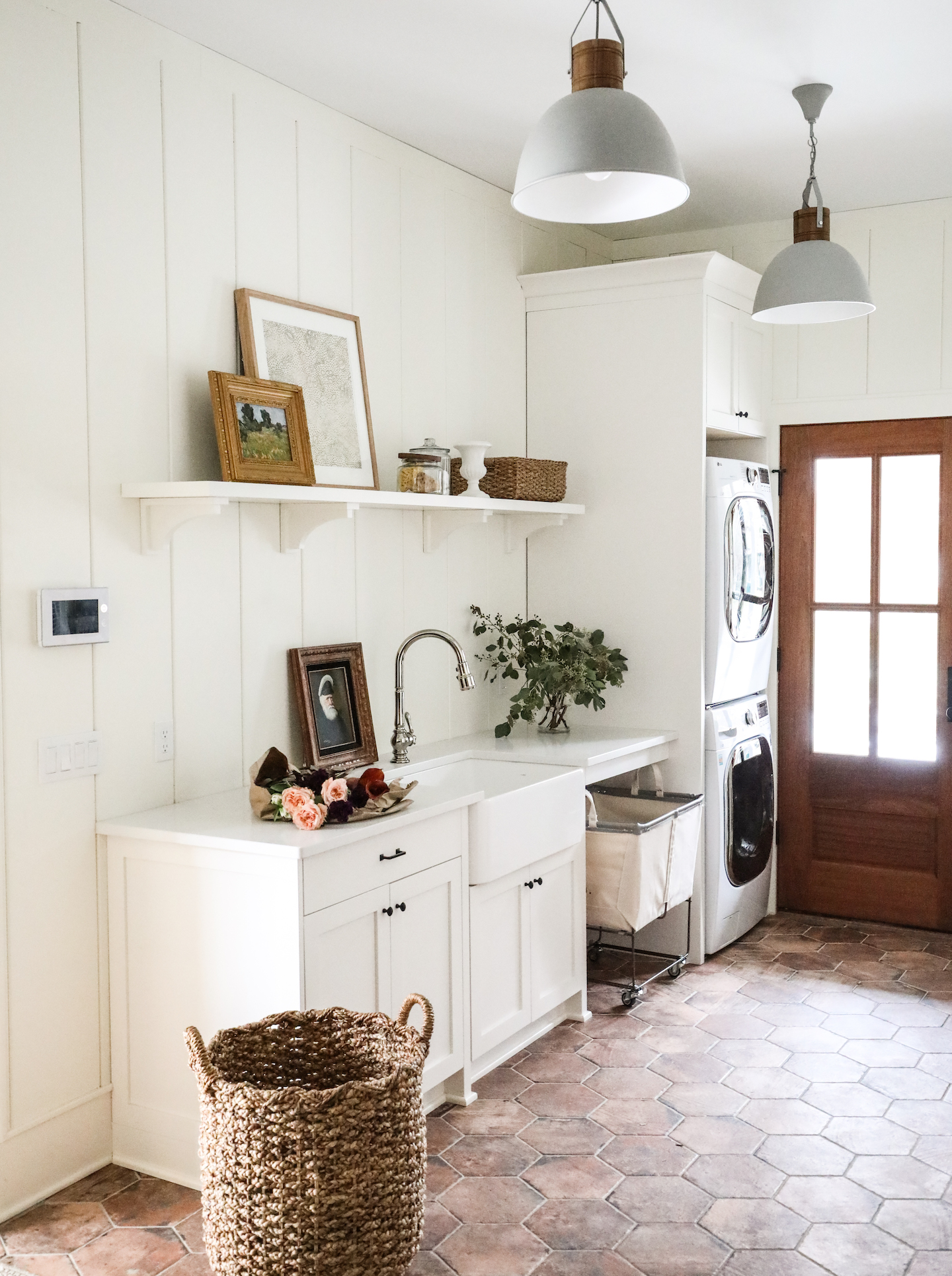
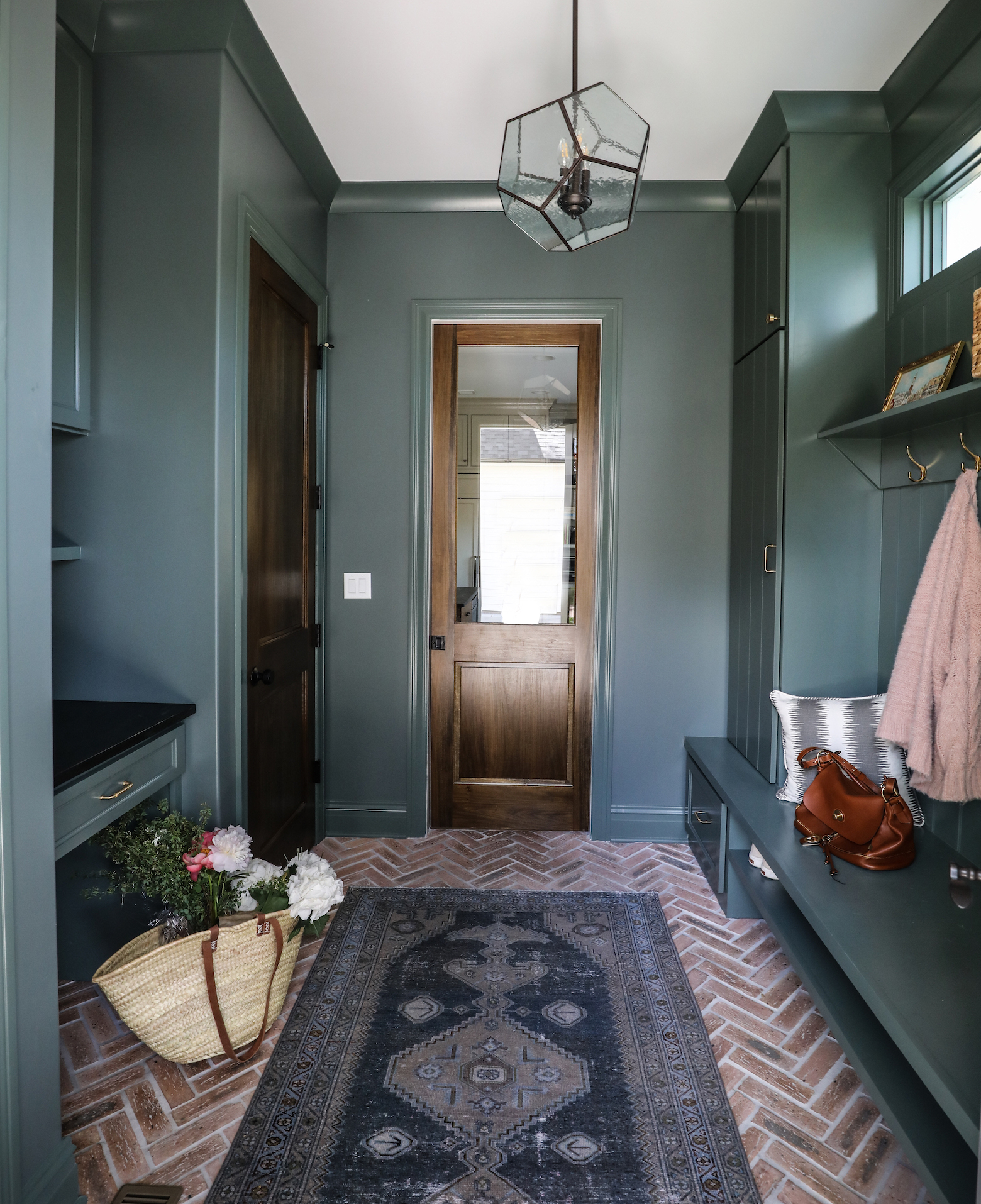
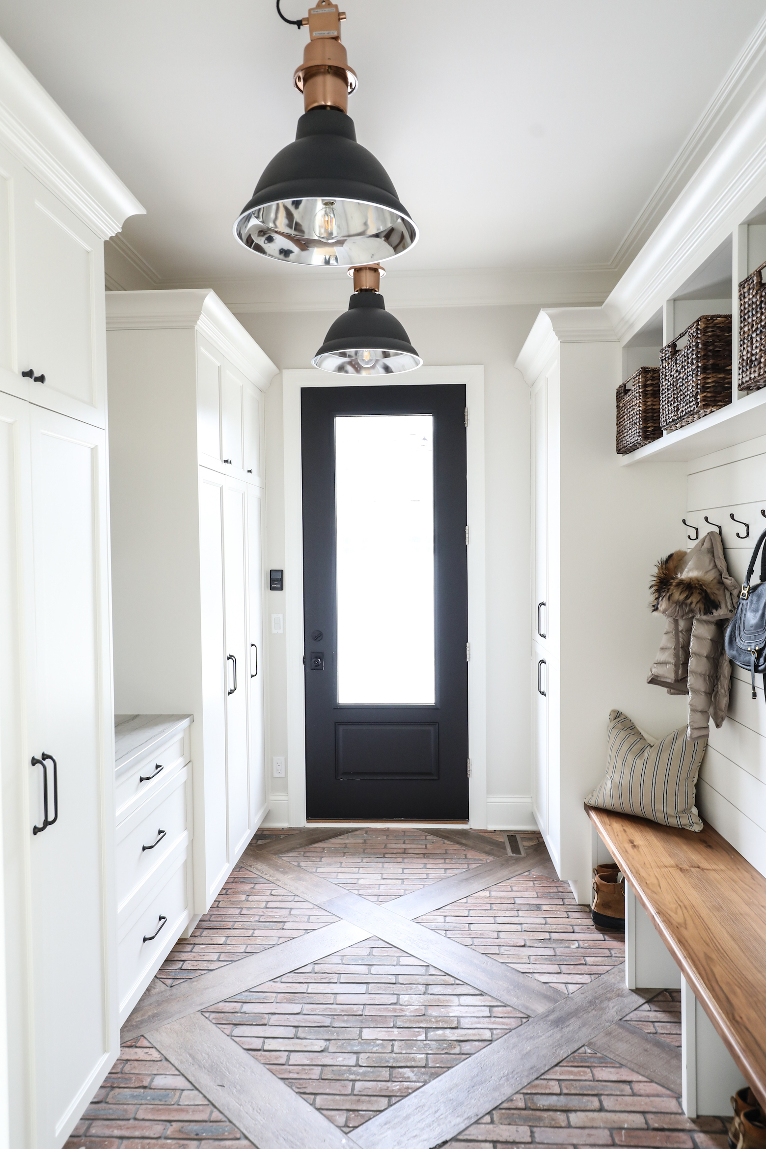
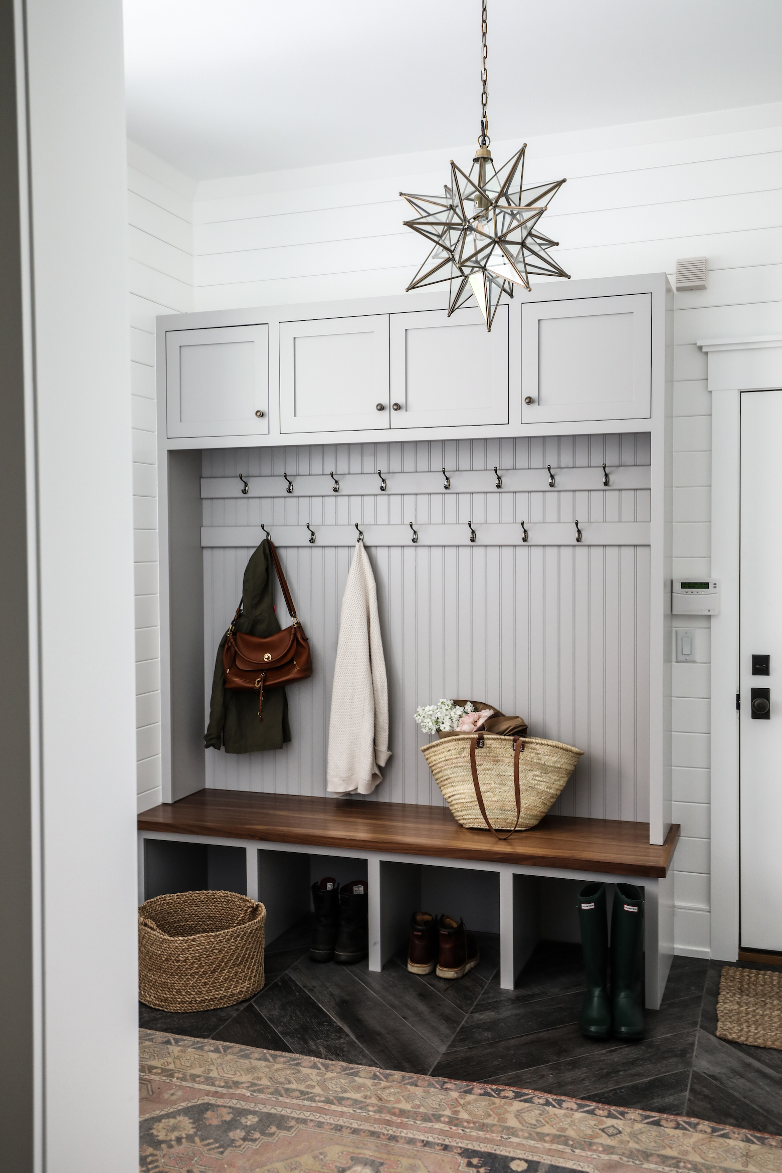
The hardest working room in the house, mudrooms have become an essential space in any new build or renovation we work on at Park & Oak. Particularly in our geographical area, mudrooms see a lot of action in nearly every season. Snowy or muddy boots and coats of all shapes and sizes abound for many months of the year. And for those of us with kids, mudrooms help corral the trappings of kid-dom: shoes, coats, backpacks, snow pants, and gear for every sport/activity imaginable. Having one space as a hub and landing zone for so much is a life-saver, especially when trying to make it out the door to school/work/soccer practice/orchestra/swim team, etc., etc., etc.

Mudroom Tips

Joanna, one of our senior designers, helped come up with a punch list for getting the most out of your mudroom.

1. Think about your unique needs

  • How many cubbies or cabinets will you need? We typically recommend one for each member of the family, if space allows. Closed cabinets help hide the mess, but open ones can be more kid-friendly. We like metal mesh doors when breathability is important (think: workout gear).
  • How many pairs of shoes will be stored in the mudroom? Make sure to plan space for these.
  • Do you prefer to hang coats on a rack, or a hook? (Tip: hooks are better for kiddos!) Will each family member need space to hang a bag? Or two? Or three?
  • Do you have a pet? A walk in wash station contains the mess and makes clean-up easy.
  • Will the laundry live in this room also? We like stackable units to conserve space.
  • Do you need a drop zone for mail and papers? It’s much more common now to see a space like this in mudrooms versus in the kitchens of yesteryear.
  • Do you have space to add a powder room or bathroom? Having a bathroom near the family’s main entry/exit has been such a life-saver for us. No more running half way across the house when the kids need a last minute rest stop!

2. Incorporate storage accessories

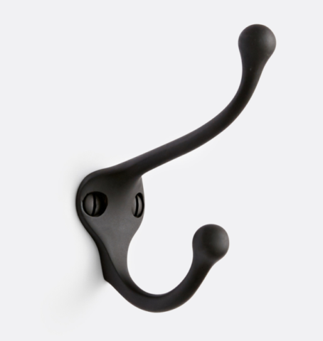
  • Hooks, hooks, more hooks. Think you need 10? Buy 20.
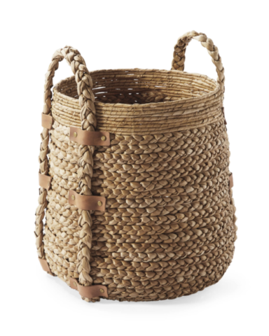
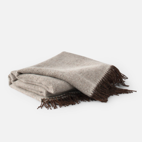
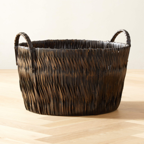
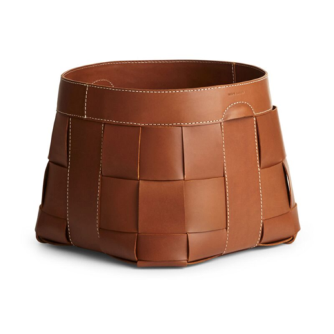
  • Have baskets on hand to corral stray laundry and keep blankets at the ready. Assign one to each family member to contain hats, scarves and gloves, or, in the summer, towels, goggles and sunscreen.
  • Use smaller baskets to organize small items within cabinets.
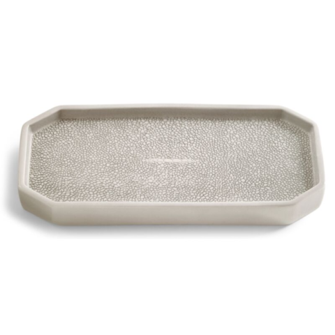
  • Keep a tray on hand for the day’s mail, keys and loose change.

3. Make it beautiful

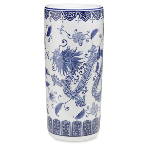
This is the room you will see every time you walk in the door of your home. It should make you feel happy and glad to be home. Add vintage artwork, a pretty umbrella stand and cozy textiles to help make it a welcoming space in addition to a functional one. Need more ideas? Scroll to the shop gallery for our suggestions.


Inspiration from Park & Oak


Shop Mudroom Essentials

0 In Inspiration

Trends that Endure

We were honored to be one of a handful of designers recently featured in Redfin’s 2022 Trending Interior Design Styles report. Their round-up highlights so many of the great things on the horizon for this upcoming year in the world of home design, from textured walls to earthy neutrals to bringing the outdoors in.

Talk of trends always gets us thinking about how the backbone of our work is rooted in timeless elements. Don’t get us wrong, we’ve been known to incorporate a trend or two in our designs, but the overarching goal is always to create a space where you’ll feel at home today, tomorrow, in five years, in fifteen. With that in mind, we thought we’d share three of our favorite enduring trends.

1. Vintage rugs, chests, and art

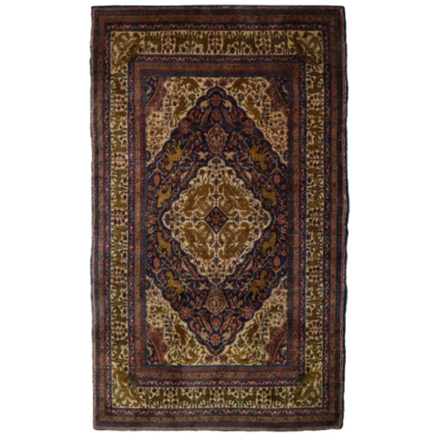
If we could incorporate a vintage rug, chest or piece of art into every single design, we would. More than almost anything else, these three elements guide our design style. There is a reason these pieces endure – they have wow factor without being ostentatious, they bring character and patina to a space, and lend a collected look to even the newest build.

2. Classic materials

It can be fun to jump on a trendy material for something like pillows, but when it comes to the majority of upholstered pieces, draperies and rugs in the spaces we design, we like to stick with the classics: linen, wool, sisal, leather, velvet, silk.

3. Warm wood tones

We embrace a variety of wood tones in our designs, but when in doubt, warm wood tones will always be a classic choice with lasting appeal.

What enduring trends are your favorite?

0 In Inspiration

Contrasting Metals

You may have painstakingly sought out perfectly matching fixtures for a recent renovation, wanting to achieve just the right look for a kitchen or bath, or maybe even a living space. We understand! There was a time we’d have done something similar. But, lately, we are embracing a less popular option: go crazy, mix those metals!

If you examine the photos in the gallery below, you’ll see that by mixing metals in these spaces, we’ve created a more layered, textured look. Matching metals can read a little one-note; contrasting ones give depth, bouncing light in a different way, giving the eye interesting places to land. This can be a more difficult balance to achieve, needing to consider each element carefully – plumbing fixtures, light fixtures, cabinet hardware, accessories, even furnishings – but is worth it for the end result!

0 In Room Reveals

Reveal: Carmel Butler’s Pantry

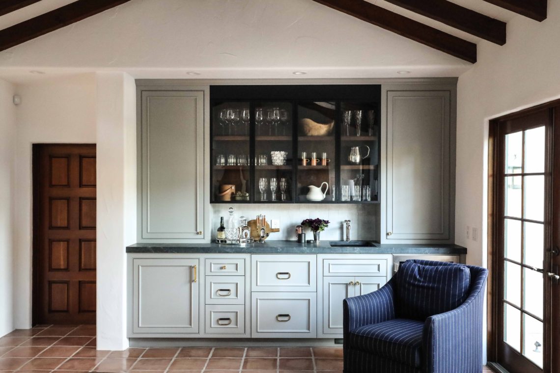
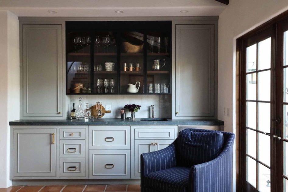
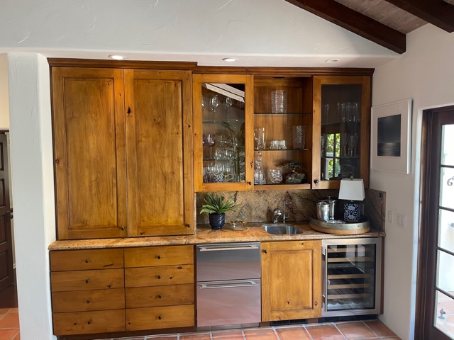
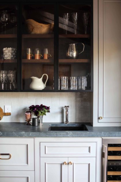
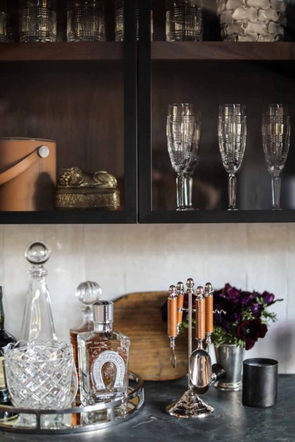
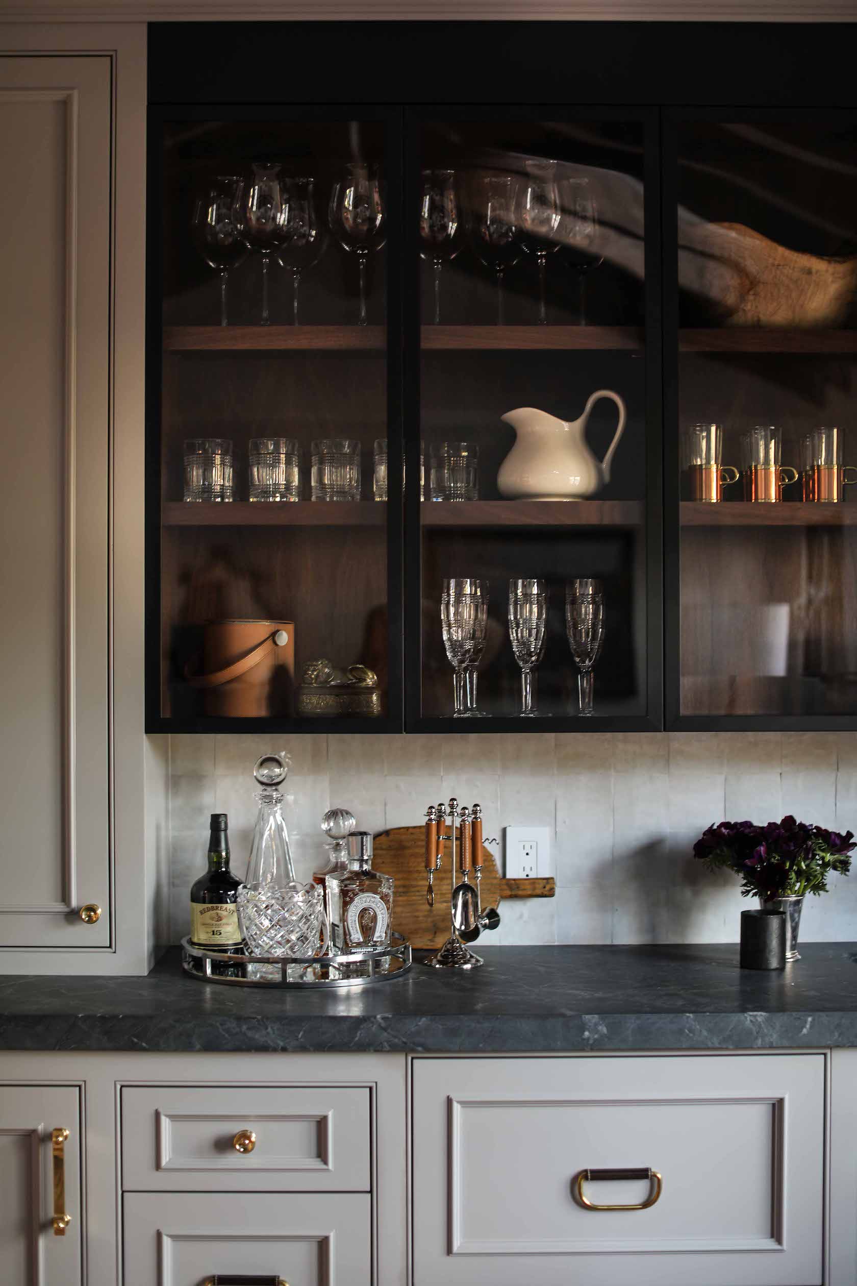
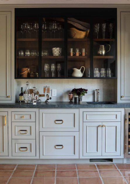
There will be more reveals to come for our Carmel-by-the-Sea project, but we couldn’t wait to show you the butler’s pantry, the first finished space! Let’s start with a before & after.

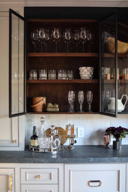
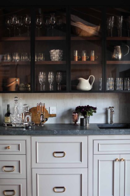
This Spanish-style home allowed us to stretch our wings a bit, as it is not a common form of architecture in the Chicagoland area. You’ll see more of those influences when the kitchen reveal comes, but there are hints of it here in the butler’s pantry. We wanted to stay true to this style, but brighten things up from the original cabinetry and finish choices. The light gray paint on the built-ins accomplishes this, but the dark stain inside the open top cabinets helps stay true to the style, and echos the dark ceiling beams.

These Waterworks leather and brass pulls are also at home in this architectural style. We sourced these gorgeous pulls in person during a visit to the Waterworks showroom in Chicago’s Merchandise Mart.

The handmade clay tile is a natural choice here, too. The uneven distribution of the material and variation in color from tile to tile gives great texture and depth to the backsplash.

Located just behind the kitchen, the butler’s pantry also shares space with a cozy den, so makes the perfect spot to keep barware and glassware.

We can’t wait to show you the rest of this project! Stay tuned!