Blog :: Room Reveals
Reveal: Historic LaGrange Home
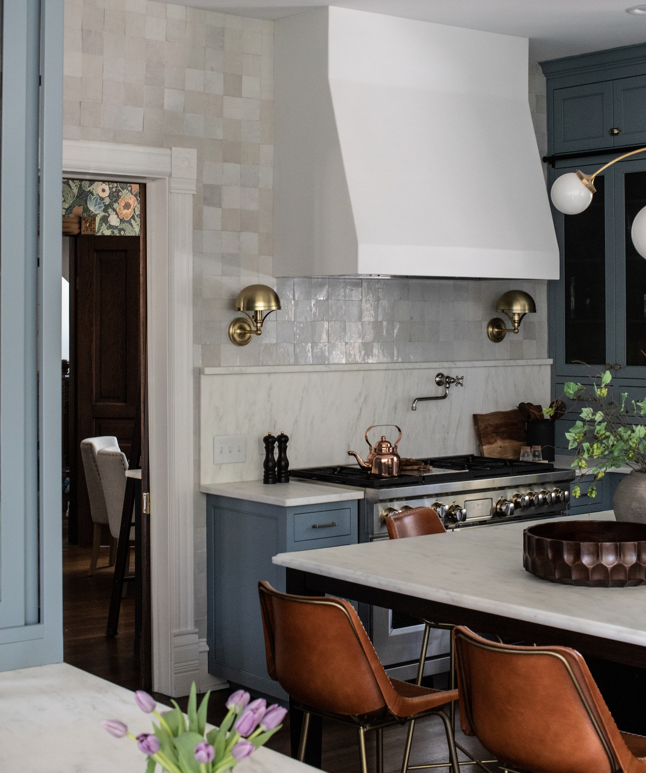
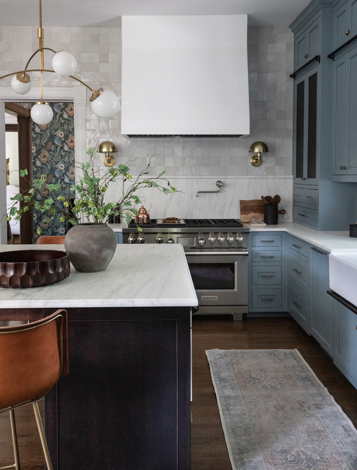
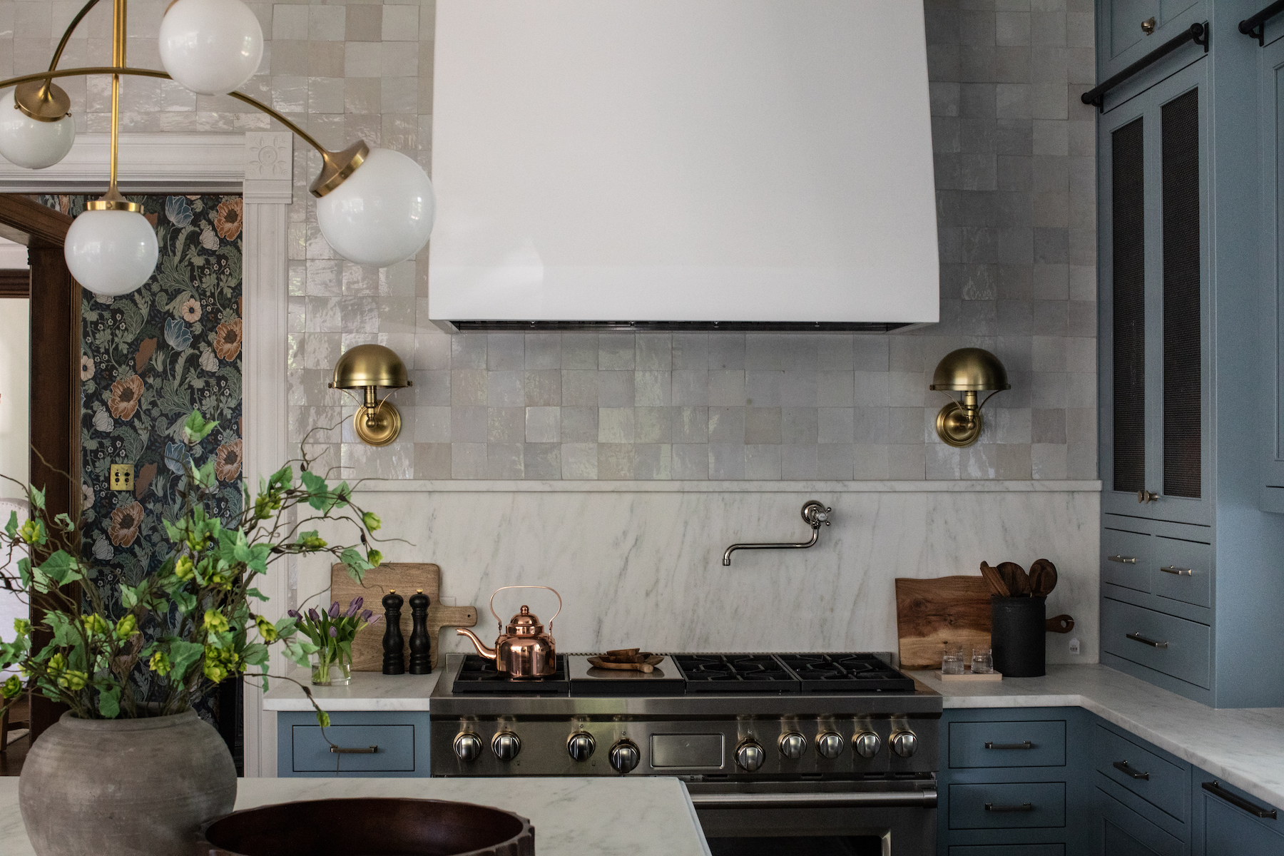
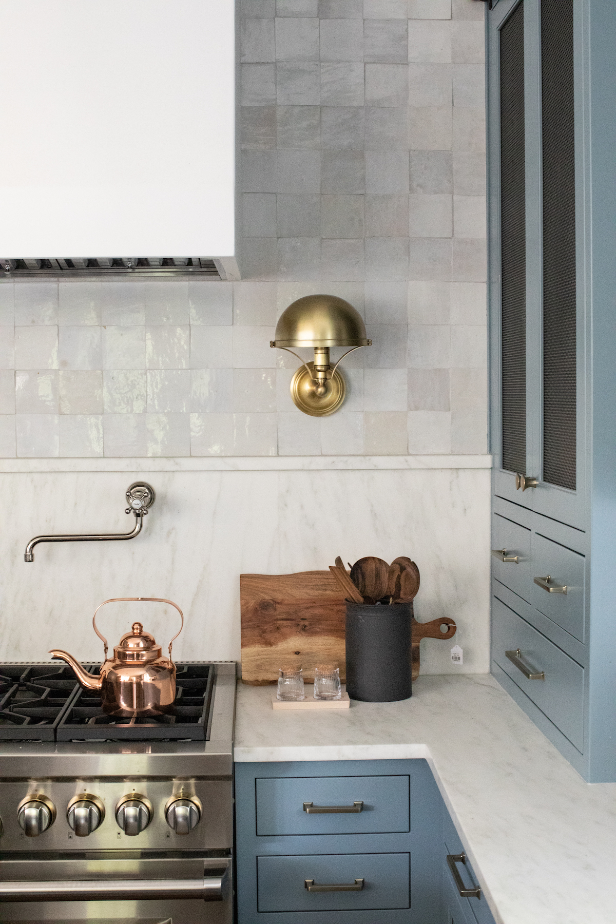
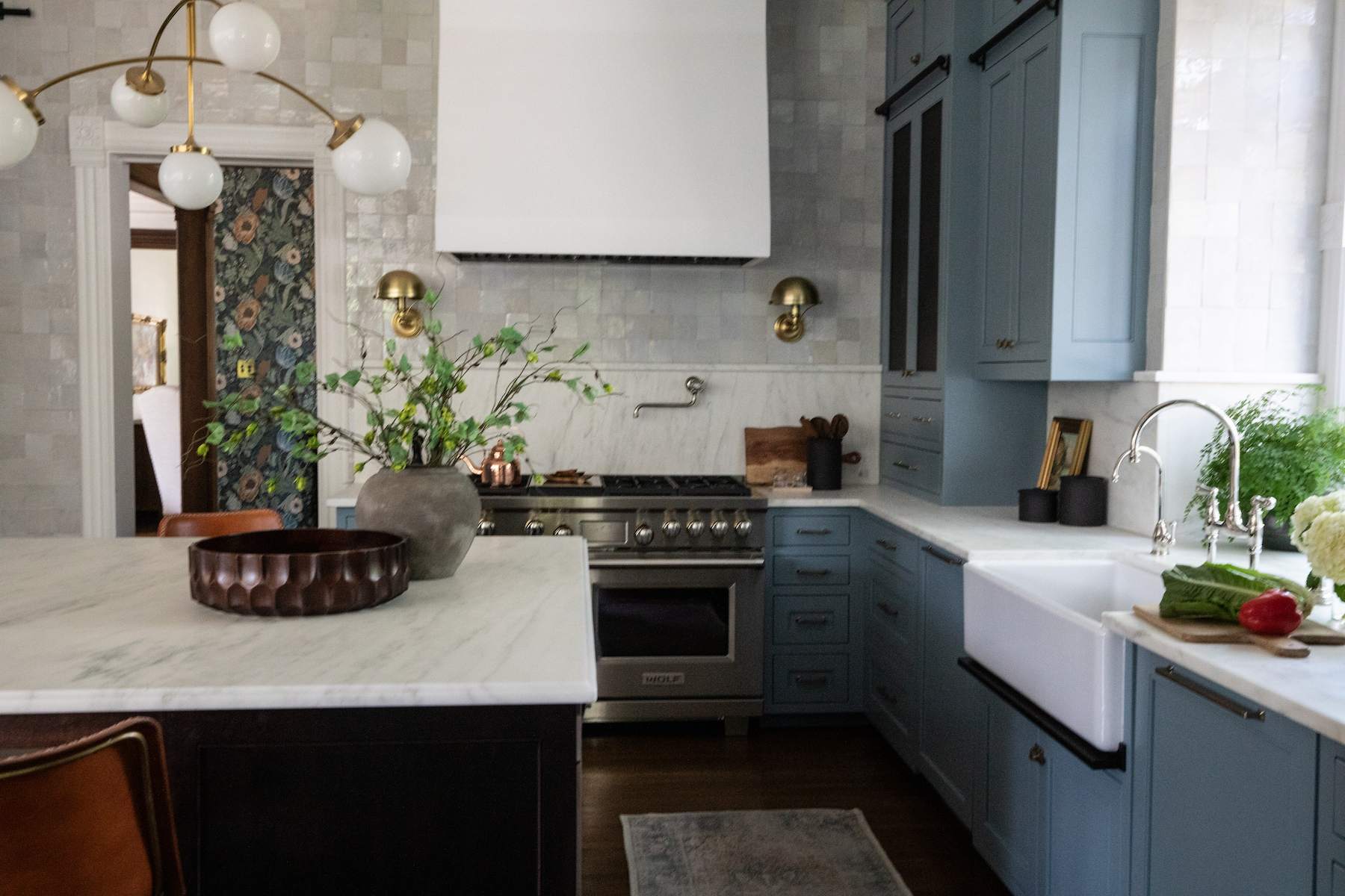
It’s so bittersweet to see this project cross the finish line. We dived into the renovation on this late 19th century Victorian at the height of quarantine and other Covid-related restrictions. As did so many others, we had to re-learn our work habits, adjust our processes, pivot to new ways of doing things. Zoom meetings to review custom stain samples to be sure the island coordinates with the 100+ year old trim is never ideal, but the ways we adapted as a result have actually our made our design process and our team stronger. There is something incredibly rewarding about having come out on the other side of this project, and with an end result that just makes us so happy. Isn’t this color happy? (It’s Benjamin Moore Van Cortland, and we were giddy that our clients were fully on board with using a strong color to anchor their new kitchen.)

As with many renovation projects, our goal here was to make enhancements to this home that would improve its functionality for modern day living without losing its historic character. The young family who purchased the home felt strongly about preserving historic details and making any renovations feel like they fit the character the home.
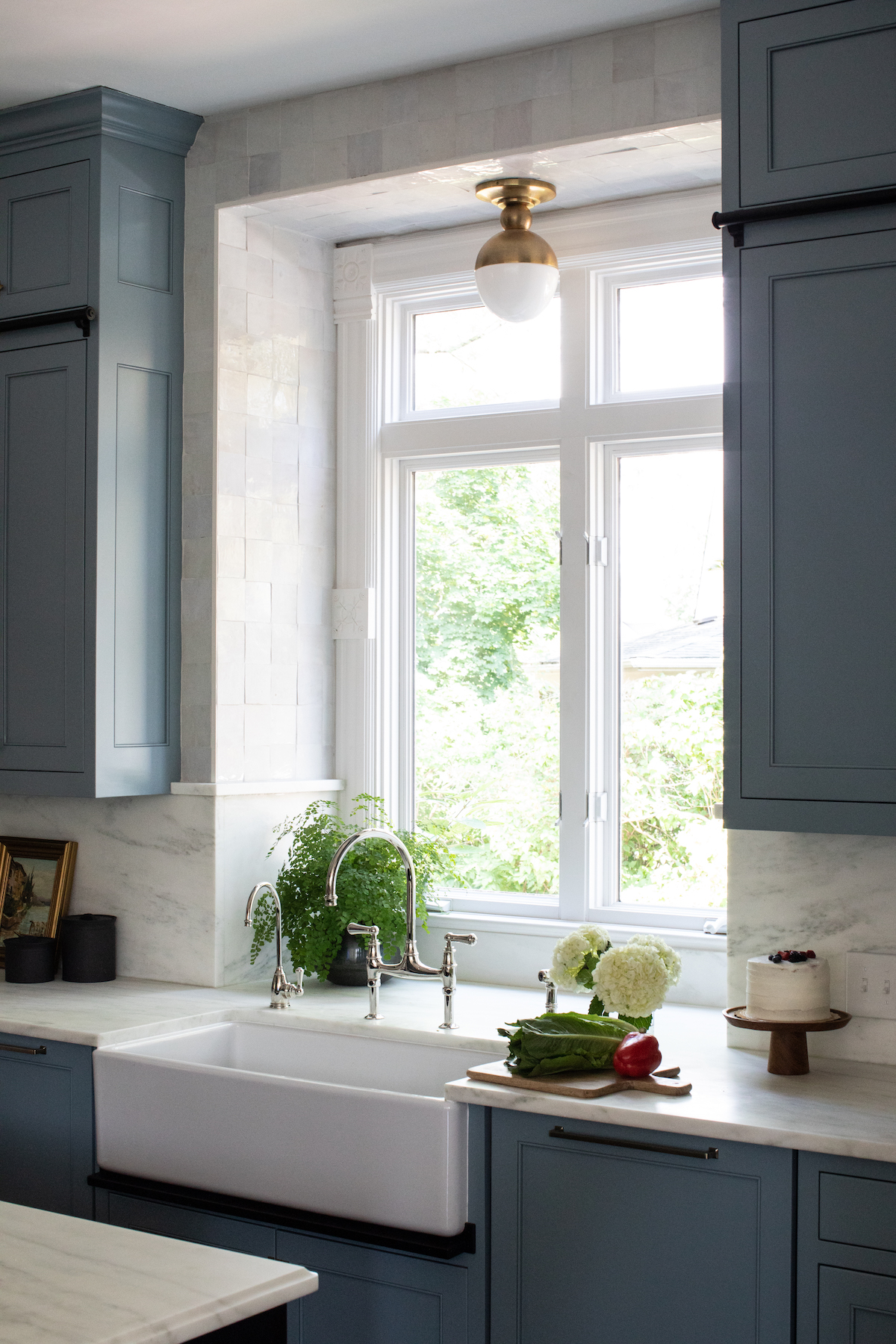
An addition that pre-dated our clients’ purchase of the home housed a functional, but outdated kitchen with some questionable construction. We went down to the bones, shoring up construction where needed and making some layout changes. In the new kitchen, we maximized space with cabinetry reaching to the ceilings, and a square island with plenty of room for this family who loves entertaining to prepare meals and serve and mingle with guests. Zellige clay tile, marble counters, and fixtures in a mix of metals – one of our secrets to a balanced space — all work together in harmony. Scroll for a pretty striking before/after!


via Park & Oak
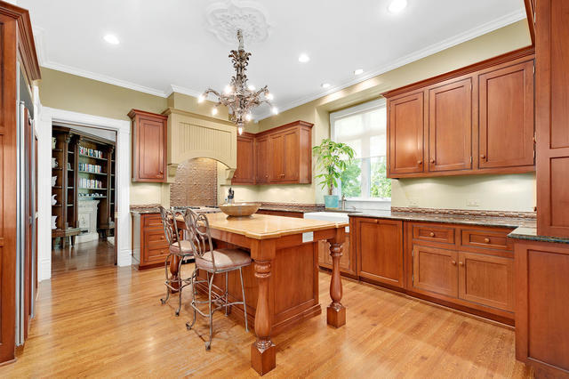
via Redfin
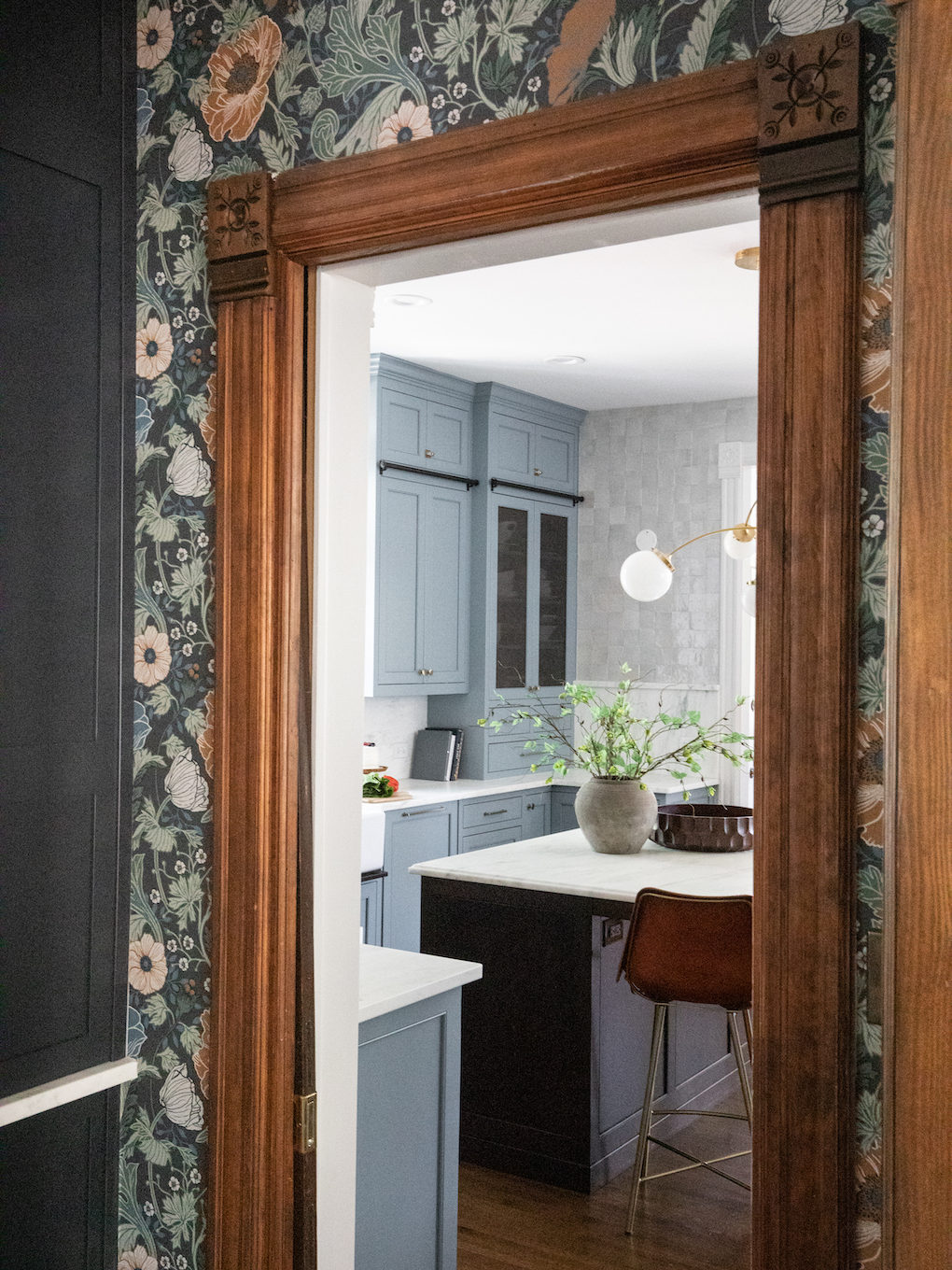
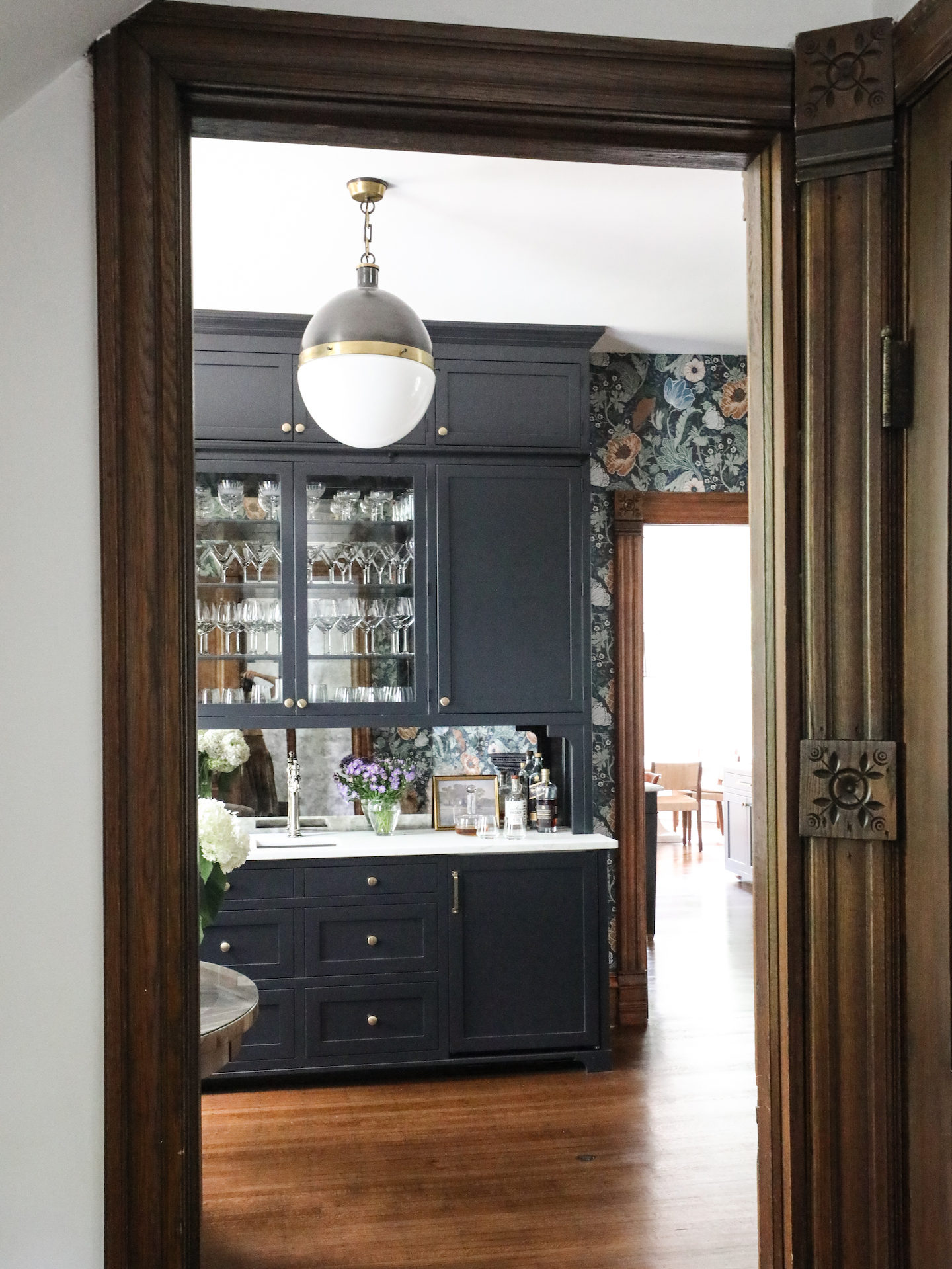
We knew we wanted a “wow” moment in that cocktail room that peeks out from the edge of the kitchen, and the clients agreed. Wallpaper was an easy choice here. But instead of the tiny florals and chintz that dominate old Victorians, we went bigger, and a little bolder with the A-Street Anemone paper. It still lends that feeling of something classic and historic, but with an updated touch. Removing the existing built-ins gave the wallpaper room to shine, and opened up the space a bit.


New cabinetry in the cocktail room, painted in Benjamin Moore Soot, was constructed with a built in rail for the ladder. For storage and visual purposes, we wanted these cabinets to go all the way to the ceiling, but practicality dictated the need for an easy way to access what is stored there. Making this ladder part of the architectural details of the home ultimately saves the client time, space and headaches. You’ll notice we’ve extended those rails to the kitchen cabinetry as well, so the ladder can be moved around as needed. There is also a discreet place to hang it on the wall if that space is needed while entertaining.
Integrated wine storage and a beverage center are built into the bottom of the cocktail room cabinetry, and mirrored glass bounces light around the room, illuminating the beautiful wallpaper and other features.

Also, let’s just take a moment to appreciate this timeless century-old trim work. While researching historic details of the home, we came across a catalog page showing the different block types that were available to cap off trim pieces. The blocks in the LaGrange Home appears to be style R-1124. Would you agree?
Elsewhere in the home, we updated the guest bath and kids bathroom to capitalize on historic features, as well as maximize functionality.
We applied molding in the guest bath to enhance the classic feel of the home. Combined with elegant brass fixtures and a dark/light treatment on the walls (Benjamin Moore Kendall Charcoal), the effect is timeless.

The kids bath features one of our favorite hidden details: a step stool built into the cabinetry that can also still function as a drawer, but, much like the ladder in the cocktail room, gives the kids efficient, easy access to the sinks until they are tall enough to reach on their own.


Welcome to Park & Oak
We’re a full-service interior design firm creating timeless, comfortable homes across the U.S. Our work blends beauty with livability—crafted with care, inspired by you.
Whether you're building your forever home or refreshing a single space, we're here to make the process feel joyful and effortless.


