Blog :: Room Reveals
Reveal: Hinsdale Refresh
This one has its own special place in our Park & Oak hearts since the client ultimately became one of our team members!!
Lisa and her family had already made great strides in updating their new home, but needed some help getting to the finish line, especially in the living spaces of the home. She echoed sentiments we’ve heard from homeowners before: that they had made some costly mistakes and wanted to get it right the second time around. We loved helping Lisa and her family refresh these spaces and give them the home they had dreamed of!
The light, bright room pictured below, their family room, just needed a little grounding. Substantial linen window treatments help balance the dark fireplace surround and draw attention to the detailed ceiling molding. We brought in custom rust lounge chairs for a comfy pop of color, and used some of the clients’ own vintage finds throughout the space.
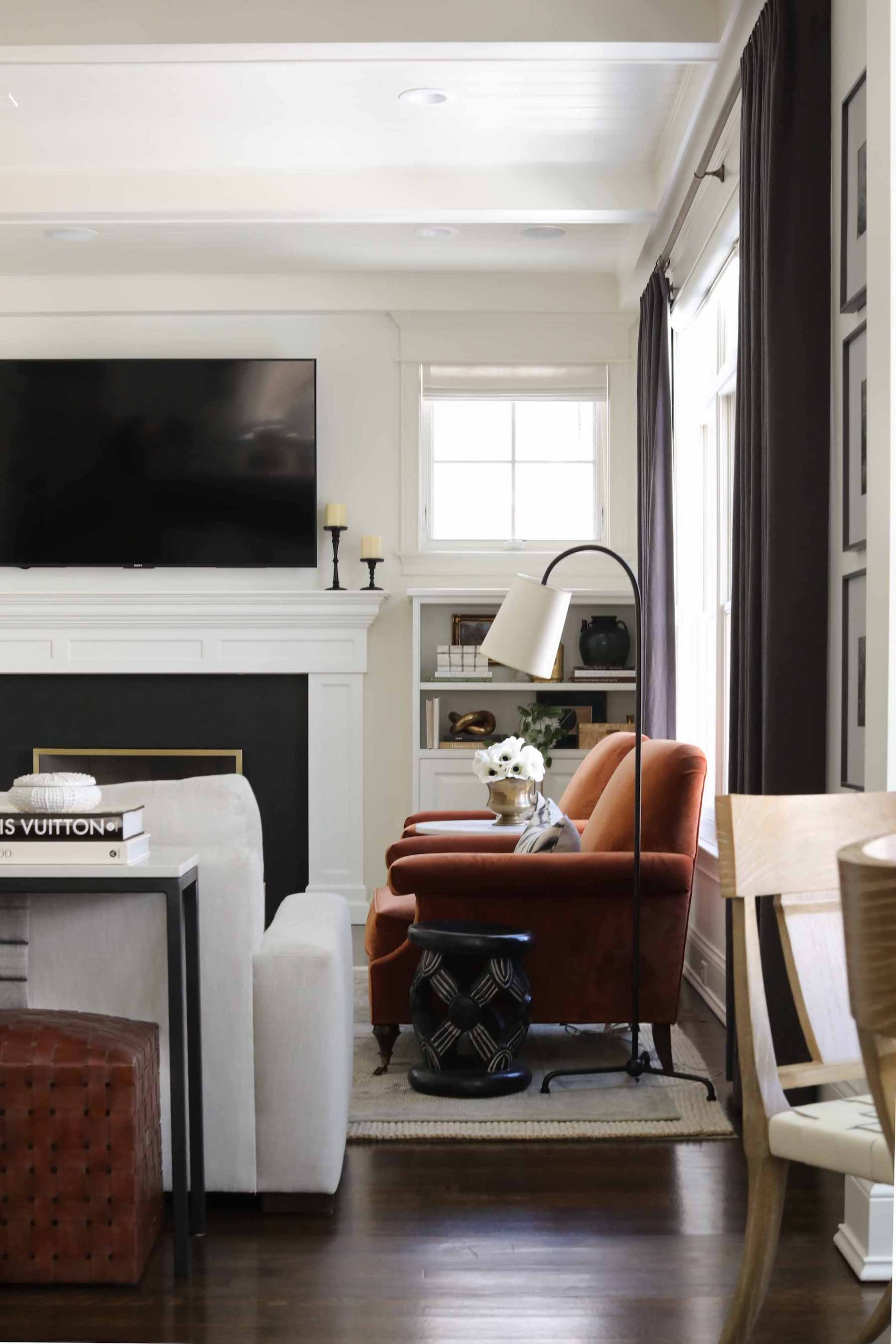
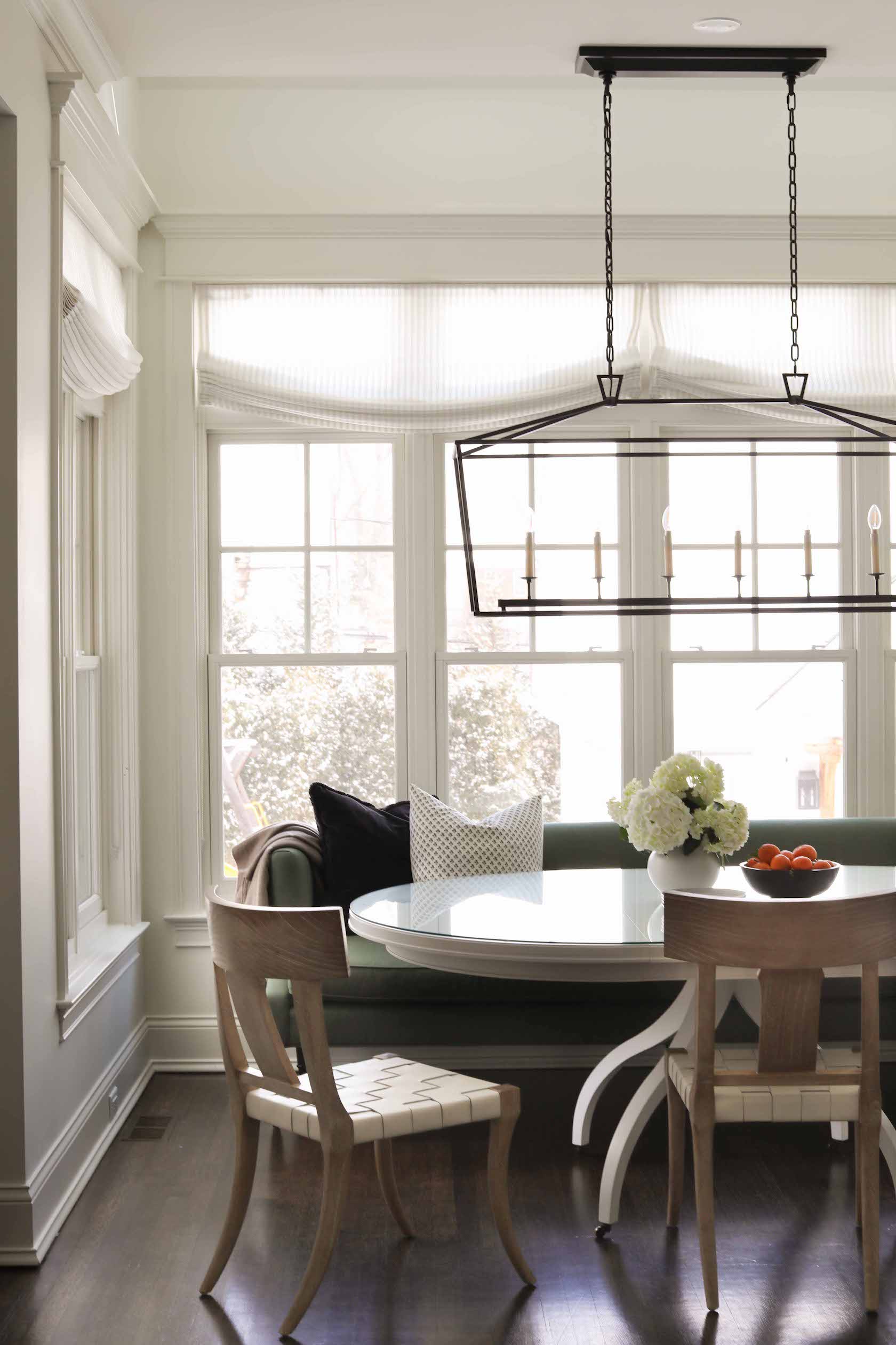
Peeking out from the right side of the above photo is one of the chairs in the refreshed breakfast nook. A large, built-in banquette in this space was not really working for Lisa’s family’s needs. One of our intentions in kitchens – and their adjacent spaces – is to make things warm and cozy; a happy, homey place not just to cook, but to live your life. A sage green settee here extends this concept to the breakfast nook, giving Lisa and her family a comfy place to sit not just for meals, but throughout the day in this hub of the home. Sturdy, wipeable chairs are practical (but still pretty!) for this family with young children. Relaxed roman drapes help break up all the horizontal lines and add an elegant touch.
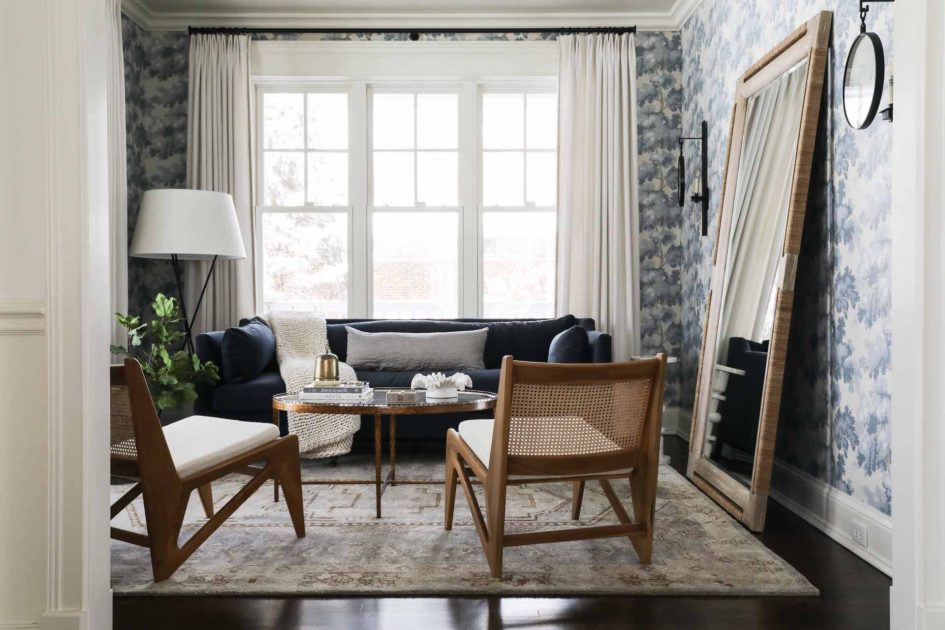
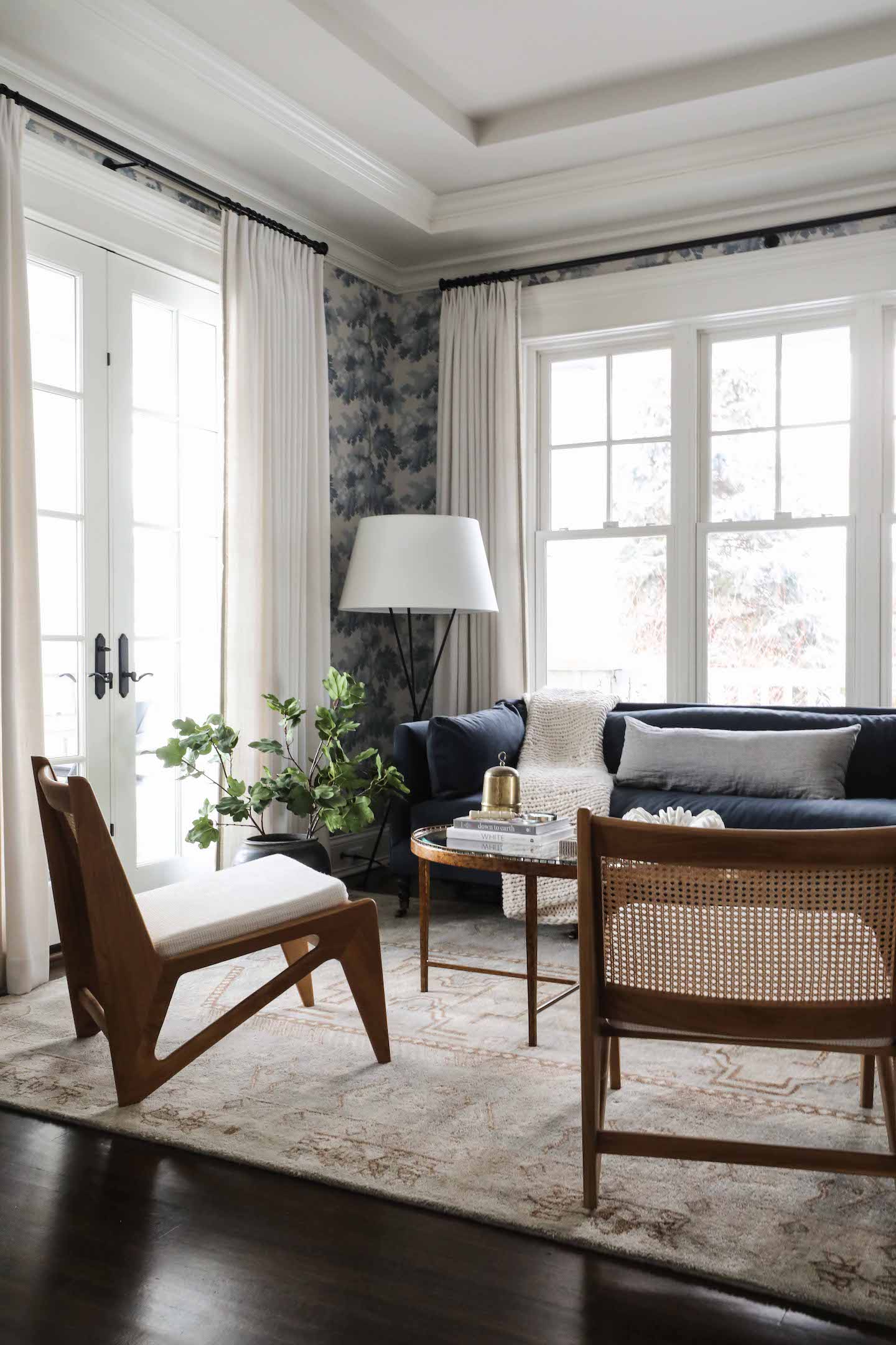
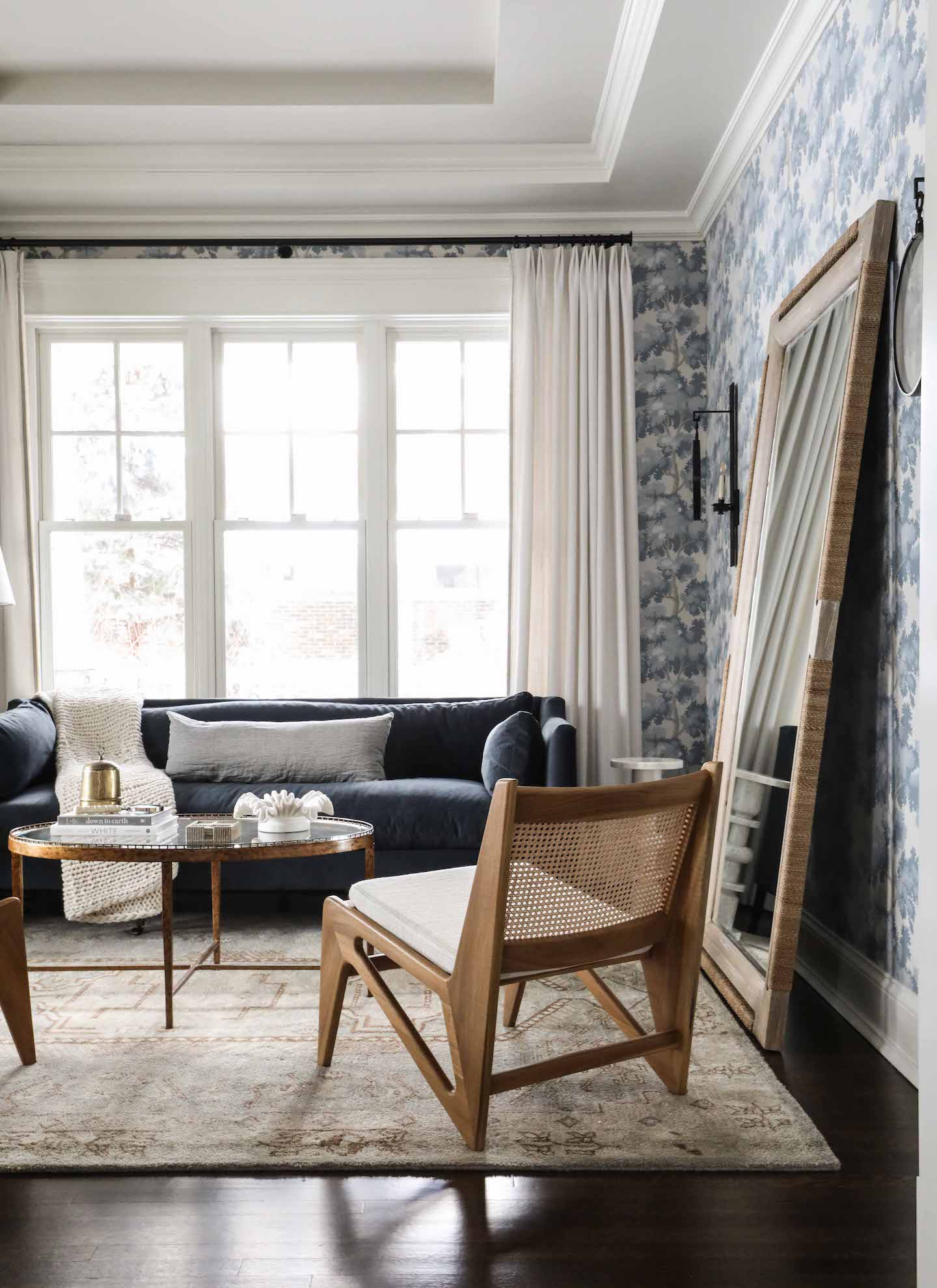
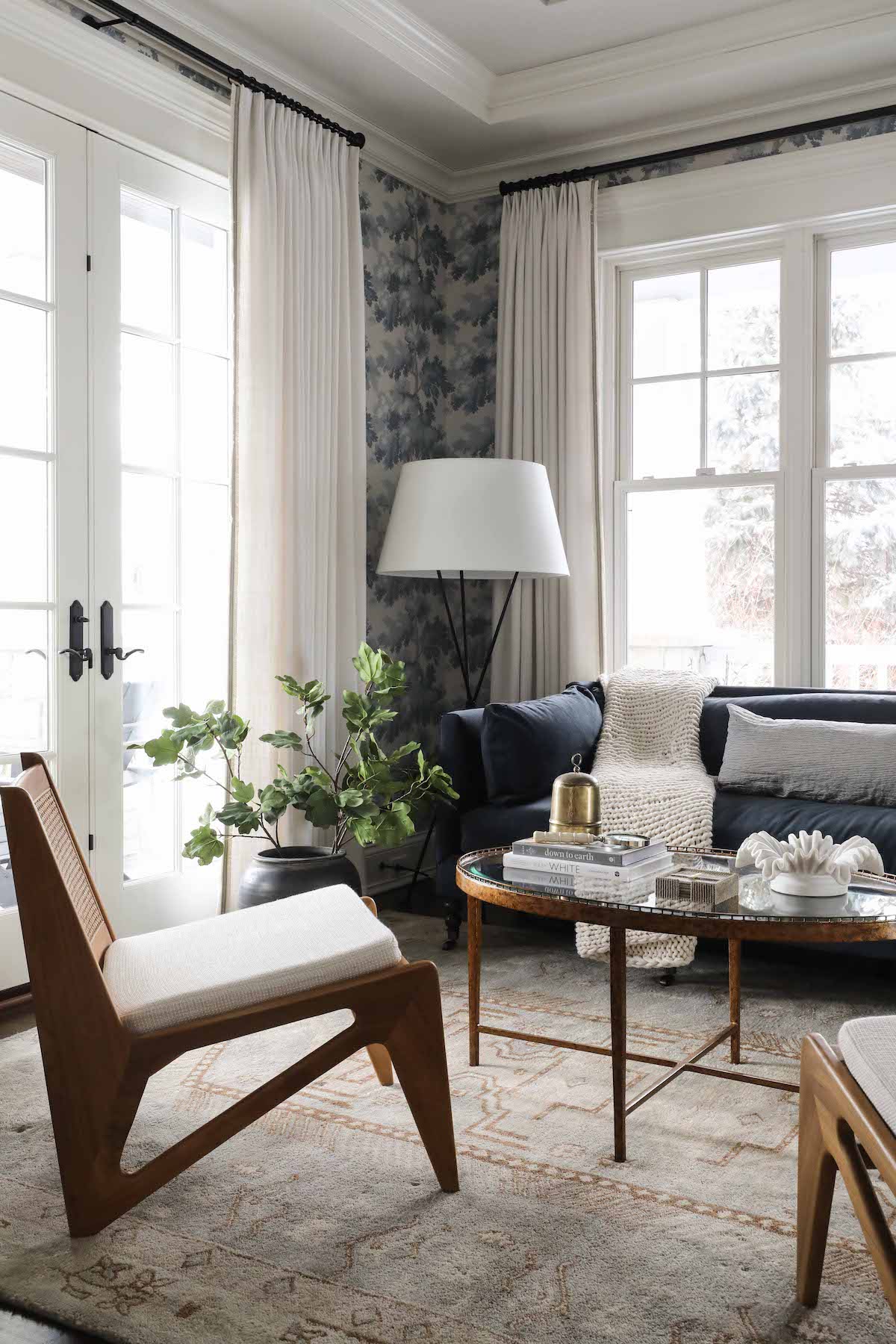
Lisa’s favorite room – her oasis – is the sitting room we created in the front of the home. As we’ve all discovered in the last couple years, it can be nice to have a place in your home to get away. For Lisa, this is now the place. We wanted the room to stand apart – to draw the eye of visitors and be an enticing destination – so we started with a bold wallpaper, Sandberg Raphael, in the Light Blue colourway. Lisa would be the first to tell you this choice made her nervous when she saw it on the design board, but can’t imagine it any other way now that the room is complete. The wallpaper makes an elegant backdrop for the navy sofa, kangaroo style chairs and Lisa’s own mirror. Custom window treatments with a pretty trim detail help highlight the beautiful windows and french doors.
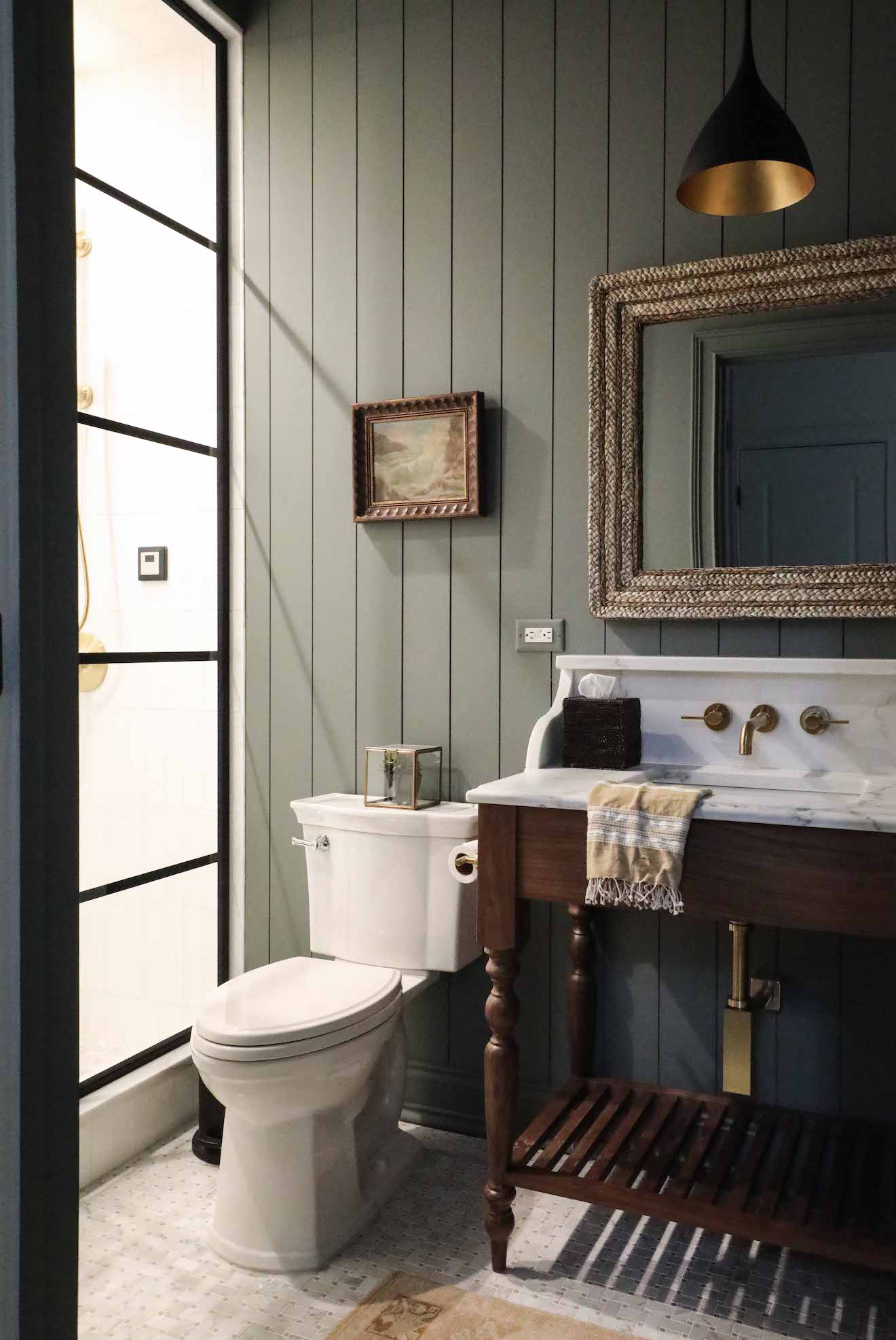
Lisa’s family uses their home gym frequently, and wanted the nearby bath renovated for convenience after workouts. The only wishlist item was for a steam shower, which we highlighted with steel and glass doors. The paint we chose here – Benjamin Moore Duxbury Gray – has a spa-like quality and the right tone offset for the custom vanity and counter/backsplash/ledge we designed. A pendant light with a brass interior adds a pretty and unexpected detail, and the rattan mirror brings a natural element. Lisa’s own vintage art finishes off the space.
Welcome to Park & Oak
We’re a full-service interior design firm creating timeless, comfortable homes across the U.S. Our work blends beauty with livability—crafted with care, inspired by you.
Whether you're building your forever home or refreshing a single space, we're here to make the process feel joyful and effortless.

