It can be tempting in a large renovation project to go down to the studs and start completely fresh. The sky’s the limit! Endless options! And sometimes, that is the right and logical choice. But often, there are elements of a home well-worth holding onto. Details that make a home unique and give it the patina of a beloved space.
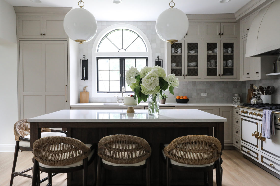
In the first-floor renovation of this 1908 Hinsdale home, that element was the arched windows in the kitchen and library. Original to the home, these windows added so much special character, and were worth designing a renovation around. Changes we made to the home’s floorplan mean that both of these stunning windows are now visible to those seated in the home’s dining room. The windows echo each other and help tie together the spaces, as well as the history of the house, in a singular way. Even the barrel-shaped hood chosen for the range is a nod to these arched windows, and, according to the homeowners, one of the more commented-on details of the renovation by guests to the home.
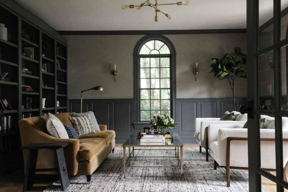
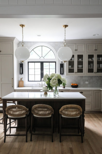
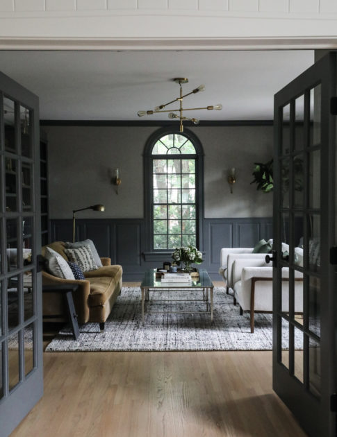
The original kitchen in the 1908 Hinsdale home was smaller, with no center island. This family with three small children really wanted to add some additional space for everyday living. By relocating the powder room (originally where the range stands now), we gained enough space to add an island with seating for all three kiddos, plus one extra! Opening up this section of the first floor also means more comfortable mingling in the gathering spaces of the home. Our clients entertain their large families for many holidays, and having room for guests to roam was critical.
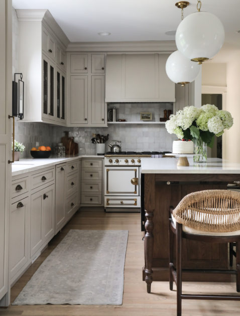
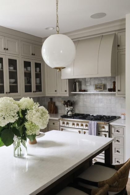
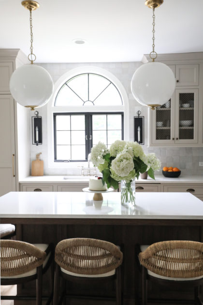
Notable Details
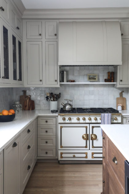
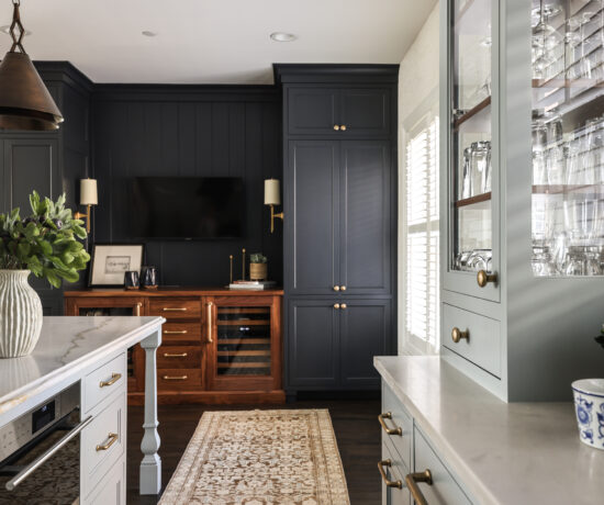
We love adding open front cabinets to a kitchen to let the eye see something different in a wall of cabinetry. In the Hinsdale kitchen, we added wire mesh to the open cabinets, which lends another layer of interest and variation.
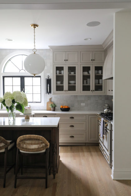
The wall tile stretching from the range all the way around to the window adds sheen and reflects beautiful light throughout the room. It also further highlights the magnificent arched window.
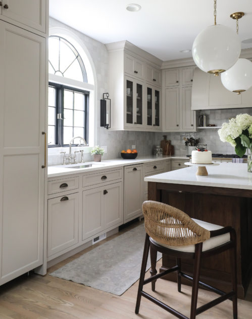
We are always searching for ways to add function to form. Our clients are talented home cooks, so while this demure shelf above the range serves a design purpose by breaking up lines, it also provides a resting place for everyday cooking essentials like salt, pepper and olive oil. Plus, we always like a little art in the kitchen. The showstopper La Cornue stove anchors this section of the room.
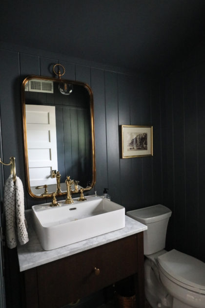
And finally, having “borrowed” the old powder room space to add space to the kitchen, we tucked this new powder room into a little-used hallway and utility space.
From our Clients:
The Park and Oak team was outstanding to work with on our recent home renovation! They were attuned to our design preferences and also did a tremendous job in helping us think creatively. With their suggestions we were able to retain the charm and character of our 1908 home, while also making it modern and functional for family living. We are so pleased with the result and would highly recommend them for design concepts, materials selection, and furnishings.

No Comments