Blog :: Room Reveals
Before & After: Glen Ellyn Study
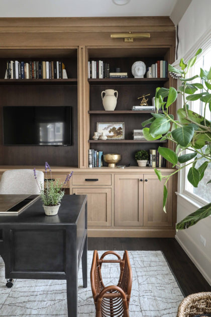
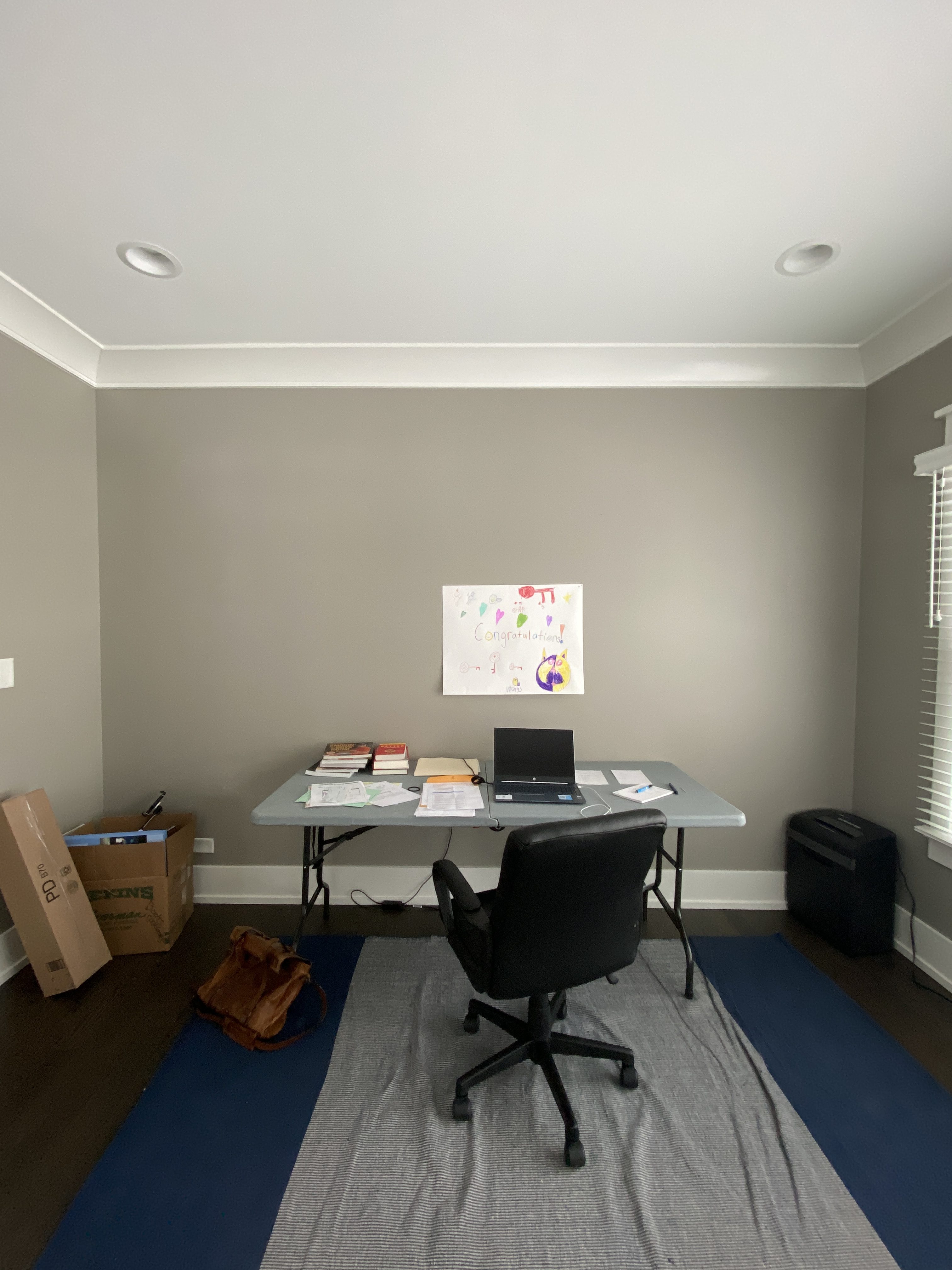
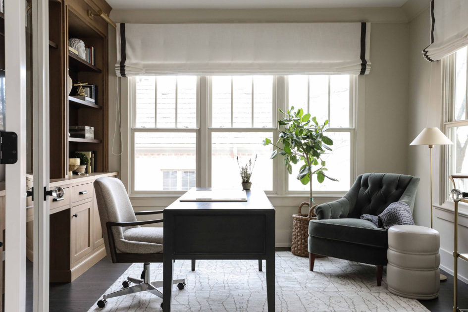
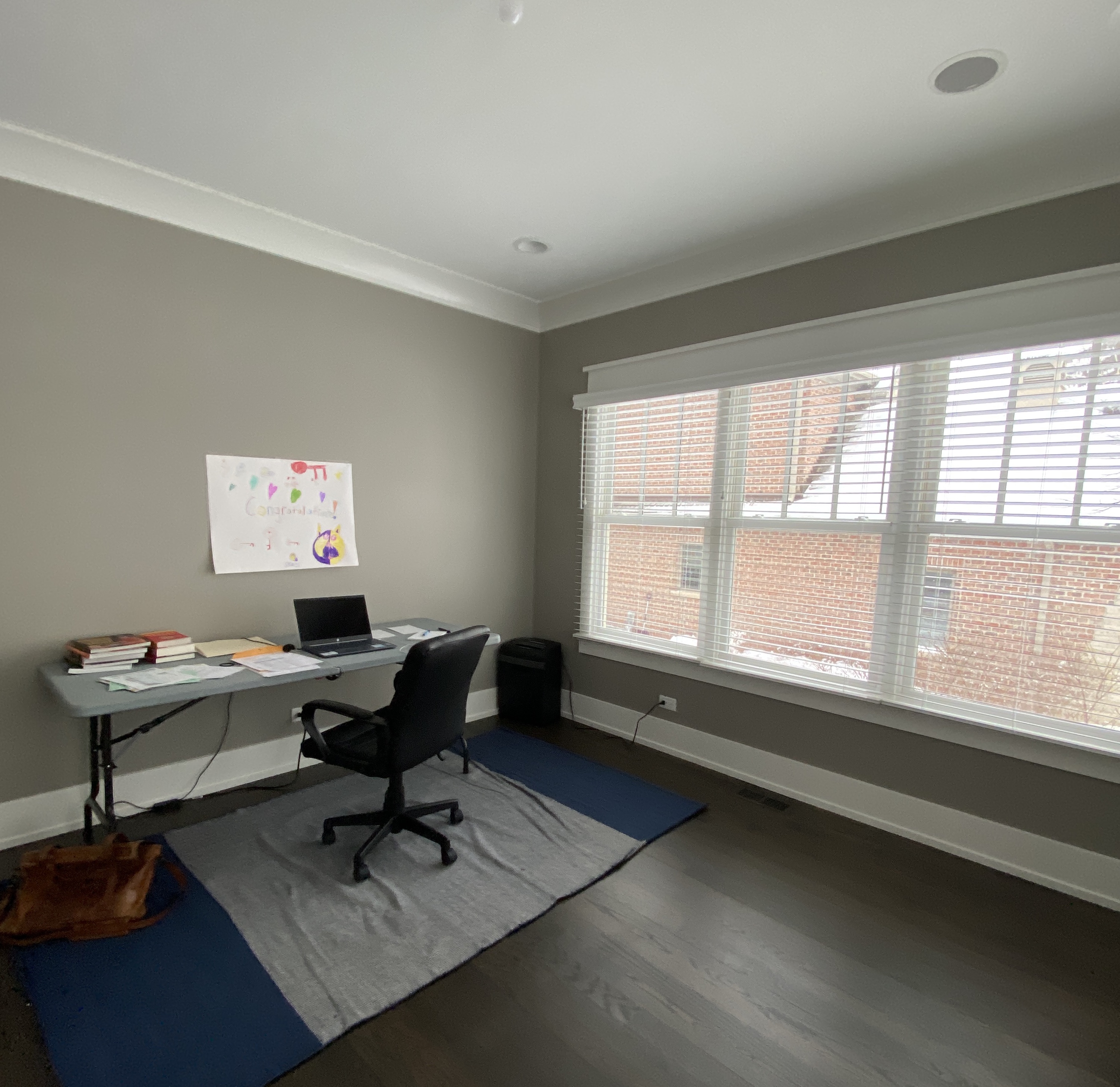
As you’ll see from the before photos, we started with a blank slate at the Glen Ellyn study. While that may seem daunting, our client had some specific ideas for what they wanted in the finished space that helped light the path. Bright, but masculine. Zoom friendly. And lots of built-ins for storage. (Plus a desk that doesn’t fold up!) With these elements in mind, we set about designing a study that would be both functional and beautiful.
The mixed wood tones we chose for the built-ins fit a neutral color scheme while still lending interest and depth. The dark tone helps camouflage the television, now a common office fixture in the age of Zoom. We like the way the contrasting tones in the built-ins also complement the dark wood floors. Don’t they make a striking focal point for the room?
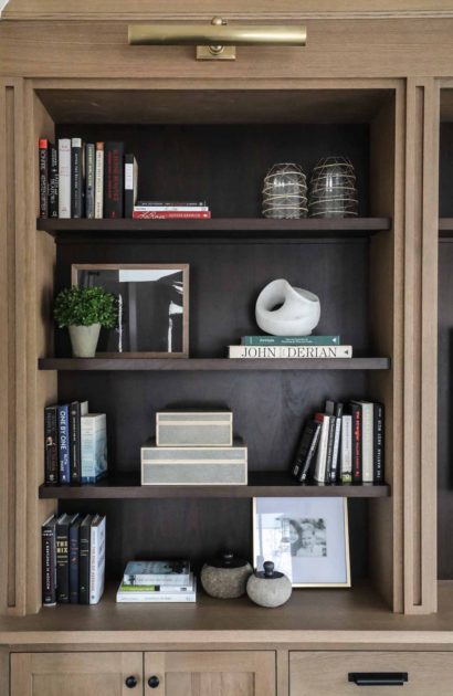
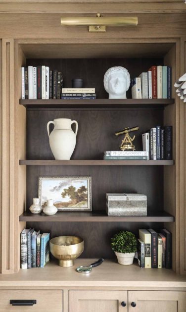
With plenty of cabinet and drawer storage below, there was room to get creative on the built-ins’ shelves, using a combination of the clients’ own books and art, plus some of Park & Oak’s favorites (we love a bust!).
A comfy chair for guests (or the occasional brain break) was a must. And lots of bright light means a plant will flourish here and help give life to the room. A light rug helps balance the dark wood floors, and a classic, unfussy roman shade finishes the room.
Check out the photo at the top of the post and see if you can spy the bar cart – the age of post-work cocktails needn’t end just because we work from home!

Welcome to Park & Oak
We’re a full-service interior design firm creating timeless, comfortable homes across the U.S. Our work blends beauty with livability—crafted with care, inspired by you.
Whether you're building your forever home or refreshing a single space, we're here to make the process feel joyful and effortless.

