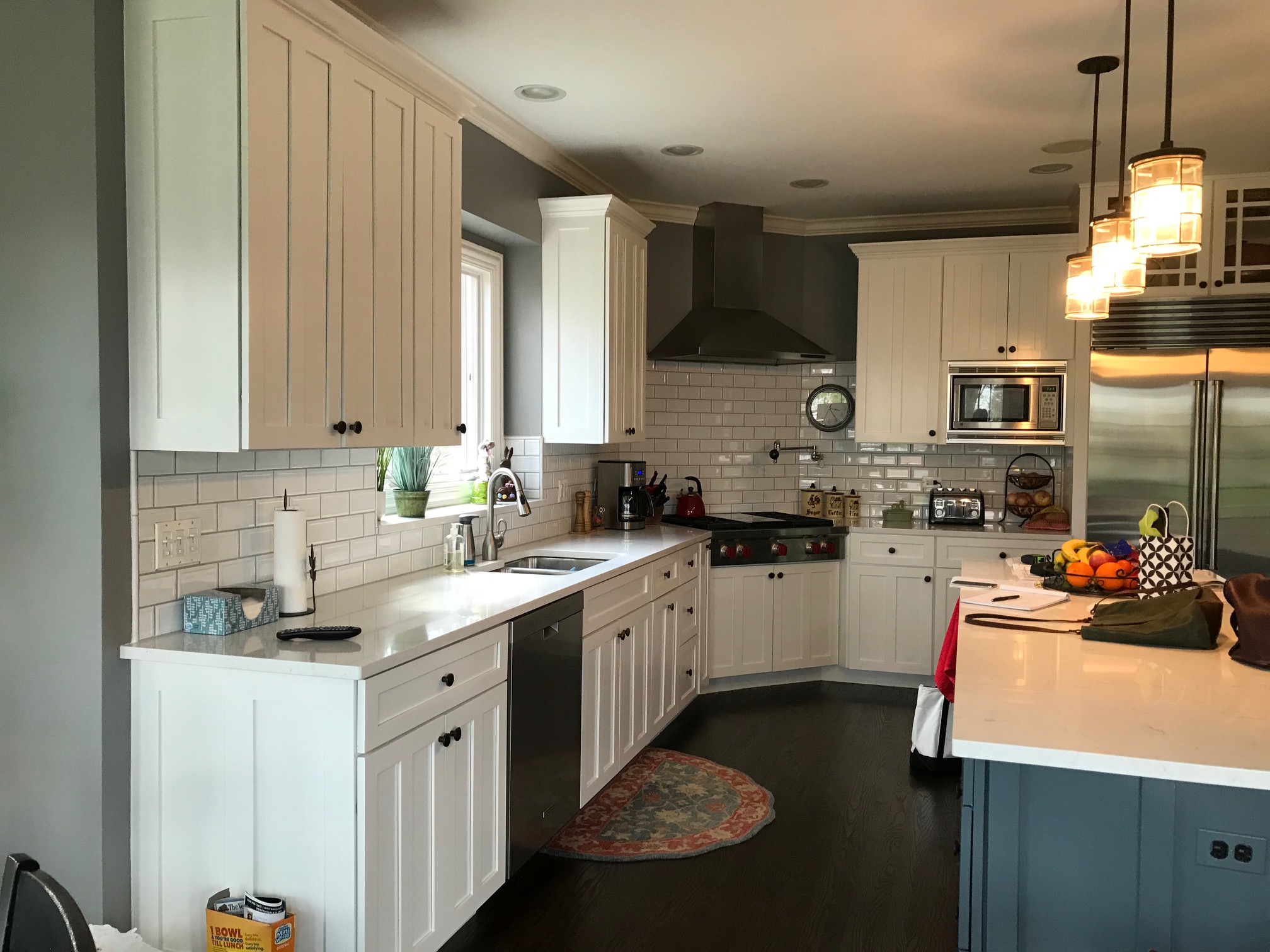
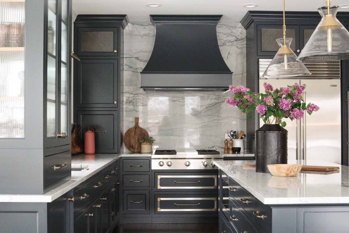
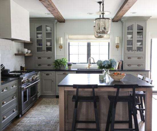
With our client needing to move into their new home on a short timeline, time was of the essence in the renovation of this Glen Ellyn kitchen. While significant structural changes were not necessary, you’ll see in the before & after shots that we made some tweaks that had big impact in making the space feel more balanced. Most notably, we squared off the corner where the original range was situated, and moved the range to the center of the wall where the refrigerator was situated. That small change went a long way in giving the eye sensible places to rest.
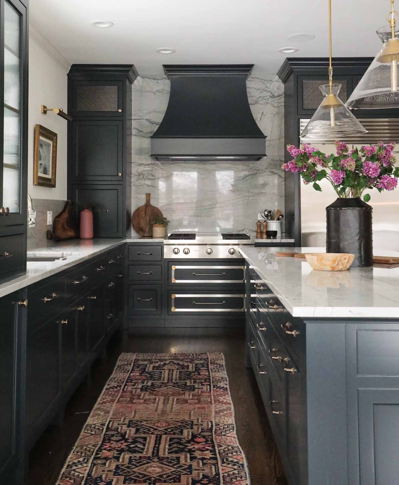
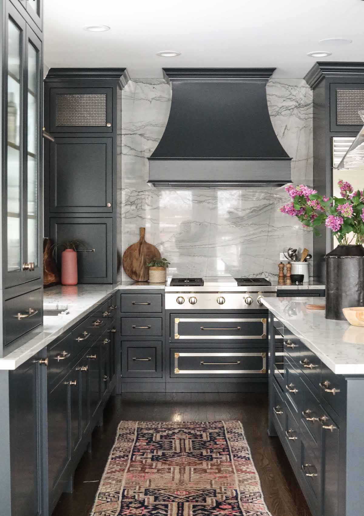
The new cabinetry and island, painted with Farrow & Ball Black Blue, are custom designed for the family’s specific kitchen needs. Reeded glass on the upper cabinet in the forefront of the kitchen has the effect of lightening up the space – as clear glass would – but diffuses the light and doesn’t require vigilant cabinet organization from the homeowner. The same is true of the mesh inserts used in the top cabinets on either side of the range. The mesh helps break up the cabinetry, and adds texture, detail and lightness. A larger island allows for more storage, and gives the family a place to gather.
In lieu of replacing the already new range, we opted to add a custom metal detail to the drawer fronts, giving this area its own special interest. Quartzite counters and backsplash make for durable, easy cleanup – a must with three teenage boys in the home.
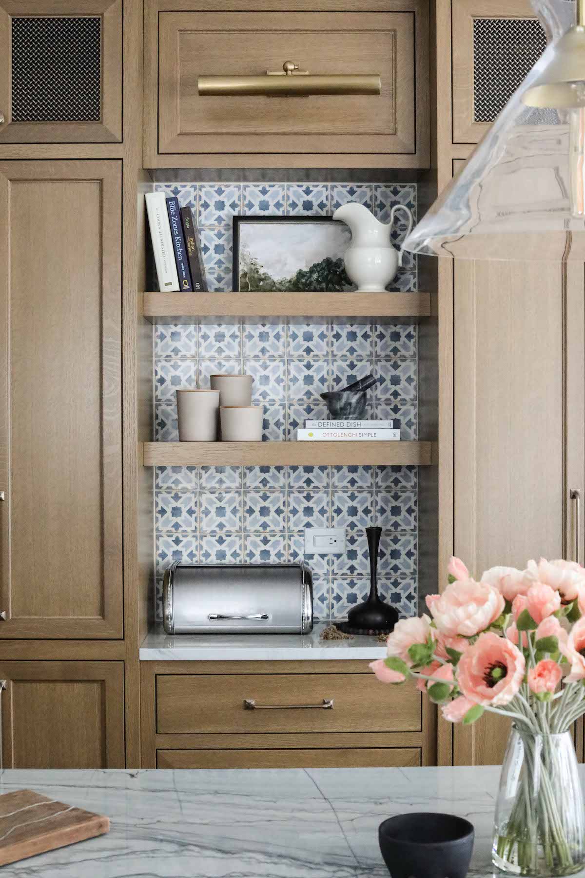
The original pantry wall felt a bit like it was floating in the space, so we cased the new pantry to give it more permanence, and made it larger to help accommodate the storage needs of the family. Wanting to give the kitchen a rich, lived in quality, and help break up the space as well as connect it to the family room beyond, we opted to stain the pantry versus painting. The tile is Casablanca ceramic from Bedrosian’s Tile & Stone, chosen for our color-loving client to bring some additional interest to the kitchen.
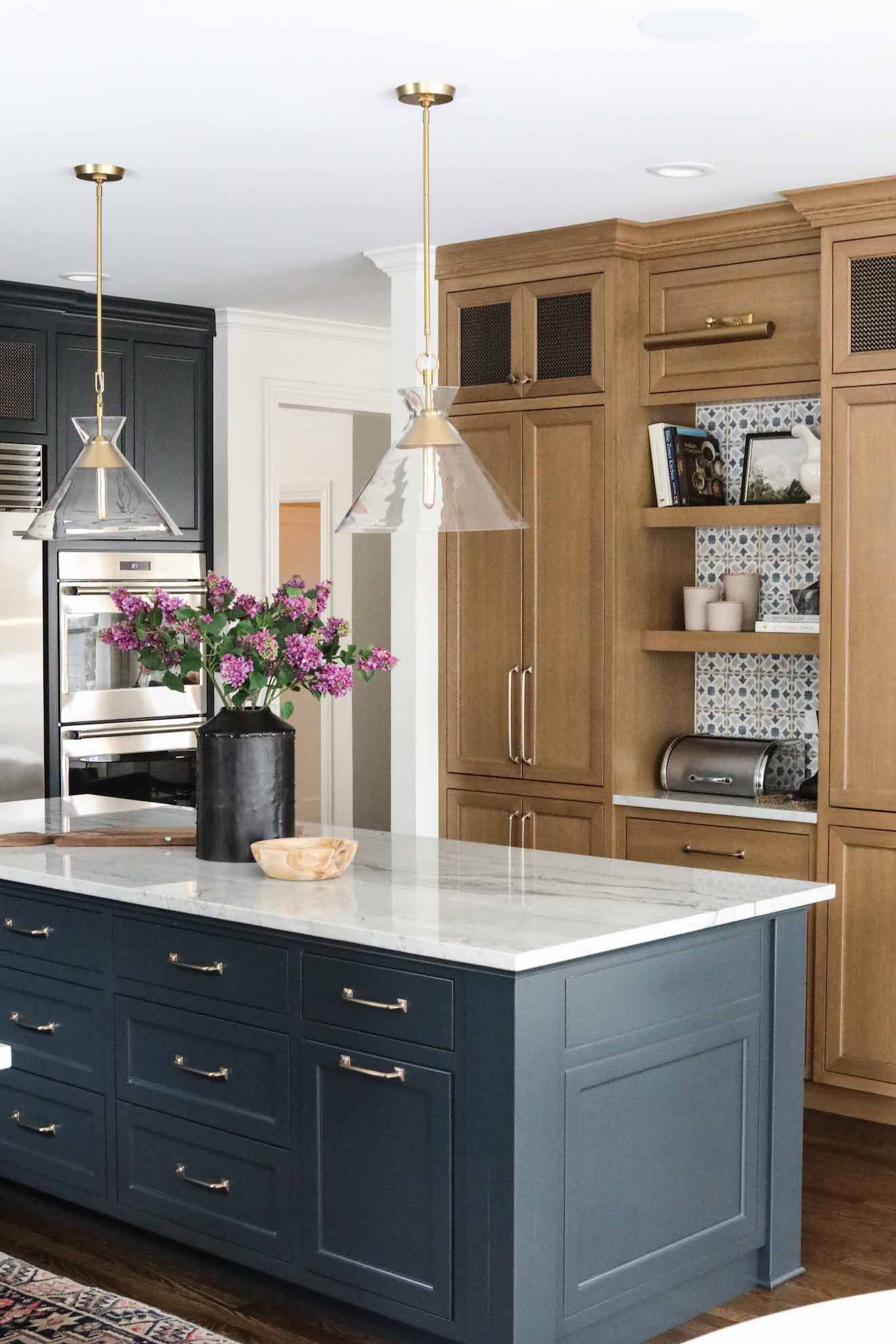
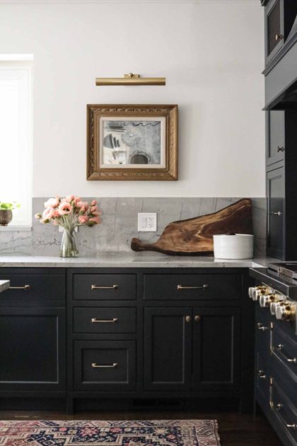
Finally, adding art is one of our favorite ways to make a kitchen – the place where many families spend the bulk of their time – feel like a comfortable living space. The art here is vintage, curated by our team, and we styled the shelves with some of our favorite accessories. We added a library light not just above the artwork, but in the pantry coffee bar, as well, to really drive home the idea that this is a cozy, welcoming space.

No Comments