We’re hoping these hostess gifts below will help you shop for this weekend if you have not already done so. Or, if you’re more ahead of the game than me, these can also be used for last minute gift ideas for teachers and coaches. Happy shopping!
We’re hoping these hostess gifts below will help you shop for this weekend if you have not already done so. Or, if you’re more ahead of the game than me, these can also be used for last minute gift ideas for teachers and coaches. Happy shopping!
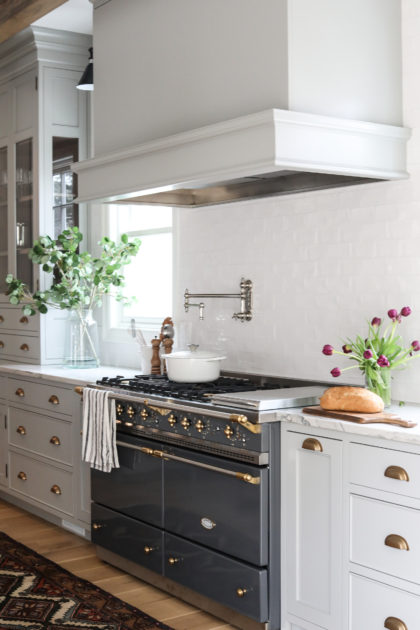
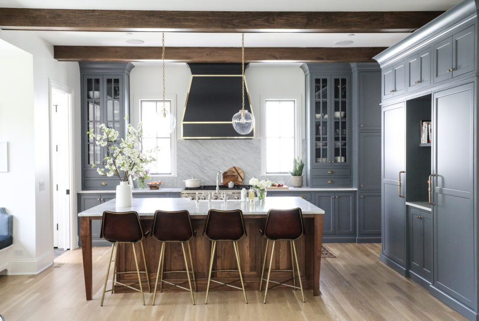
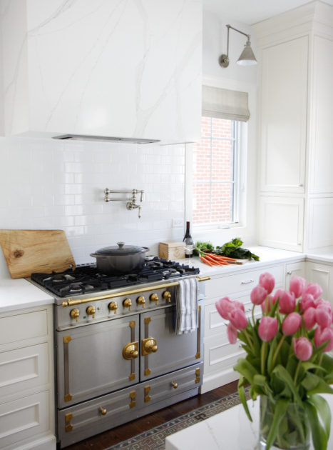
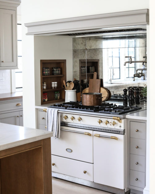
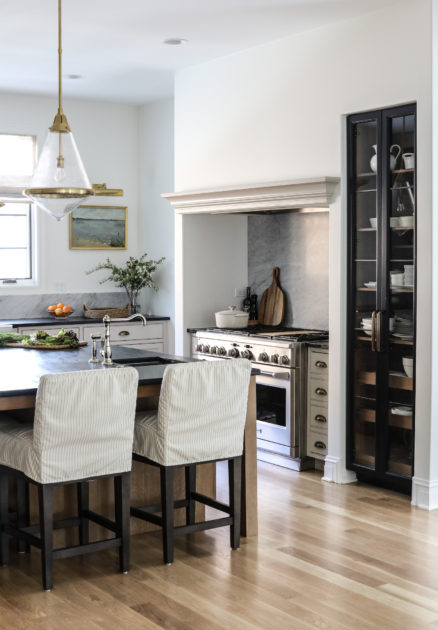
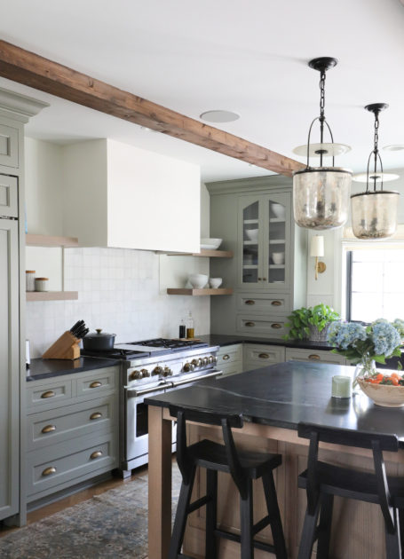
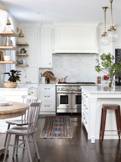
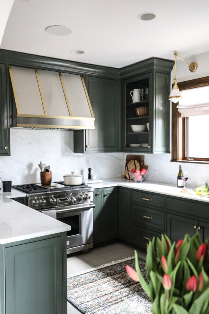
When you dream about a new kitchen, what do you picture? Marble countertops? Custom-stained cabinetry? A magnificent French range? You are probably not immediately besotted with a particular style of range hood, though, right? Ah, but that is the one element with the power to tie it all together. The range hood can be the difference maker. The focal point in a kitchen full of understated elements. Or the quiet place in a showstopper kitchen where special details abound in the cabinetry, fixtures or counters, or, the striking range or backsplash right below it.
Like many elements of a kitchen, the range hood serves a specific purpose and is restrained by any number of code requirements, depending on where you reside. But here’s the thing about range hoods. Beyond those codes, the options are, quite literally, endless. We start with a basic hood insert, and then will revisit the custom choices for the finished design dozens of times. Endless study goes into discovering the balance of the right shape and material for each individual kitchen. There is no one size fits all. And this is where our designers really shine. When we talked about this blog post, Joanna, one of our lead designers, called range hoods “a designer’s paradise.” It’s an area where our collaborative team delights in coming together to create *just* the right hood for your kitchen.
Will it be copper? Brass? Stone? Or designed as cabinetry? Plaster? Fluted? Squared? Should there be a trim detail? We have experimented with all of these materials and more for a completely custom hood for each project. This can be the functional art for your kitchen. Don’t overlook it!
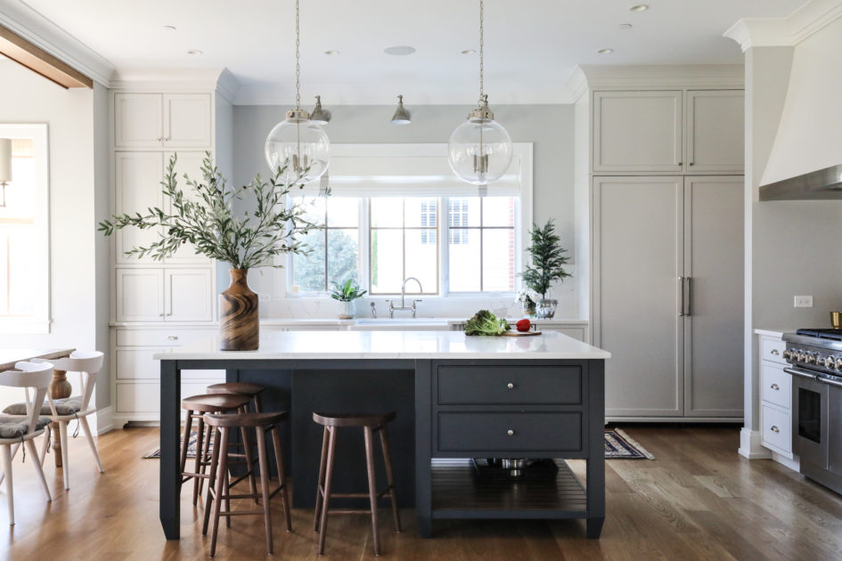
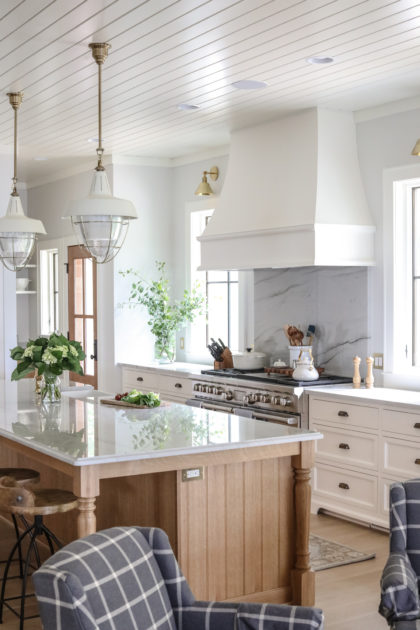
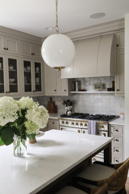
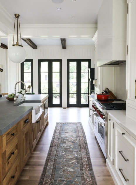
See some of the custom range hoods we created for previous projects in the gallery below.
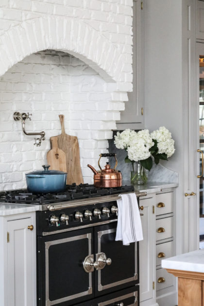
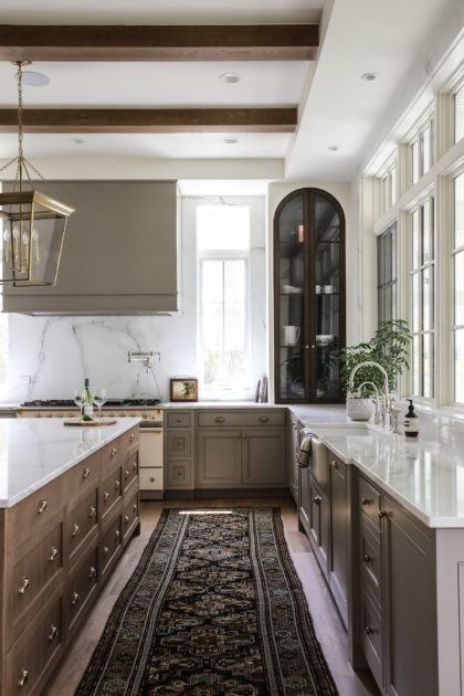
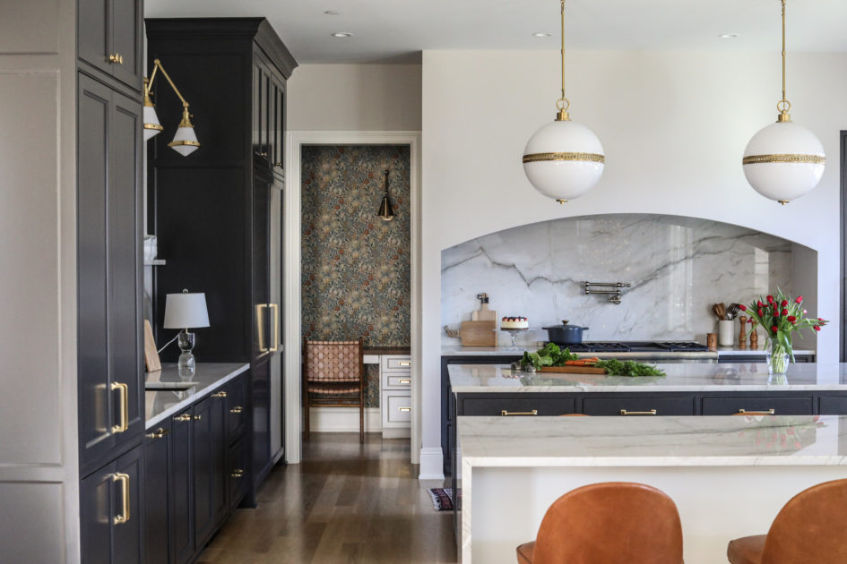
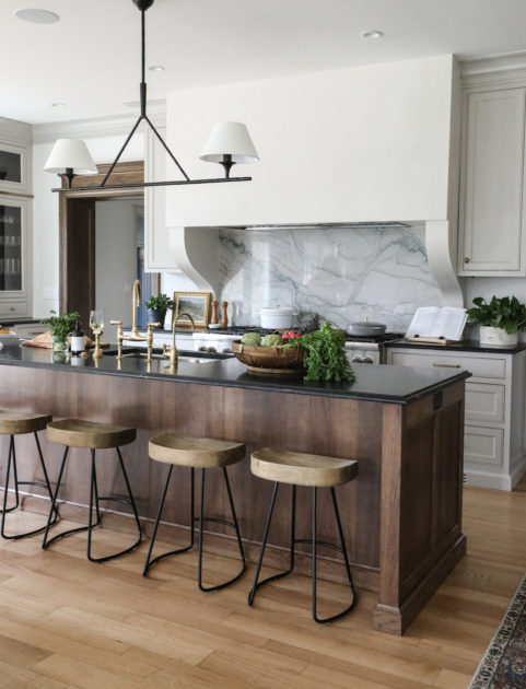

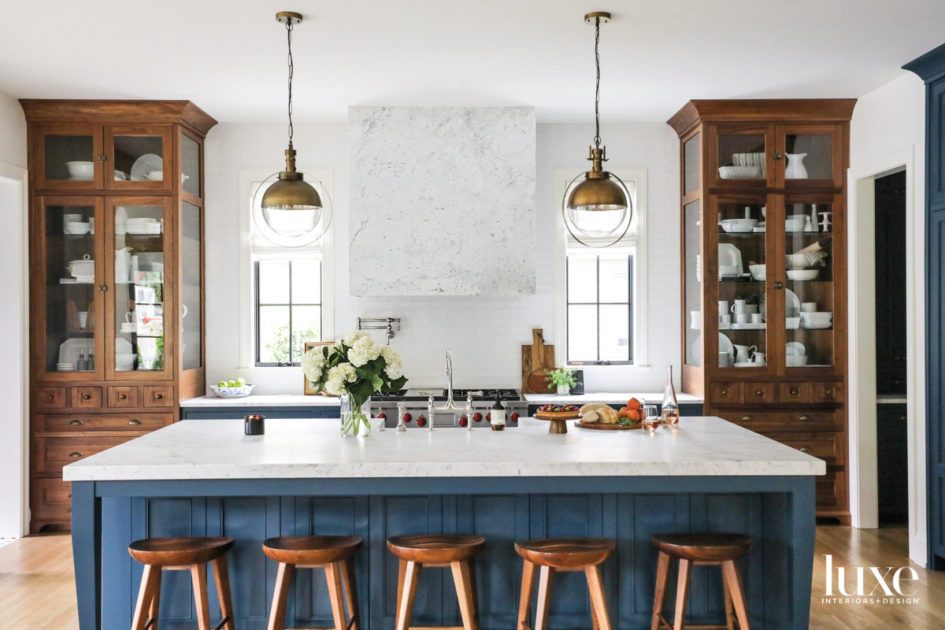
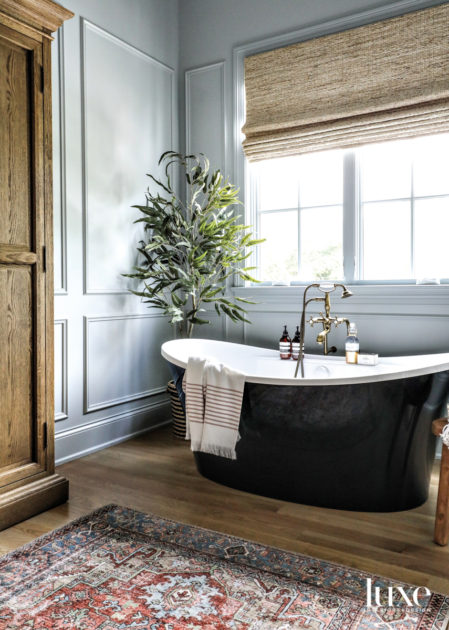
We are so proud to share that last week we were honored with two Luxe RED Awards in the regional categories for Kitchen and Bath. The Luxe RED Awards, sponsored by the Luxe Interiors + Design magazine group, recognize “excellence, innovation and the best residential architecture, interior design and landscape architecture projects across the country.” The Awards include submissions by many of the nation’s top design luminaries and are judged by a multidisciplinary panel of industry experts.
While our winning rooms are pictured below, we strive to bring this level of design to every project and are proud of all the work we do together with our clients to make each space remarkable. Thank you for trusting us with your most cherished spaces!
In any new build kitchen, part of the challenge and reward is in creating a space that has character. That doesn’t yell: “Look at me! I’m new!” Each design should also reflect the owner and take into consideration their unique needs and preferences. It’s in these details that a design comes to life and becomes more than just drawings on a page.
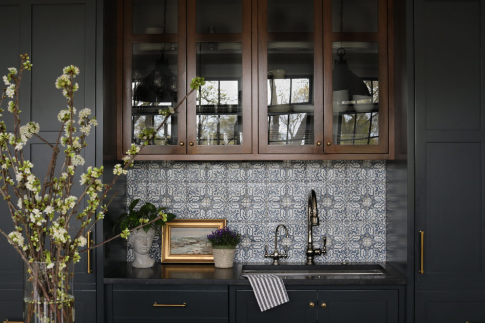
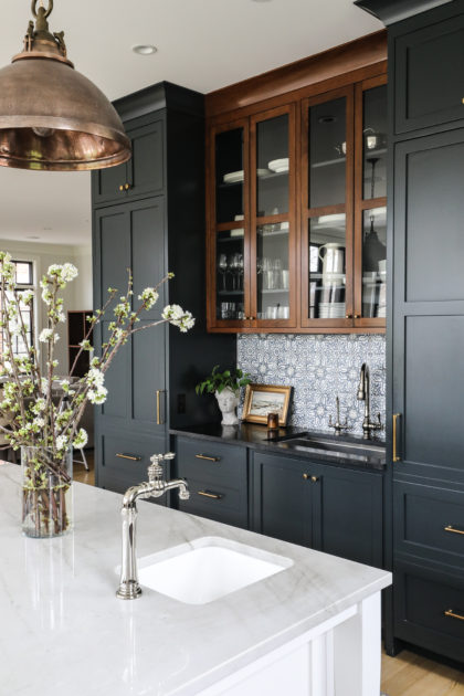
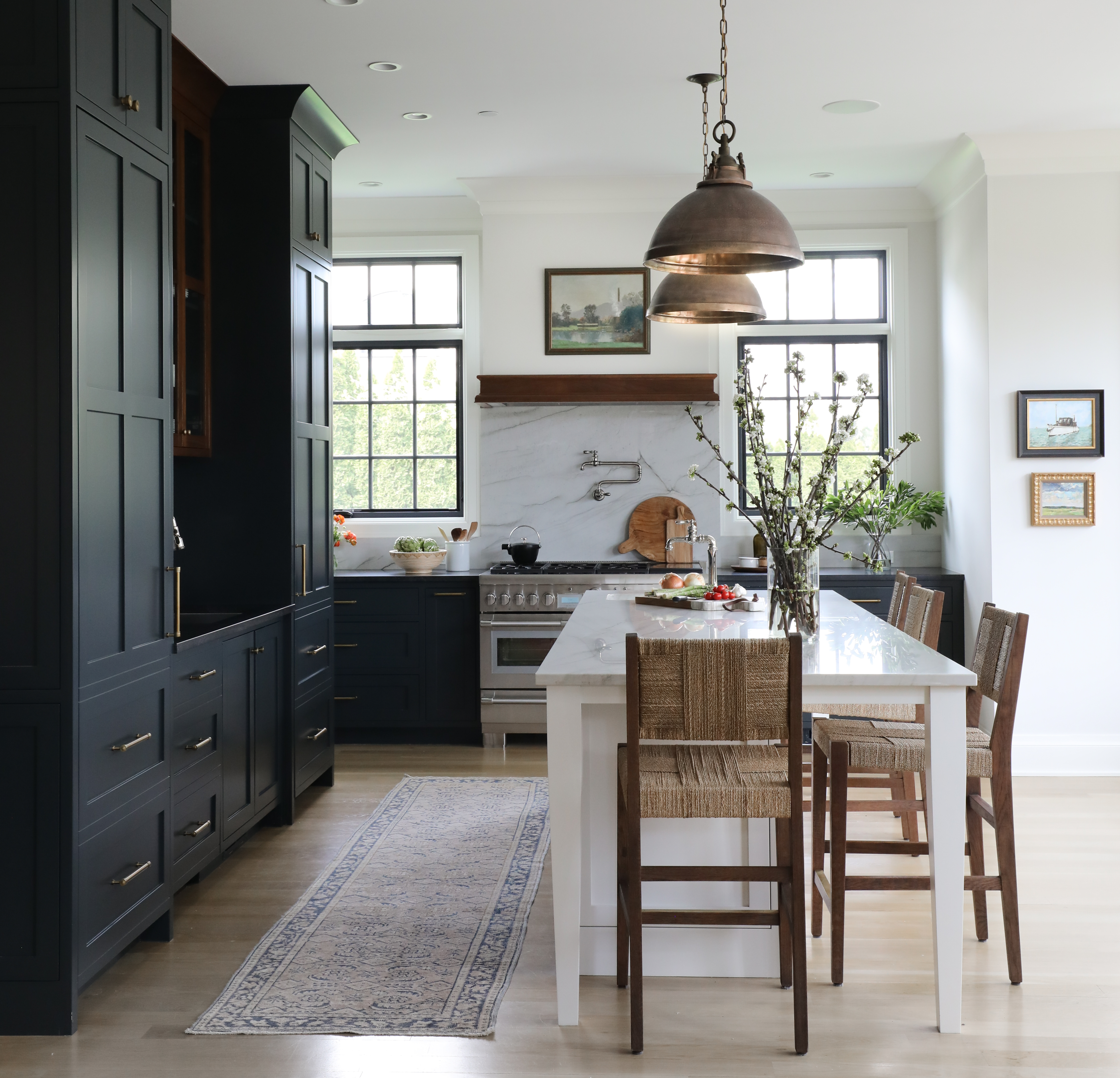
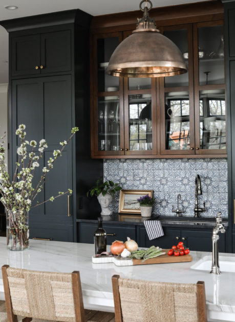
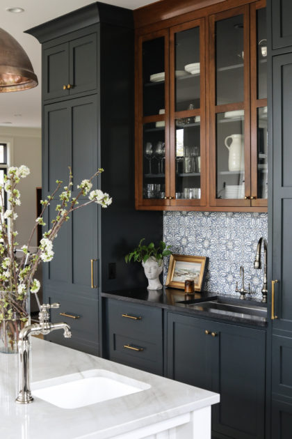
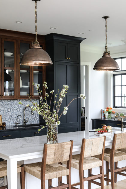
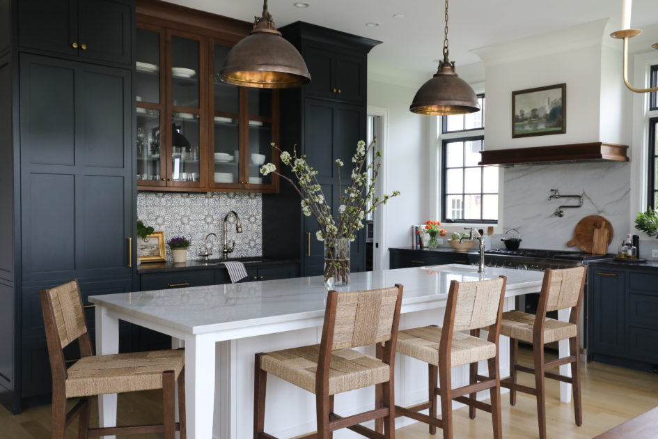
In the Park Ridge kitchen, our clients felt strongly about keeping the full-size sink off the island, but also really wanted the convenience of a prep sink. We love a little creative space planning, and the end result is a placement for both sinks that feels intentional, gives interest to the room and still meets our clients’ distinct needs. The location of the main sink along the back cabinet bank also gave us a great opportunity to highlight the beautiful Tabarka tile. Tabarka is renowned for their collections of terracotta tile that are formed, painted and glazed by hand. By locating the sink here and adding a pretty Kohler Artifacts faucet, focus will always come to this special tile.
To further highlight the area, we chose to stain the cabinets just above the tile in a higher sheen than their painted neighbors. This helps lend the look of an antique piece, and is also a striking backdrop for the copper island pendants, whose patina gives depth and warmth to the room.
These small details all come together to give this new kitchen a touch of old world character.
Doesn’t spring in New York sound lovely? We’ve been cooped up a long time, and Manhattan is calling. Here are some of our favorite boutiques and galleries in NYC – see you there?
200 Lexington Avenue (Midtown)
Before Thomas O’Brien was a household name thanks to his partnerships with Marshall Field’s, Visual Comfort, Waterworks, Target and more, there was Aero, the retail partner to O’Brien’s design firm. Recently relocated to Midtown from its long run in Soho, Aero features O’Brien’s latest finds in a revolving selection of antiques, art, tableware and refurbished vintage modern furniture.
5 Crosby Street (Soho)
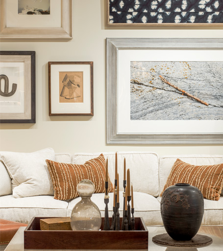
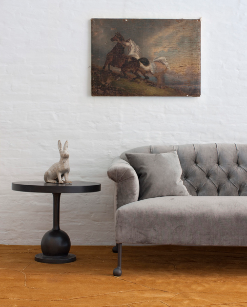
Founded by artist Tyler Hays, BDDW is recognized internationally for their individually designed furniture, ceramics and clothing. All pieces are fabricated in Hays’ Philadelphia studio by local artisans and craftspeople. The Crosby Street location is their flagship, but you can also find an outpost in the mother of all fashion and design cities: Milan, Italy.
548 1/2 Hudson Street (West Village)
A mecca for mid-century glassware and pottery (think Murano and Blenko). Their largest-in-the-world collection has been carefully curated by owner Stephen Saunders since 1997 and is organized by color, making for striking displays.
55 Great Jones Street (Noho)
With a flagship in the heart of the Bowery, The Future Perfect is as much gallery as retail. Limited edition contemporary furnishings accompany exhibitions by up-and-coming artists.
55 Great Jones Street (East Village)
What started with Derian’s signature, sought-after decoupage became a home goods destination for vintage and antique furnishings, linens, stationary, lighting and art.

25 West 29th Street (NoMad)
Wedding planner to the stars Jung Lee branched out into home retail and the fashionable betrothed of NYC did a happy dance. Her impeccably curated collection of home goods and furnishings (perfect for your registry!) is celebrated for being unusual but timeless. Think everyday with a glamorous twist.
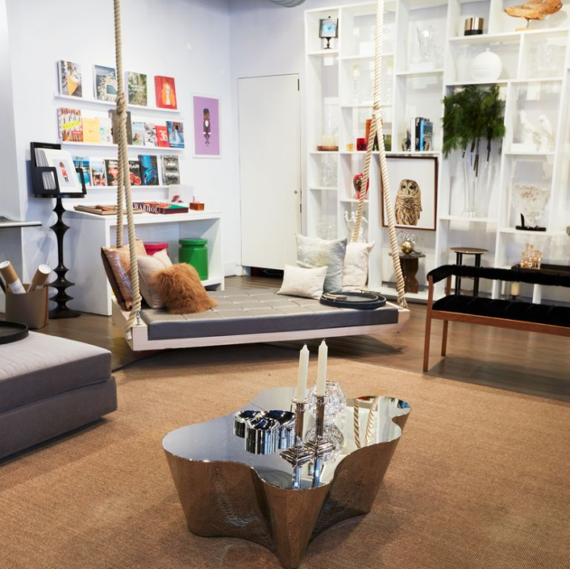
962 Lexington Avenue, Manhattan (Upper East Side)
Mecox is so committed to providing inspiration to their clients they have completely changed the floor displays of their upscale home and garden furniture and accessories every Wednesday since 1998. Based originally on Long Island, the emporium now has nine locations across the country.
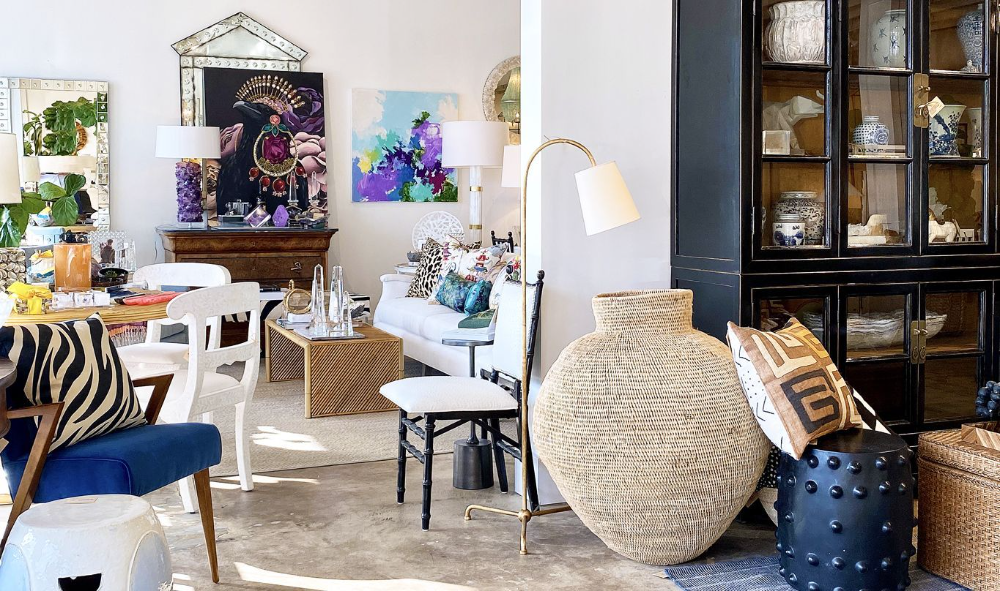
8 Centre Market Place (Little Italy)
Though sometimes billed as “boho-chic,” fashion media darling No. 6 stocks an impressive selection of statement pieces from talented local and international designers. Insider tip: Don’t miss the clogs.
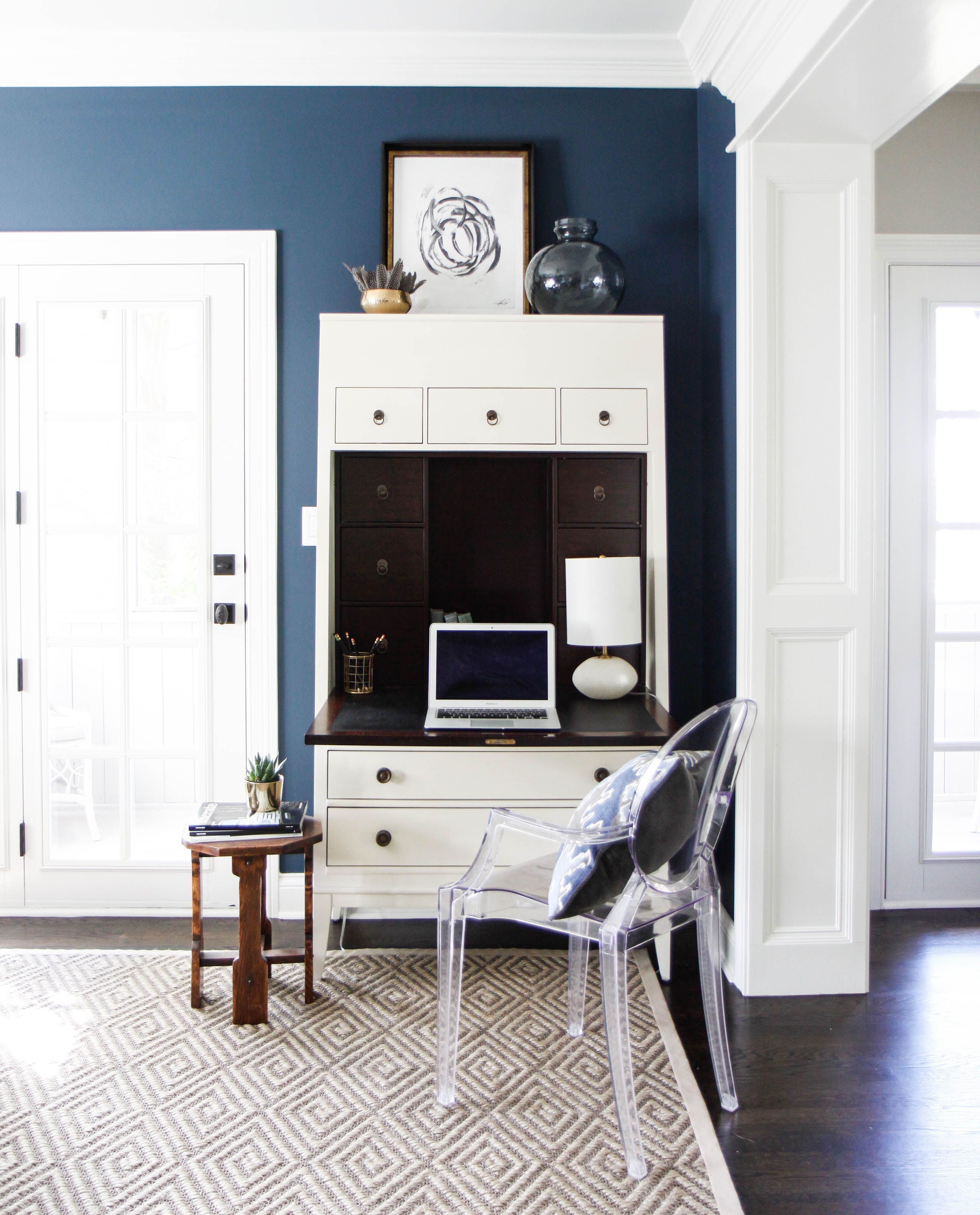
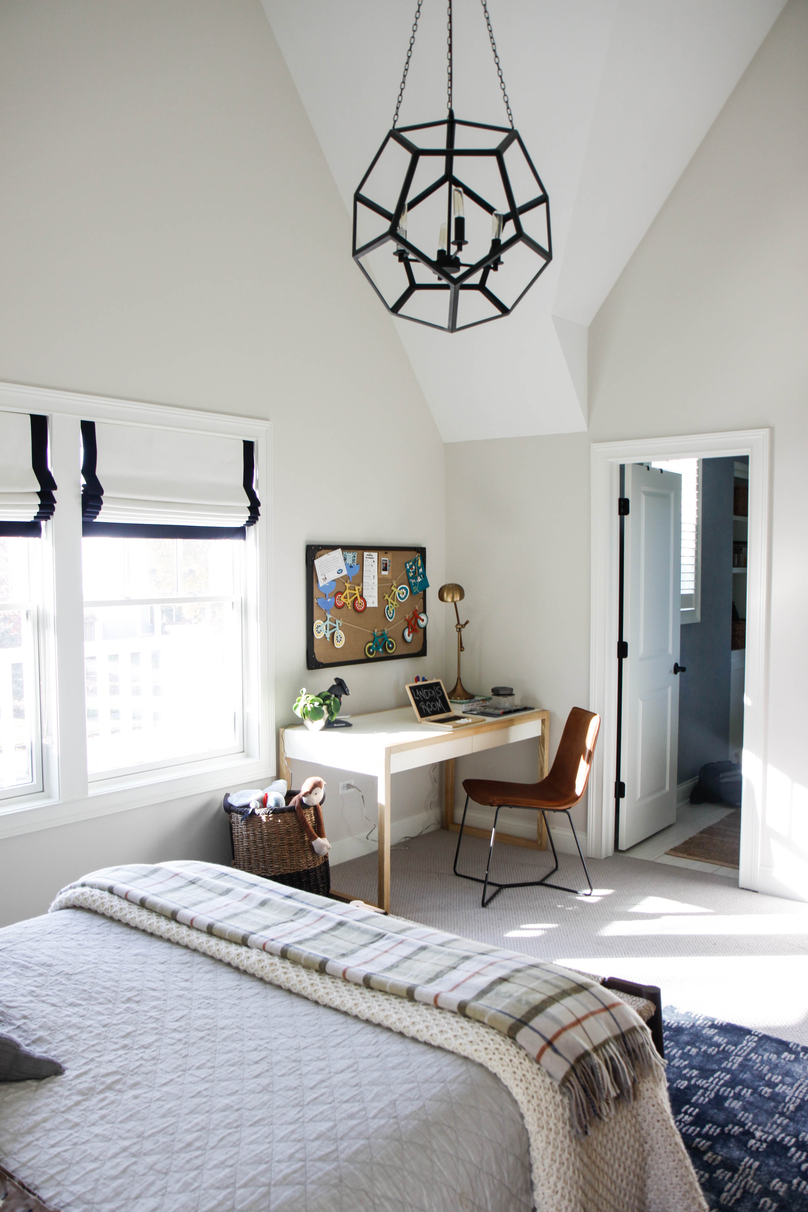
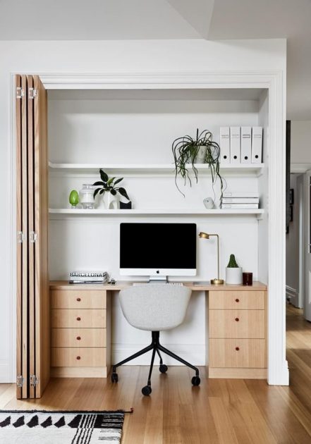
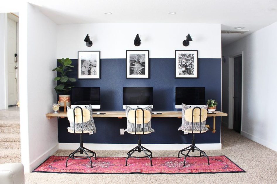
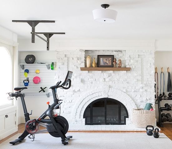
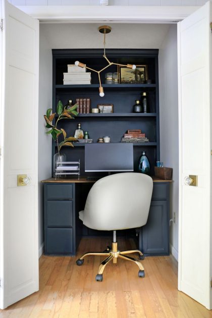
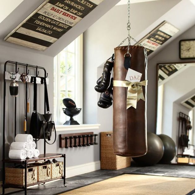
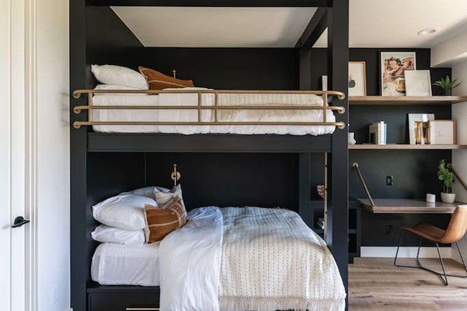
One outcome of the past year has been a space reckoning inside our homes. Suddenly, homes that seemed plenty big enough to work, play, cook, entertain and study started to feel very cramped. Much the same time we started to reassess space-planning in our own homes, our clients also began to reach out, trying to figure out how to squeeze home gyms into a little-used guest rooms, children’s workspaces into closets and full-fledged offices into whichever nook and cranny that was available. Spy the desk peeking out from the corner of the laundry room in the photo above?
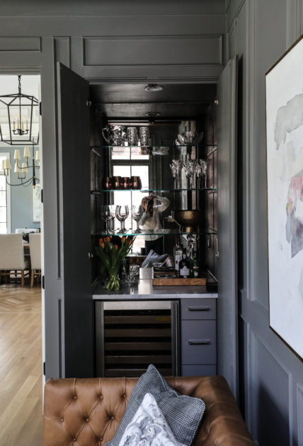
Helping our clients find space for the things mattered during a difficult year was incredibly rewarding. And like many of you, as our lives are starting to return to normal, we are so grateful to have transformed our homes into more functional spaces for the various needs of our families. Need some inspiration for a little creative space-planning of your own? See some our and others’ solutions below.
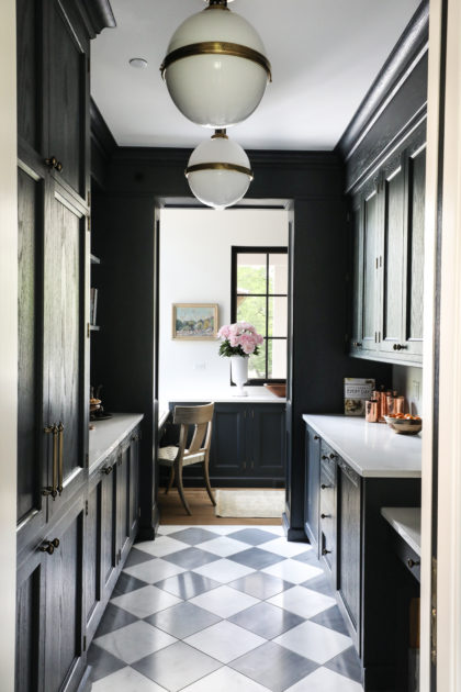
Part of what is so rewarding about working with an older home is the imagination required to take a space not necessarily built for modern living and bend it to meet the needs of a modern family. So when we initially met with our Glenview client in November 2019, we expected to navigate some tricky details in the renovation of their 1950s-era colonial home.
What we could not anticipate was that four months into the project, a global pandemic would turn everything upside down, making on-site consultations impossible, supply chains unpredictable and carefully staggered scheduling of contractors an absolute necessity. Like so many others, we stretched to learn new ways to work and found creative ways to design and communicate from afar. Through it all, our clients were unflappable, trusting us every step of the way to manage these hurdles and deliver the renovation they had dreamed of.
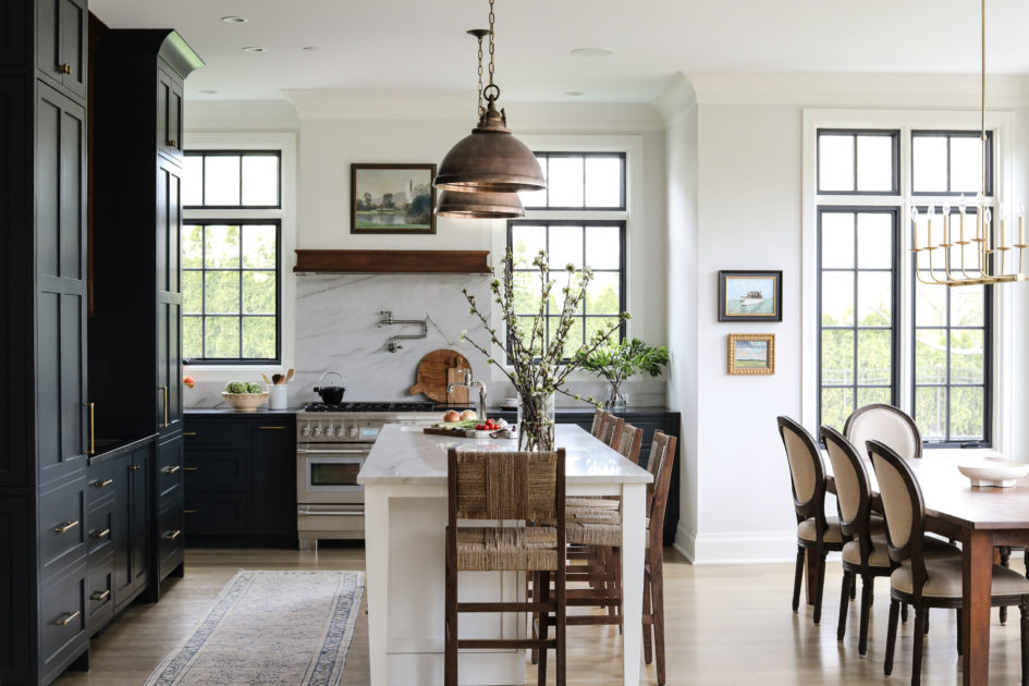
The centerpiece of that renovation is an open, spacious kitchen for cooking and entertaining. The original footprint of the home had been added to in the 1980s, creating additional living space but still leaving a cramped, galley-style kitchen. With some creative space-planning and an excellent partnership with the incredibly talented builder-architect firm Louis Banks Design Build, Inc, we were able to relocate the kitchen to the little-used living area, combining two spaces into one large room. The original home featured many fine details, including white oak floors and detailed casework; we mimicked these features in the renovated kitchen, seamlessly blending old with new to leave the homeowners with a space that retained the character of an old home but with the conveniences of a new one.
From our wonderful client:
I cannot speak highly enough about the Park and Oak team. We renovated our 1950s home and somehow Park and Oak brought it up to modern times while keeping the historic charm. It’s elevated style yet incredibly warm and inviting. Their team embraced design elements that reflected the essence of our family and … brought the style back into this home that it deserves and it’s perfect!
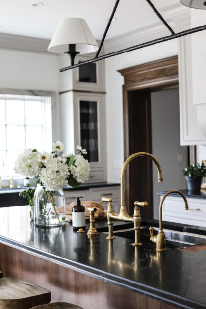
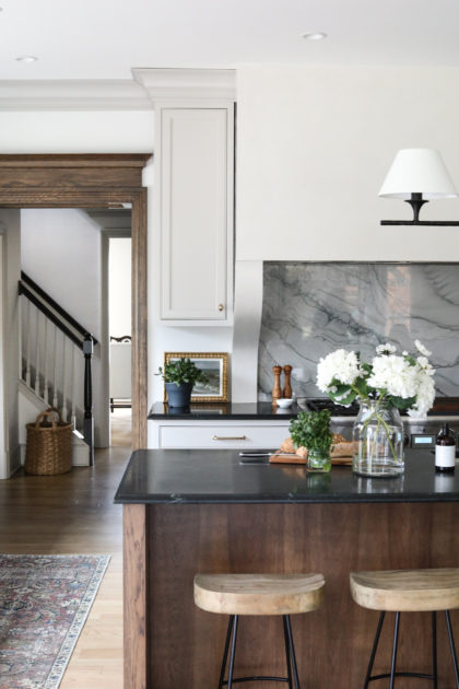
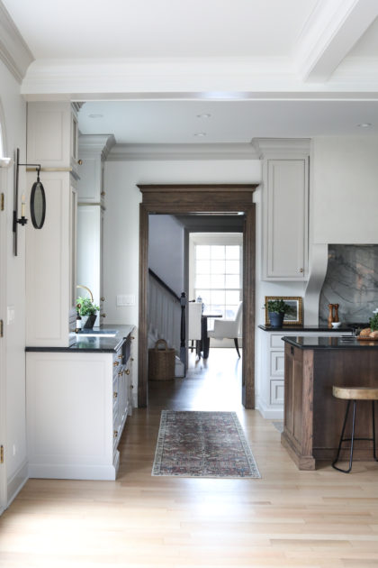
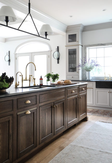
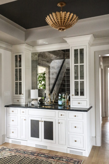
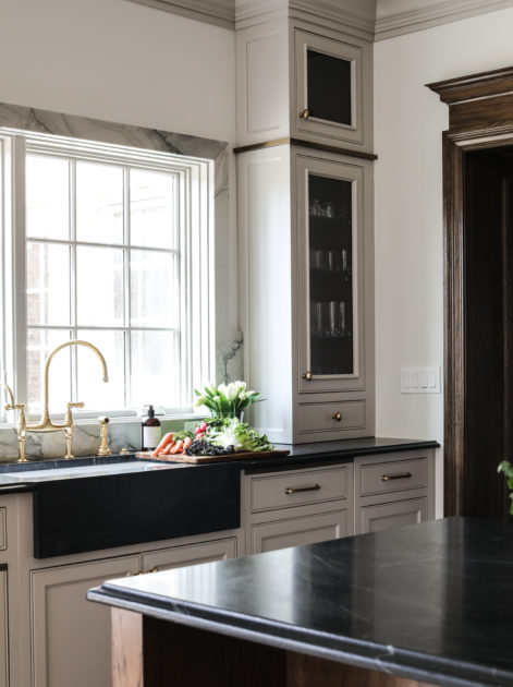
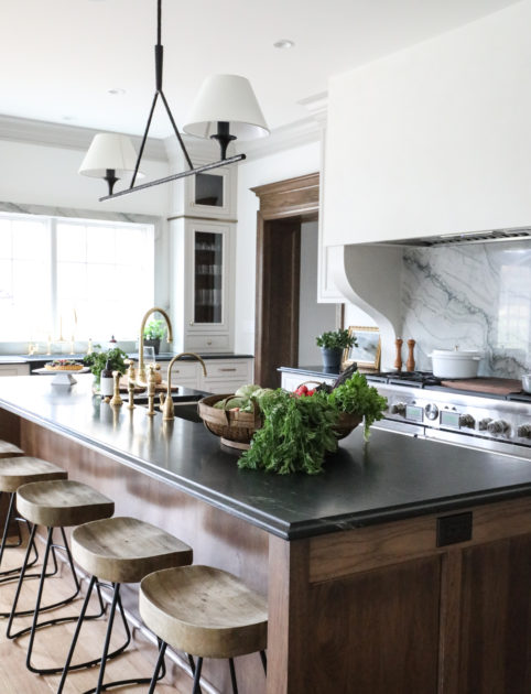
If you were getting ready to renovate your kitchen, what would you start daydreaming about first? A showstopper French range? An integrated double-door refrigerator? A coffee bar? Marble everywhere? Before we get too carried away, let’s pause for a moment. We’re here to tell you maybe you should be dreaming about…your faucet.
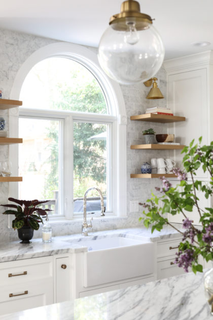
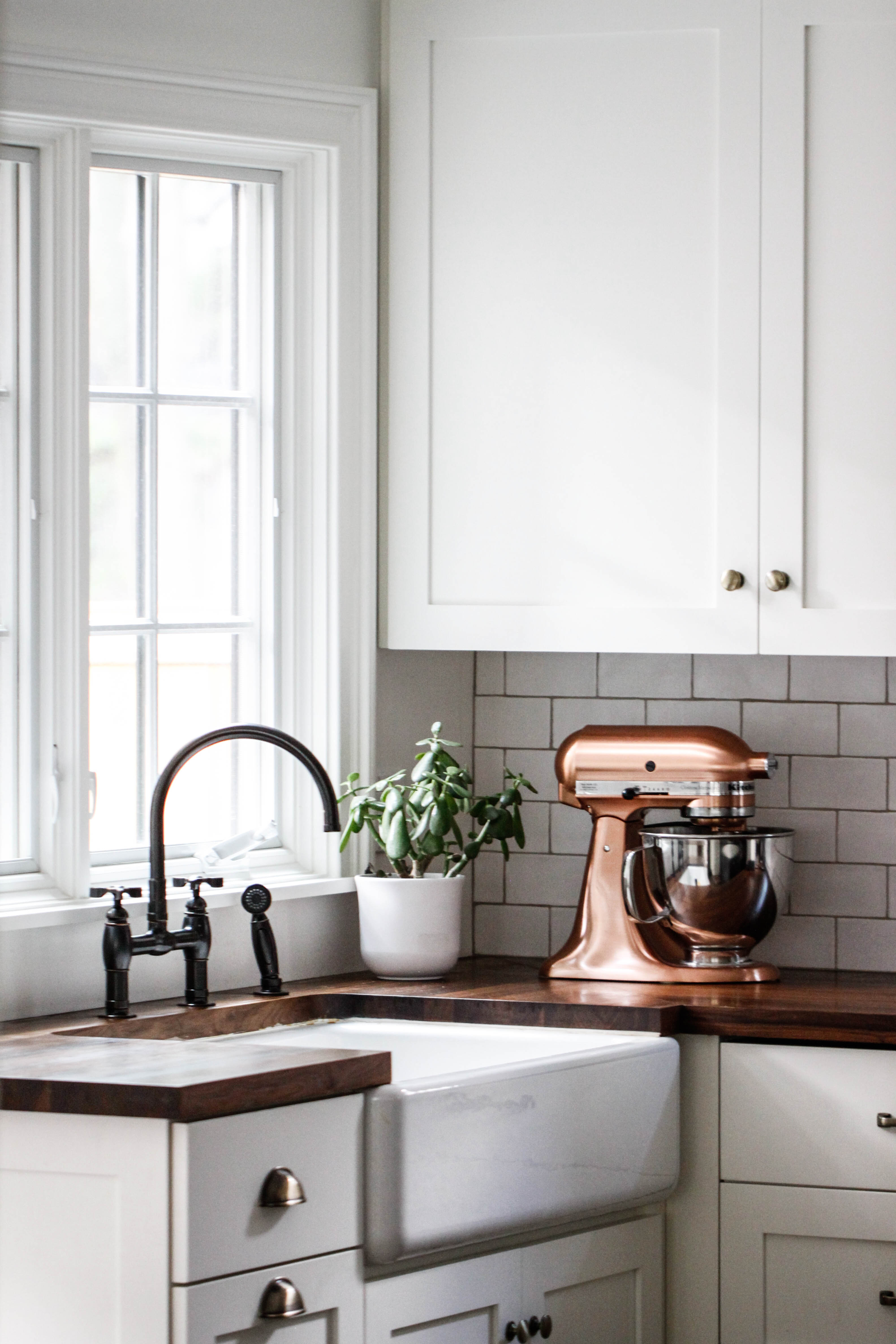
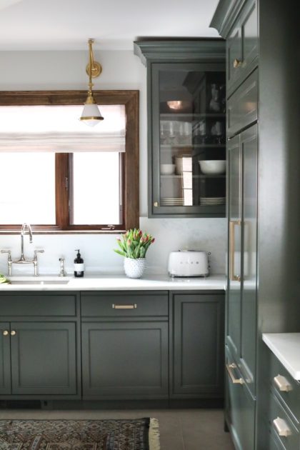
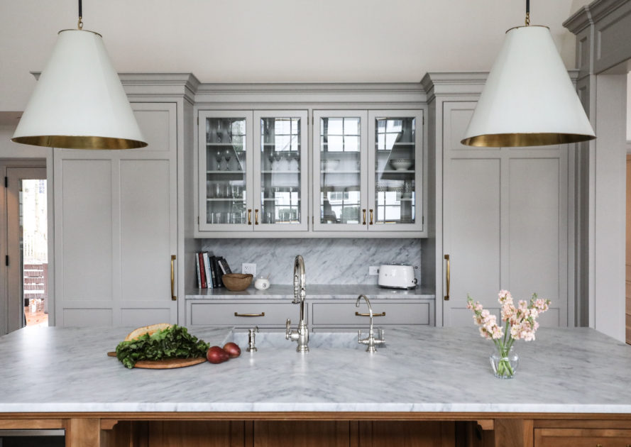
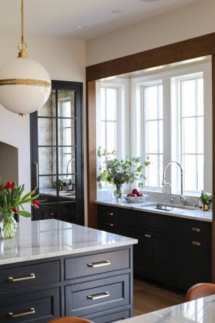
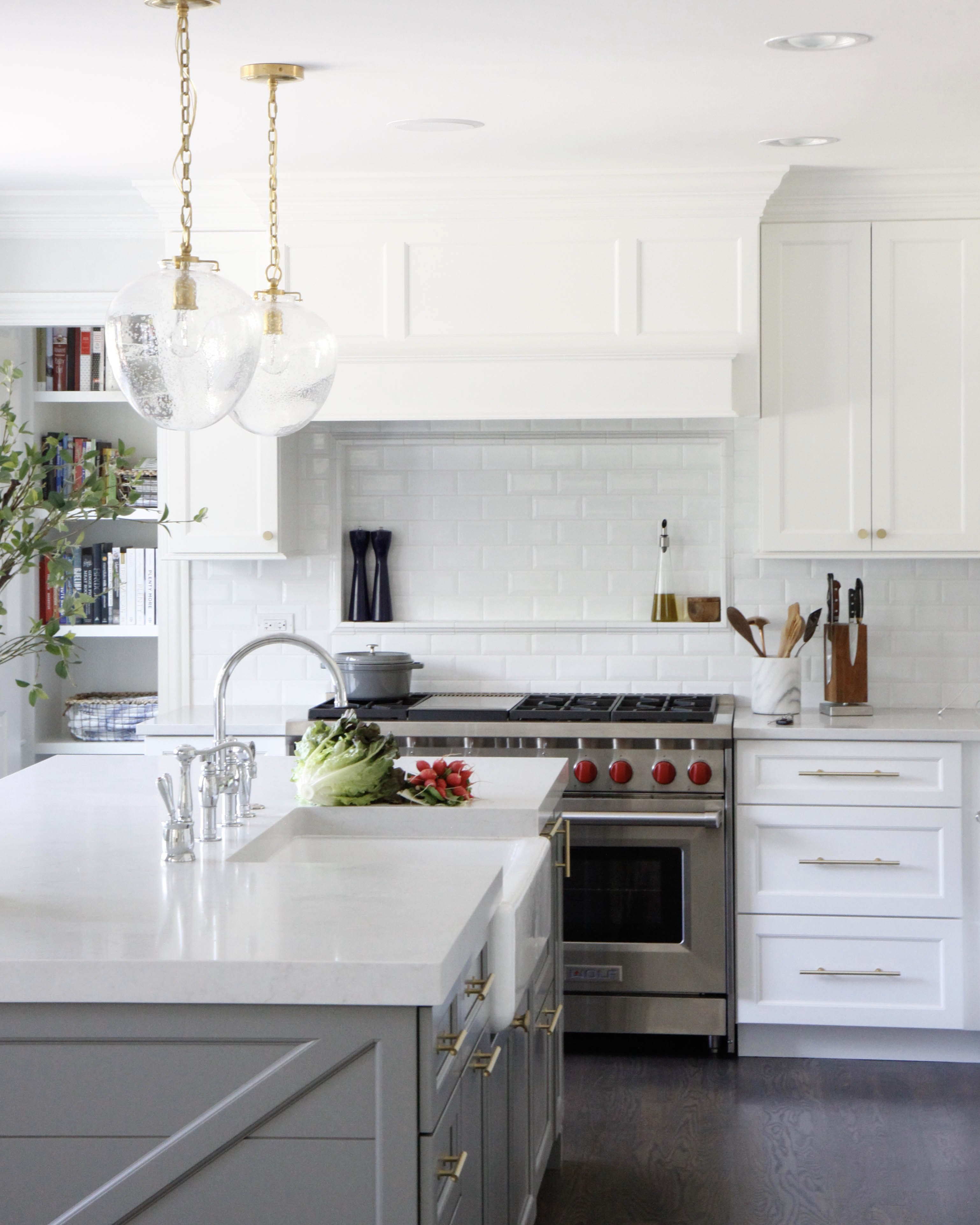
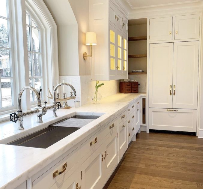
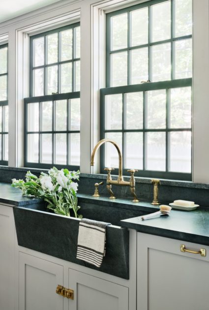
We know. It wasn’t your first thought. But consider the most used feature of your kitchen. It’s probably your faucet, isn’t it? Which means you are spending as much (or more!) time looking at it as that glorious range. So why shouldn’t it be beautiful, too? Fortunately, there are many gorgeous options available to upgrade the style of your faucet. Browse the gallery for kitchen faucet inspiration and then see our round-up below to shop a selection of our favorites.
Pictured above: Perrin and Rowe Bridge Faucet
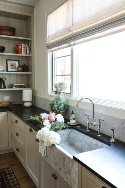
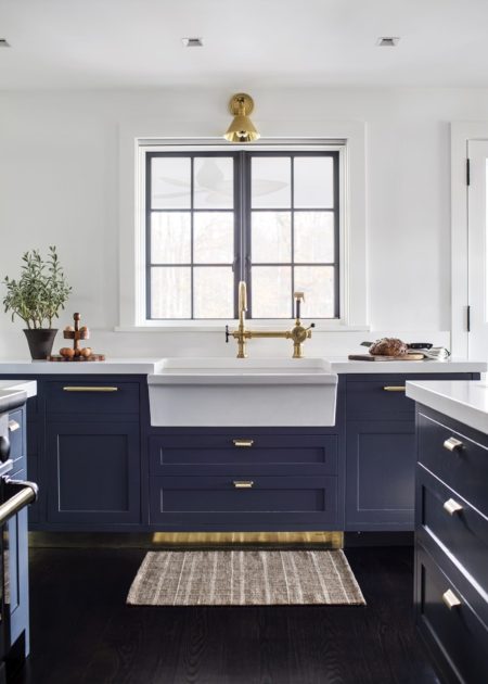
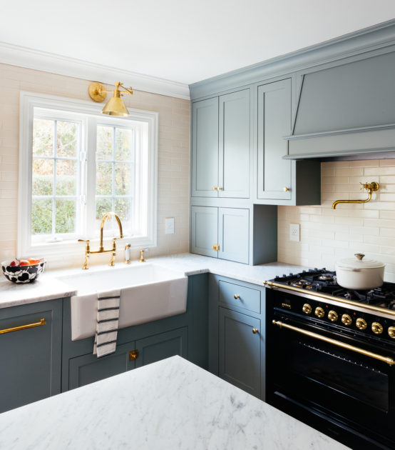
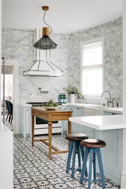
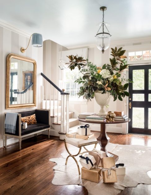
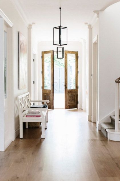
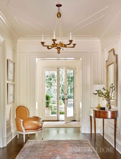
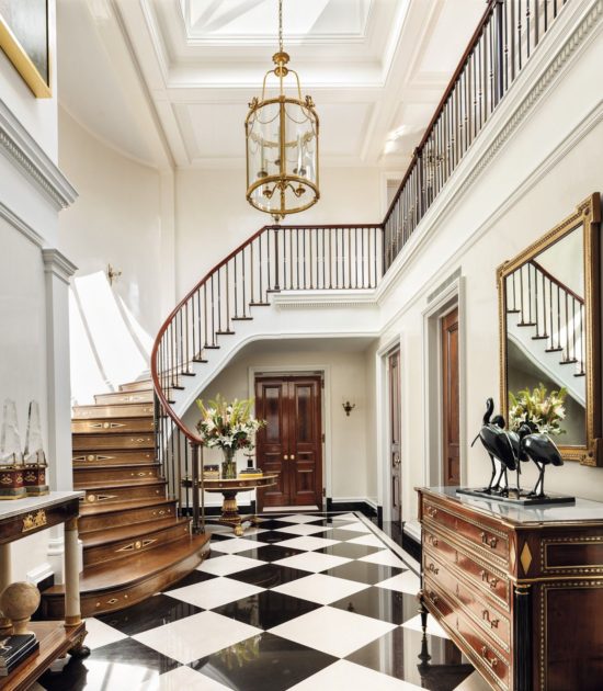
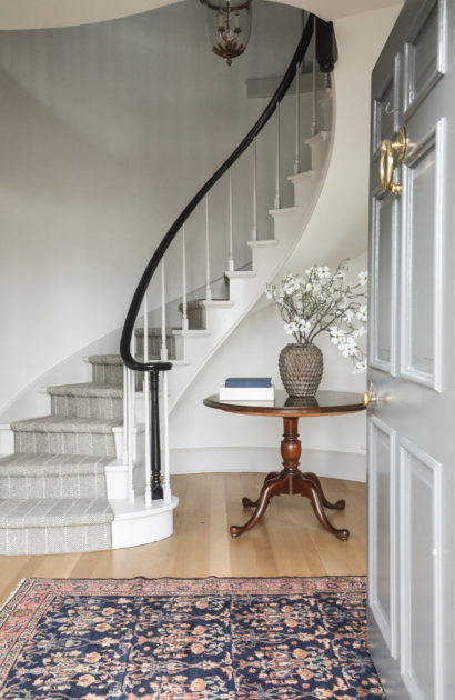
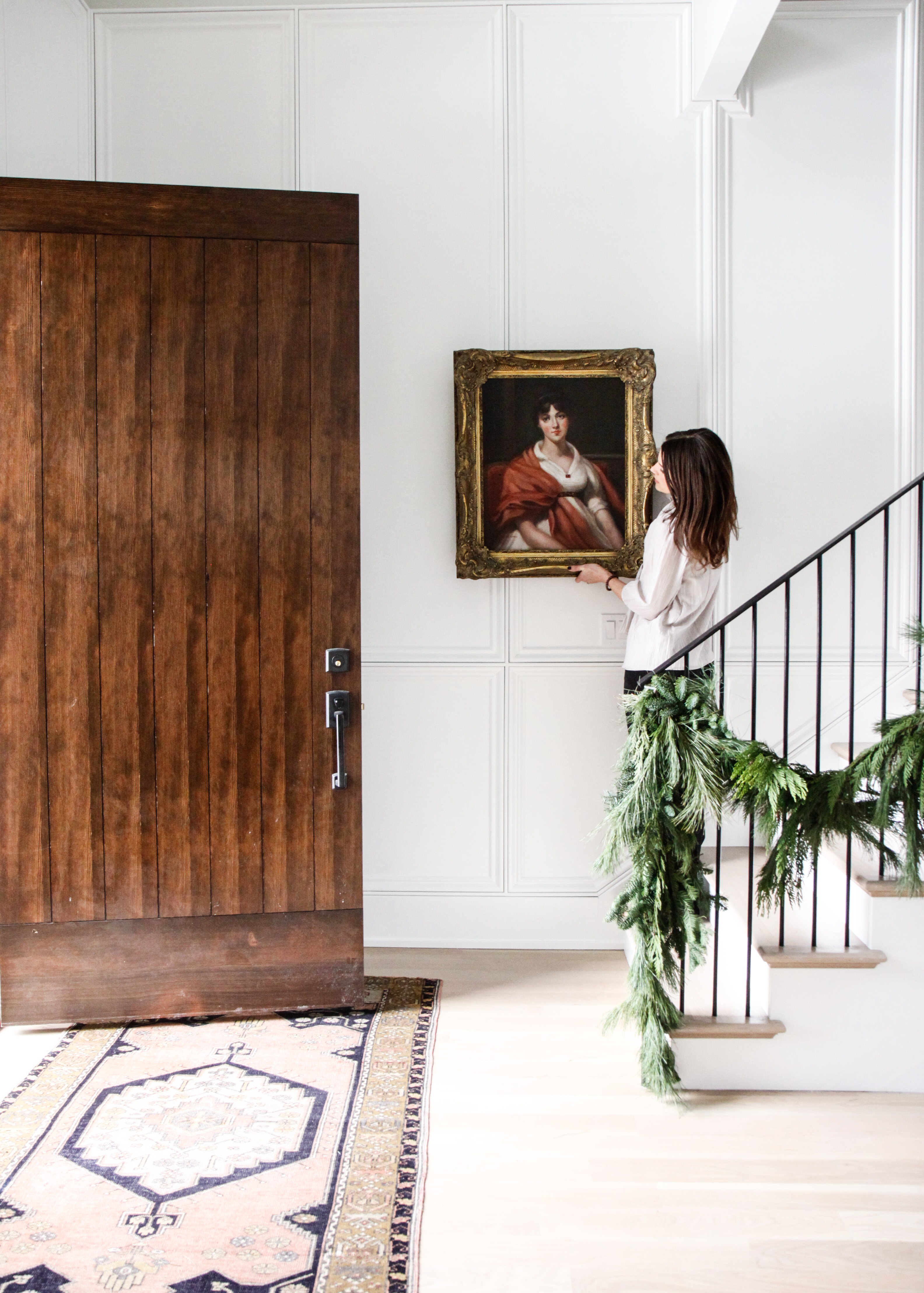
Think about the first time you go to visit a new friend. Have you wondered what the inside of their house will look like? We do! Are they minimalists? Maximalists? Do they love all things mid-century? Crazy over antiques? Full of curated art? Maybe you’ve hedged some guesses based on what you already know about your friend – how they dress, what they read, what movies & tv they like. These things are all related!
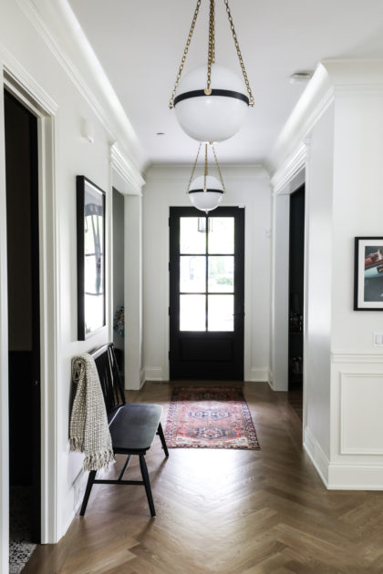
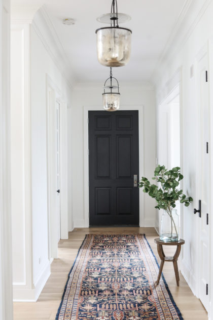
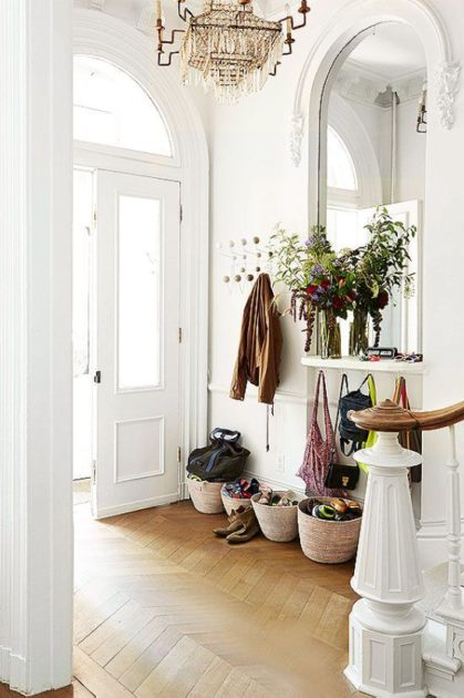
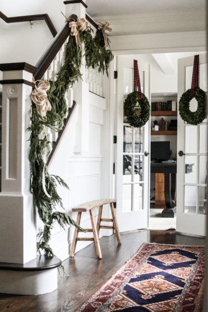
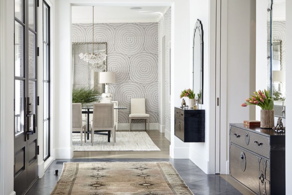
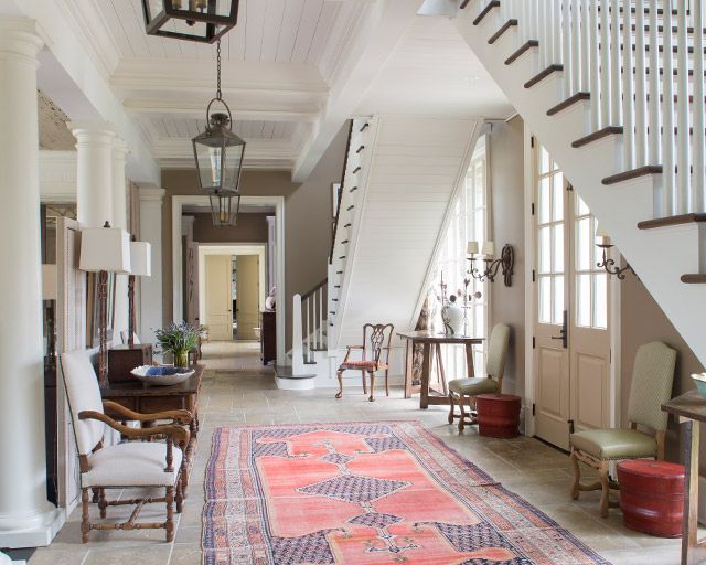
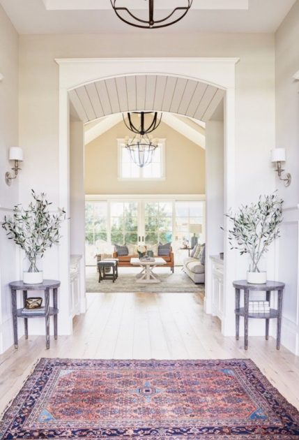
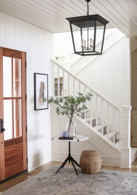
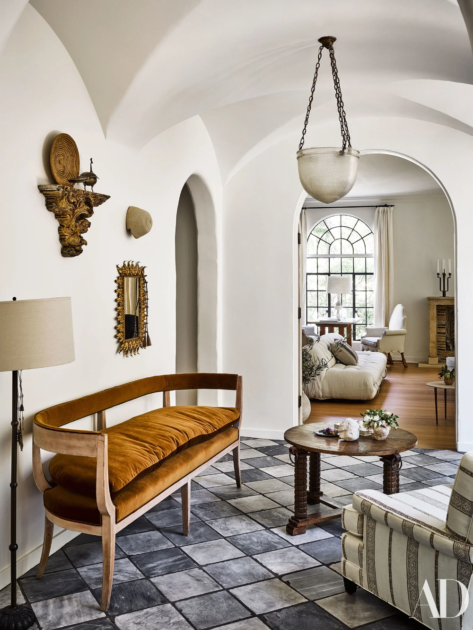
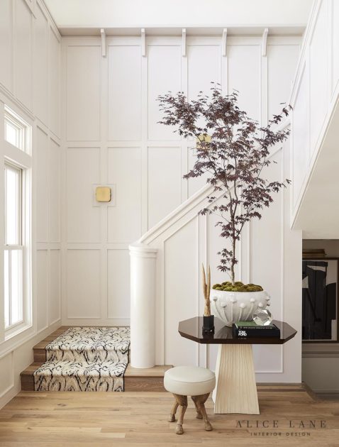
Regardless of individual style, here is what we believe all good home entries have in common: they are welcoming. Your entry is how you tell your guests about your style, but it is also how you say, “Come on in! We’re so glad you’re here!”
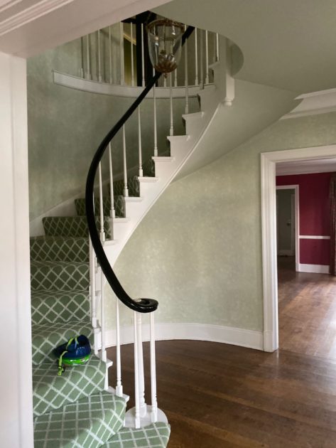
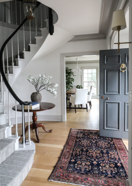
Here are some of our secrets for creating a welcoming entry. Be sure to scroll to the bottom for a great Before & After of the entry featured above!
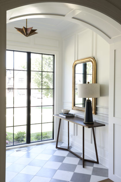
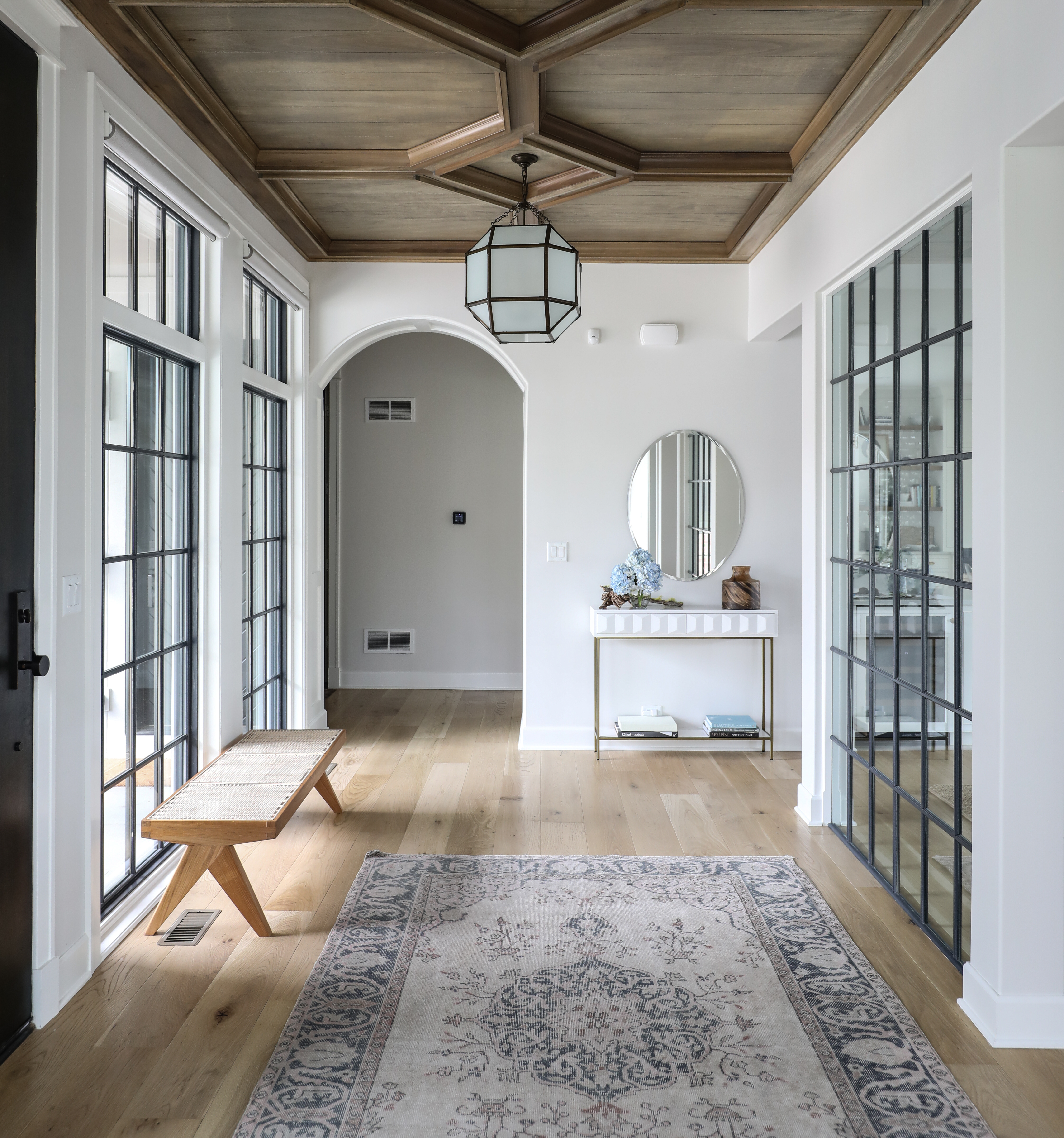
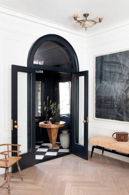
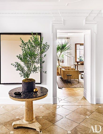
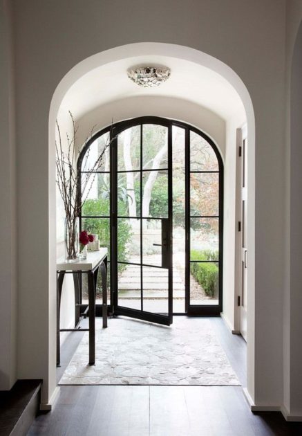
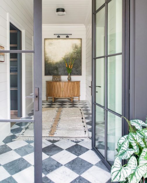
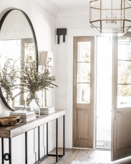
Using some of the details mentioned above, look how we were able to transform this entry into a beautiful space to welcome visitors to the home.
