Search results for

fireplace

0 In Room Reveals

Reveal: Historic Wilmette Home

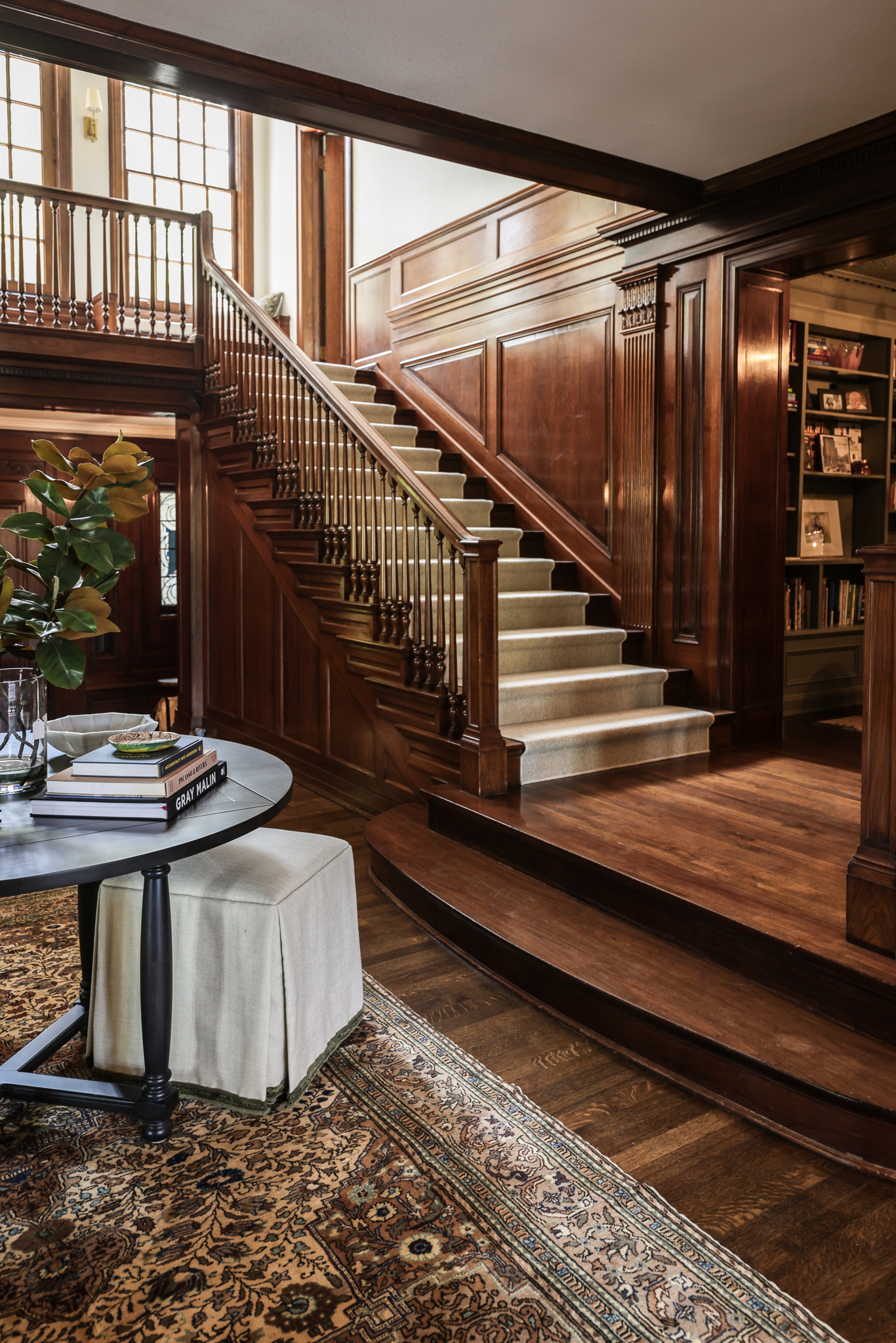
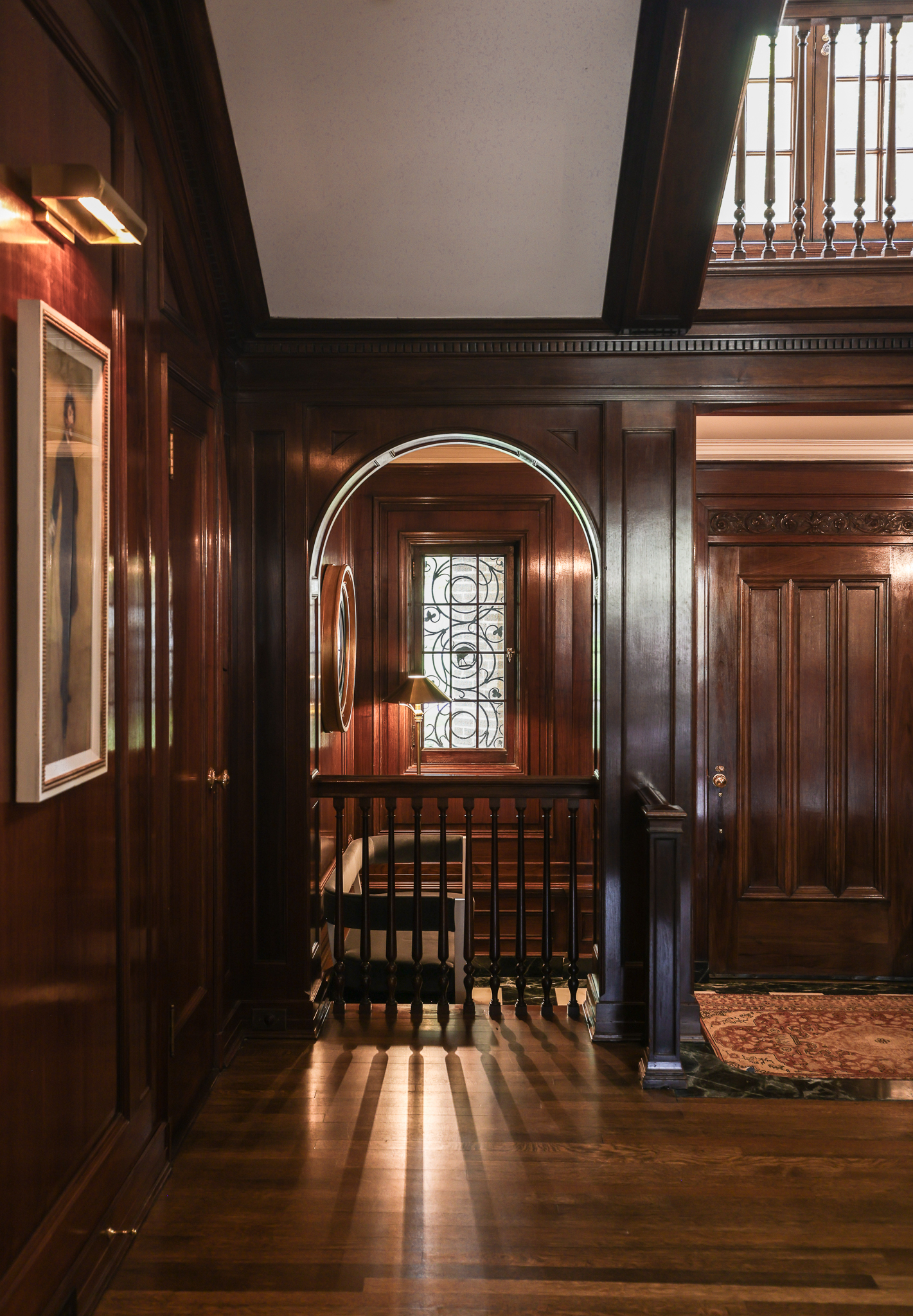
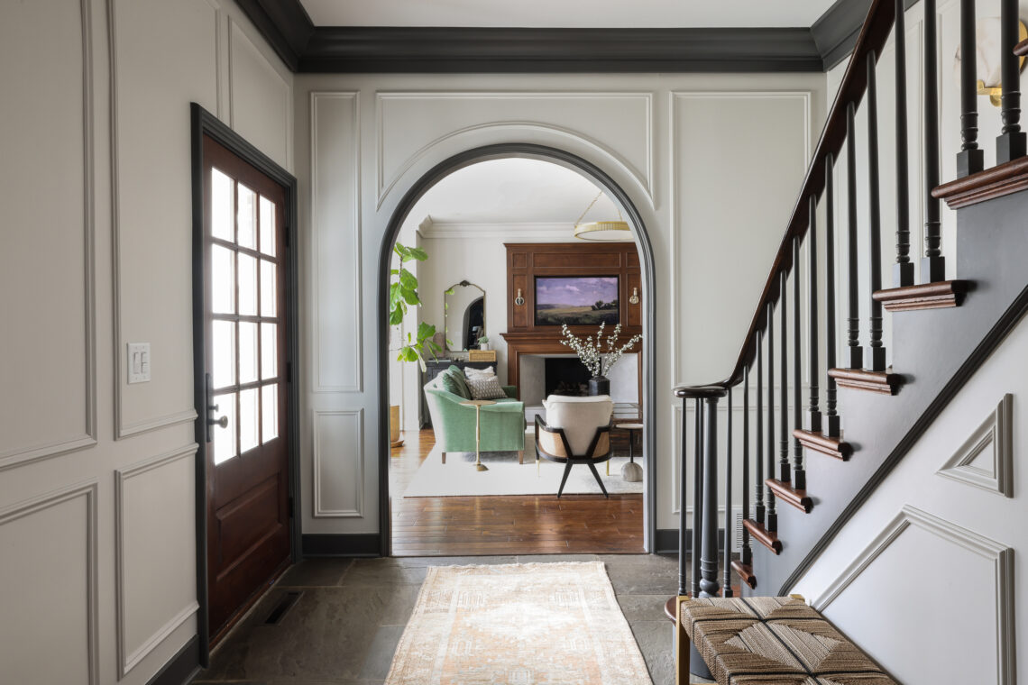
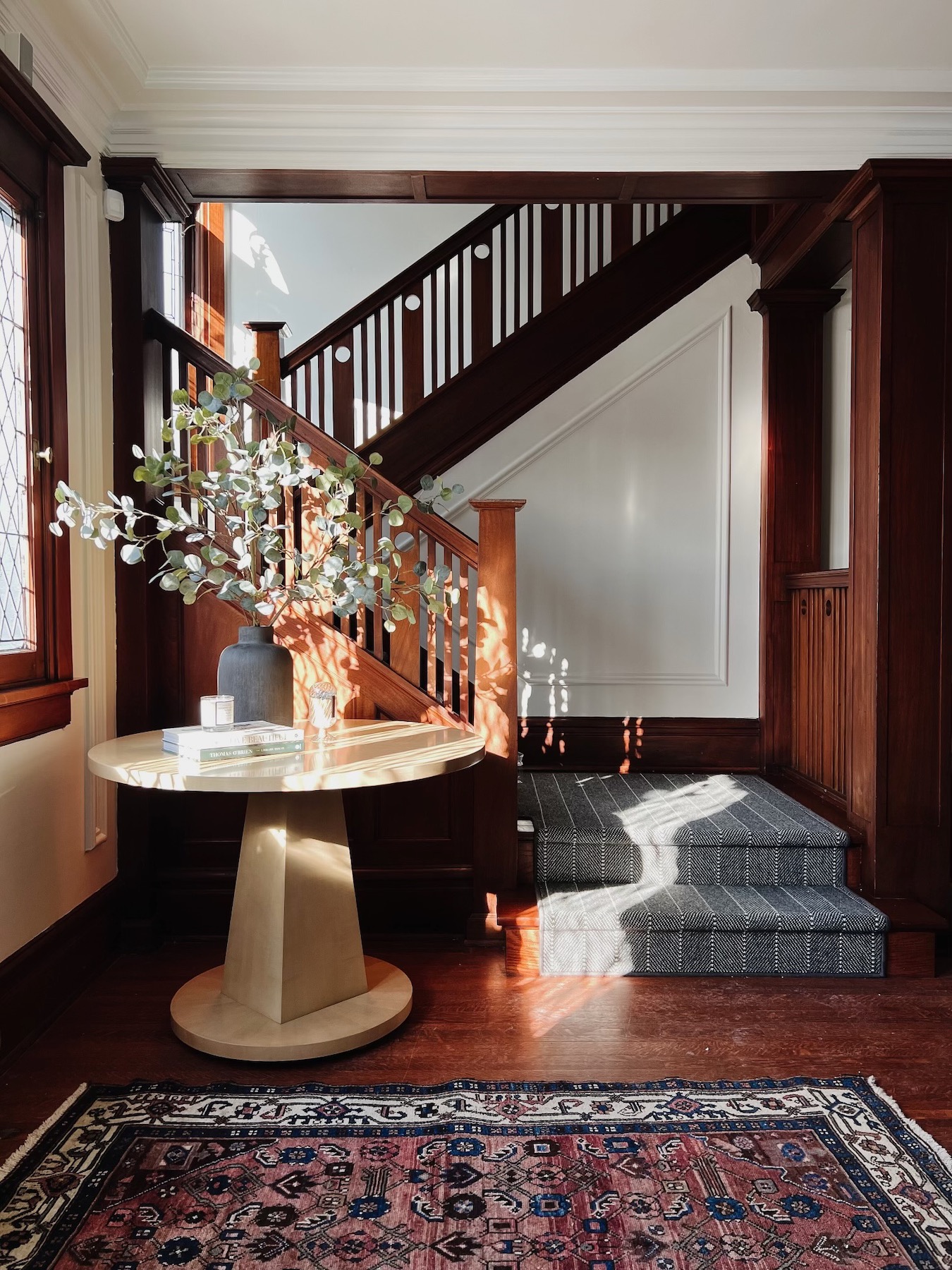
Learning the stories behind the historic houses we work in, and how our clients wound up there, can be such a fun part of the job. For example, this 1927 home has a twin sister next door, built for real-life, early 20th century sisters. Our clients initially bought a house down the street, even though they had been eyeing these twin homes for years. When this one hit the market, they knew they had to make the move…again. And we can see why. This home has such beautiful bones: intricate woodwork throughout, checkered tile floors, that grand staircase. It was easy to understand why our clients had been admiring it for so long.

Our job was to enhance the original details and maintain the historic feel of #POwilmetterefresh, while also updating it for modern-day living. The end result is a finished home that is a true testament to the value of furnishings, careful accessorizing and attention to detail. Let’s take a tour!


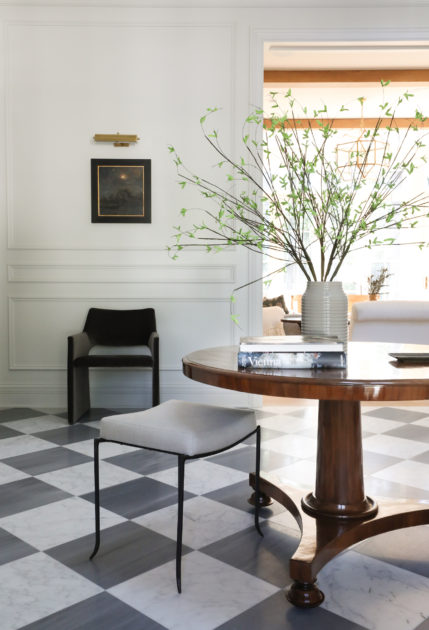
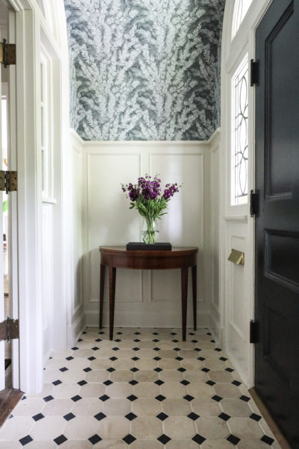
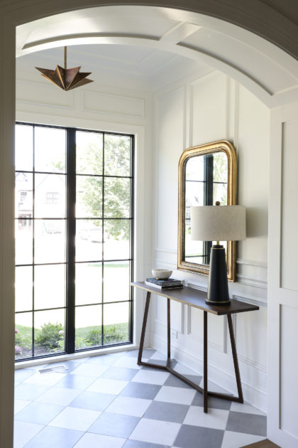
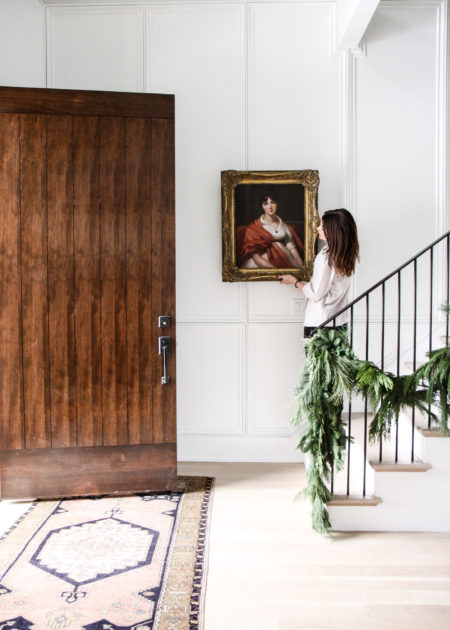
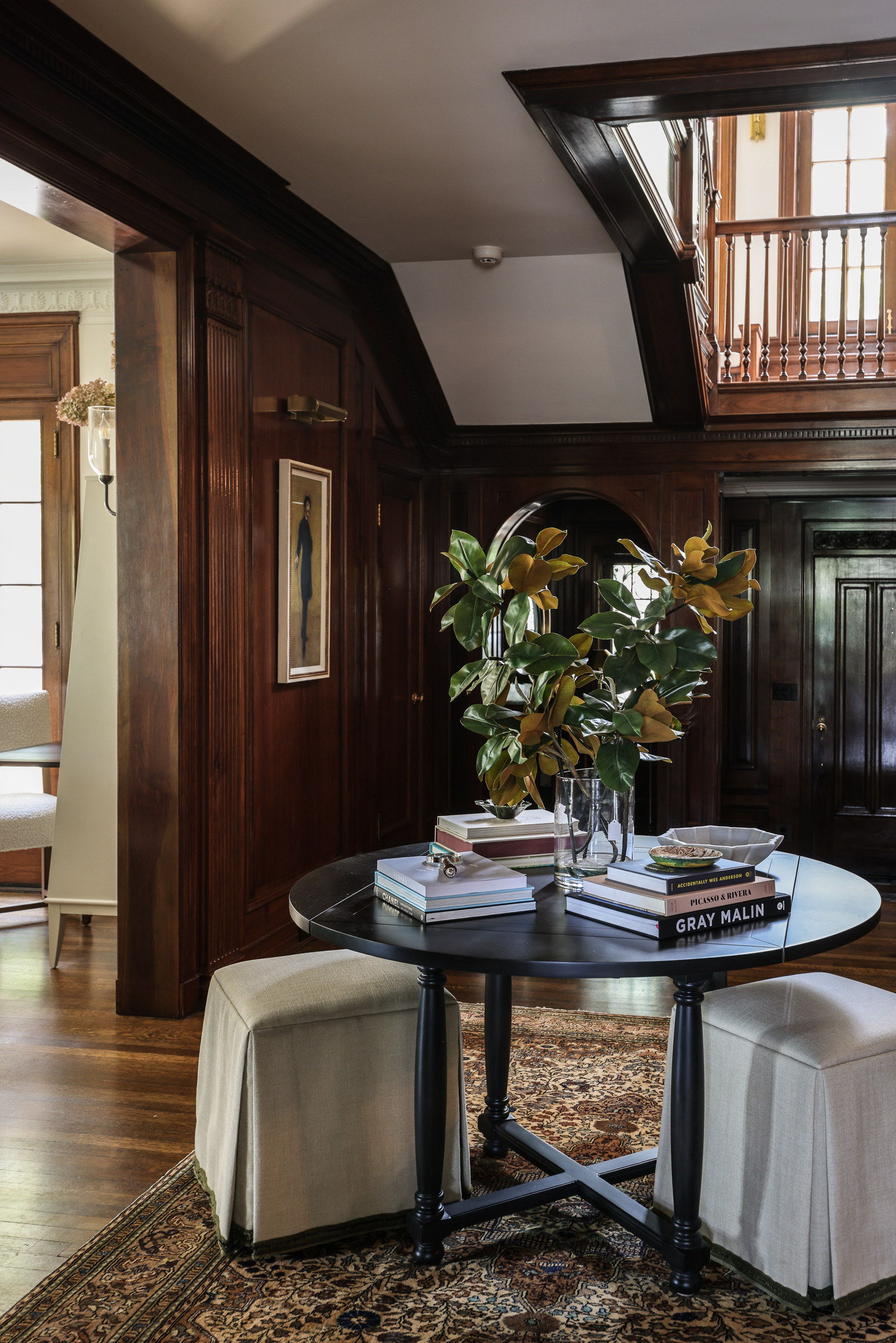
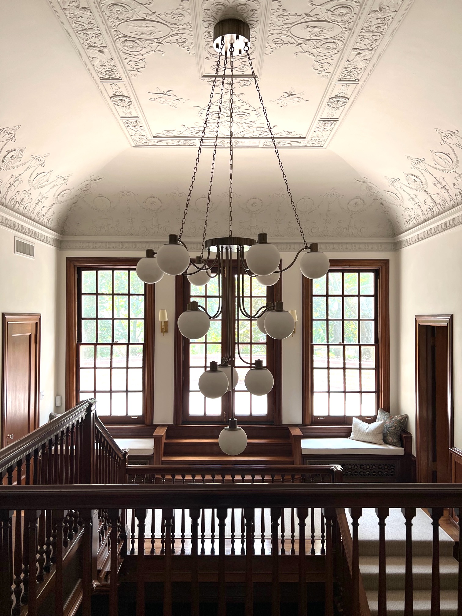
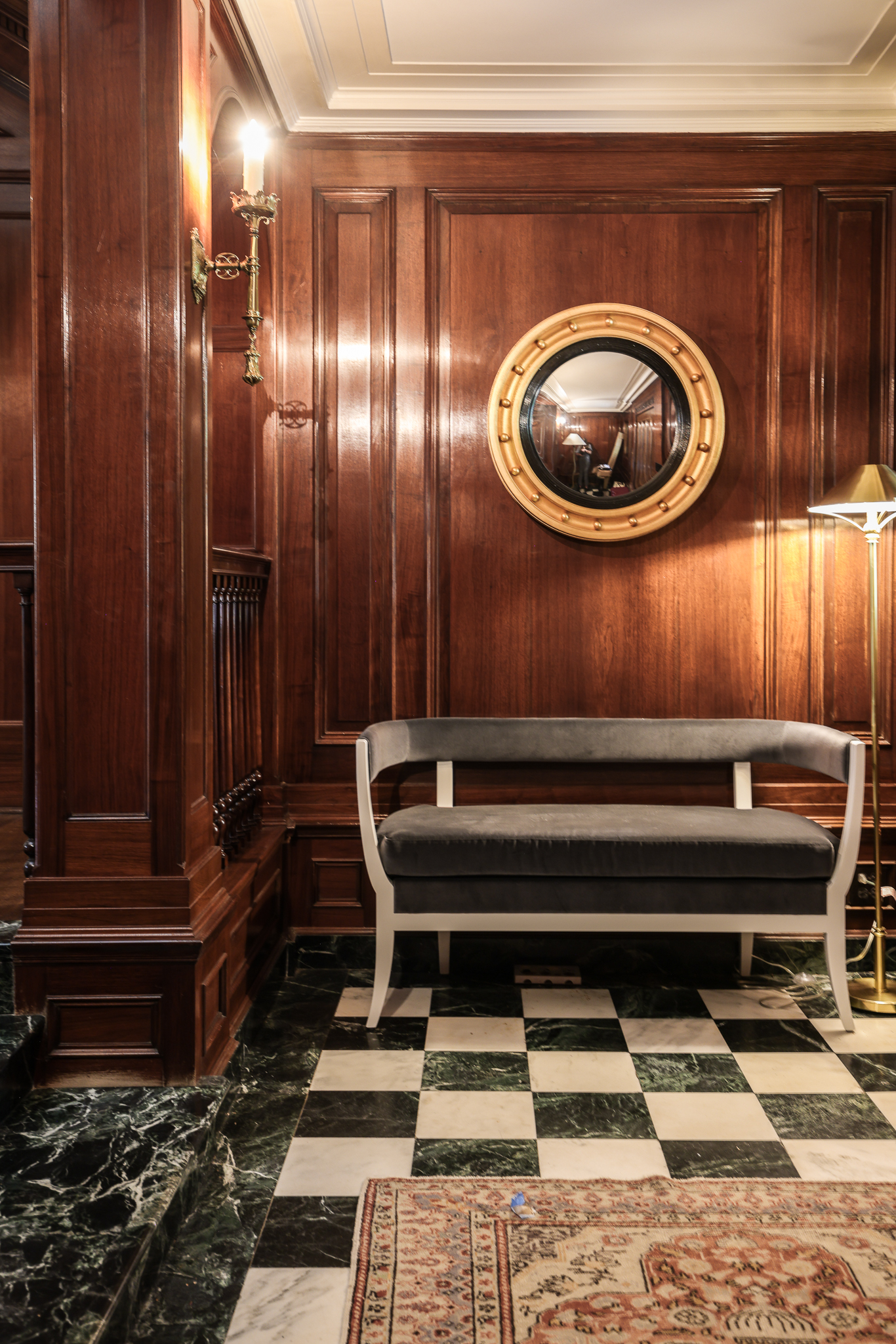
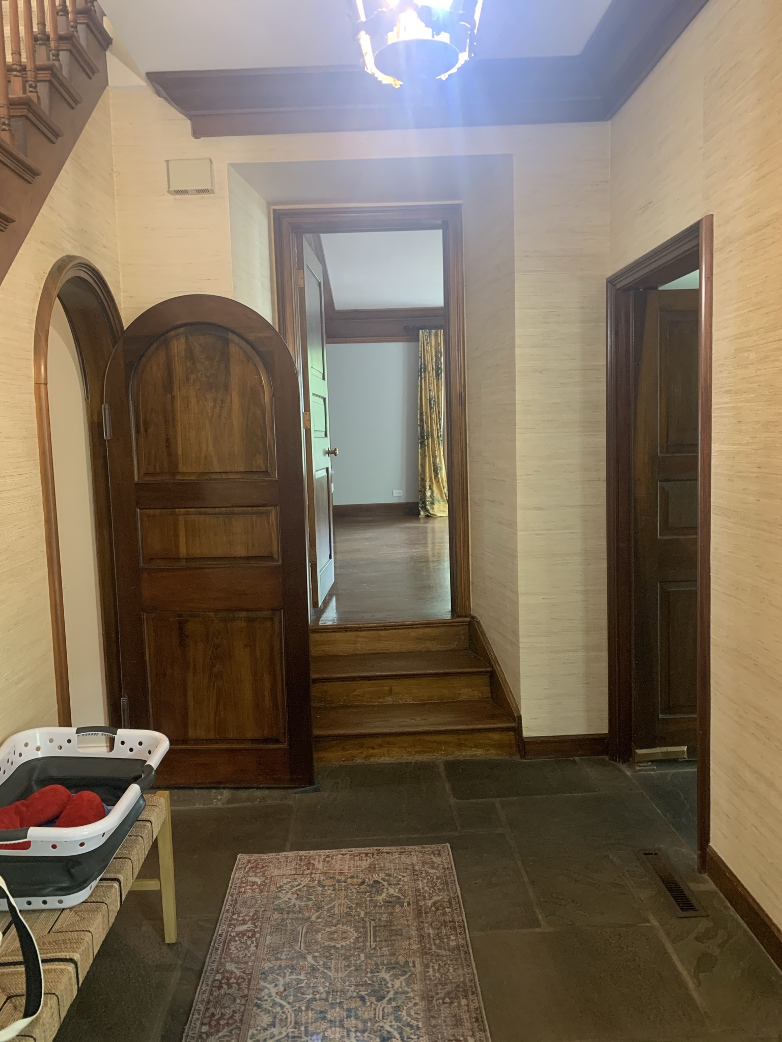
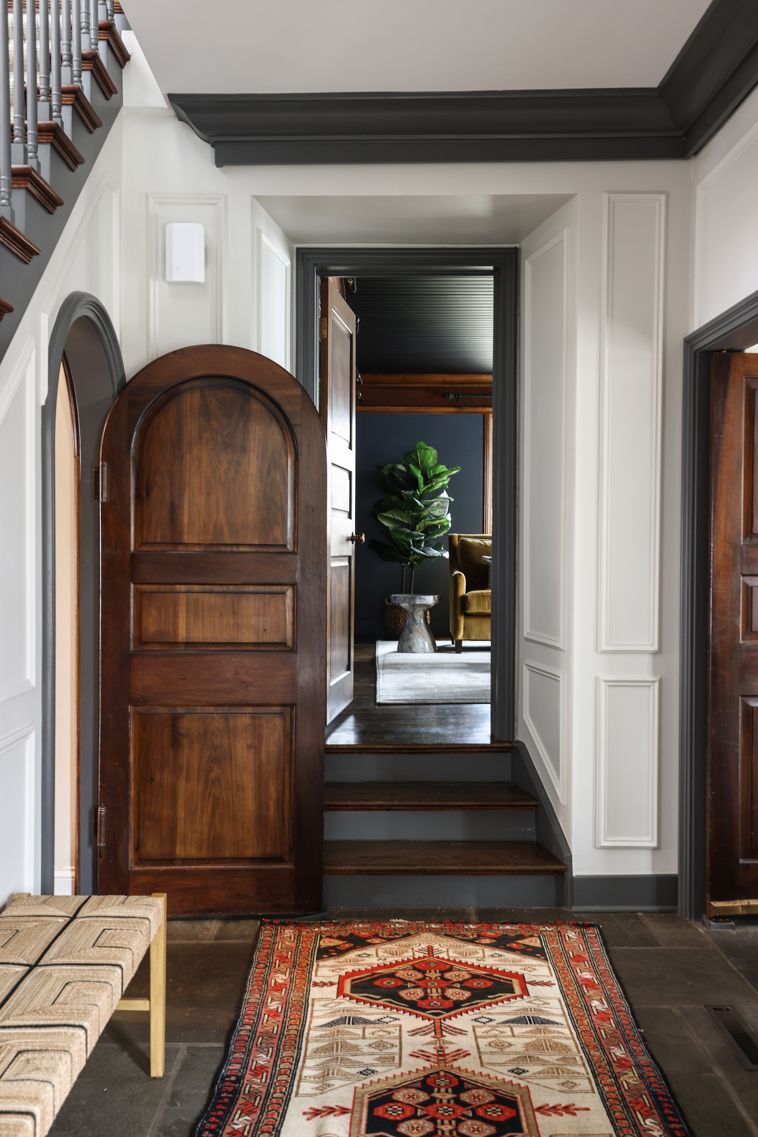
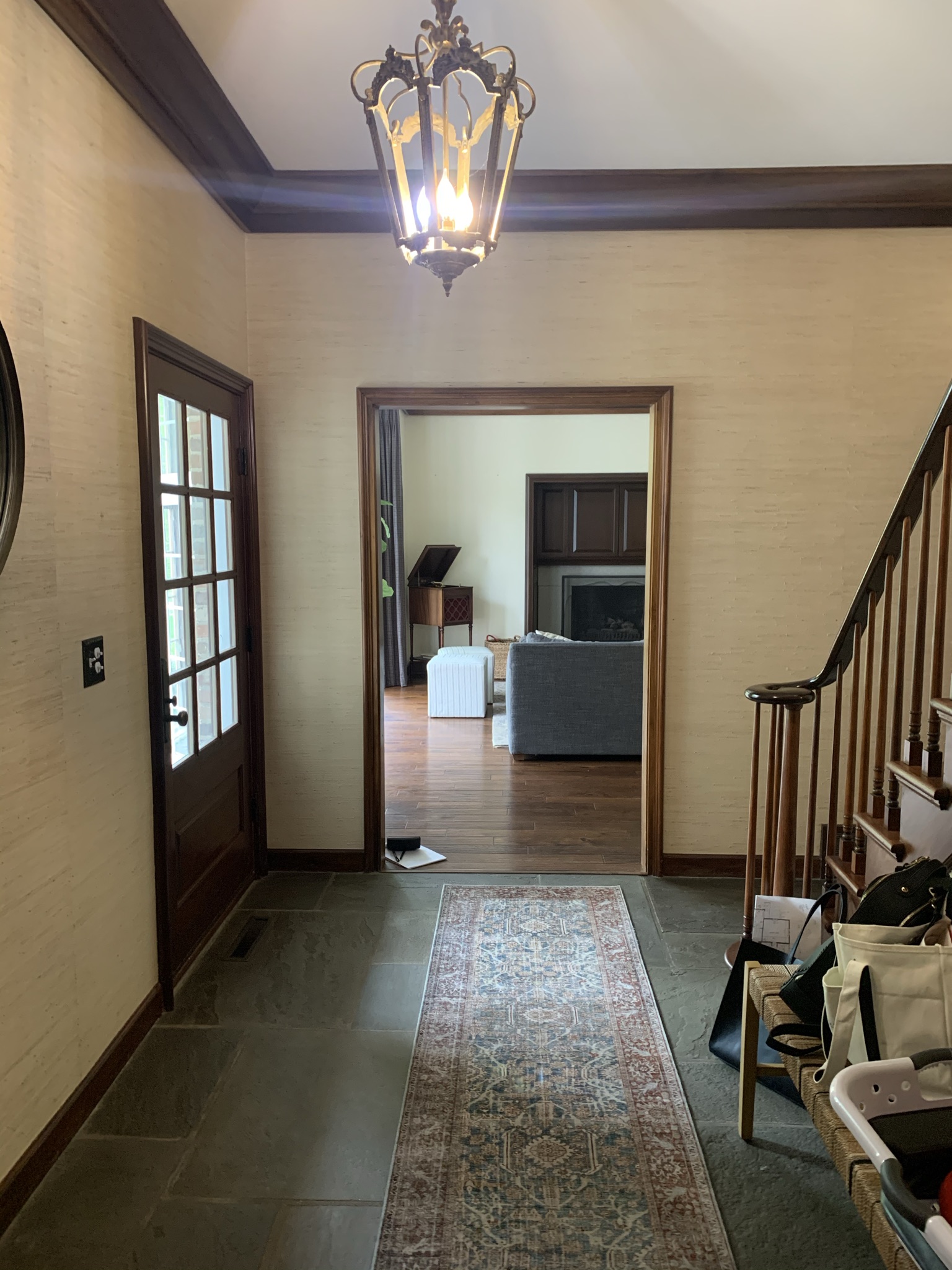
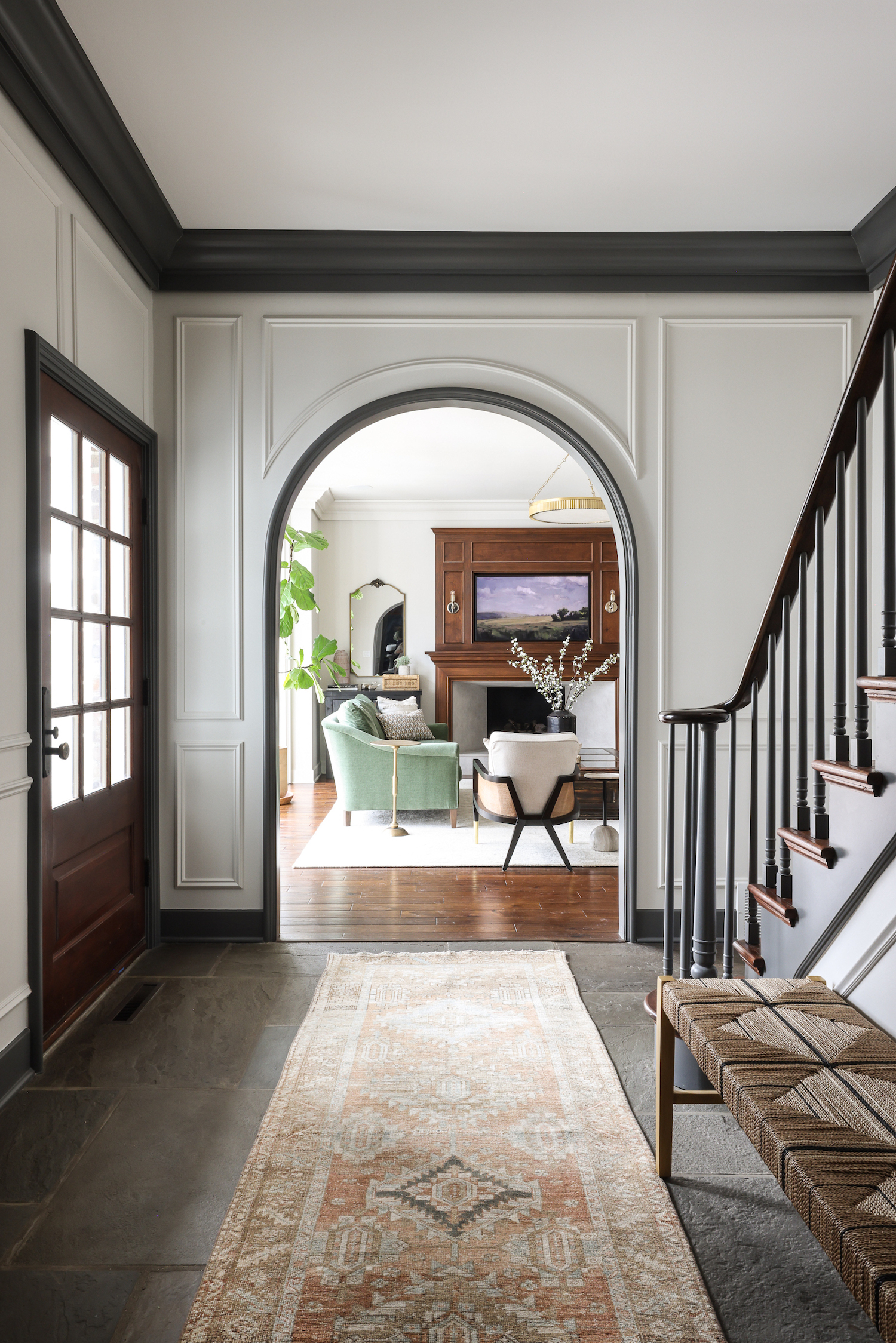
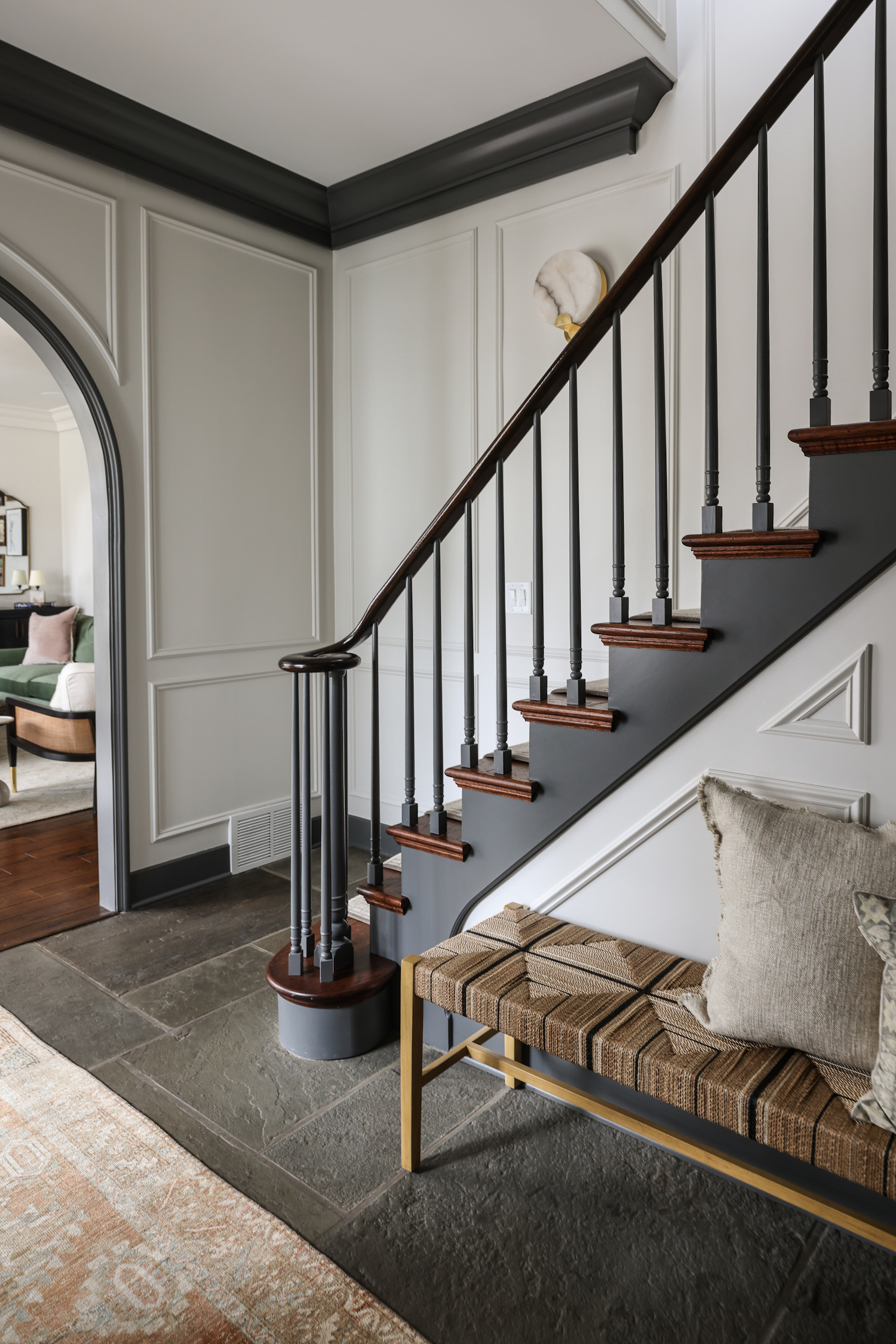
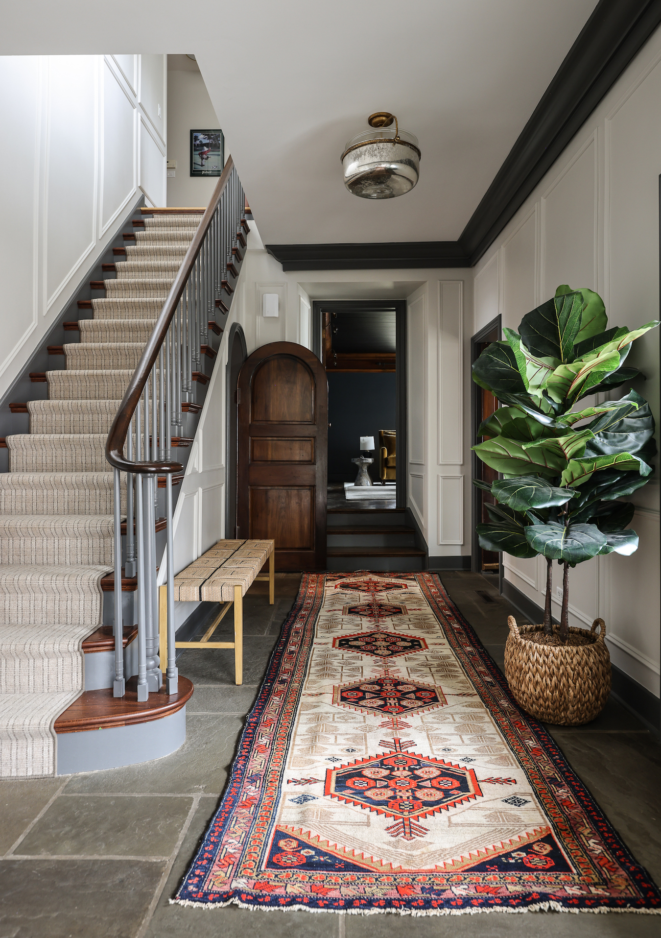
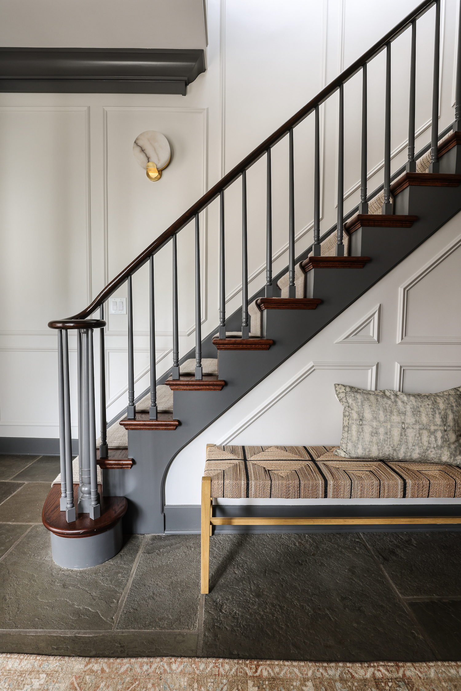
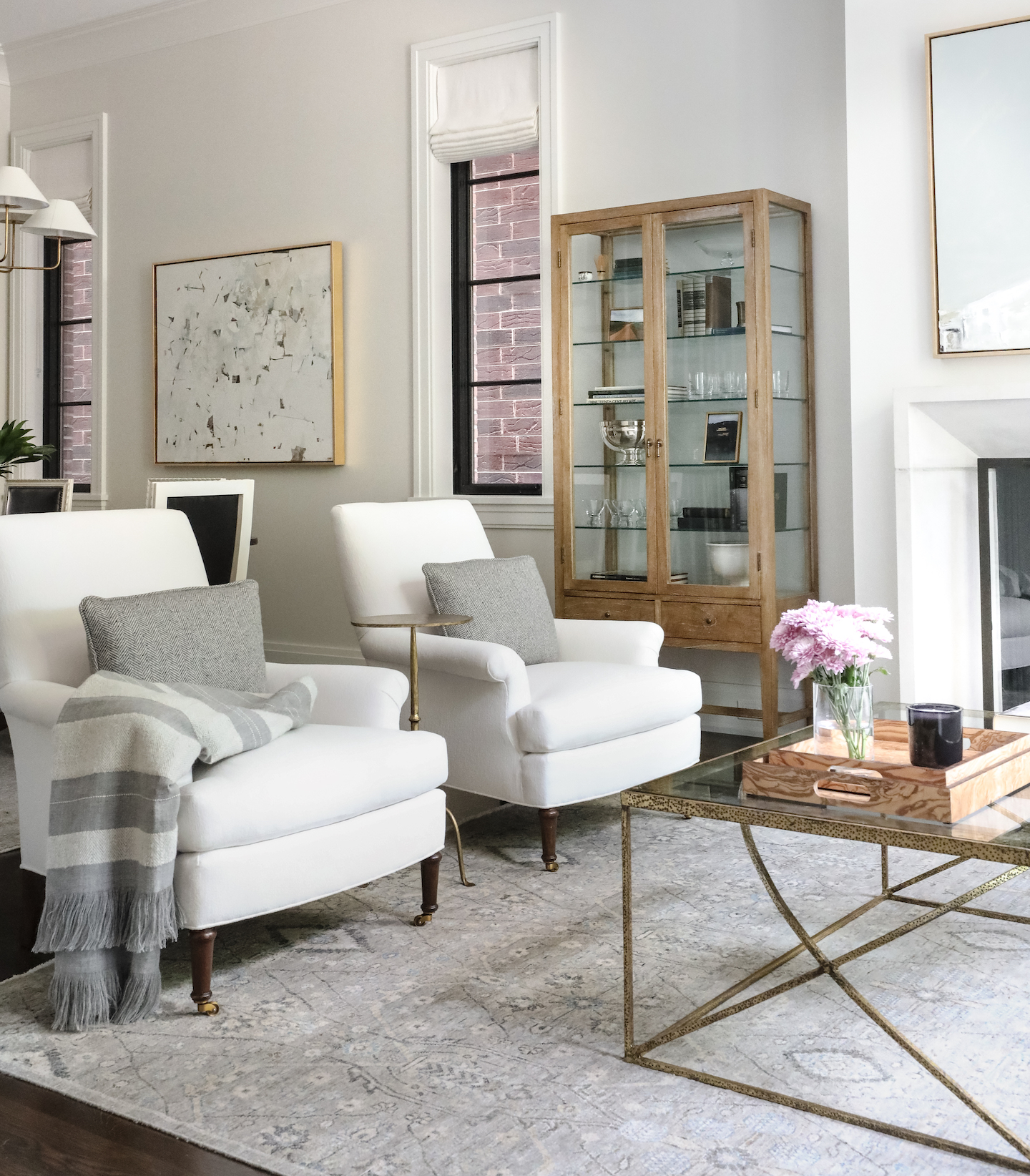
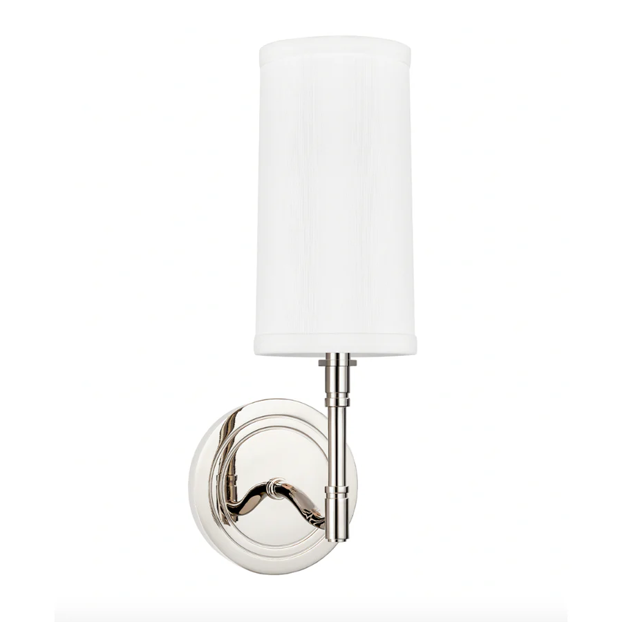
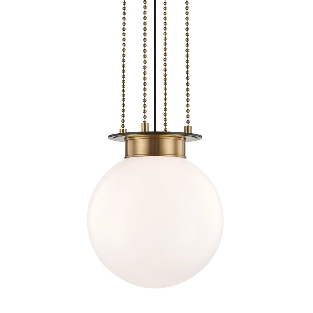
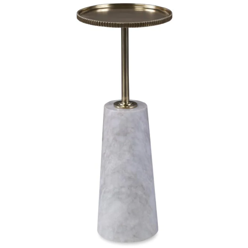
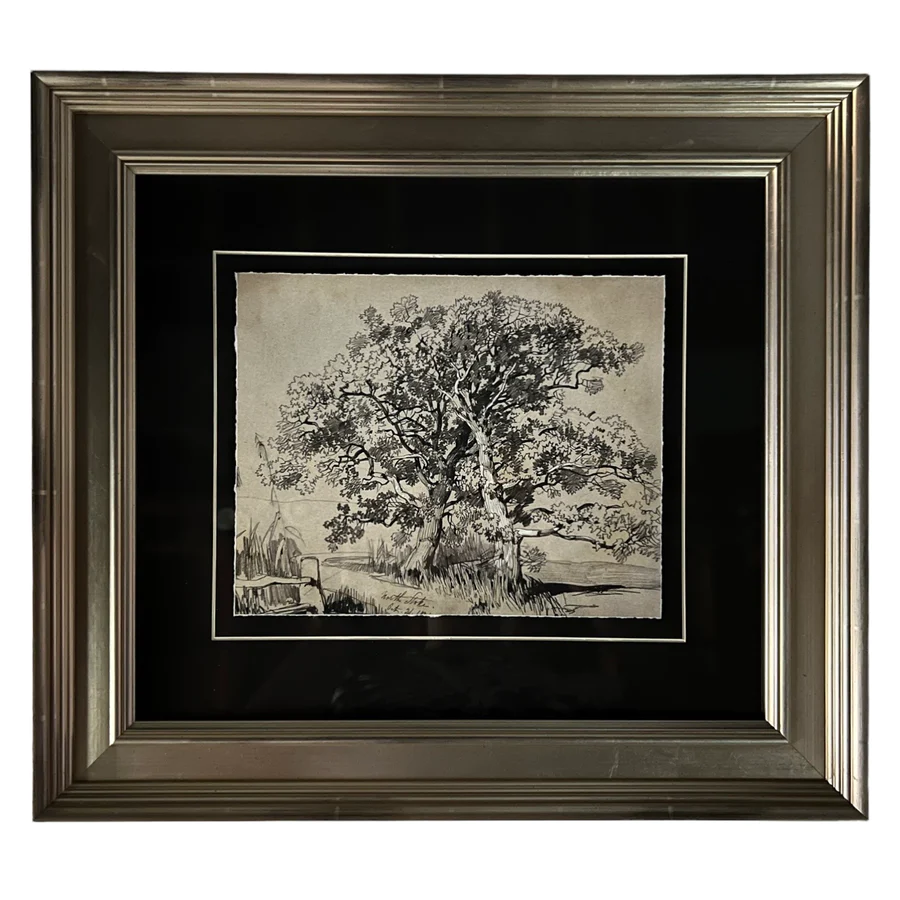
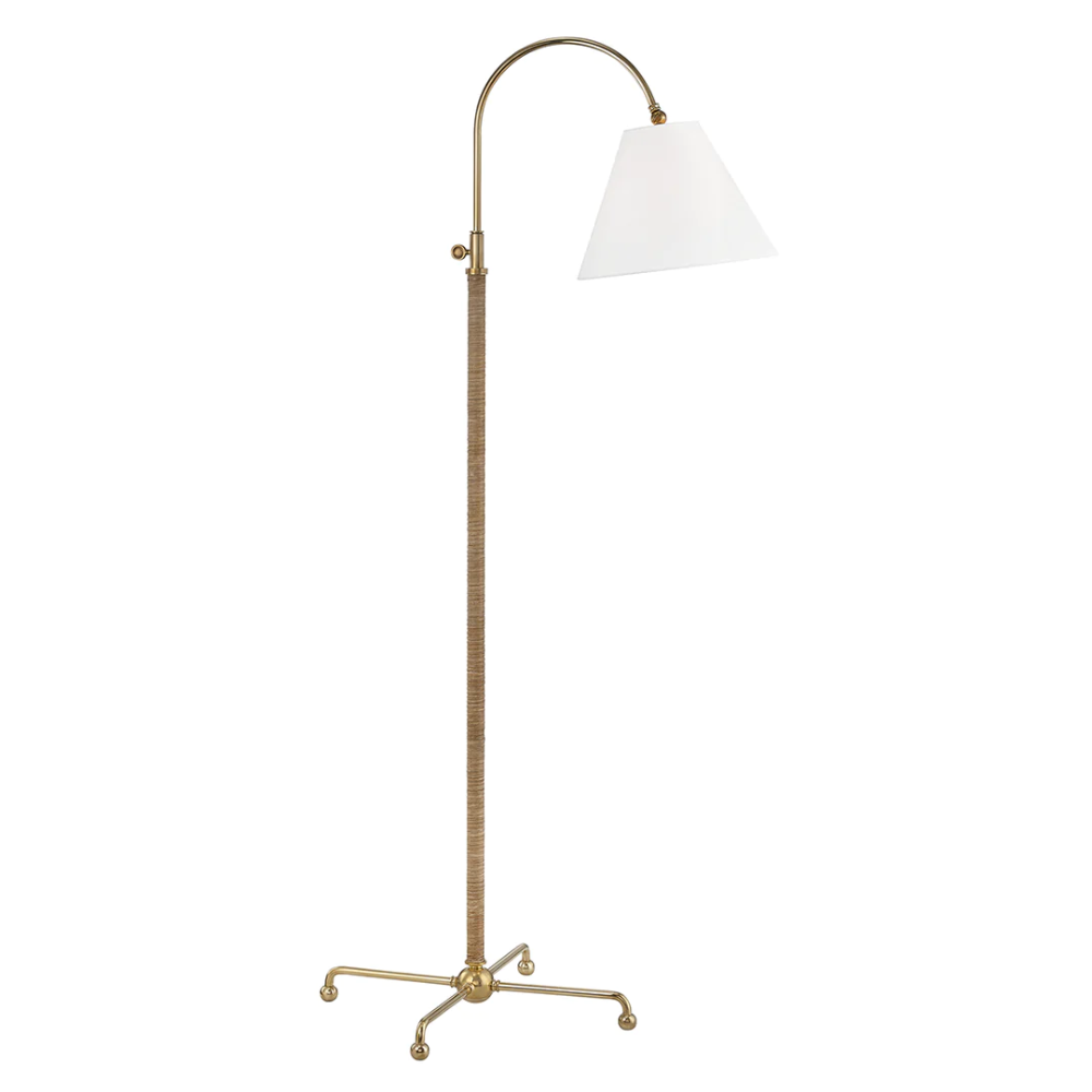
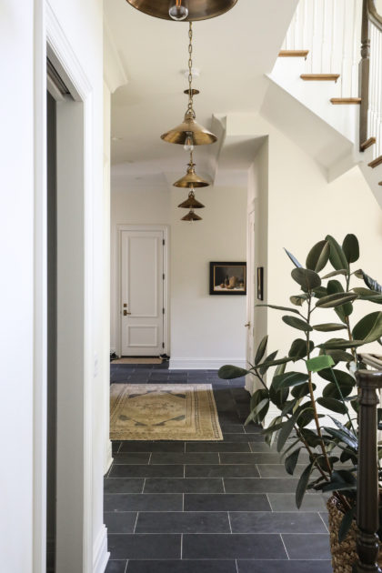
It was important to create a grand entry moment to match the magnificent details in the home’s foyer. A gorgeous table (styled by Collected stylists!) and vintage rug fill the space beautifully, and allow guests a stopping point to marvel at the beautiful architecture and build details. There is a lot to take in here, from the staircase to the detailed wall moulding to the checkered marble entry flooring. One thing the home needed, though, was additional lighting throughout. Brightening it up with strategic and beautiful lighting was a very important element to our client. In addition to adding sconces, picture lights and a floor lamp in the foyer, our team custom-designed a showstopping chandelier for the center of the staircase. Be sure to check out the video of us raising it!


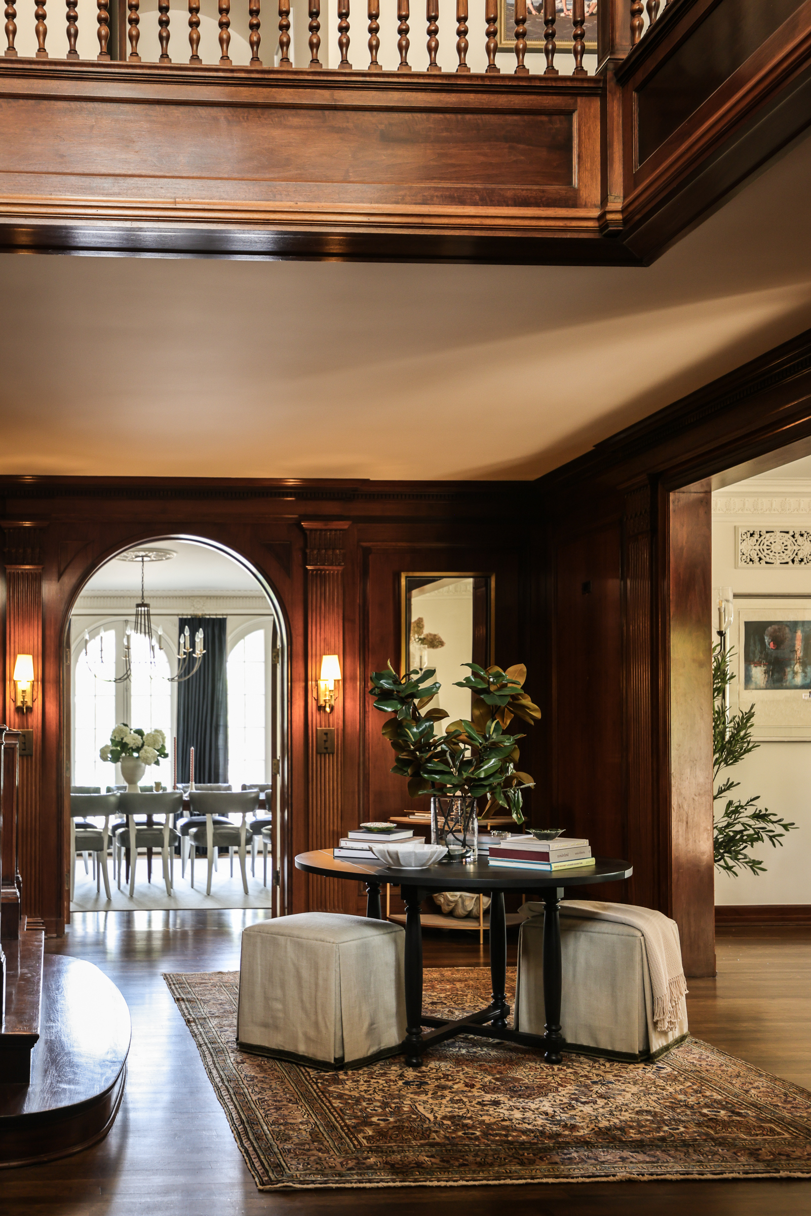
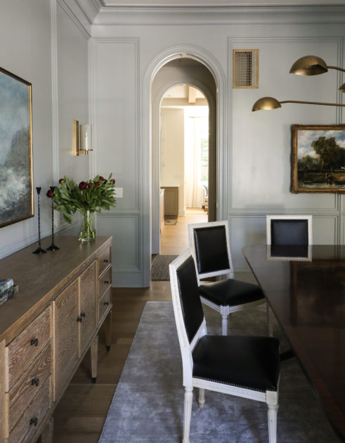
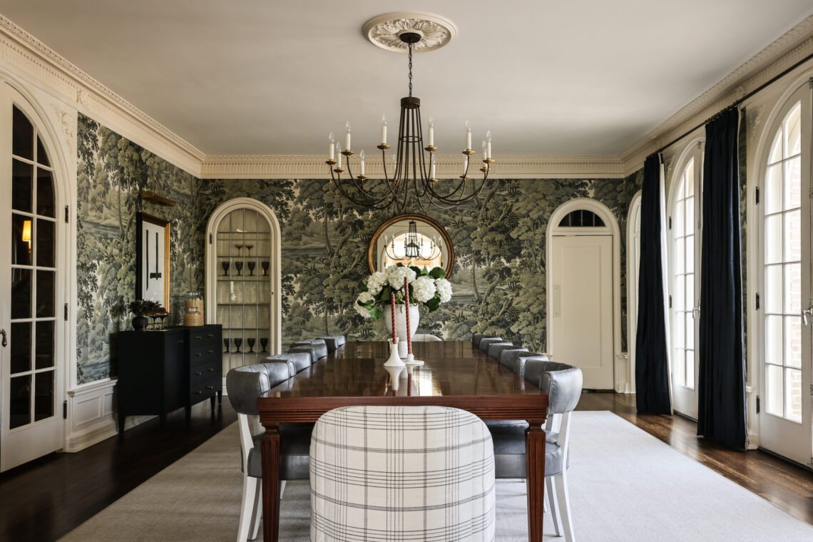
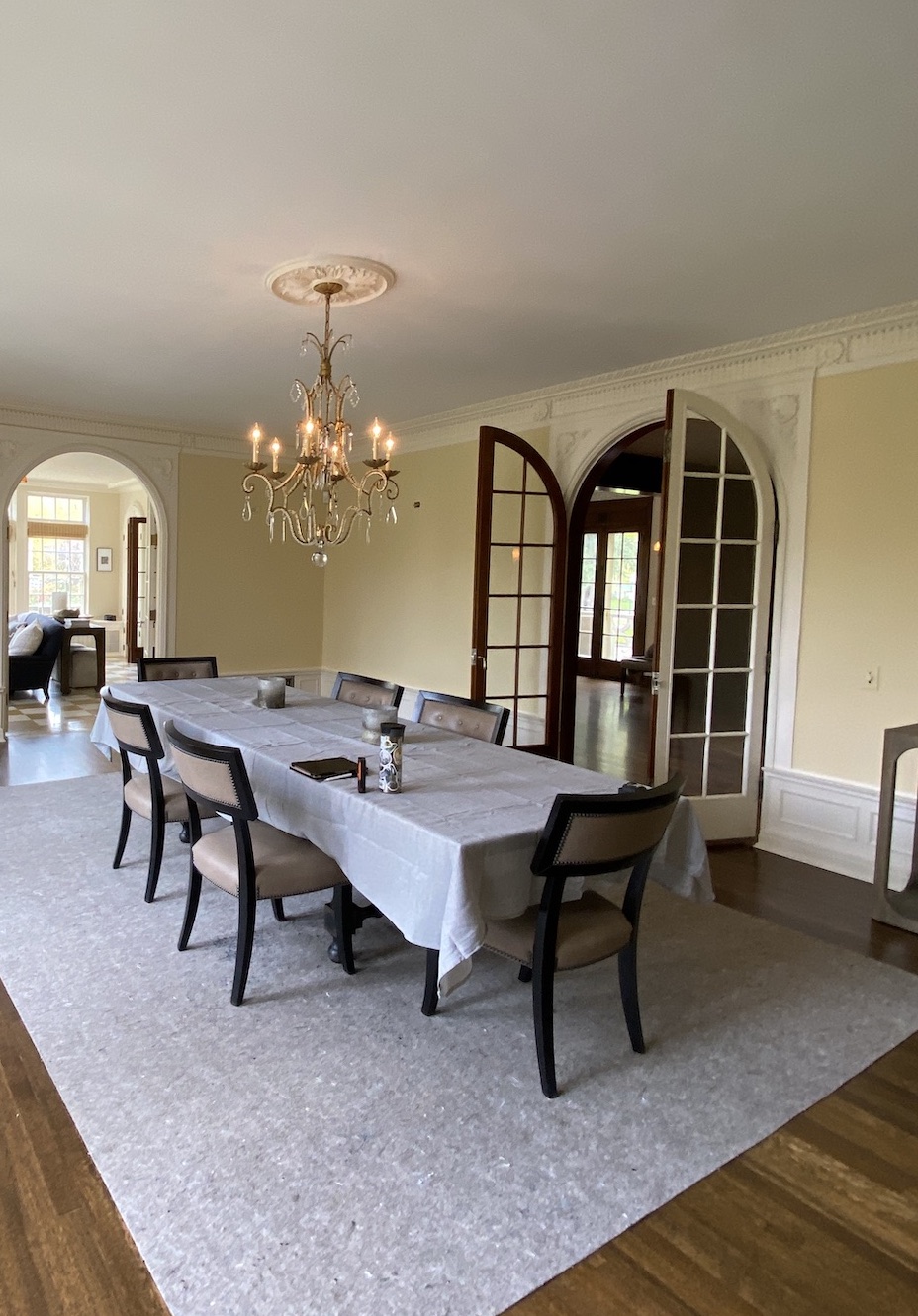
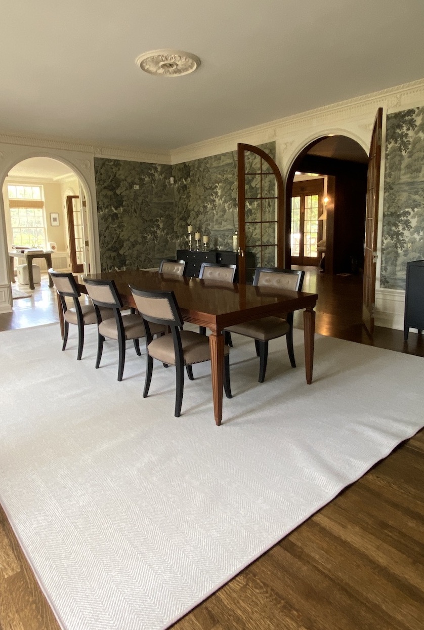
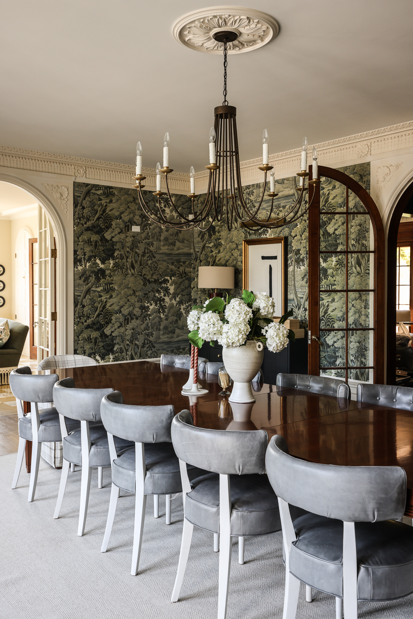
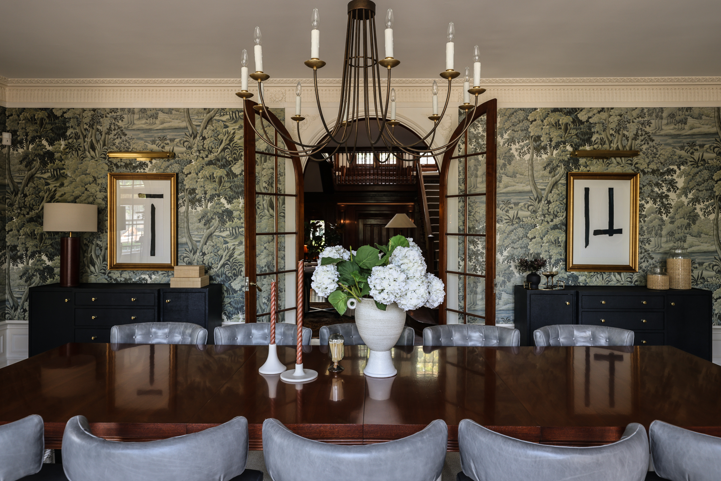
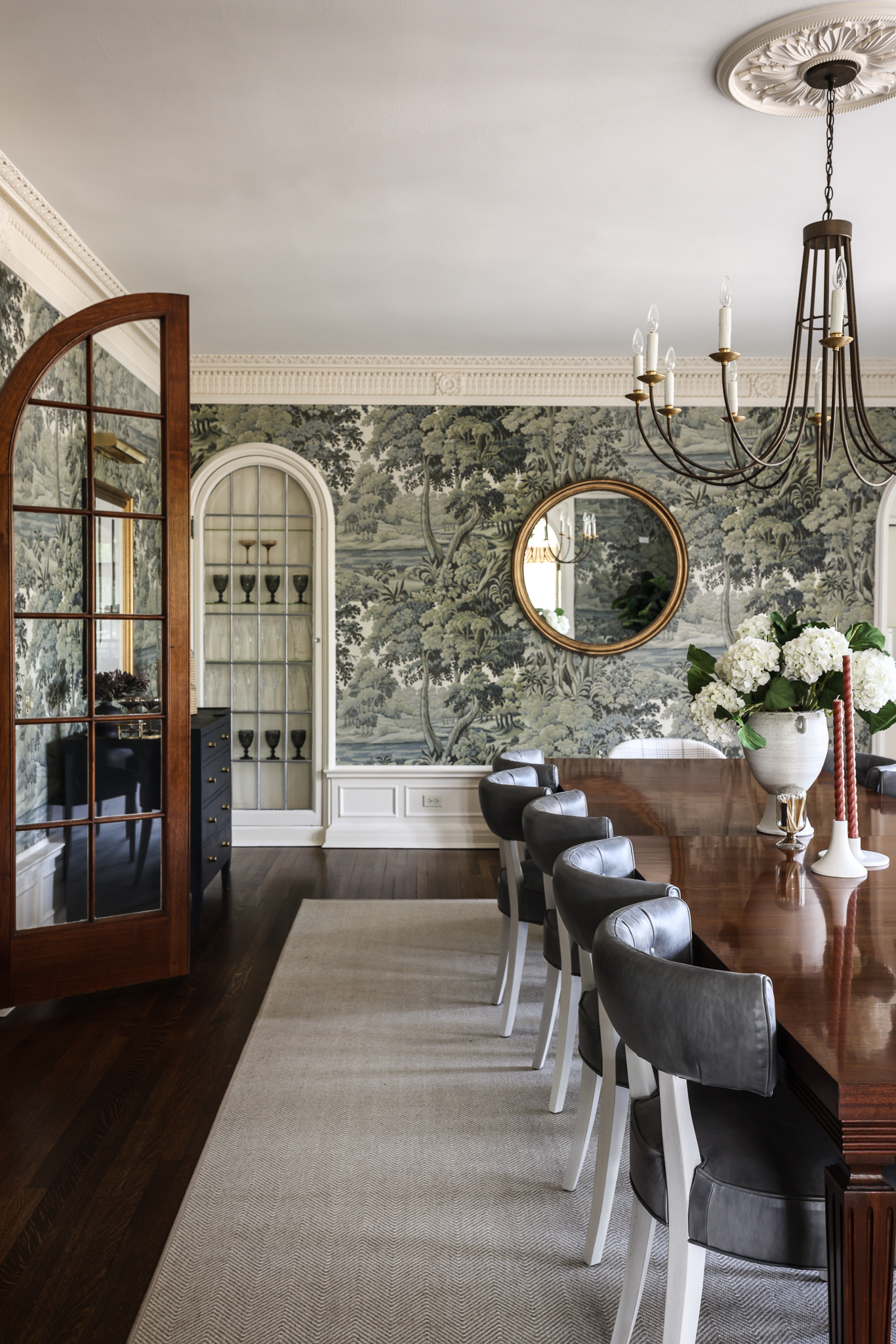
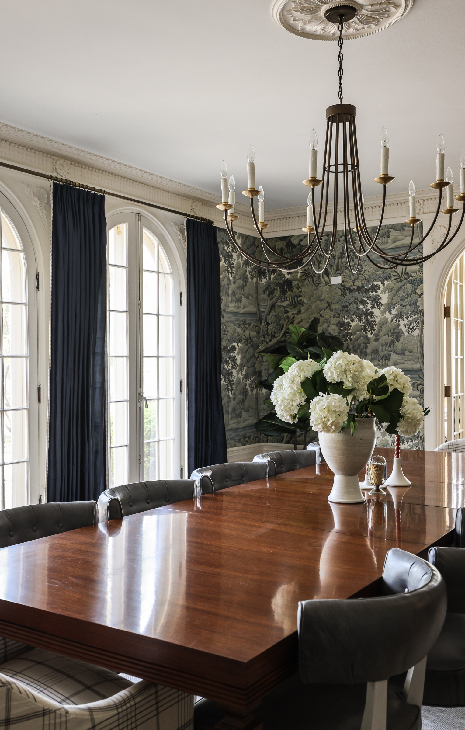
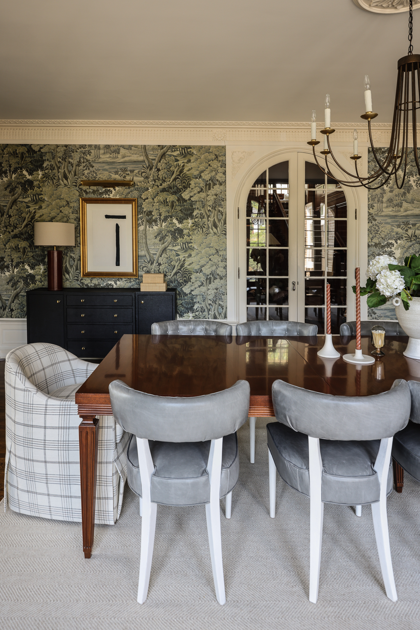
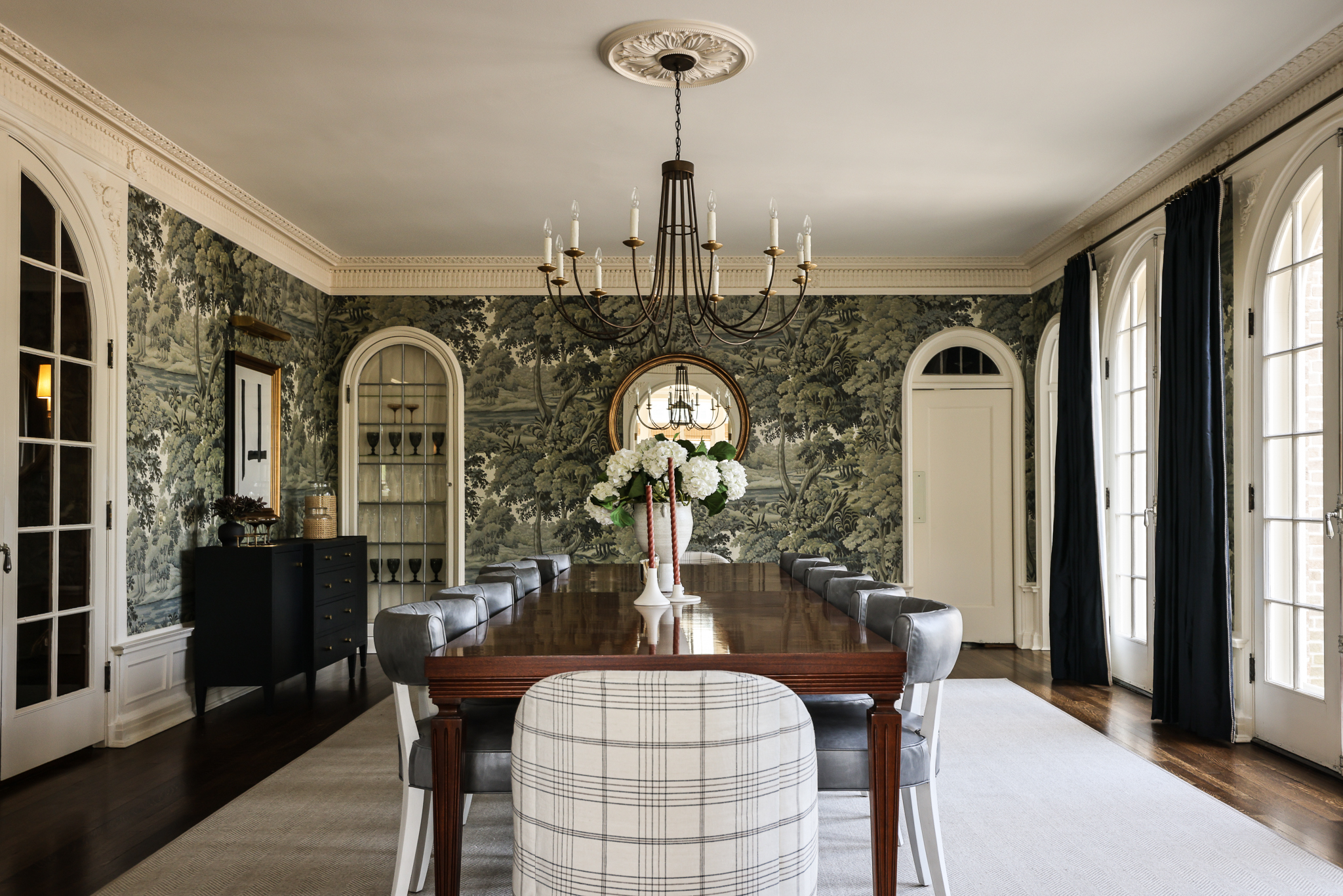
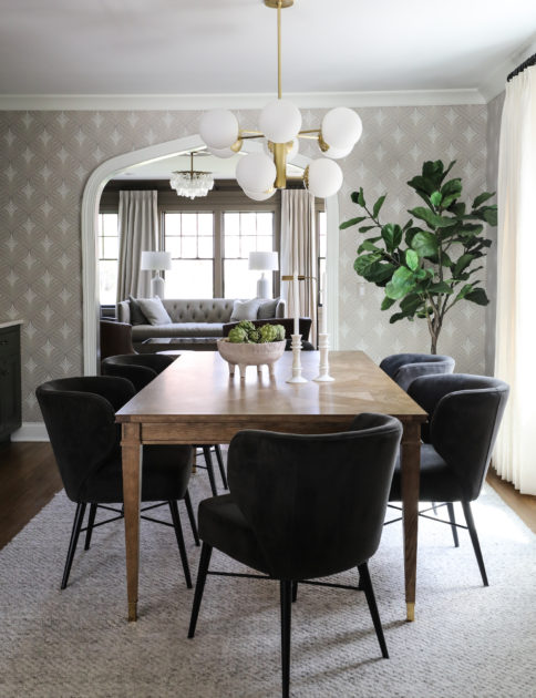
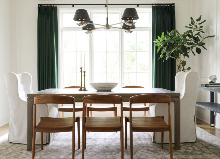
Catching a glimpse of the dining room through the arched doorway from the foyer lets you know something special is in store there. Our client really hope for a “wow” moment here. They frequently entertain large groups of family and friends, and wanted a room for dining with them that felt grand but not stuffy. Enter: comfy custom chairs with performance fabric, a large table to seat up to 12, an elegant Julie Neill chandelier, and of course, that mural wallpaper. (Wallpaper is House of Hackney, Plantasia) Window treatments highlight the arched windows and a neutral rug grounds the space and keeps the room from feeling too dark. Here is a room where accessories really do heavy lifting to help to finish the space and tell a story. The room had magnificent original details: intricate trimwork and moulding, arched windows and doors, a classic ceiling medallion. But even with those beautiful bones, it was lacking impact. Every piece we added was carefully considered to make this room the focal point it deserved to be, and to revisit its distinctive historic character.

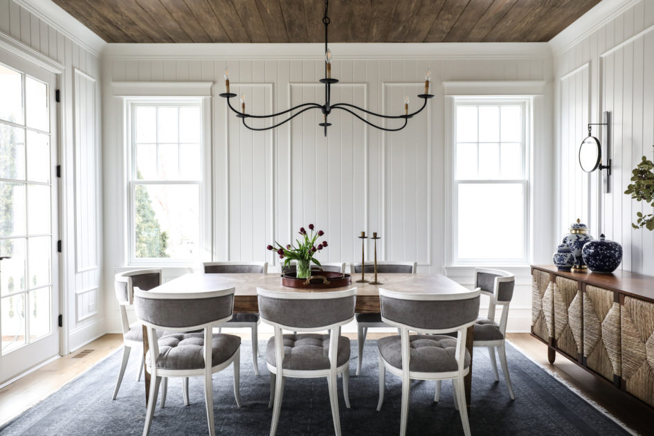
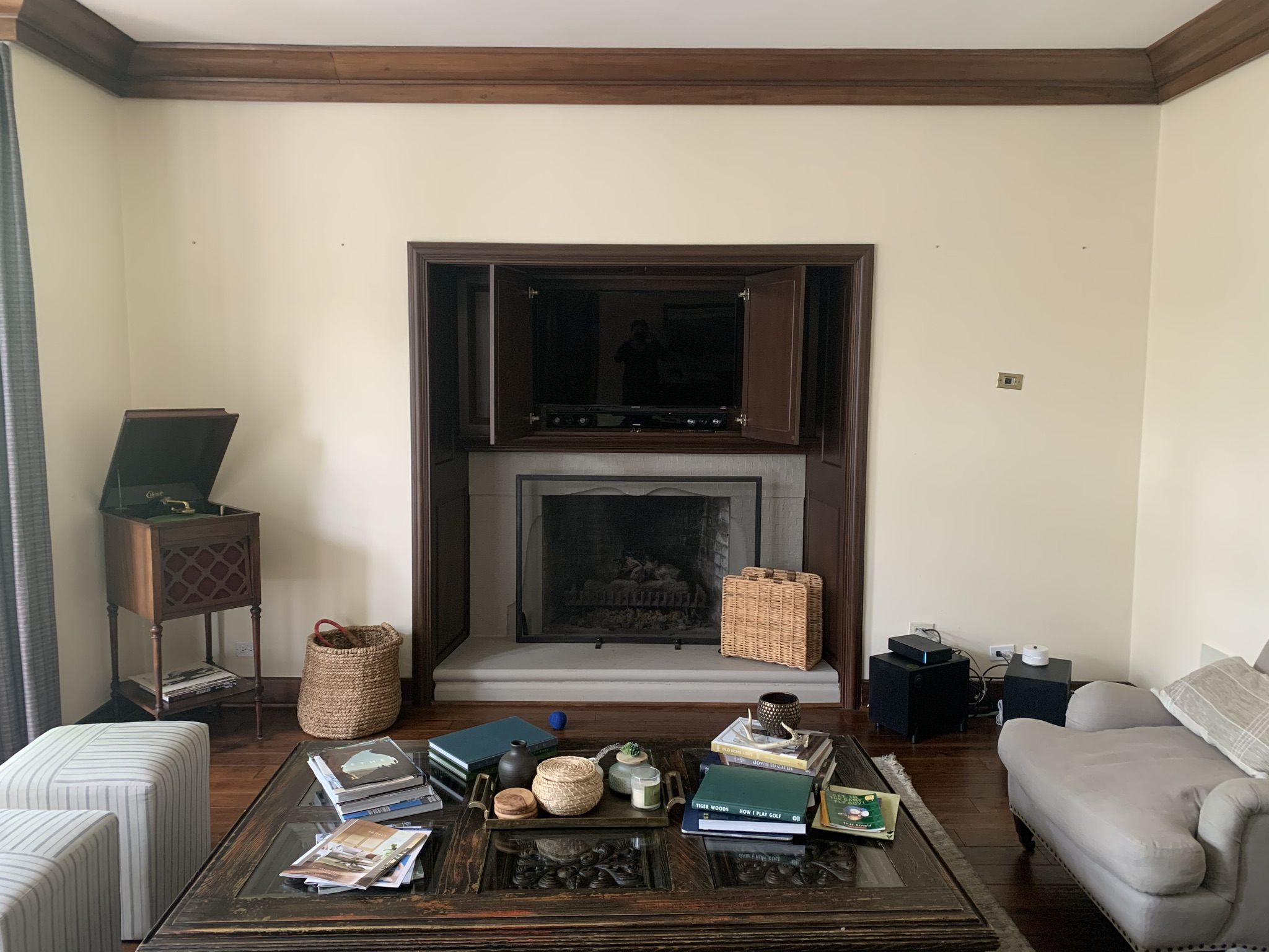
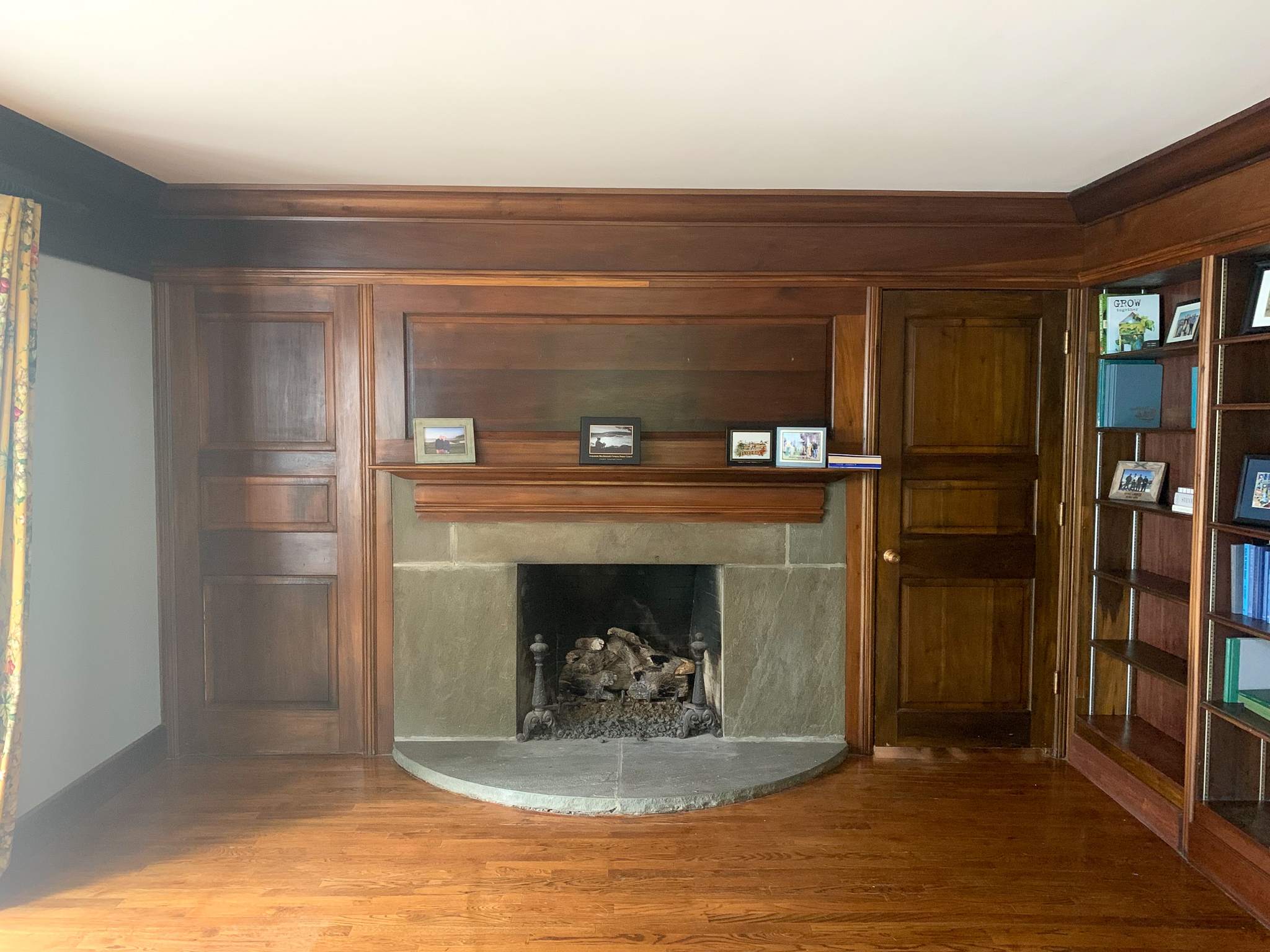
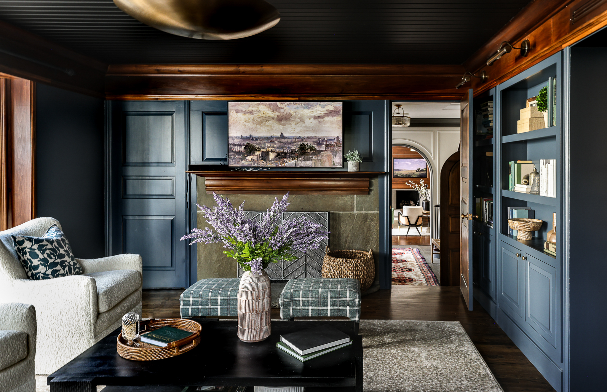
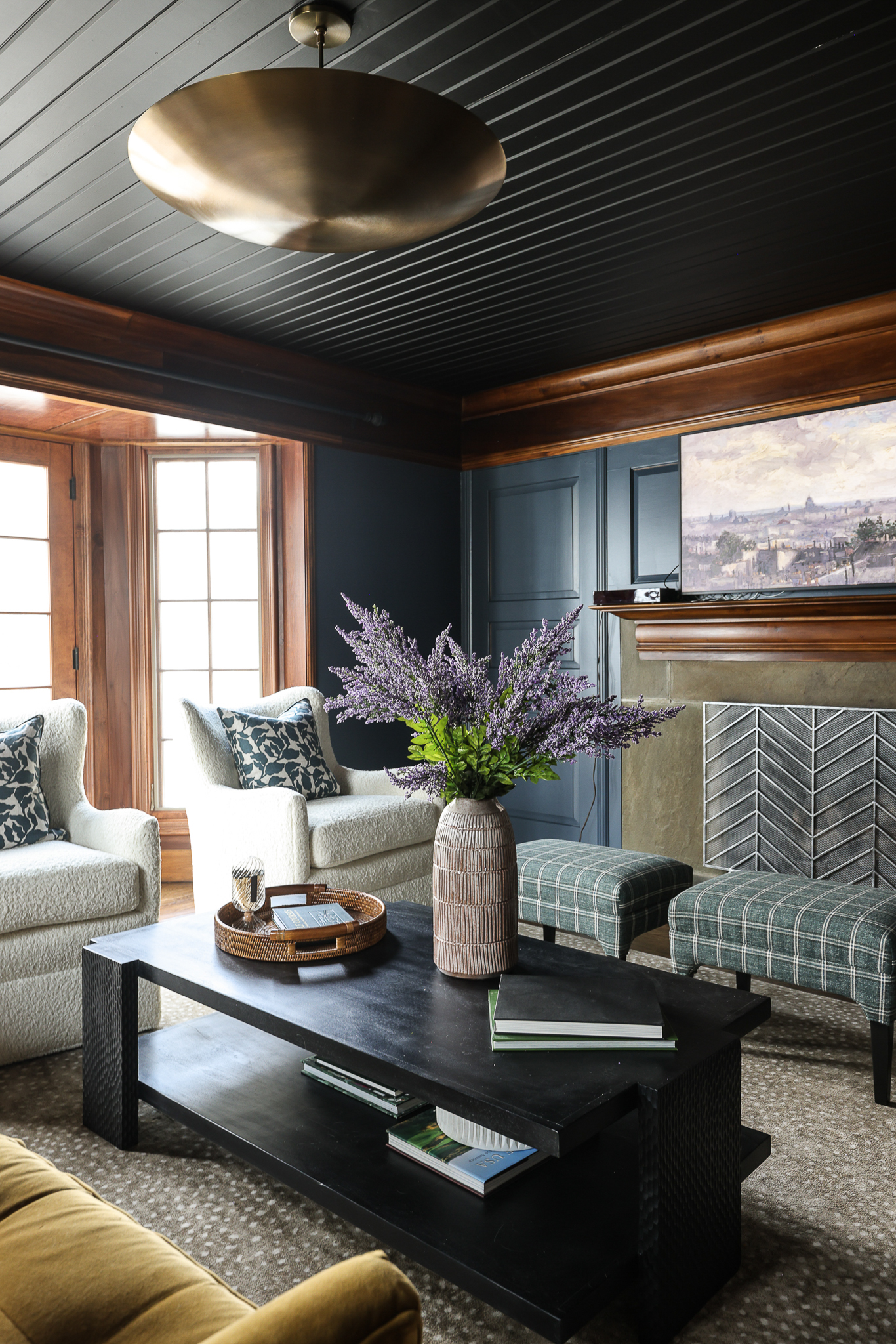
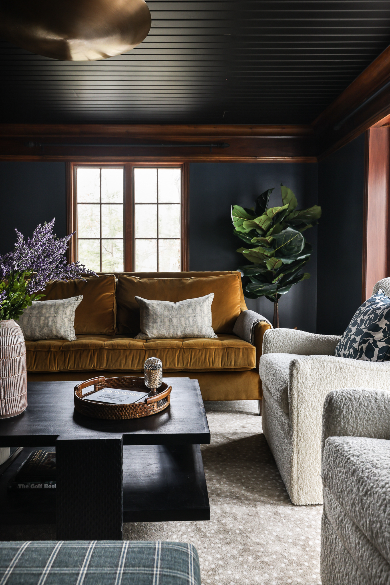
A progression showing the impact of furnishings and accessories:


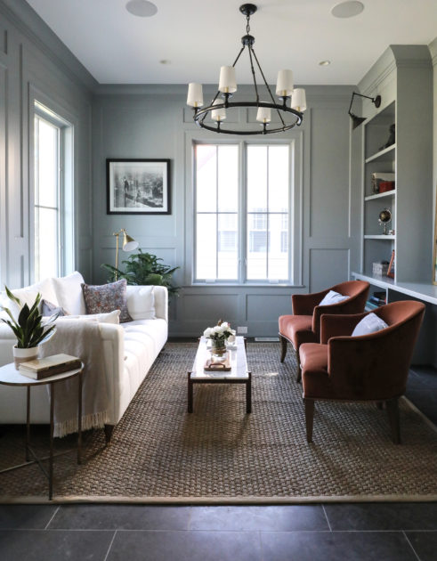
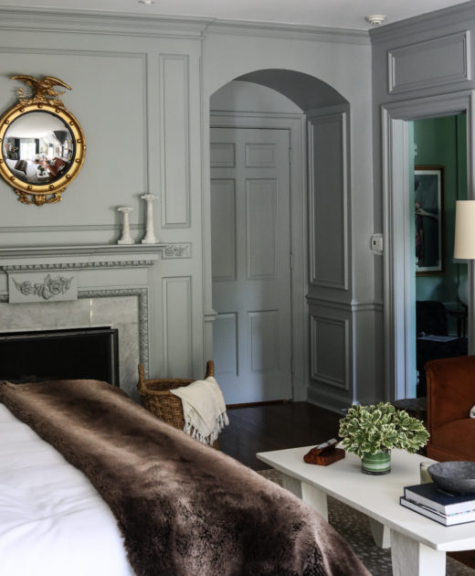
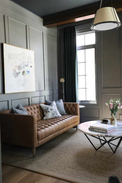
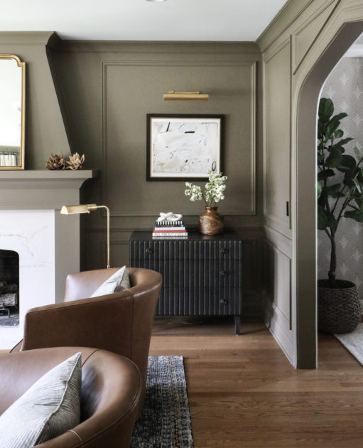
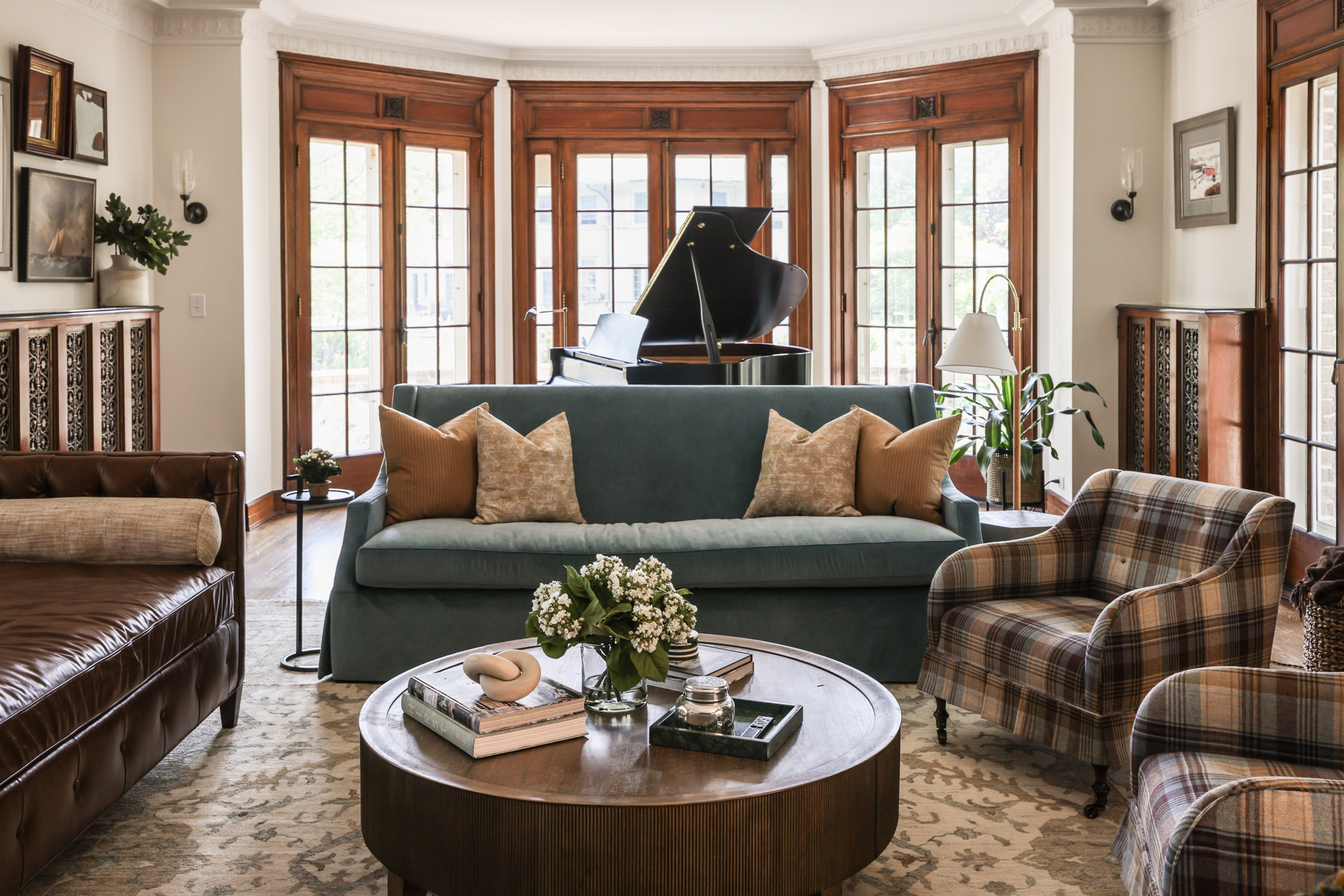
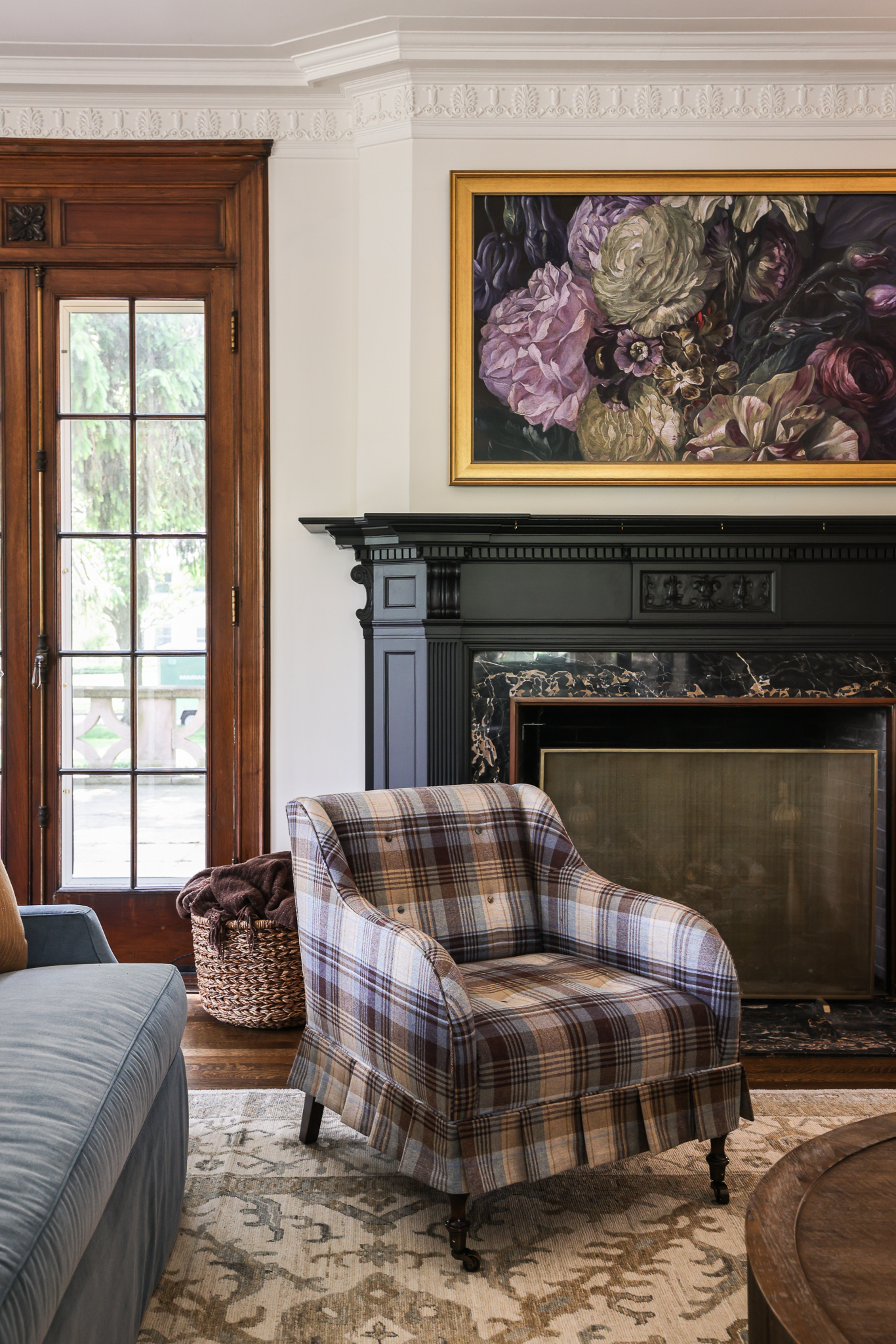
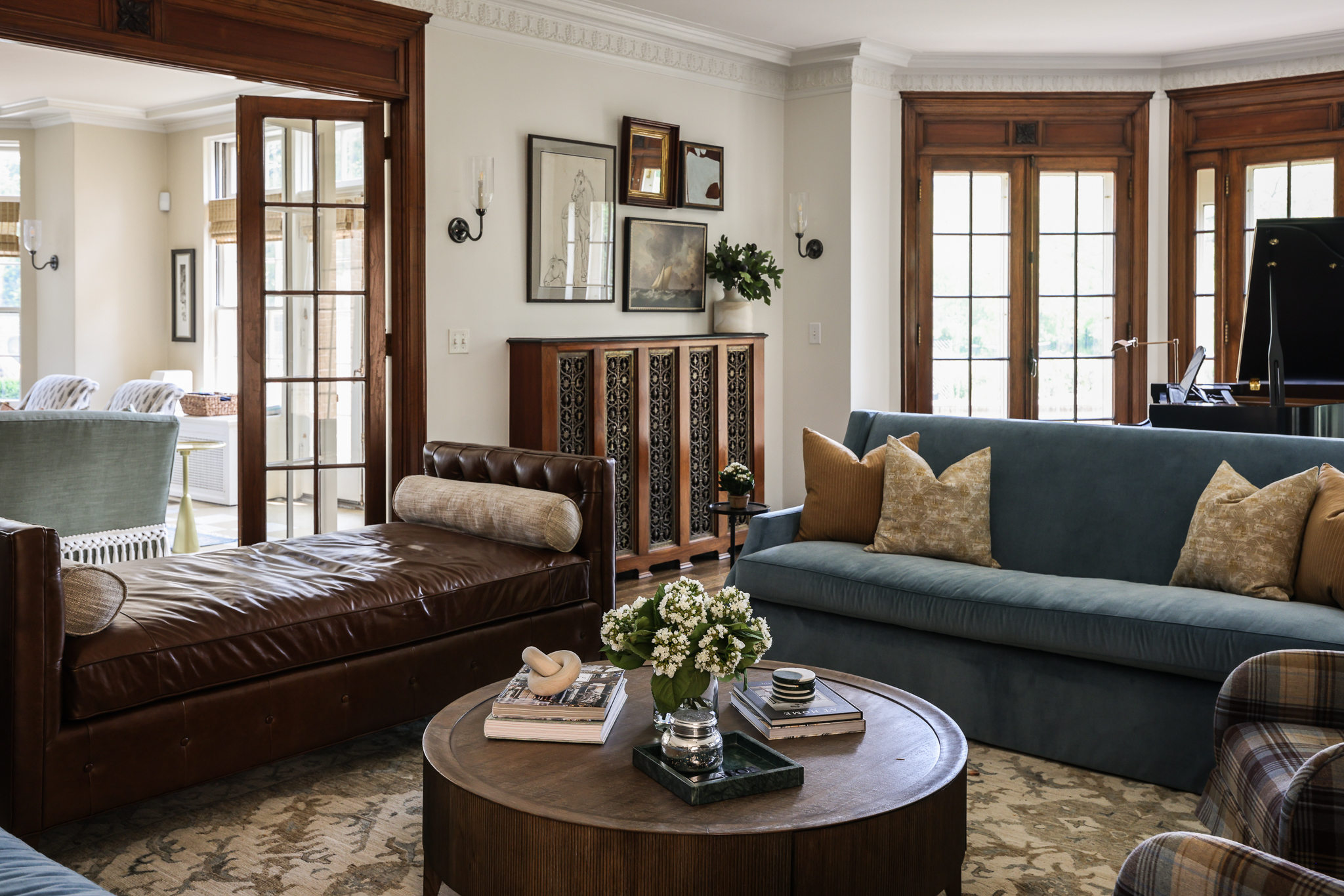
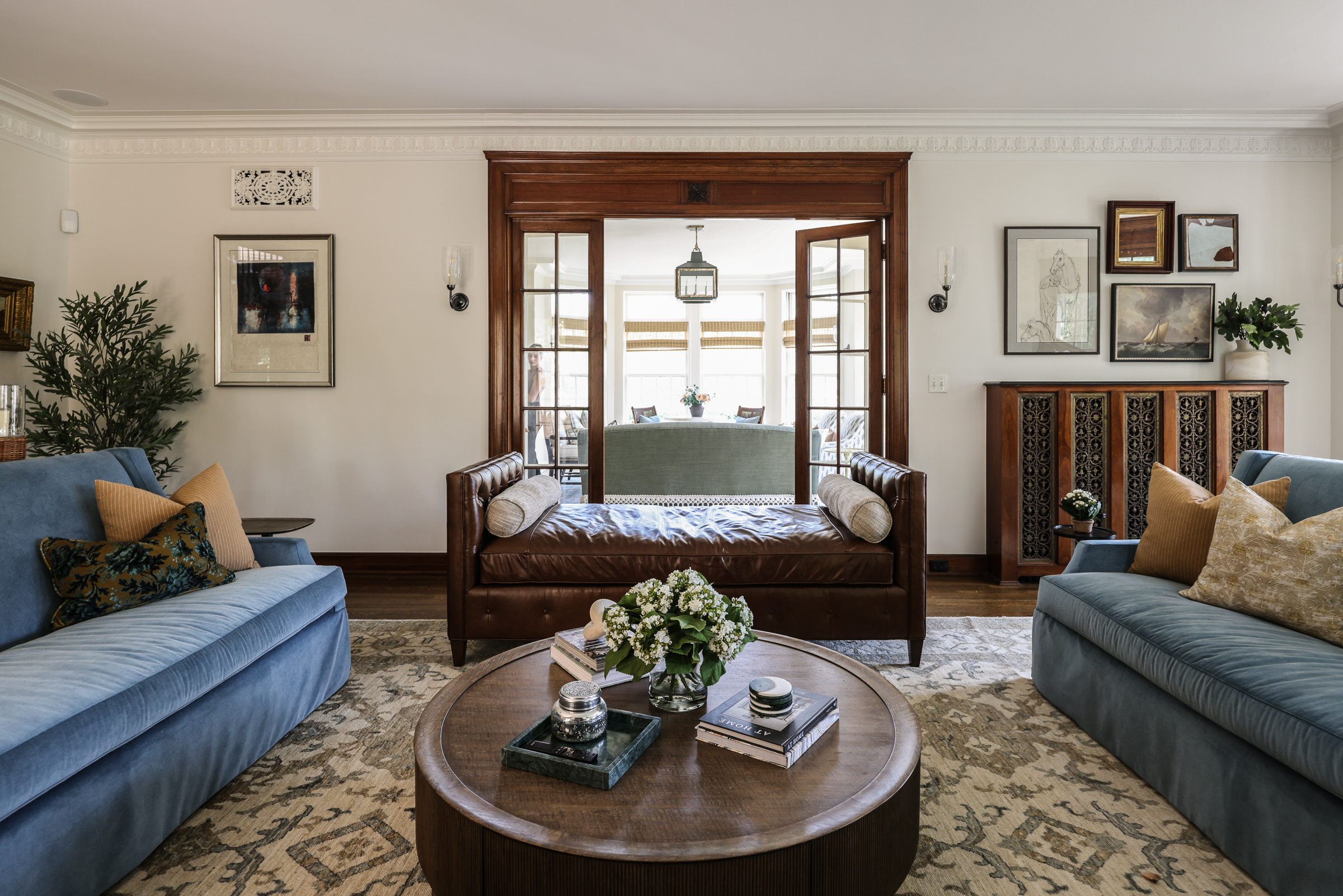
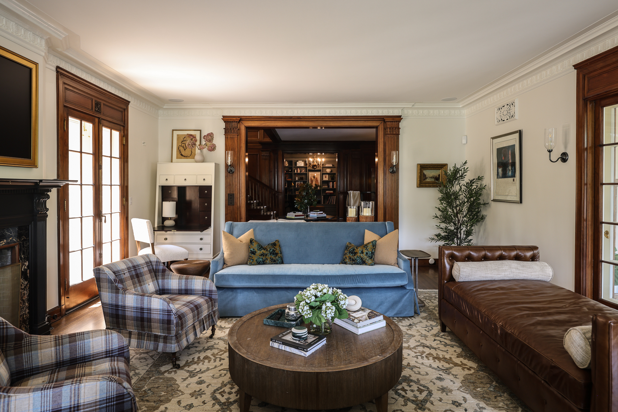
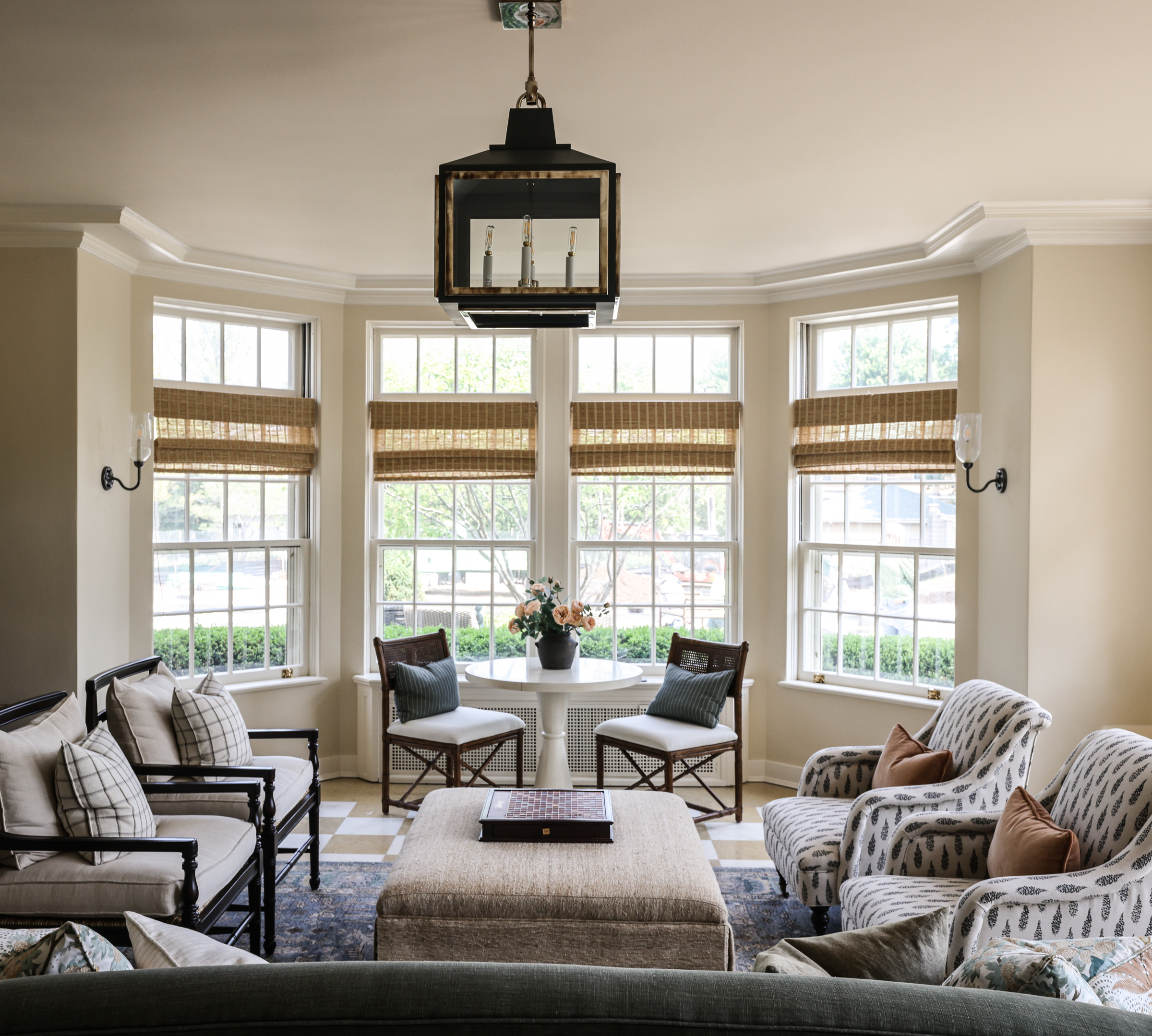
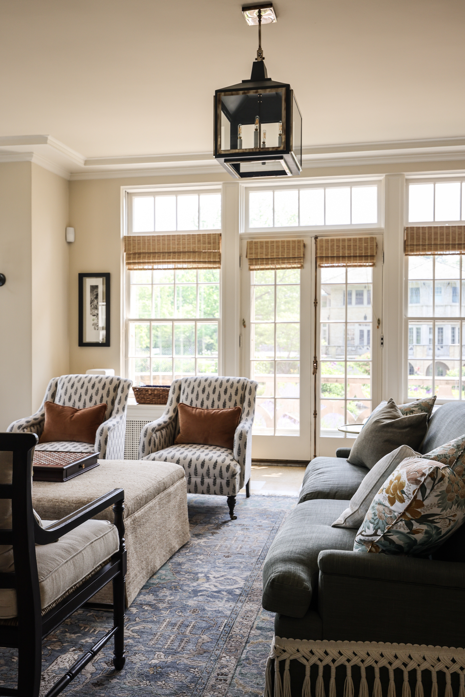
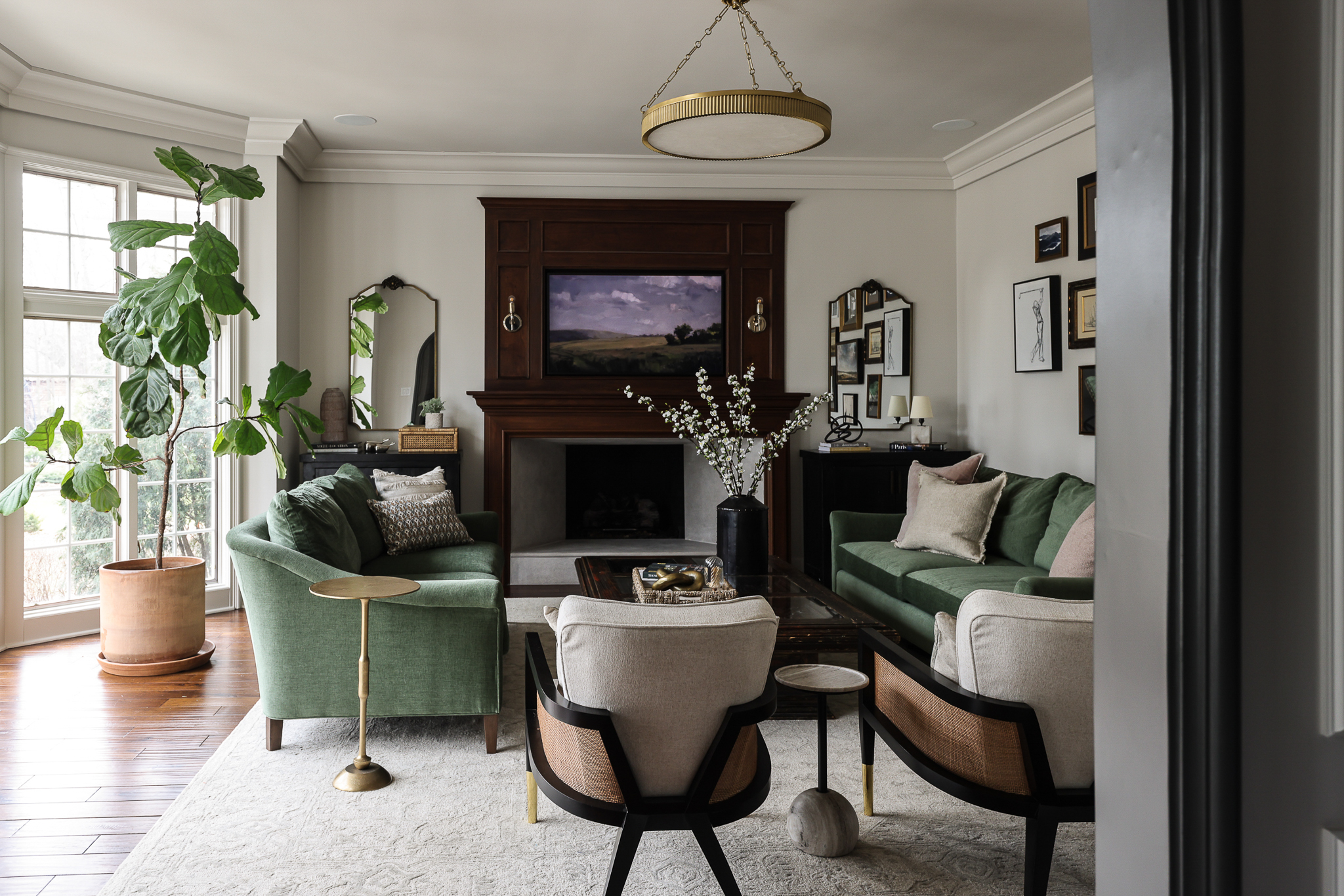
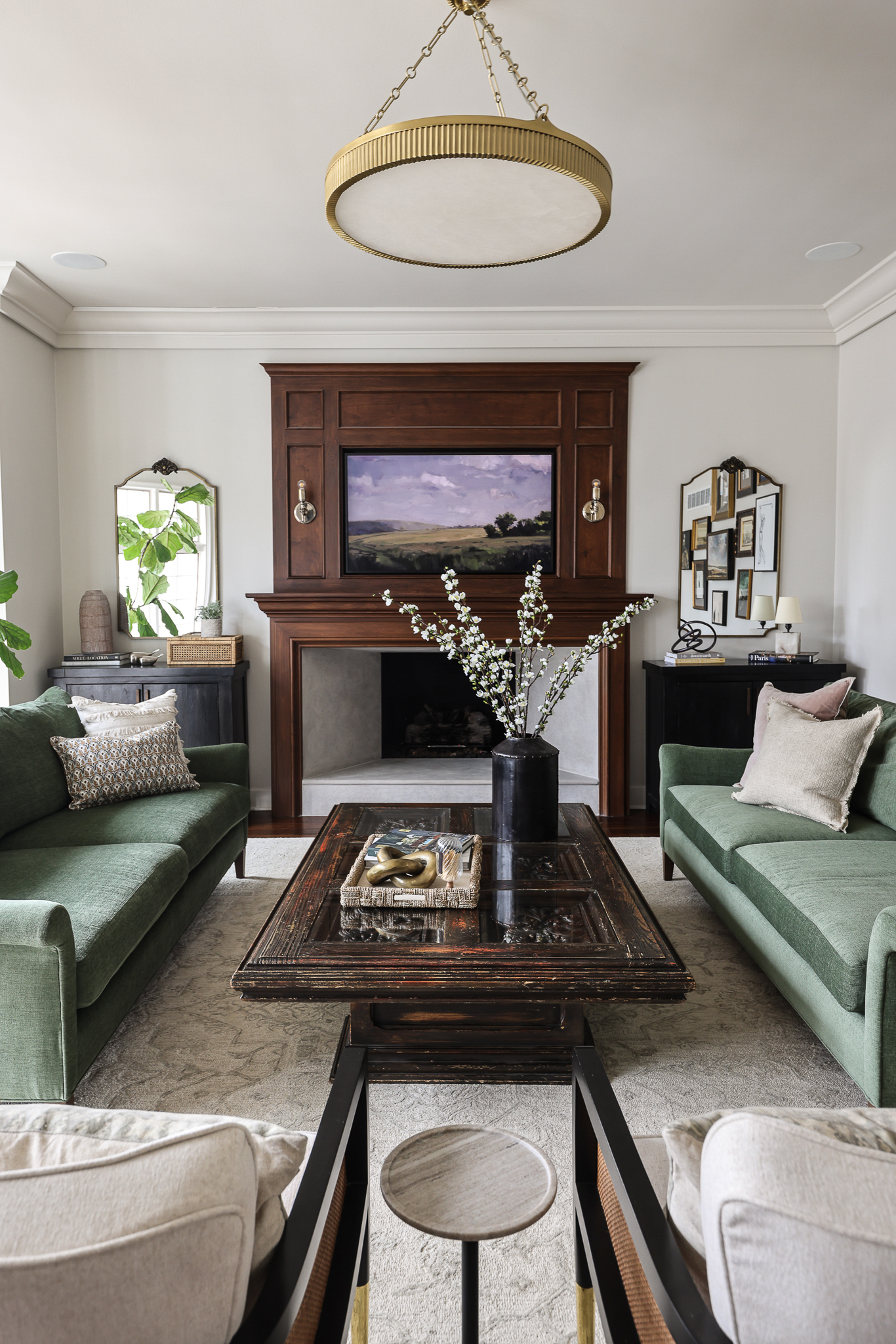
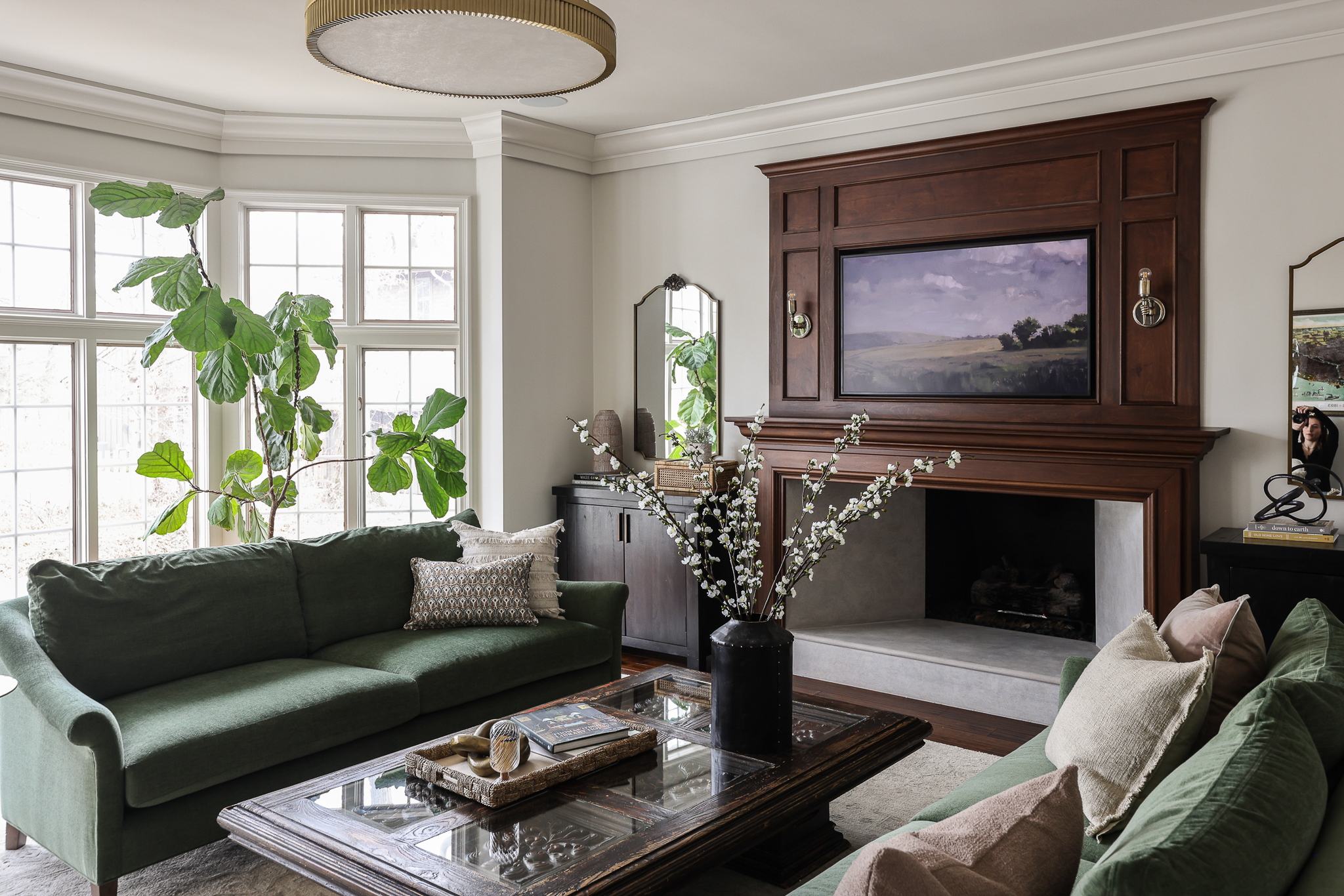
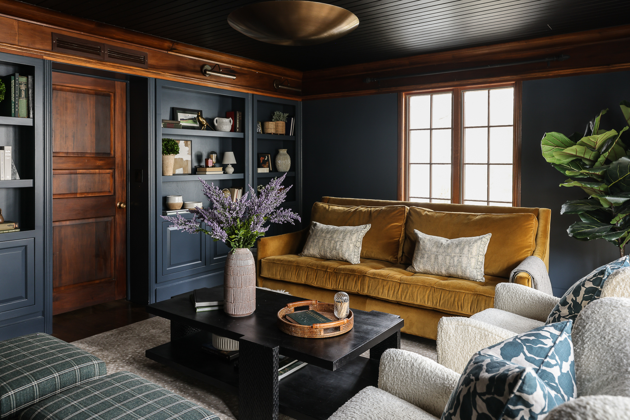
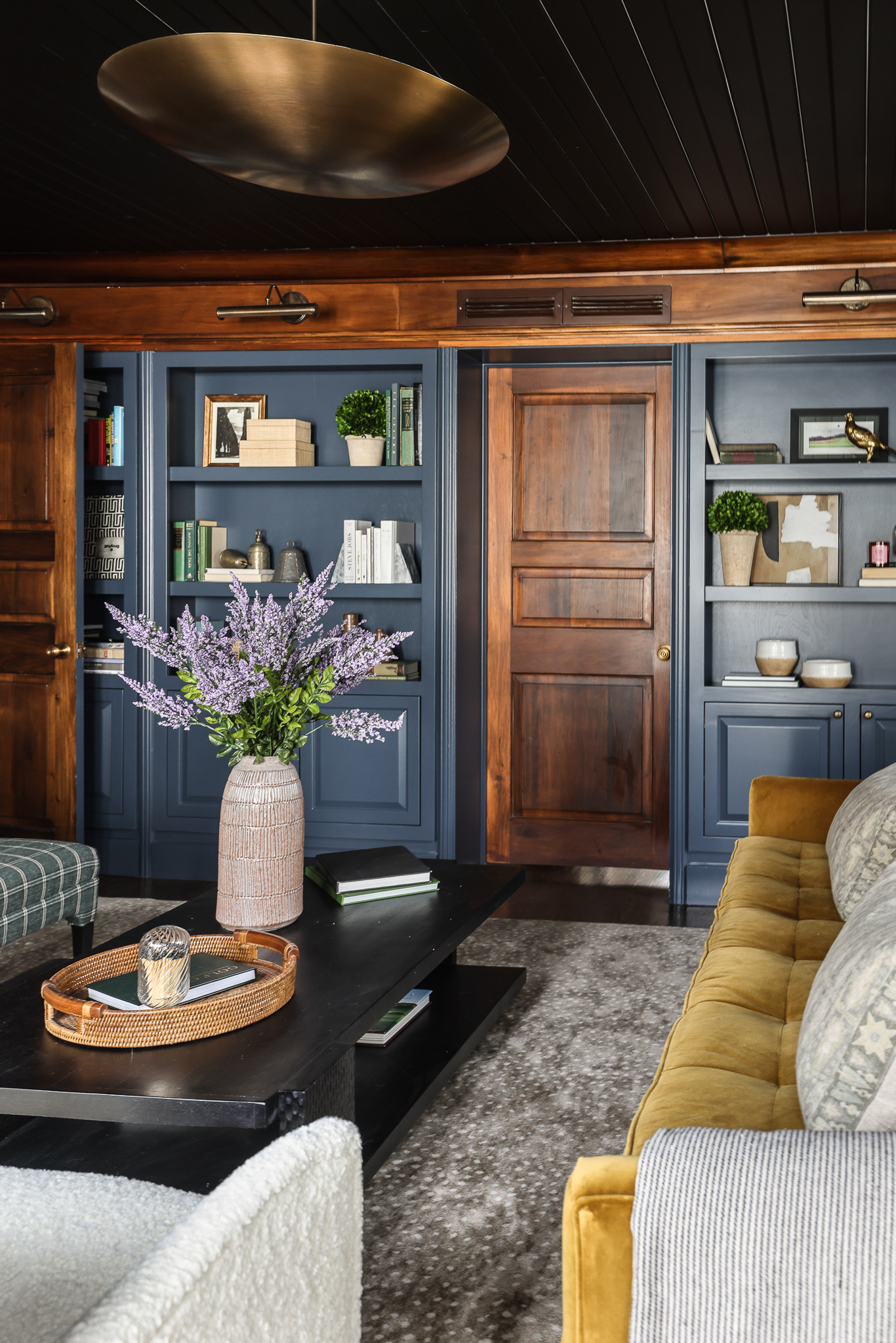
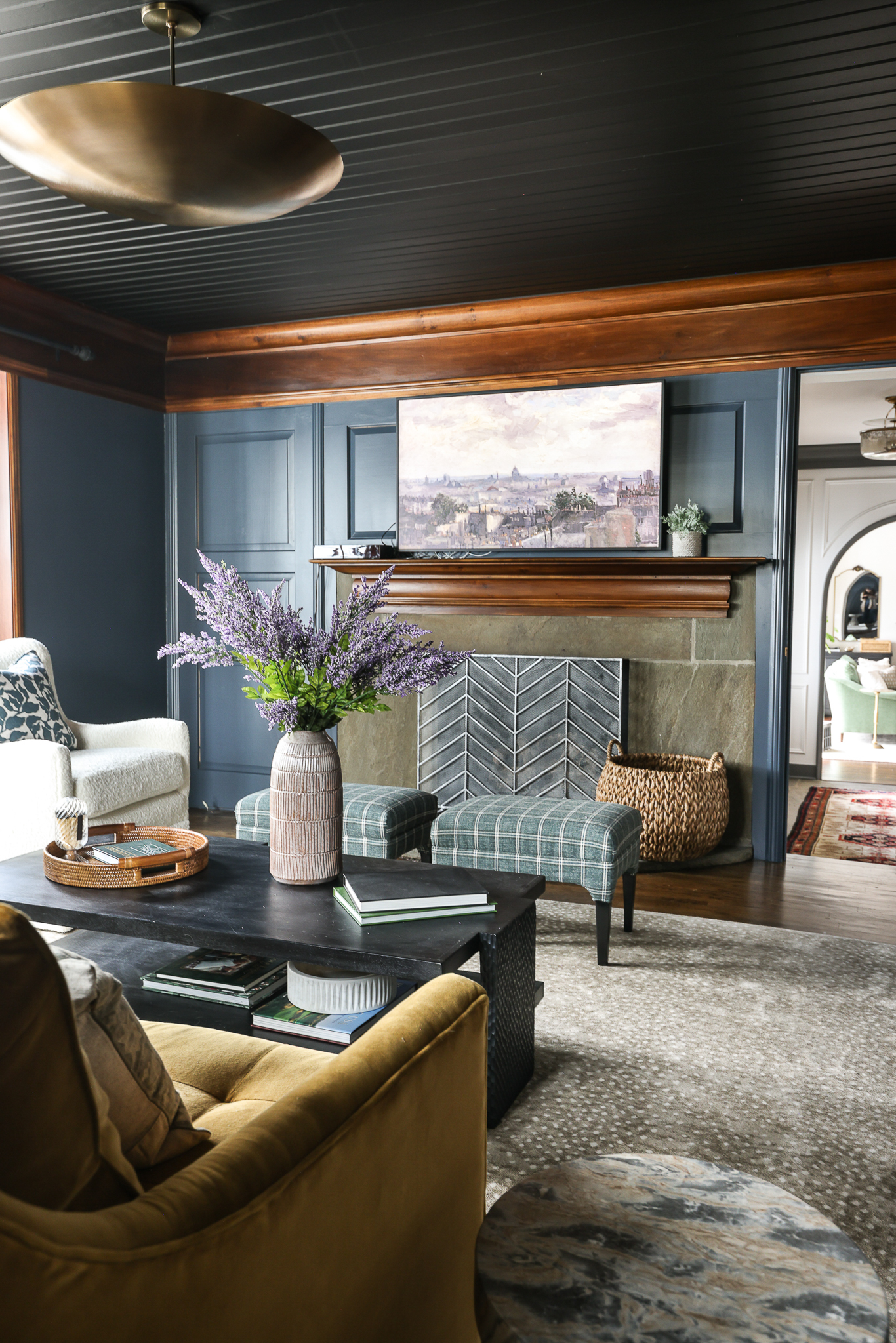
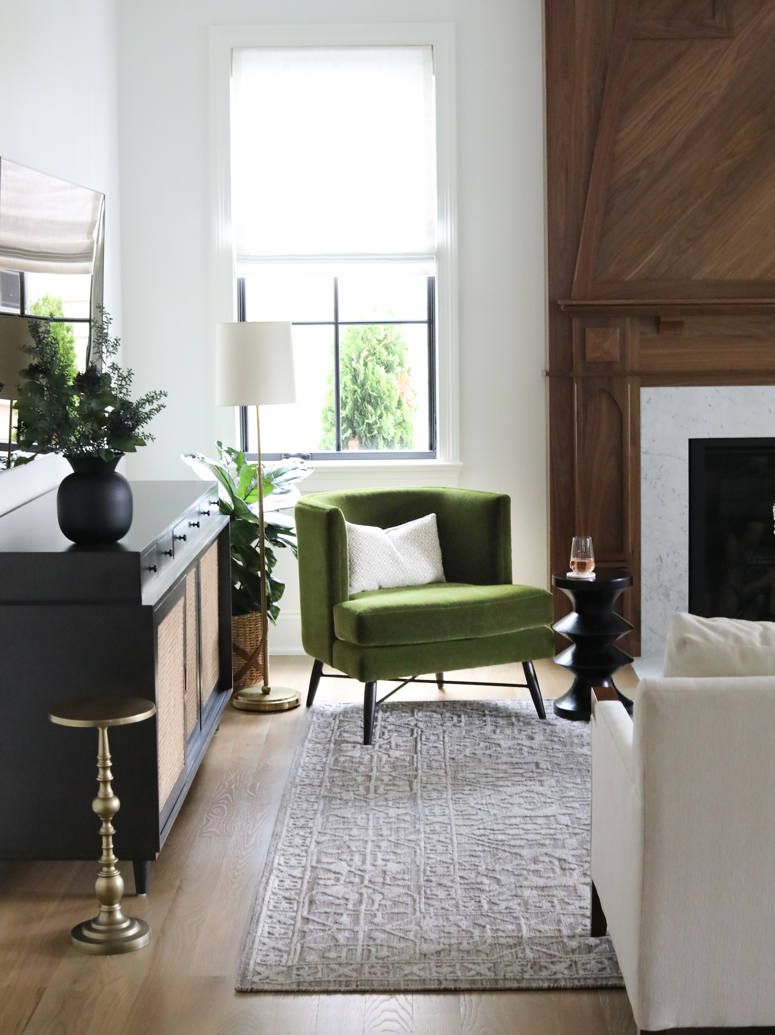
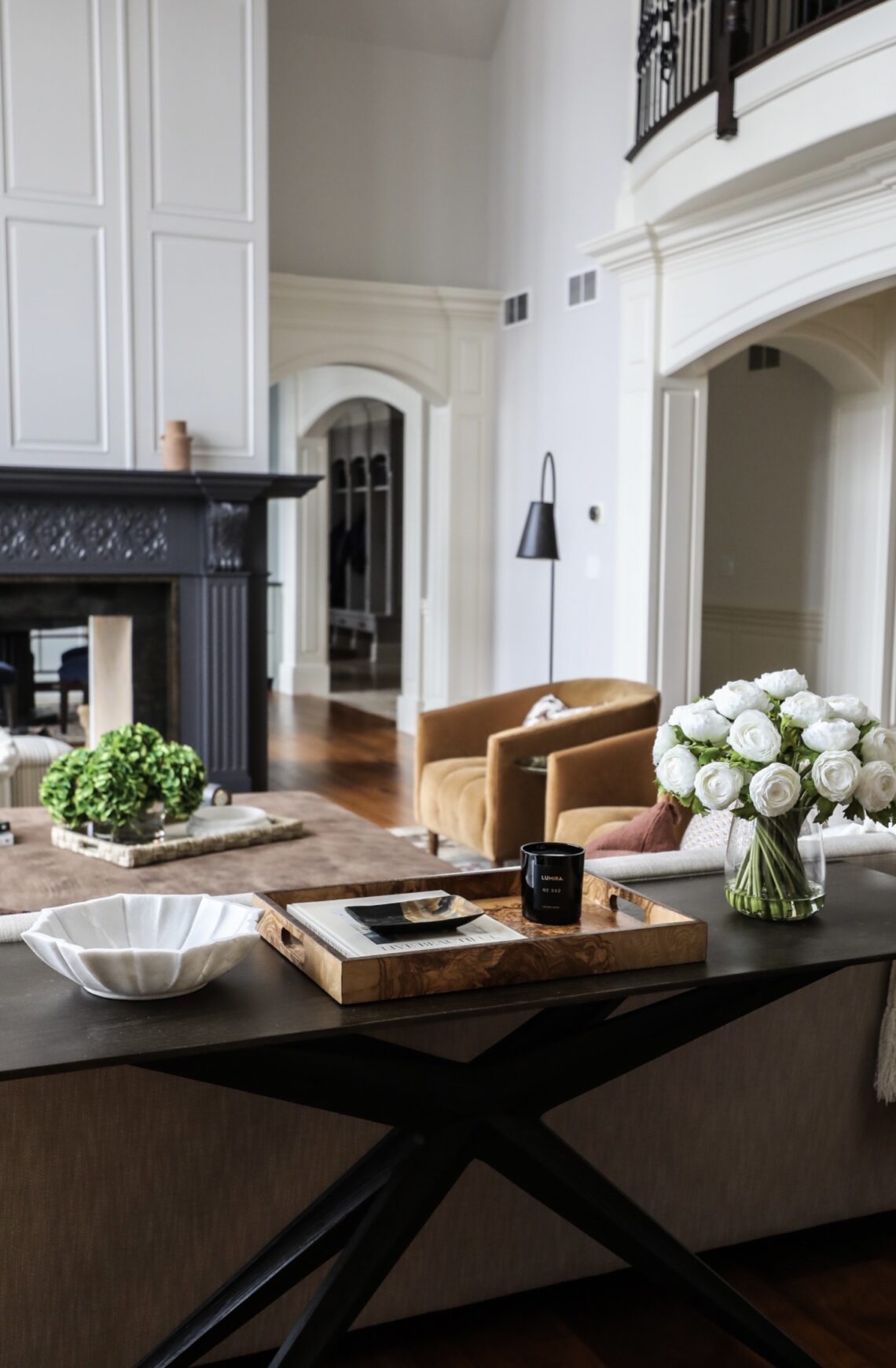
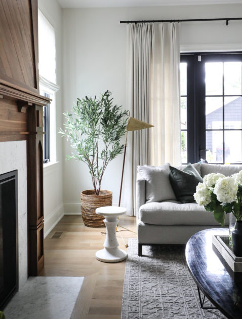
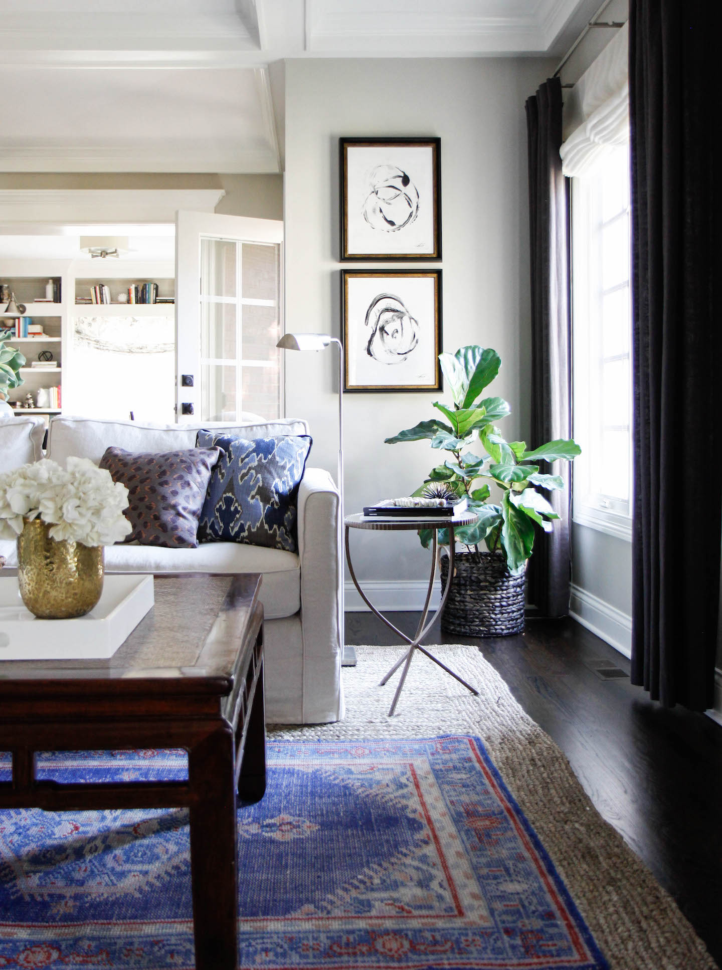
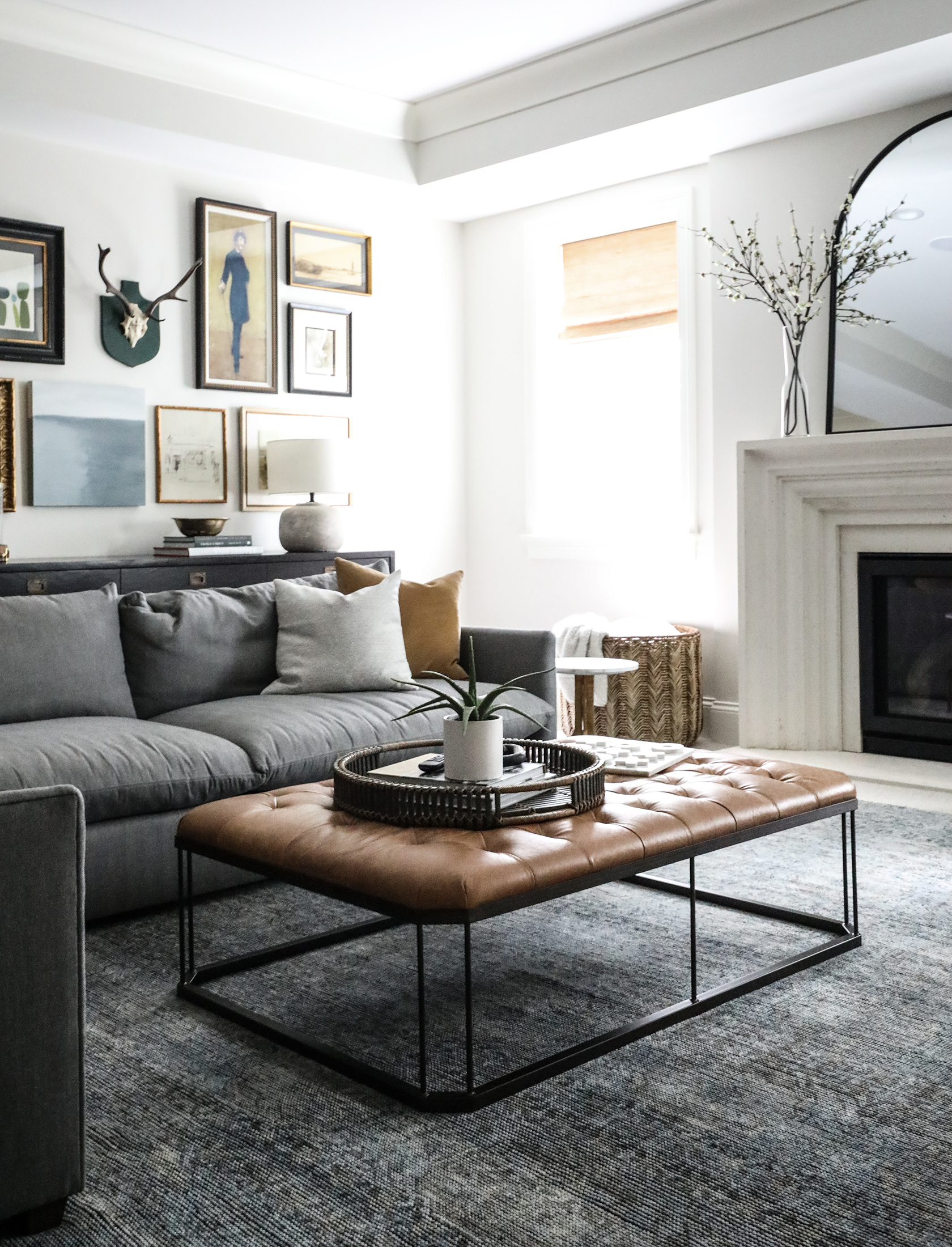
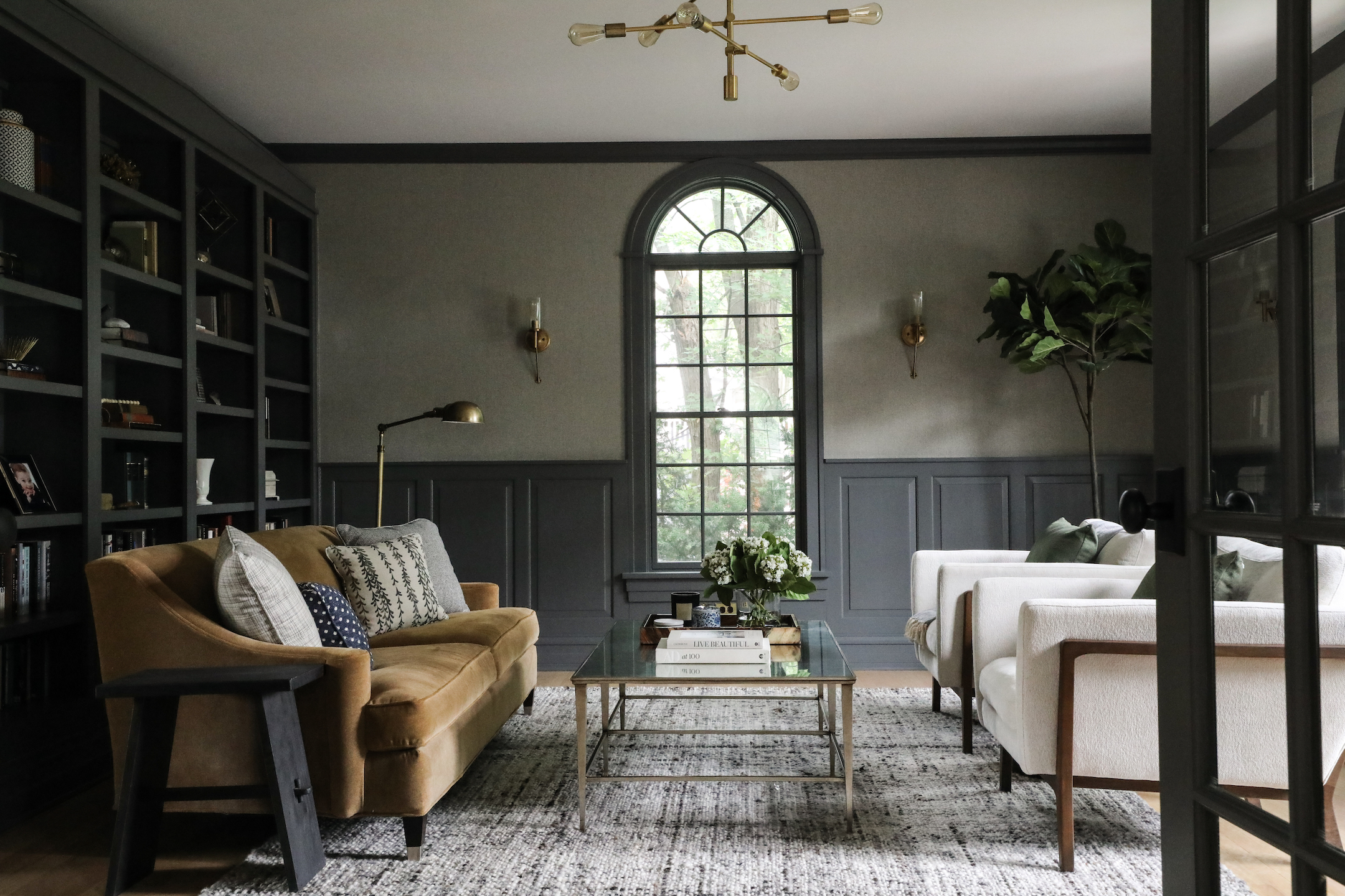
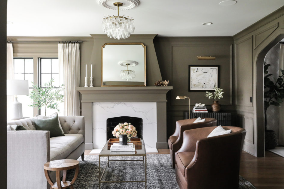
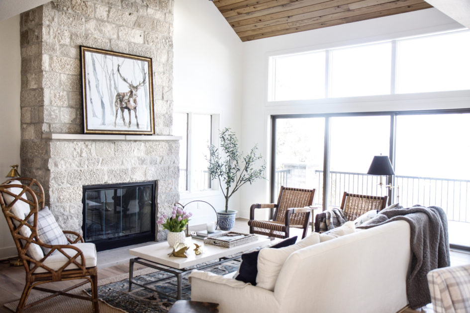
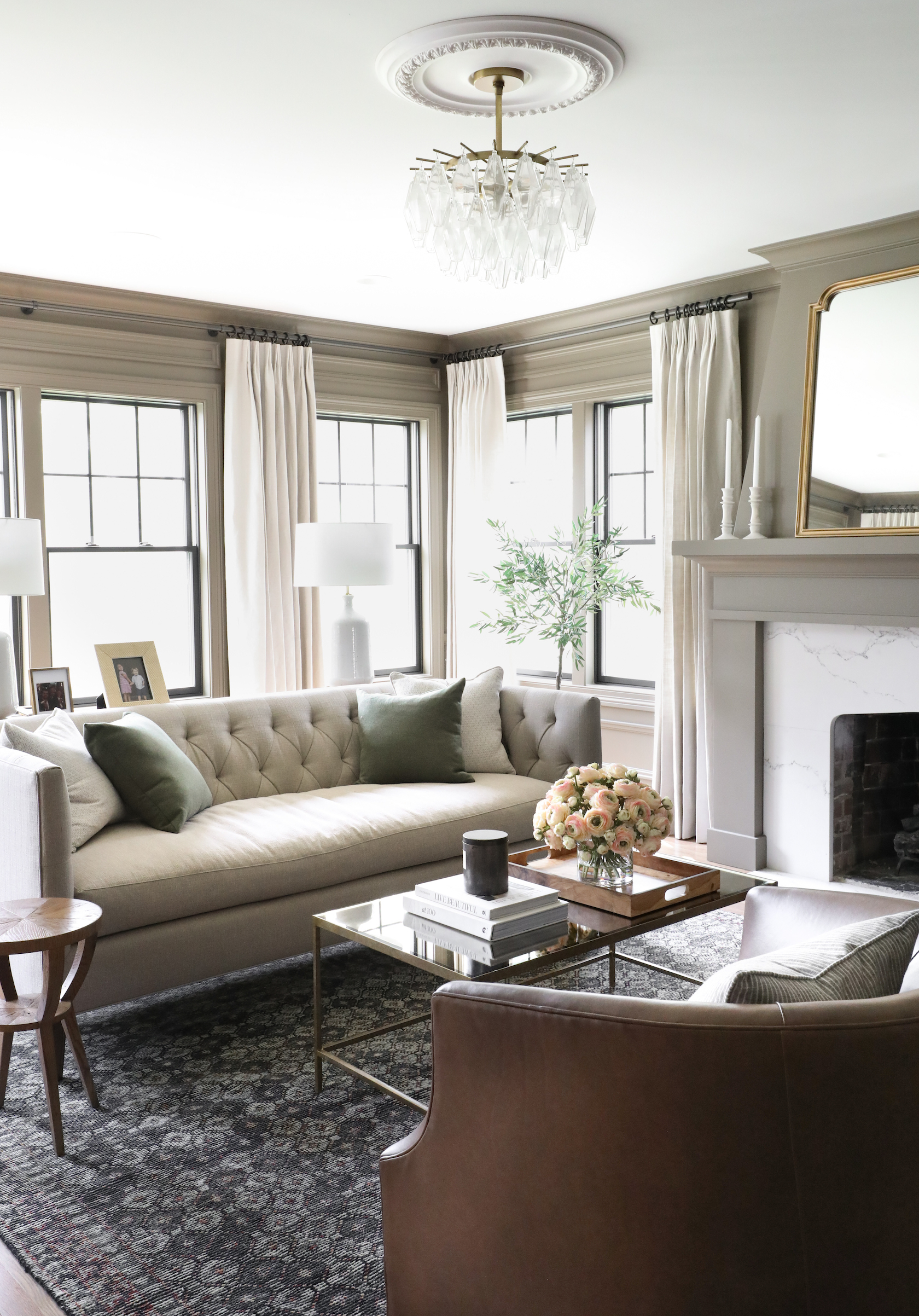
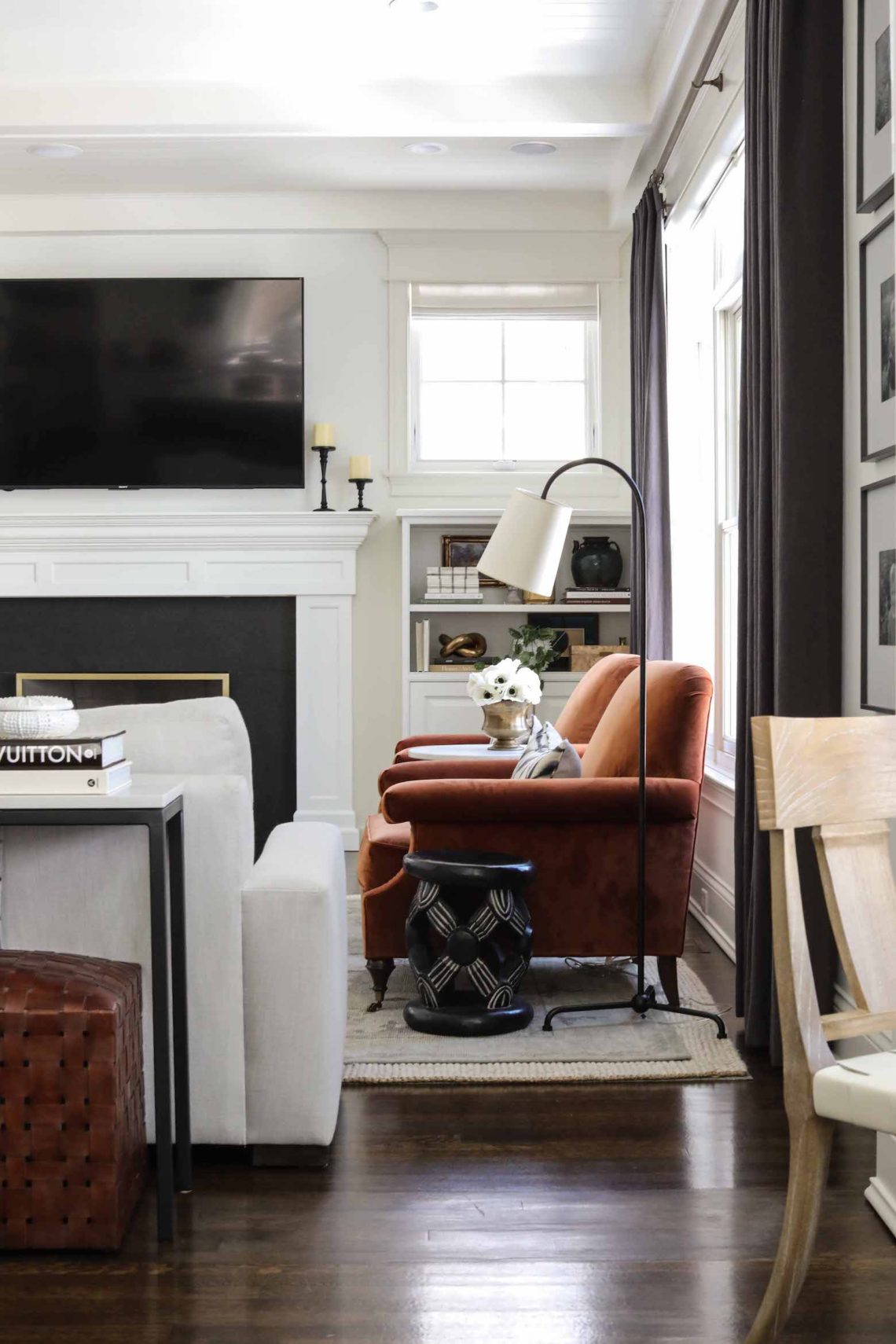
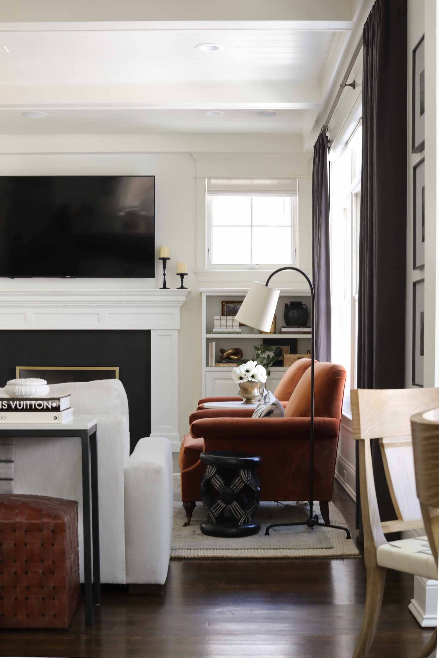
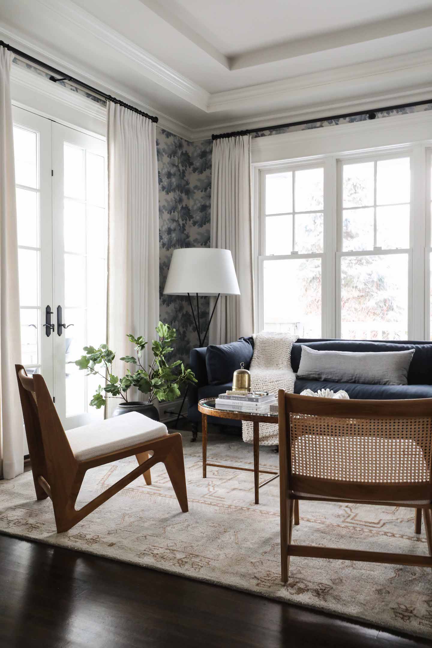
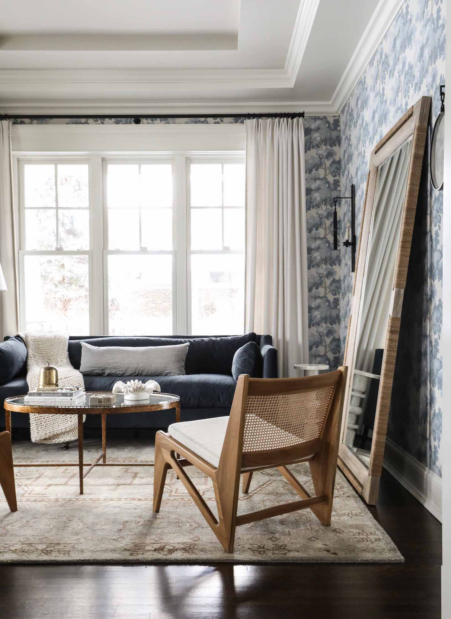
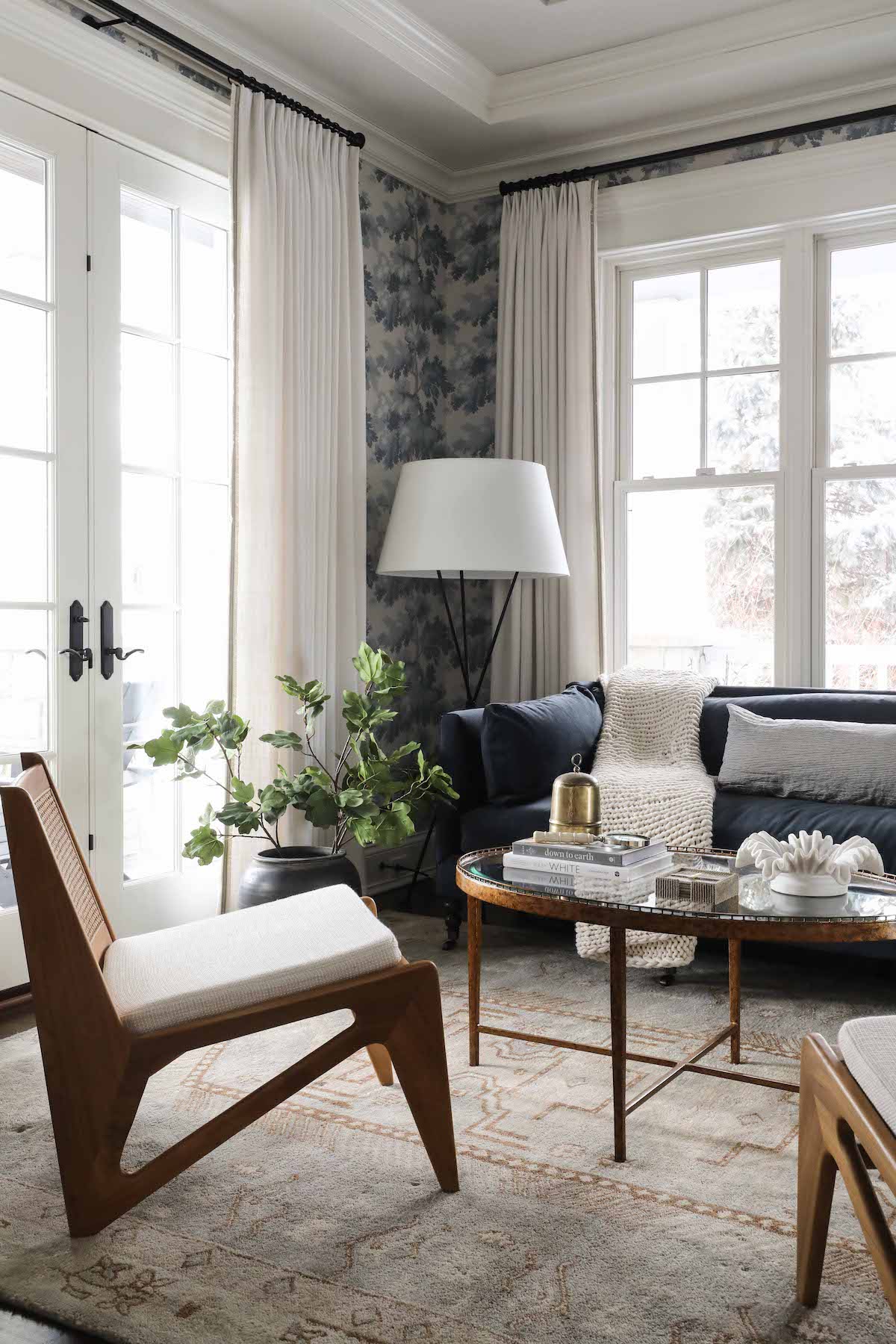
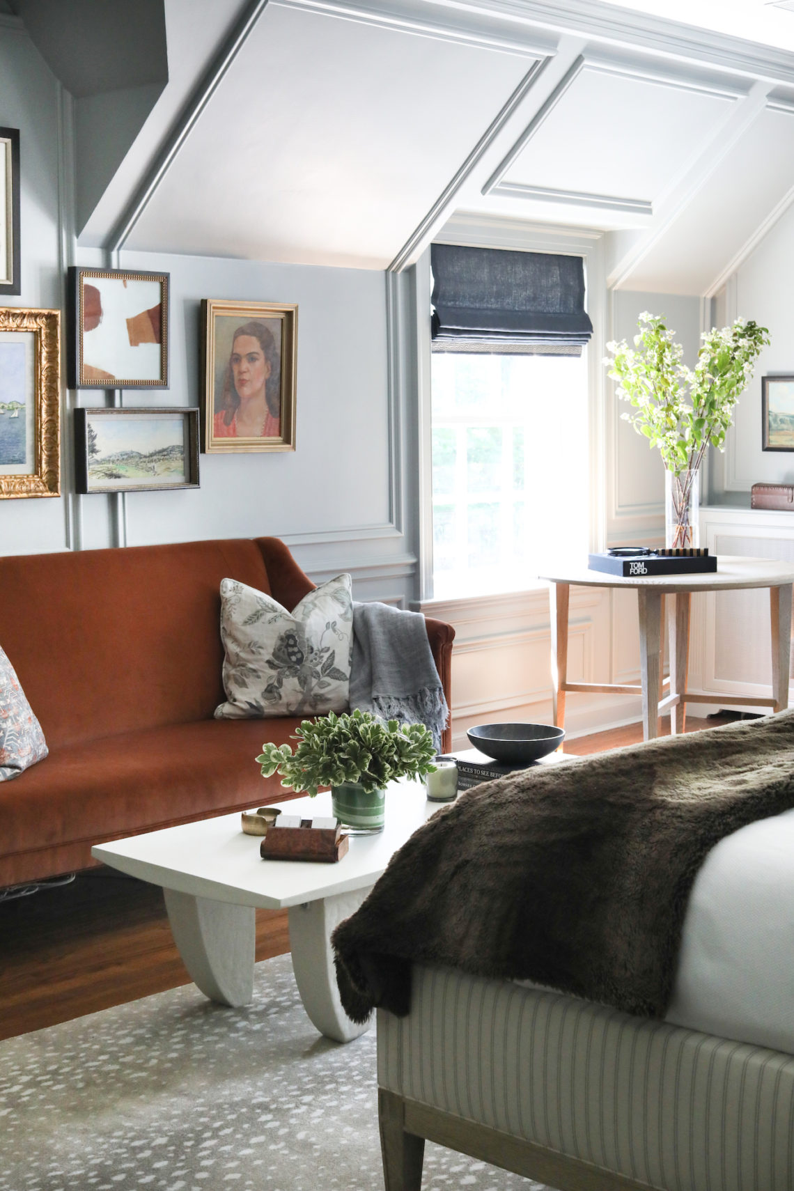
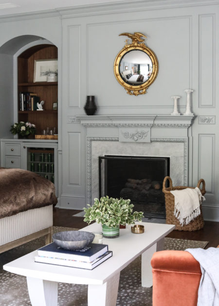
Look closely at the photos below and you can see all the special details in the #POwilmetterefresh family room: doors and trim with intricate carvings, custom radiator covers with elaborate metal grates, a fireplace designed to mimic the doors. Here we wanted to highlight these details, but also needed to brighten up the room a bit. We added sconces strategically around the room to add a layer of ambient light beyond the recessed ceiling fixtures. Their design echos the history of the home. We kept furnishings classic, with plaid and leather, plus matching blue sofas that behave like a neutral while also bringing additional color to the space. The bay window was a perfect spot for the family’s baby grand piano, which all the kids play. The home was painted before listing, and we kept that color in the living room, though we did paint the fireplace surround in Benjamin Moore Black Beauty to draw attention to it.


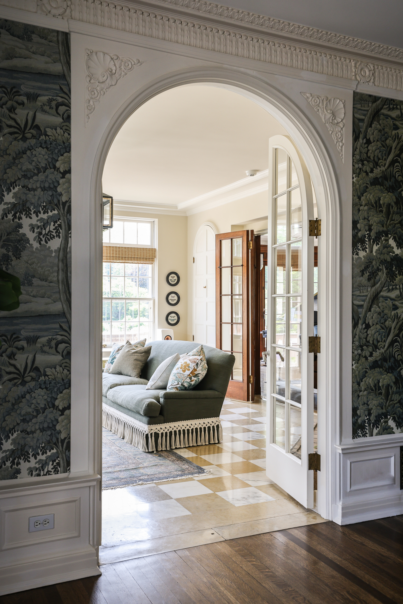
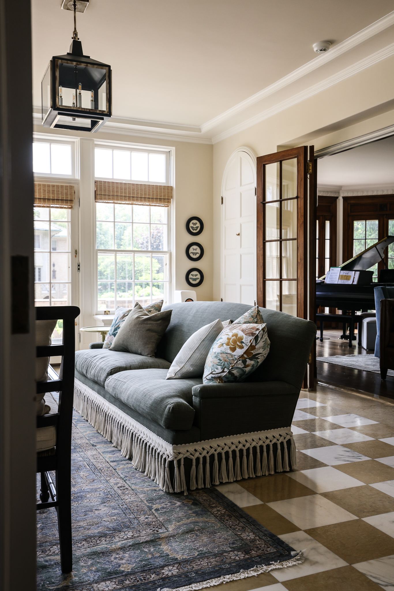
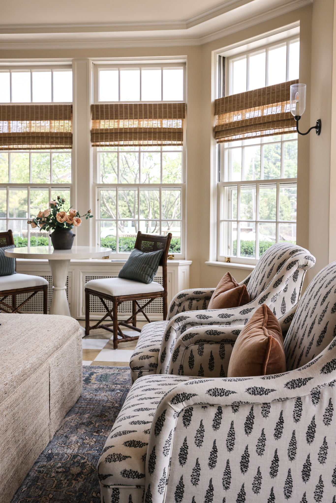
Off one end of the family room lies the sunroom. This room leads out to the grand main lawn of the home, so the family anticipates spending a lot of time here. The original checkered tile floors were the launching point for the design of the room. We expected this shade of yellow to be a little tricky, but the recovered sofa and blue-grey tones of the rug, combined with other neutral upholstery, helps balance out the yellow and brown tones beautifully.


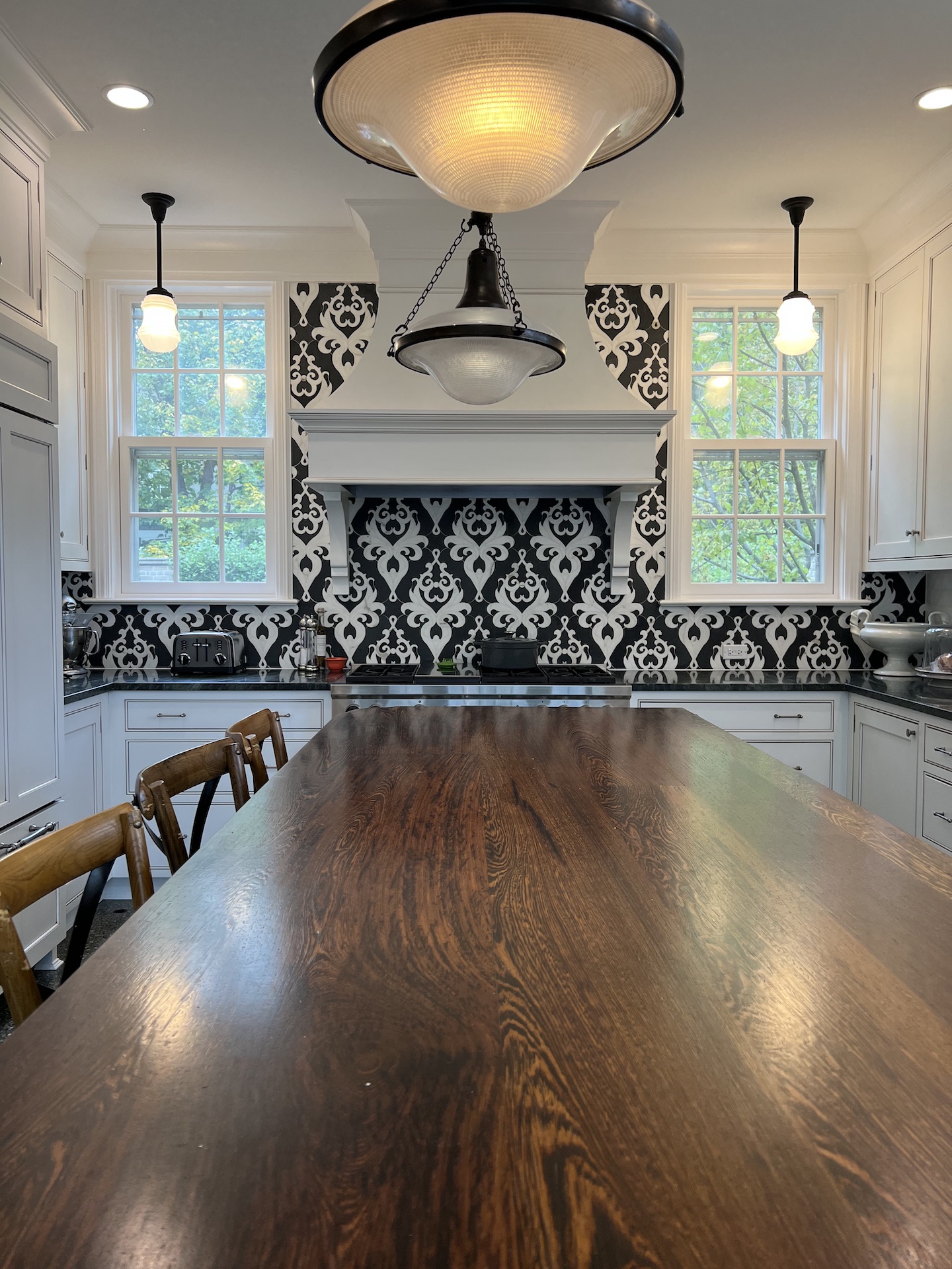
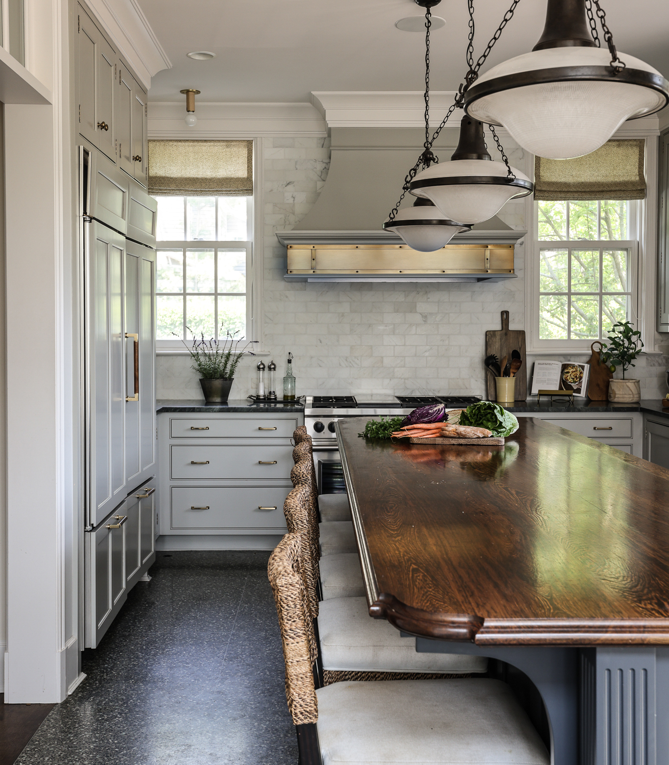
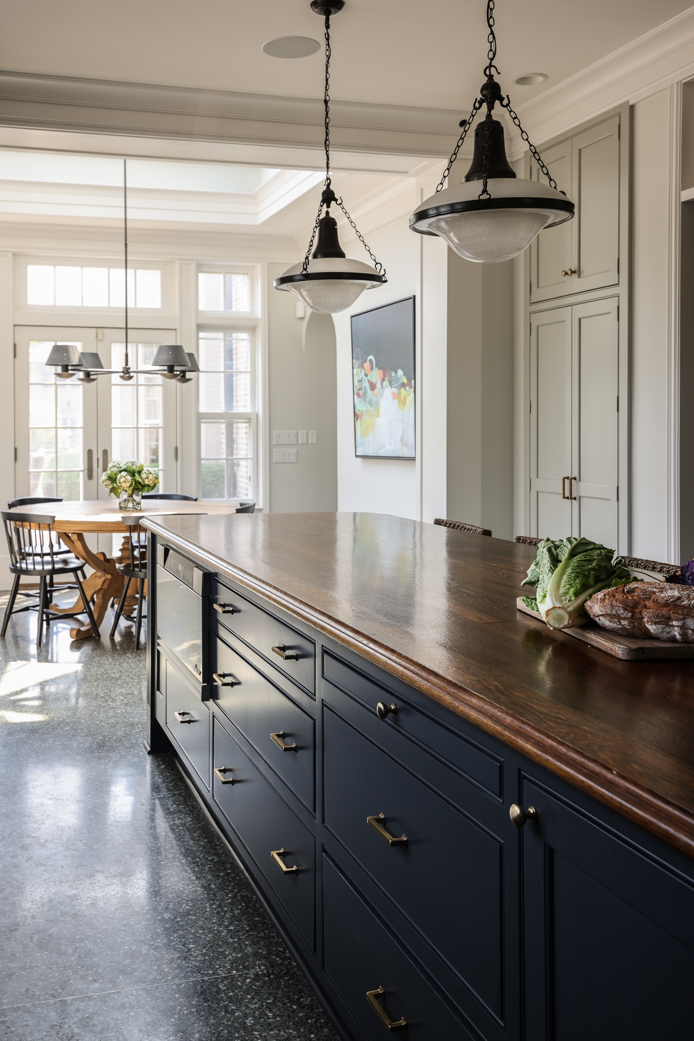
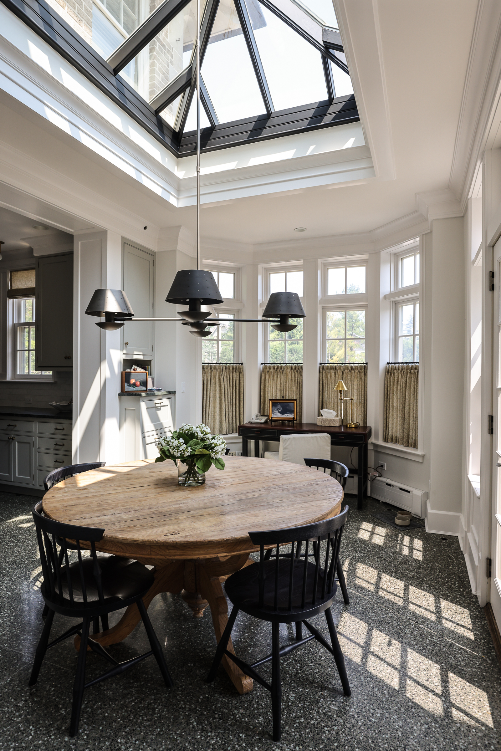
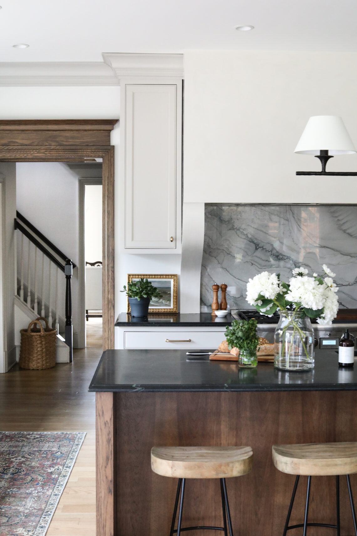
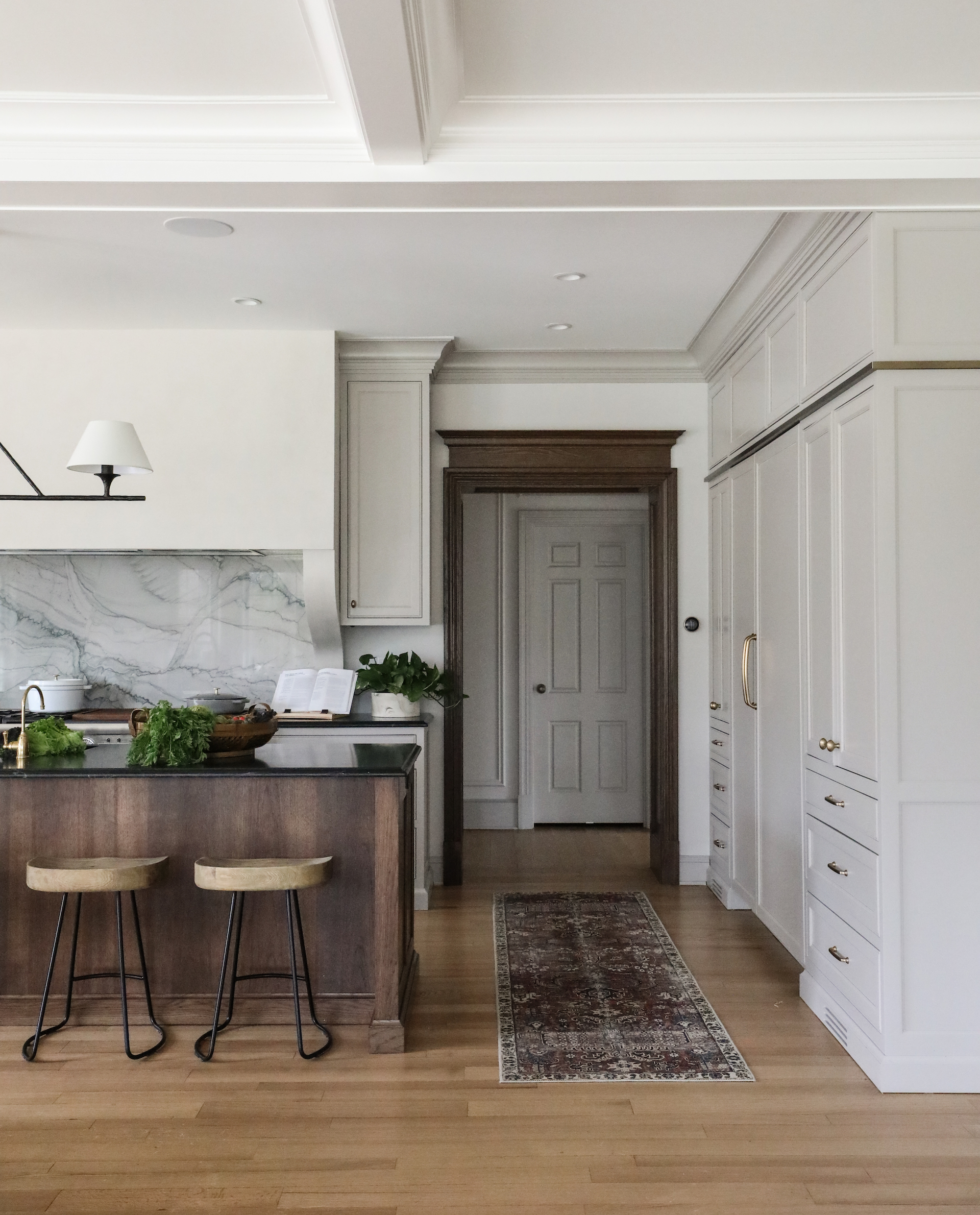
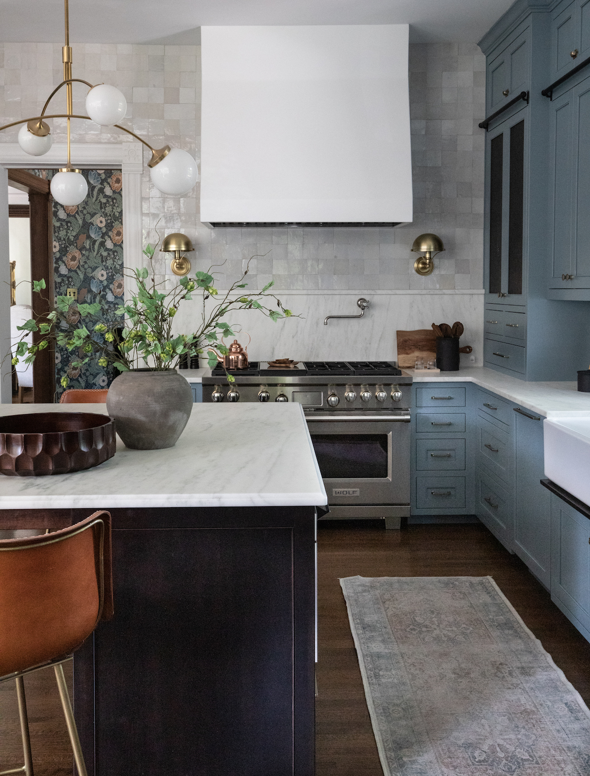
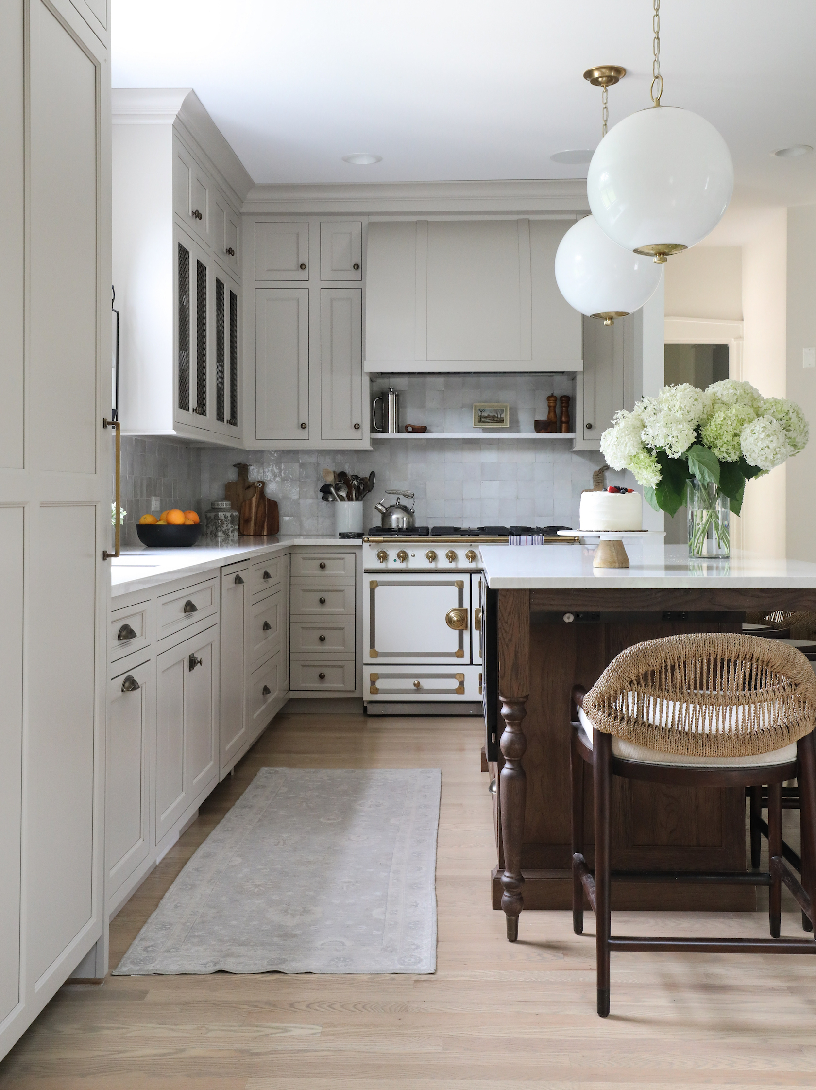
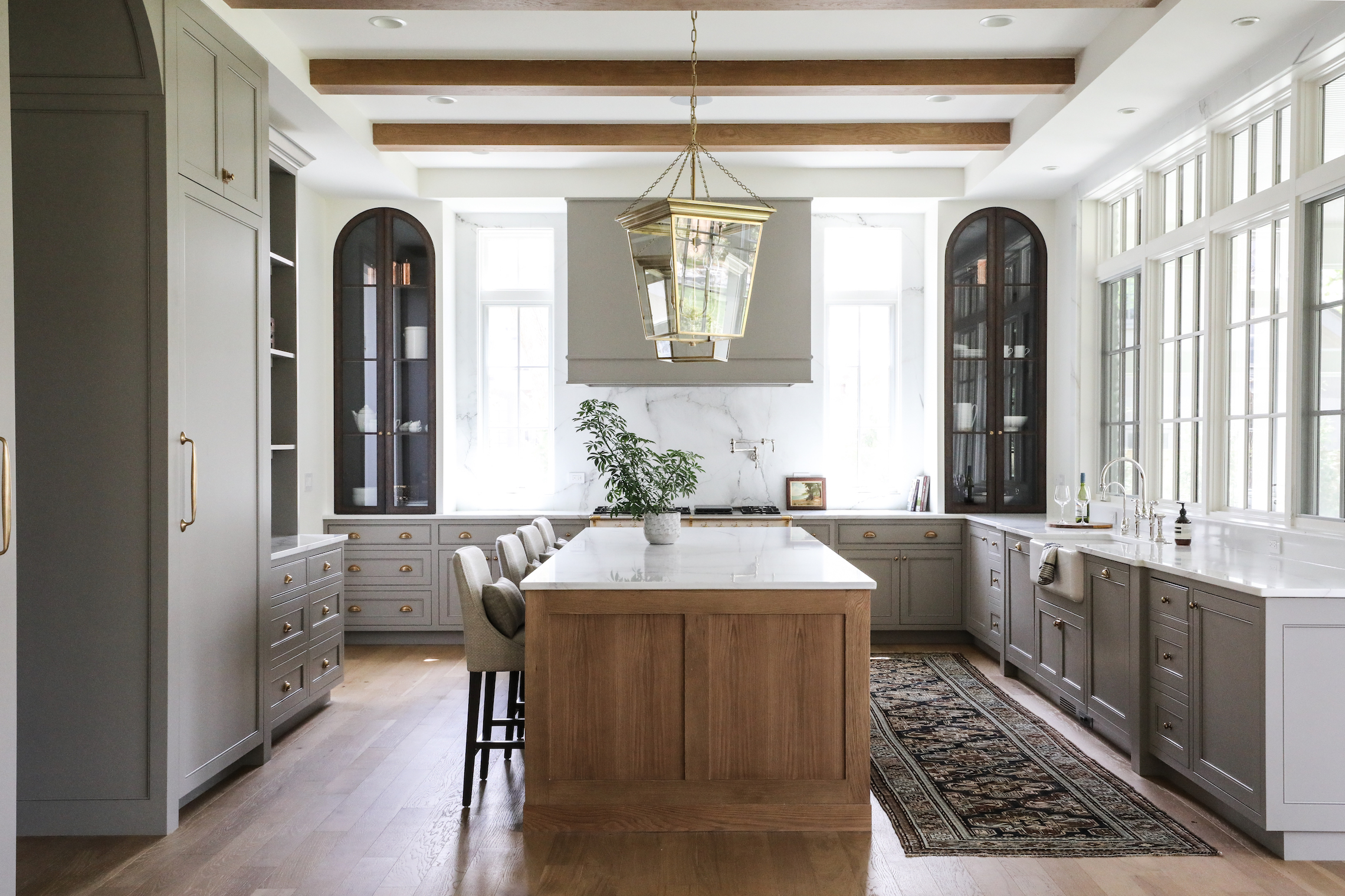
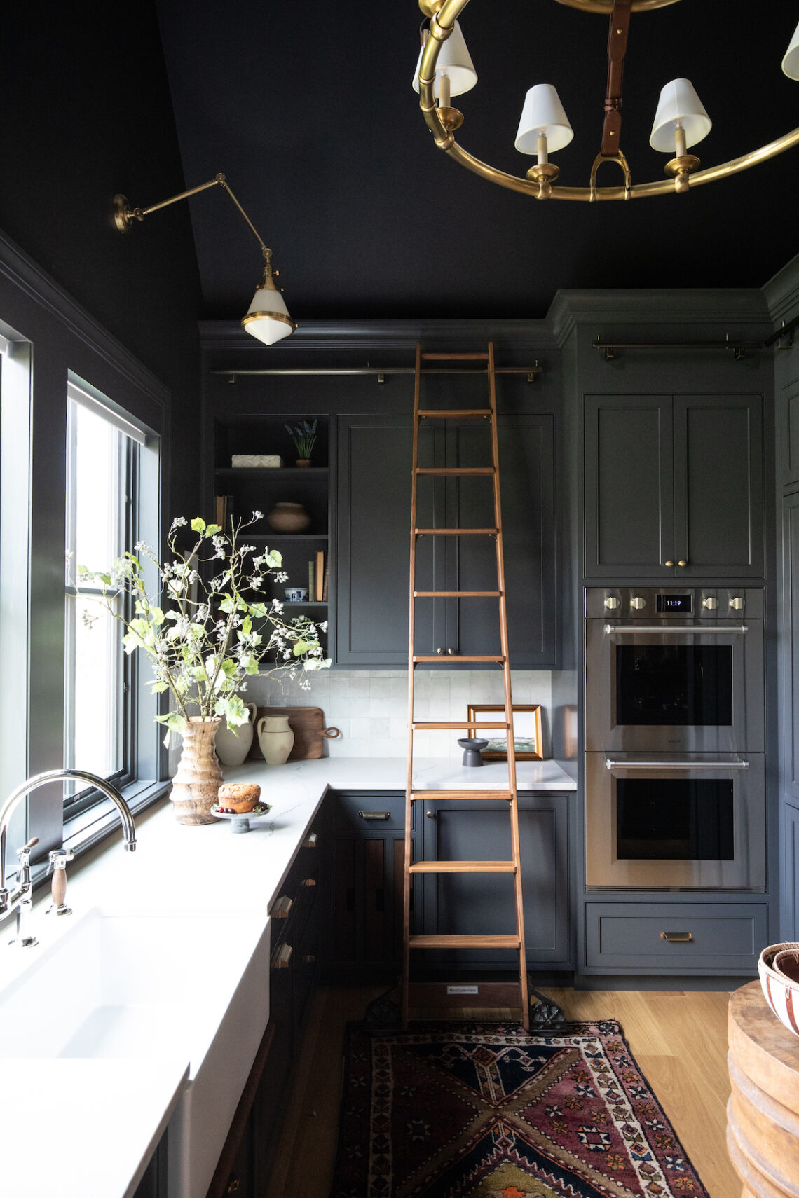
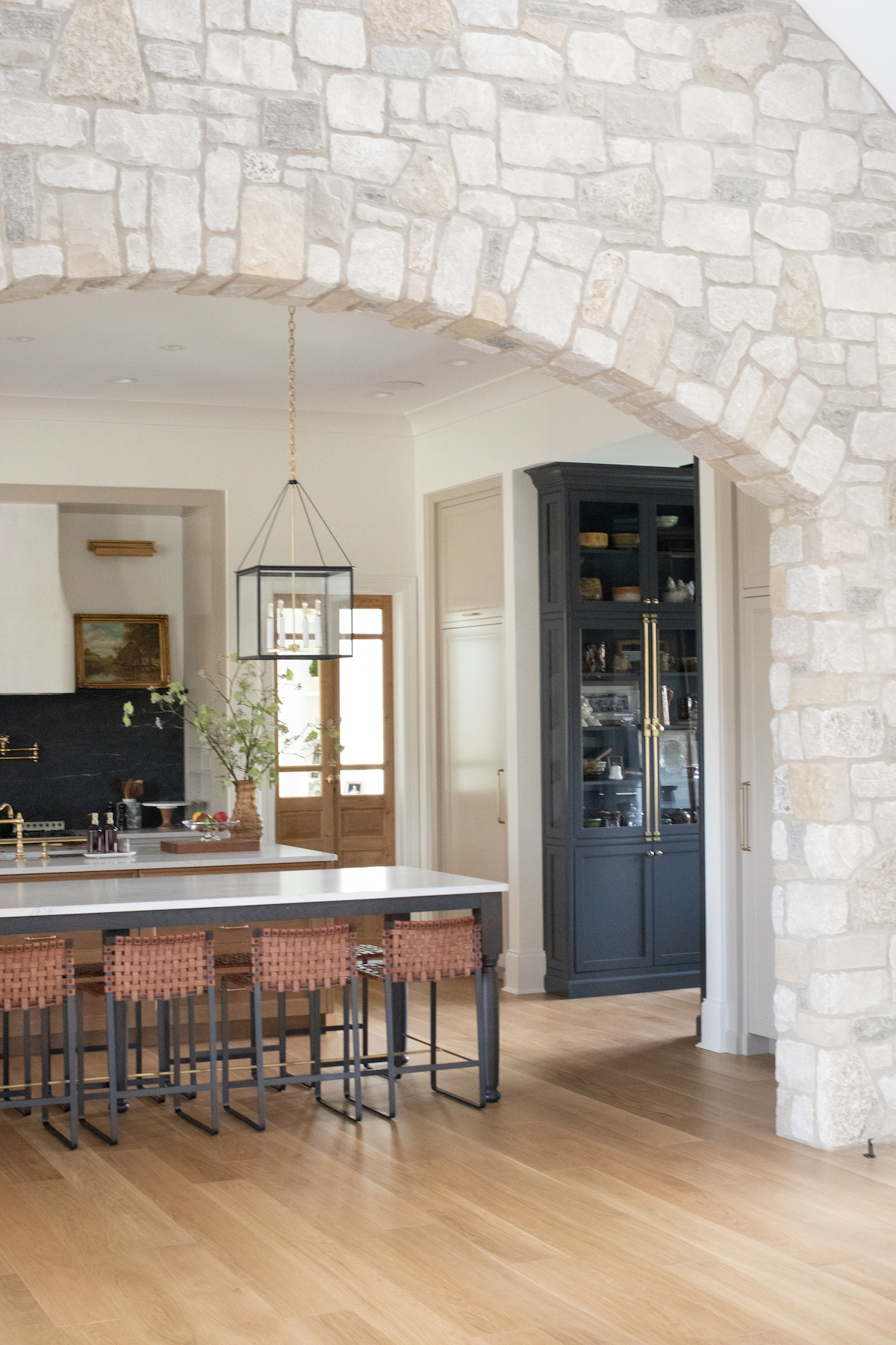
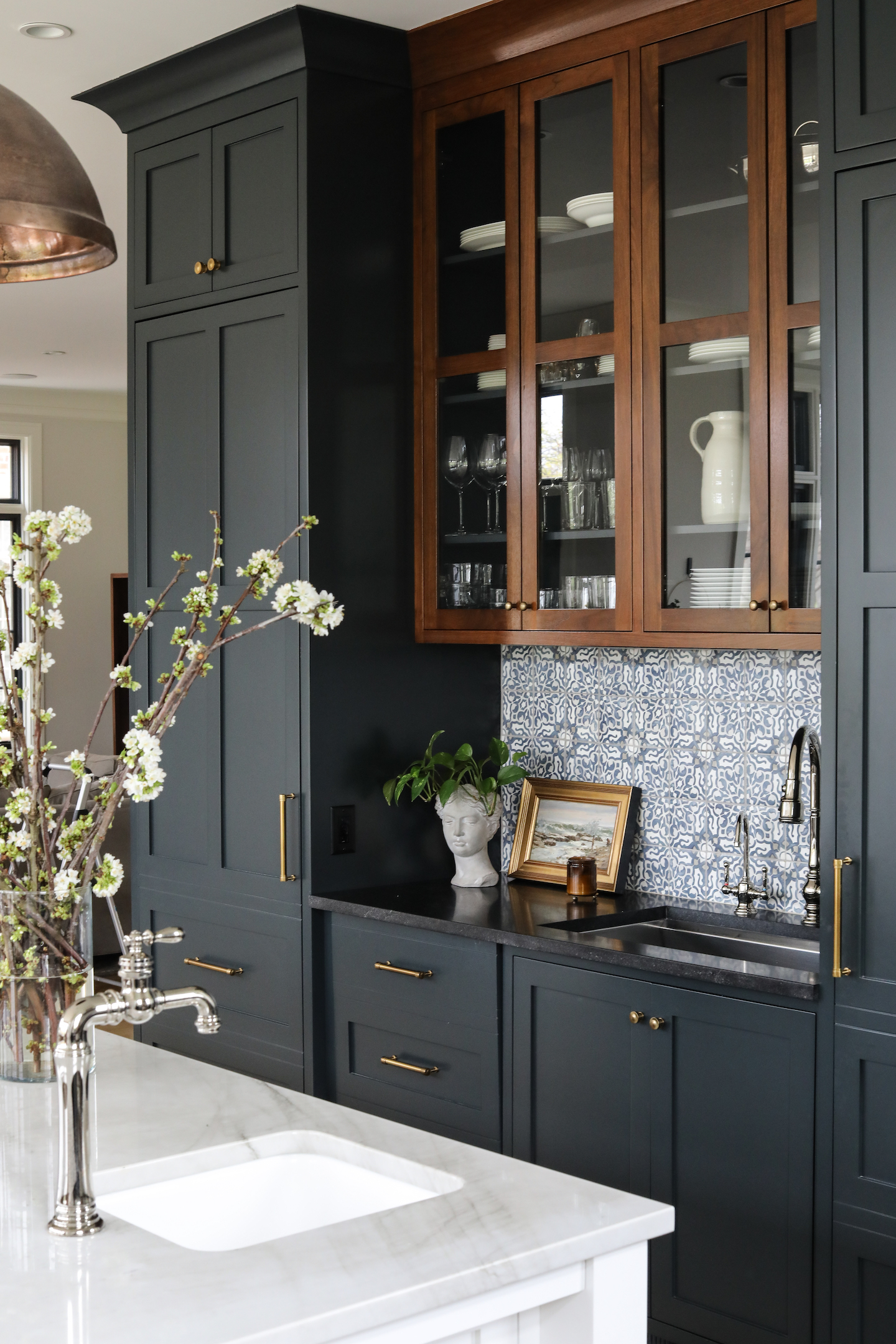
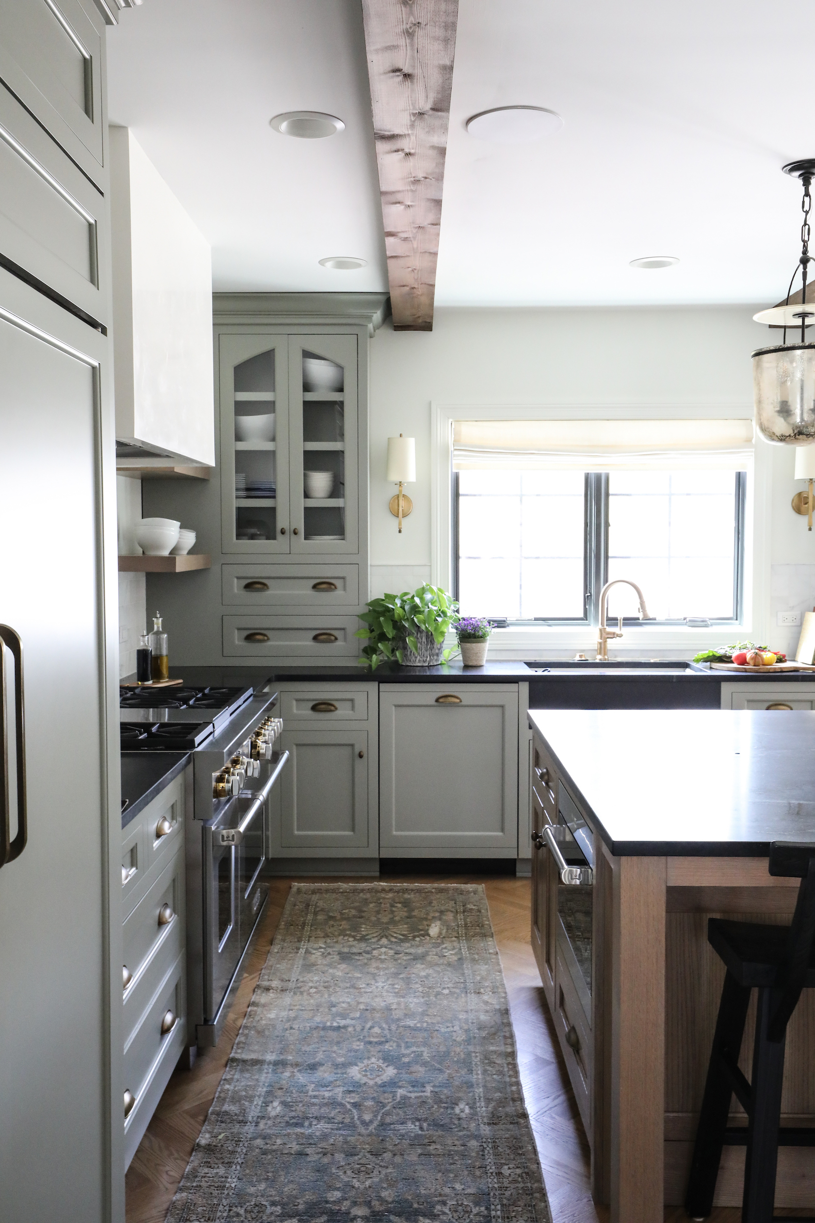
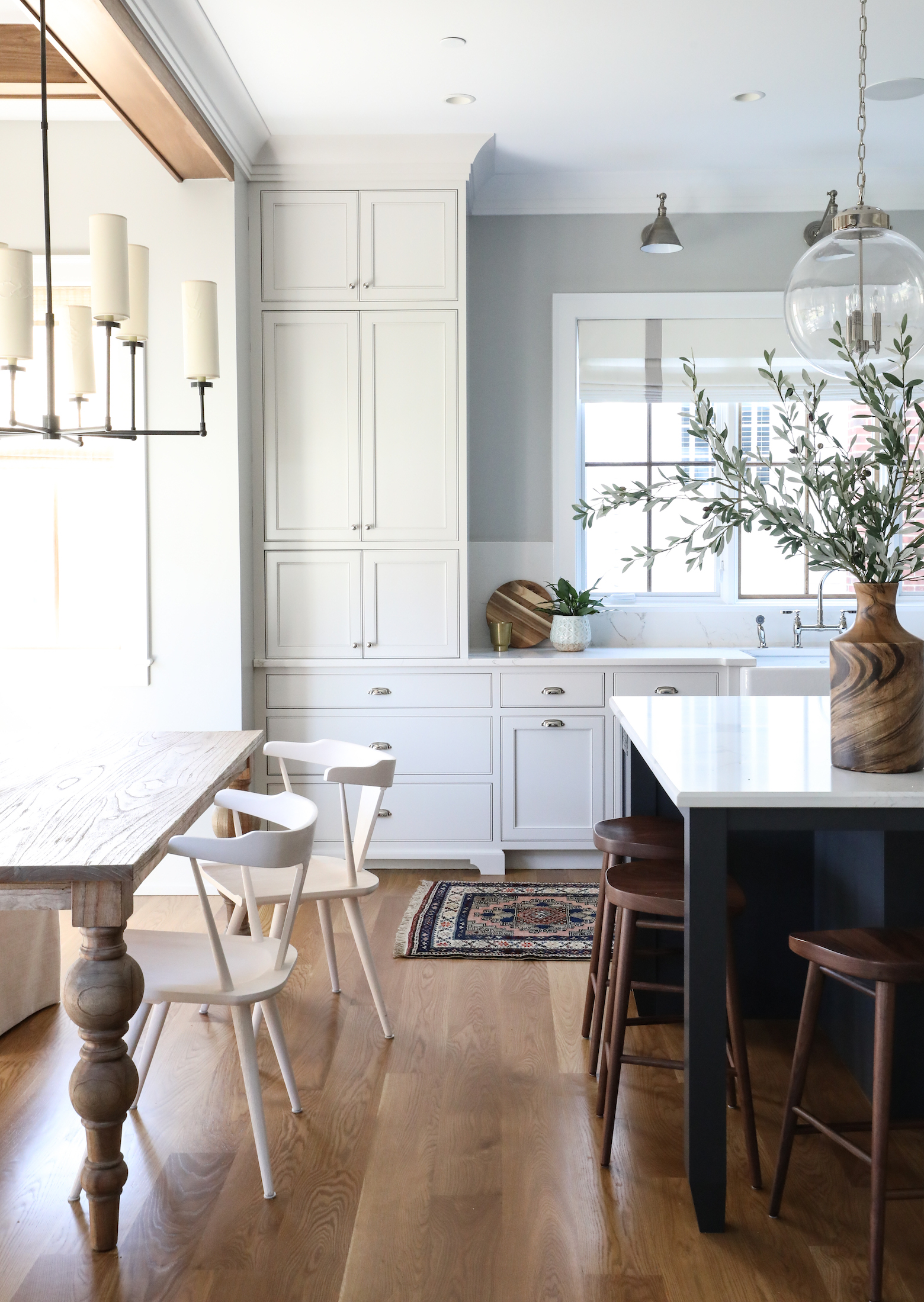
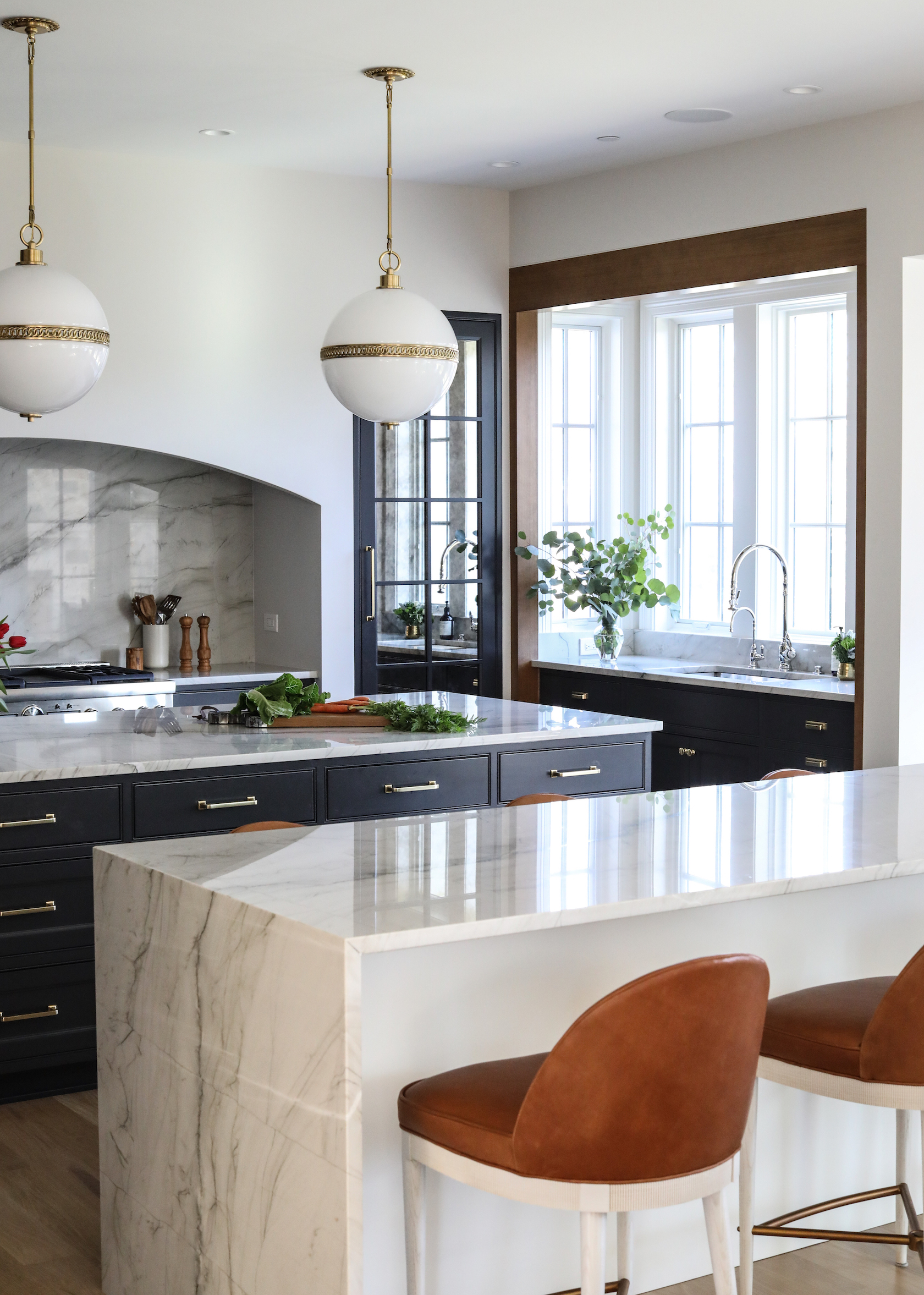
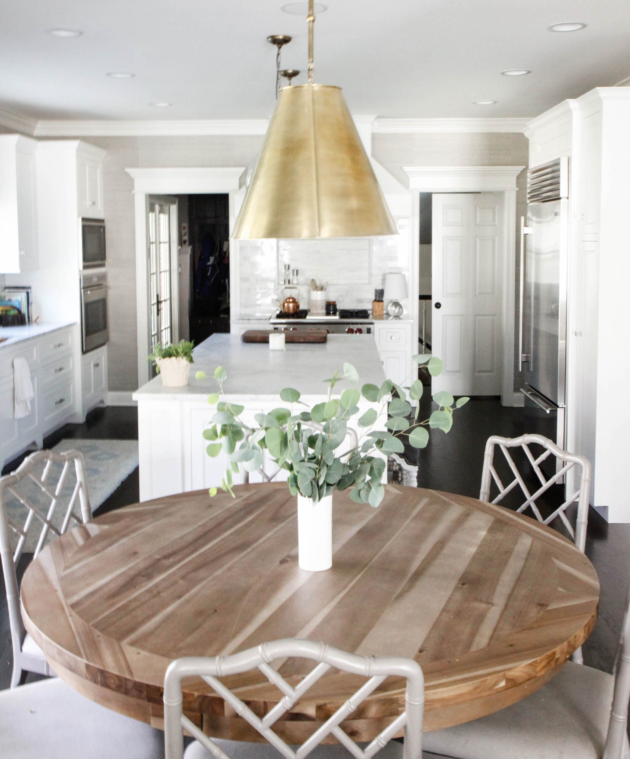
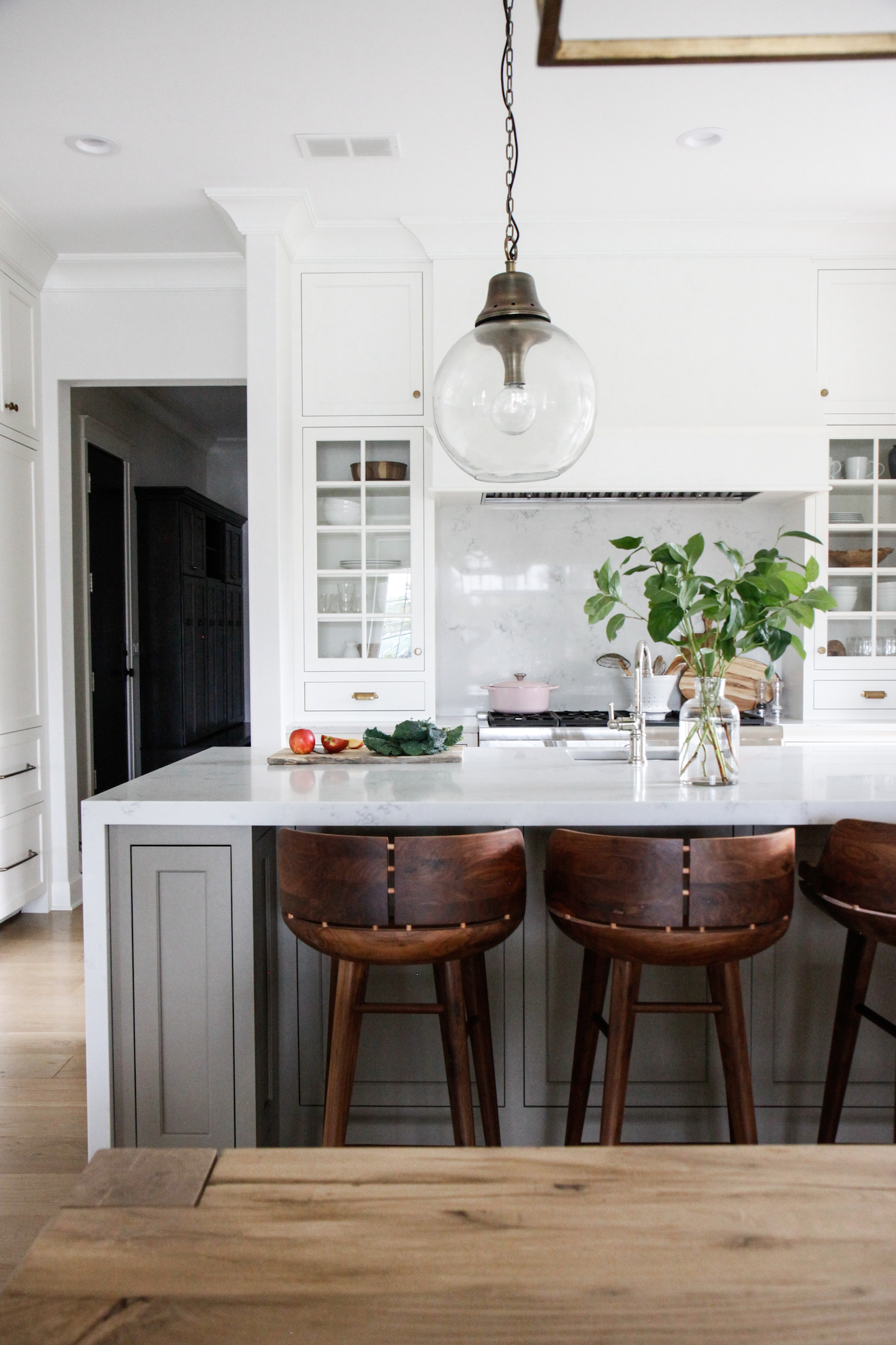
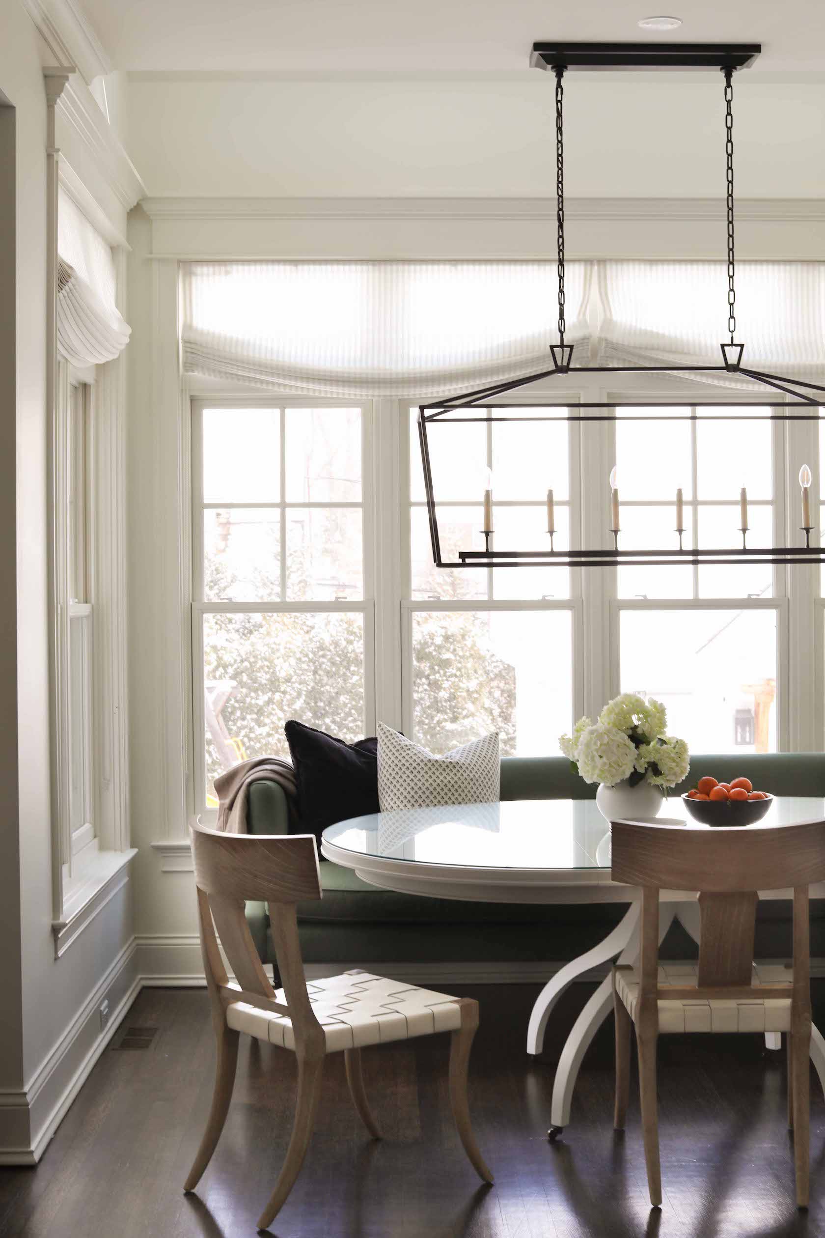
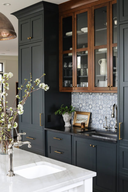
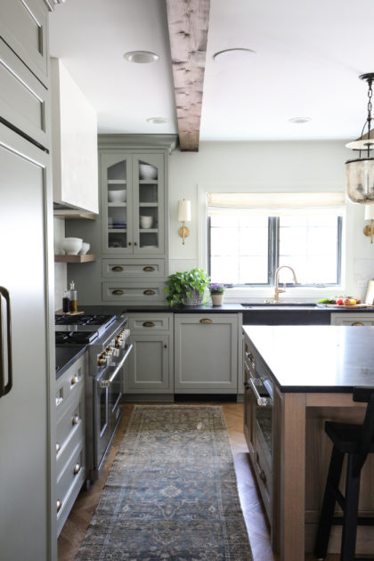
In the kitchen, small changes brought the overall design in line with the rest of the home. An ornate and busy tile backsplash had been added behind the range at some point in the home’s life. It wasn’t in line with the home’s traditional, classic feel, so we replaced it with a more timeless marble tile. Banding the range hood in brass adds interest and another layer of texture to the room. We painted the island in Farrow & Ball Railings, and all other cabinetry in Sherwin Williams Mindful Grey. The sunny, peaceful breakfast nook got a classic table and chairs, with lighting and window treatments to finish the space.

0 In Room Reveals

Reveal: Glen Ellyn Refresh

When our clients were making the move from the city to suburbs, they knew they wanted a home that came with some built-in character. Often, you just can’t replicate the feeling of a home that has been lived in, has stood the test of time. What they found was a perfect blend of a stately Georgian and cozy English cottage, built in 1965. The bones were there — solid wood doors, beautiful wood trim and door casings, elaborate built-ins — but it needed some updating to bring it to life again, and turn it into both an oasis for the family, and also a spot made for entertaining. Transforming this gem was so much fun!

First, the foyer. Aged grasscloth wallpaper had become a little dreary in a space with limited natural light, so we replaced it with detailed moulding — extending up the stairs — making the foyer feel polished and grand. The foyer walls are painted in Benjamin Moore Pale Oak, with trim in Kendall Charcoal. The original arched door to the basement is one of the defining features of the home. To further highlight it, we added an arched entry to the living room, also. Now, when you enter the home, these mirrored arches greet you.

Treads, railings and balusters of the staircase were still in excellent condition and true to the home’s style, so we did not replace them. However, adding a pinstripe runner and painting the balusters, risers and stringers gave this classic staircase new life.

via Park & Oak

Let’s move to the family room peeking out above. A standout feature of the room is the fireplace. Historically, fireplaces were often set back very deep to allow multiple pots to be cooked simultaneously. Of course, most homes no longer require that functionality, so to create the illusion the fireplace wasn’t so deep, we angled limestone and applied a wood build out surrounding the fireplace. This allowed us to preserve the historic character of the mantle while also updating it to fit a modern day aesthetic. Mirror sofas in a rich emerald green add elegance without sacrificing comfort. The coffee table is a family heirloom. Walls, trim and ceiling in this room are painted Benjamin Moore Pale Oak and floors are original.

On the other end of the foyer lies the lounge for the primary bedroom. Again, there was ample historic character to work with in the space, it just needed some freshening up. We used moody Sherwin Williams Sea Serpent on the walls and Benjamin Moore Onyx on the ceiling to really play up the cozy factor here. Updated built-ins made to mimic the original trim, window casings and baseboards create contrast but also really highlight all the original woodwork in this cozy space. Custom furniture upholstered in velvets, boucle and wool ensure that every moment spent in this room will feel comfortable, warm and relaxing.

via Park & Oak

We love the refresh of this post-modern home!

0 In Inspiration

Contrasting Wood Tones

We get a lot of questions about how we decide which wood species and stains to use in a space, and how to ensure that everything will add up to a cohesive look. While every project and every room is different, we have a few rules of thumb to share that will help you on your way.


Mix it up!

Much like our approach toward contrasting metals (go for it!), we always try to use a variety of wood species and stain tones in each individual space. When everything matches, it’s difficult for the eye to know where to land, and all your woods start to blend together. When you introduce different tones in same space you create a layered effect, and the eye can rest for a bit on each piece and take a moment to really appreciate each individual element as part of a cohesive whole.

The bones of the #POglenviewreno home below included beautifully detailed trim and casework that we highlighted with a darker stain to contrast the lighter white oak floors. The hickory island is a foil for both.

via Park & Oak

White oak floors, a warm wood ceiling and a burl desk all work together in perfect harmony in the #POhinsdalenewbuild office.

via Park & Oak

The original trim at #POlagrangehome is peeking out from the background. Working around that trim was important, so the island and floors were chosen to provide contrast.

via Park & Oak

Know where to start.

In room that may have a large number of different wood tones, knowing where to start is key. In a remodel, we suggest starting with your floors. Often, you won’t be replacing those throughout an entire home, so you need to work with what’s there. Re-staining is always an option, but you’ll want to choose that stain first — and know how it behaves with the species you are staining — before you move on to other considerations. Be sure when selection stain for floors that you see it in your home in different light. Once you’ve chosen your floor stain, bring a sample with you when you go choose any other elements.

via Park & Oak

In a new build, we suggest starting with the kitchen island. This is a big impact point in any home, as kitchens have become a central feature of modern living. An island can also be built from a variety of wood species — hickory, walnut, ash, cherry, oak — while new build floors are nearly always oak. Once your island has been designed, you can choose a custom stain that plays well with that particular wood species and that you will love as a prominent feature of your home. Floor stain can come next, and then any additional wood elements later.

via Park & Oak

Think high contrast.

Contrast is your friend, especially for wood elements that touch each other, such as a floor and kitchen island, as in many of the examples above, or floor and fireplace, as below in the #POgrovenewbuild. Contrast helps the choices look purposeful, and lends the layered look that helps a home feel cozy and lived in.

via Park & Oak

Staining the interior of a built-in or bookcase is a great way to highlight the pieces held there, and provide the kind of contrast that makes wood elements interesting. #POglenellynstudy

via Park & Oak

Working with beautiful original wood details that would be difficult to re-stain? A rug can help break up wood elements that are too similar, as below in the #POsouthbendlawoffice.

via Park & Oak

A final thought on contrasting wood tones: often homeowners steer away from mixing wood tones and wood species out of a desire for perfection. But, if everything matches just so, you can wind up feeling like you are living in the pages of a magazine rather than a real home. We are here to say: embrace imperfection. Mix those woods. You won’t be sorry.

0 In Room Reveals

Reveal: Wheaton New Build

We’ll get to this dramatic back kitchen later in the post. First, let’s talk arches. Specifically, the jaw-dropping stone arch that is the centerpiece of this new build home. We came onto this project after the plans had been drawn up by the architect, Derrick Architecture, and right away noticed the exterior would feature some stone accents. We knew immediately that we would want to bring this natural element indoors, as well, and worked with our very talented builder, Muellner Construction, to choose a stone with enough variety of scale, texture and color to really give this room an echo of the outdoors. The stone wraps all the way around to the interior of the kitchen, so regardless of whether the family is relaxing by the fireplace, or getting ready for dinner, the stone arch greets them. The wood beams on the soaring ceiling also help bring warmth and a coziness to this large space.

via Park & Oak
via Park & Oak
via Park & Oak
via Park & Oak

With a kitchen open to the main living areas of the home, we needed to make sure there was a happy marriage between the spaces. Carrying the stone onto the kitchen side of the arch helps achieve this, and by using a variety of natural stains and finishes and neutral elements, the kitchen serves as a dramatic focal point beyond the show-stopping arch.

We especially love the soapstone backsplash that covers the length of the space behind the range and accompanying cabinets. Soapstone is porous, and will pick up character marks along the way. But, treating occasionally with mineral oil will help keep its beauty intact as it ages. We like the way this dark piece anchors the large kitchen.

via Park & Oak

Two islands mean there is plenty of space for family and friends to gather during get togethers. The seating island — made of flat-cut white oak — is stained with a custom black stain. Stools on the kitchen side are backless to easily slide under the island when not in use. The woven leather adds a touch of texture to the kitchen. The sink island is constructed of rift-sawn oak in a custom stain chosen to coordinate with the floors and doors. Vintage art — one of our favorite accessories to add in a kitchen — helps add patina and originality to the new home. A brass Waterworks faucet and pot filler add a little flair.

via Park & Oak

What’s through those doors? On the left-hand side (besides our tripod 😉) is the mudroom and garage access, plus a craft room and powder room. Through the right-hand side door is a small office for one of the homeowners. All these rooms connect through a hallway near the garage access.

You can see the back kitchen peeking out in the photo below beyond the built-in refrigerator (full-size matching freezer is opposite, not pictured), so let’s talk about this high-drama space. (Side note: what’s the difference between a back kitchen and butler’s pantry? You’d probably get a slightly different definition from anyone you ask, but we define a back kitchen as a fully functional kitchen space. And boy, this one has it all!) Because everything in main areas of the home is light, bright and airy with lots of height and natural light, we wanted to insert a little mood into the nooks and crannies of the home. The entire space is painted in Benjamin Moore Racoon Fur, and is especially dramatic as you enter the space through a hall of built-ins displaying the owner’s collection of family heirlooms and handmade pottery. Because the owners wanted to keep the main kitchen open, with few walls, many of the appliances are housed here in the back kitchen, including ovens, extra dishwashers, and a microwave drawer. This space is also home to a coffee bar, mixer lift, refrigerator drawers, ice maker and steam oven. A library ladder makes reaching the upper cabinets a breeze. Zellige tile wrapped around the room adds a bit of lightness. Counters are the same leathered-finish aria stone marble as the main kitchen.


The main floor laundry has plenty of storage and practical touches, like the rolling hampers to make separating laundry easy. She’s a real looker, though, too, with the zellige tile backsplash, display shelves and beautiful cabinetry painted in Benjamin Moore Ranchwood.

via Park & Oak

Finally for today, the mudroom. We love designing rooms with special details for furry friends. The dogs come in and out of the yard via this mudroom, so it was important to think of them when planning the space. Built-in dog crates with custom made-to-fit dog beds lie behind mesh inserts, leaving plenty of air flow and allowing the homeowners to have occasional-use crates tucked away. A space for dog bowls is built-in to the island, with a marble backsplash to make cleanup easy. A vintage rug warms everything up.

via Park & Oak
via Park & Oak

There is so much more to this beautiful home that we hope to bring you sometime soon, so stay tuned!

0 In Round ups

Collected Curates: Candles

Candles are a hot commodity this time of year. Is there anything more zen during cold weather than relaxing by the fireplace with a candle and your beverage of choice? We think not. At Collected, we’ve done our best to curate a thoughtful selection of luxurious candles with long burn times, premium ingredients and impossibly gorgeous scents. We have another criteria, though, that we apply to our candle selection: a backstory. Because in a saturated market like candles, knowing how your candle is made, where the ingredients came from and why the scent was chosen by the creator can make all the difference.

Today we’re profiling a few of our current favorites, but the selection in store and online is even greater, with more candle backstories to come!


Baobob

As much a decorative object as a candle, Baobob has been perfuming the indoors since the 2002. The mouth-blown glass vessels are true works of art, with special editions sometimes even incorporating precious metals or handcrafted leather. Because the company considers itself a perfumer, specialized “noses” scour the globe for essences and raw materials resulting in unparalleled scents. And the hand-poured wax goes through several phases of production to achieve the highest-quality burn. True beauties.


Bastide

Leave it to the French to create a candle that is effortlessly luxurious and beautiful. The word bastide itself even means “manor house,” a south of France mainstay of luxury and beauty. Bastide was recently acquired by a third generation family of scientists and formulators, serious about bringing captivating scents and Provence’s most natural ingredients to Bastide candles and beauty products. Each product line is overseen by a “Beautisan,” the term coined by Bastide to honor the French artisans who create them. In the case of Bastide candles, a team of these beautisans, including a dedicated “nose,” work together to bring these elegant candles to market. Scent inspiration in Provence is easy to come by, and Bastide candles evoke memories of lavender fields, sun-soaked afternoon walks or a lazy lunch. Each scent has its own wax blend designed to maximize that specific fragrance. And each candle is made from hand-blown bubble wax, resulting in a perfectly imperfect and unique vessel.


Homesick

Homesick pays homage to the essence of communities and captures the spirit of memory, all with a touch of whimsy. But they are not just slapping a label on a candle that smells good and calling it Chicago. No, for a location candle like Chicago, Homesick speaks to between dozens of residents, visits local favorites, pays attention to the scents of the food and the city itself, and then tests different scents with community members until they feel they have captured the essence of their city. This painstaking process means that if you own a homesick candle, you’ll likely be experiencing core scent memories from the comfort of your own home.


Lumira

Lumira candles were born from a love of travel and passion for design. Each artisanal Lumira scent is reminiscent of a specific spot on the globe – whether a countryside village, luxurious island resort, or bustling metropolis – again, evoking the important human connection to scent memories. The woman behind Lumira, Almira Armstrong, (three cheers for women-owned businesses!) is also passionate about sustainability, and so the brand is committed to environmentally conscious business practices and giving back to their community.


Looking for a scent or brand not featured here? Check Collected for more options!

0 In Inspiration

Home after the Holidays

The holiday decorations have mostly disappeared back into their bins. Bye-bye tartan plaid pillows. See you later reindeer. Till next year Christmas tablescapes. But, anyone else find the emptiness left in the wake of the un-decorating to be a little bleak? To spruce things up, our team put together a wintery cocktail table for inspiration. And that got us thinking, how else can we continue to embrace winter in our homes? After all, here in the Midwest, we’ve got a lot of it left! Below, a few of our favorite tips for sprucing up your winter decorating after the last strand of garland has been tucked away.


1. Plants!

Just because the tree and garland are gone, doesn’t mean you have to forego the green again entirely. Visit your local plant shop (here in Chicago, we love our neighbors at Good Roots!), and bring home some green that lasts forever. A plant adds life to a room in a singular way. Even the teeny-tiniest plant can liven up a room that’s feeling a little naked after the holidays. Have a black thumb? At Collected we carry beautiful faux botanicals, from stems and branches to tabletop flower arrangements to large fiddle leafs. The construction and attention to detail on these is painstaking. You won’t be sorry.

You can go big…

…or small…

…or somewhere in between!


2. Accessorize

When we decorate for the holidays, we are basically accessorizing to the max. While you’d eventually grow accustomed to the pared-down version of your home after the holidays, there’s no reason you can’t still embrace the winter season through accessories. Incorporate lots of candles and be sure to light one with a winter scent. Bring some cozy texture to your throw pillows with boucle, velvet or chenille. Lean into winter whites and navy blues. Drape a fur or cashmere blanket over an armchair or sofa, or at the end of your bed. Change out your artwork or display books. This may also be a good time to switch up the patterns in your accessories; a change of pattern can make the whole room feel like new again. Little changes can make a big difference!


3. Light a Fire

Use that fireplace to create ambience in your home reminiscent of the inherent warmth and coziness of the holiday season. Add a basket with blankets near the fireplace so you can really settle in. Change up your mantle styling and coffee table to help things feel fresh. This is often the room where we spend our down time, so focus your attention here if you’re really wanting to amp up winter style after the holidays.

Sufficiently inspired for the refresh? Shop some of our favorite items for livening things up after the holidays in the gallery below.


Post-Holiday Decorating

0 In Q+A

Designer Q&A

You asked…we answered! We loved seeing all your questions come in through Instagram stories last week. We picked out a few to answer here on the blog, plus some on Instagram — stay tuned for more “Ask the Designer” next month!


Embrace the cozy element that an 8’ ceiling brings to a home but at the same time use some tricks to make the ceilings feel taller: bring your drapery and drapery hardware from the ceiling to just kissing the floor; bring cabinetry and built-ins to the ceiling; choose one color for the room (base, wall and crown), choose furniture that scales nicely in the space and isn’t too big and overpowering.

-Vanessa


There are certain tricks and careful consideration with scale of furniture. Mount your drapery rods close to the ceiling or crown so your panels are as long as possible, it helps create the illusion of greater height. Also opting for taller baseboards, like 7” is a subtle change that gives the sense of more height. Remove any soffits and anything built in should extend up to the ceiling, such as kitchen cabinets. In a small room, furniture should not be oversized, consider a sofa that is 34-36” deep, rather than 40-42”, and always be mindful that your flush mount light fixtures don’t drop too low.

Joanna


The key to mixing light fixtures is focusing on different types of lights and making intentional changes.

Mixing metals is great, but keep them in the same warm tone. For instance, polished nickel with brass are two different metals, but both have a warm undertone.

Another tip is to mix fixture types. One can be shaded, while the other has an exposed bulb or globe. One can be a linear light, while the other is a pendant.

Mix dimensions and width for added layers of interest and your space will look timeless and collected. 

PS: Stick to the same color temperature! Around Just under 4000 lumen will give you a natural and neutral warmth.

-Susie


It is best to approach this type of room by playing into the asymmetry. Designers like Darryl Carter aim for this style by keeping layout eclectic and creating separate, smaller vignettes of seating areas throughout the room. This design style is great at tricking the eye. You can also level out some of the asymmetry and achieve a balance by adding a tall bookcase beside an off center window and matching that height on the other side of the window with a taller floor lamp and wall art. 

-Erica


It’s helpful to lay out a palette in front of you, in this case paint samples! We recommend seeing the paint color in different light throughout the day to help make a decision. A few of my favorites are Pale Oak by Benjamin Moore, Dead Salmon by Farrow & Ball, and Pewter Green by Sherwin Williams.

-Giselle

Pewter Green
Sherwin Williams
Dead Salmon
Farrow & Ball
Pale Oak
Benjamin Moore

It depends on the space. Generally, start by looking where your cans would be placed in a room. In most cases, you can reference this and this is where you could place the mini flush mounts. Consider symmetry, and creating a leading line when placing these. Features in the room like windows, fireplaces can be another aspect you would plan their placement around.

-Emma


Absolutely not!  With the way homes are designed and/or reconstructed today, clients oftentimes omit a formal dining room in leu of a Great Rooms, which are a combination of kitchen/dining/family rooms.  

With this design change, people are often left with a kitchen size that is conducive to two islands.  

Rather than incorporating two visually heavy islands within a space, we will typically designate the island closer to the perimeter wall as the ‘work horse’ island, which houses the main sink, dishwasher, trash roll out etc. while maximizing the storage capabilities.

This offers us the opportunity to design a second island to read more like a furniture piece while still complimenting the kitchen built-in design.  This also provides our clients the ultimate counterspace for more casual gatherings as well as a sizeable dining table for more formal celebrations.

-Patricia

0 In Room Reveals

Reveal: Hinsdale Refresh

This one has its own special place in our Park & Oak hearts since the client ultimately became one of our team members!!

Lisa and her family had already made great strides in updating their new home, but needed some help getting to the finish line, especially in the living spaces of the home. She echoed sentiments we’ve heard from homeowners before: that they had made some costly mistakes and wanted to get it right the second time around. We loved helping Lisa and her family refresh these spaces and give them the home they had dreamed of!


The light, bright room pictured below, their family room, just needed a little grounding. Substantial linen window treatments help balance the dark fireplace surround and draw attention to the detailed ceiling molding. We brought in custom rust lounge chairs for a comfy pop of color, and used some of the clients’ own vintage finds throughout the space.

Peeking out from the right side of the above photo is one of the chairs in the refreshed breakfast nook. A large, built-in banquette in this space was not really working for Lisa’s family’s needs. One of our intentions in kitchens – and their adjacent spaces – is to make things warm and cozy; a happy, homey place not just to cook, but to live your life. A sage green settee here extends this concept to the breakfast nook, giving Lisa and her family a comfy place to sit not just for meals, but throughout the day in this hub of the home. Sturdy, wipeable chairs are practical (but still pretty!) for this family with young children. Relaxed roman drapes help break up all the horizontal lines and add an elegant touch.

Lisa’s favorite room – her oasis – is the sitting room we created in the front of the home. As we’ve all discovered in the last couple years, it can be nice to have a place in your home to get away. For Lisa, this is now the place. We wanted the room to stand apart – to draw the eye of visitors and be an enticing destination – so we started with a bold wallpaper, Sandberg Raphael, in the Light Blue colourway. Lisa would be the first to tell you this choice made her nervous when she saw it on the design board, but can’t imagine it any other way now that the room is complete. The wallpaper makes an elegant backdrop for the navy sofa, kangaroo style chairs and Lisa’s own mirror. Custom window treatments with a pretty trim detail help highlight the beautiful windows and french doors.

Lisa’s family uses their home gym frequently, and wanted the nearby bath renovated for convenience after workouts. The only wishlist item was for a steam shower, which we highlighted with steel and glass doors. The paint we chose here – Benjamin Moore Duxbury Gray – has a spa-like quality and the right tone offset for the custom vanity and counter/backsplash/ledge we designed. A pendant light with a brass interior adds a pretty and unexpected detail, and the rattan mirror brings a natural element. Lisa’s own vintage art finishes off the space.

0 In Inspiration

Home after the Holidays

We’ve been gradually making holiday decorations disappear back into their bins. Bye-bye tartan plaid pillows. See you later fair isle stockings. Till next year Christmas tablescapes. But, anyone else find the emptiness left in the wake of the un-decorating to be a little bleak? Here are a few tips for sprucing up your winter decorating after the last strand of garland has been tucked away.


1. Plants!

Just because the tree and garland are gone, doesn’t mean you have to forego the green again entirely. Visit your local plant shop (here in Chicago, we love our neighbors at Good Roots!), and bring home some green that lasts forever. A plant adds life to a room in a singular way. Even the teeny-tiniest plant can liven up a room that’s feeling a little naked after the holidays.

You can go big…

…or small…

…or somewhere in between!

Refer to our blog post on Houseplants for tips on how to care for those beauties once you’ve got them home.


2. Accessorize

When we decorate for the holidays, we are basically accessorizing to the max. While you’d eventually grow accustomed to the pared-down version of your home after the holidays, there’s no reason you can’t still embrace the winter season through accessories. Light a candle with a winter scent. Bring some cozy texture to your throw pillows with boucle, velvet or chenille. Drape a fur or cashmere blanket over an armchair or sofa, or at the end of your bed. Change out your artwork or display books. This may also be a good time to switch up the patterns in your accessories; a change of pattern can make the whole room feel like new again. Bring in the outdoors by using the warm rusts, greens and browns found in nature. Little changes can make a big difference!


3. Light a Fire

Use that fireplace to create ambience in your home reminiscent of the inherent warmth and coziness of the holiday season. Add a basket with blankets near the fireplace so you can really settle in. Change up your mantle styling to help things feel fresh. This is often the room where we spend our down time, so focus your attention here if you’re really wanting to amp up winter style after the holidays.

Sufficiently inspired for the refresh? Shop some of our favorite items for livening things up after the holidays in the gallery below.


Post-Holiday Decorating

0 In Research

Wall Molding

Park & Oak is fortunate to work on projects ranging from new build to century-old historical homes, and everything in between. One of the features we love most about the older homes we renovate is the existing millwork, whether in the form of molding, paneling, trim or casings. We often bring these elements into new build homes to echo the character and elegance of a historic or older home.

We could fill pages on the various styles of millwork, so this time around we’ll focus on five common types of wall molding and show some ways we have used it.

Applied Molding

Wall molding and paneling was common in home construction long ago in part because it helped protect plaster walls from moisture build-up when easy temperature control was not available. So, in addition to providing visual interest, wall moldings served a functional purpose. Often today, millwork is used for primarily aesthetic reasons, and because of this, applied molding has become very popular. Applied molding, like that featured in the two photos below, allows us to give a home the visual effect of molding, without the necessity of full panel millwork to protect walls. When used in a new build home, these applied moldings offer a subtle way to make a big impact, and bring a layer of tradition to a new space.

Beadboard

A type of vertical panel molding, original beadboard were narrow wood tongue-and-groove pieces with a beaded detail milled into the space where the pieces joined together. Historically, beadboard was used to provide additional insulation, and appeared often in kitchens, on porch ceilings and in hallways. Changes in the weather meant the boards would expand and contract with the seasons–the beads bridged the gaps with a pretty detail when the boards were expanded. Beadboard’s frequent appearance in New England cottages eventually made it ubiquitous in cottage-style designs, but we believe with the right treatment it can be at home in any fresh, classic interior. Beadboard is often used in wainscoting, which is a general term for panels or moldings covering the lower part of a wall.

Board and Batten

This is a clean, slightly more modern take on wall moldings. It consists of a regular pattern of wide molding (“battens”) used to cover the seams of the panels (“boards”) beneath. In an interesting juxtaposition, board and batten was historically most common as an exterior siding style for country homes and churches. However, when designers began adapting it for interiors, it took on a new life, and is now a welcome way to bringing freshness to interior millwork.

Raised Panel Molding

With panel molding, we create layers using a series of panels, stiles and rails in different sizes and configurations. Used commonly in formal, historic homes for wainscoting, panel molding provides true protection to a wall, so we like it in spaces that see a lot of traffic, like a powder room, or in areas of the home where furniture may frequently bump up against the wall, like a dining room, or cocktail room. Raised panel molding is also a striking way to accentuate architectural details like a fireplace, doors, or windows.

V-Groove Molding

V-Groove molding is a style of tongue-and-groove molding, generally seen used with wider planks. As with any molding, other choices throughout the space can dial up or down the drama, so while V-Groove molding is sometimes associated with more informal interiors, it can still be elegant or striking. We like it in full wall applications for smaller spaces like a bedroom, or bath.

Below, see some additional ways we’ve used wall moldings to elevate new spaces, or highlighted the molding in an older home to resurrect its wow factor. It’s a minimal effort, maximum effect method to make a big impact in a home.


Wall Molding at P&O