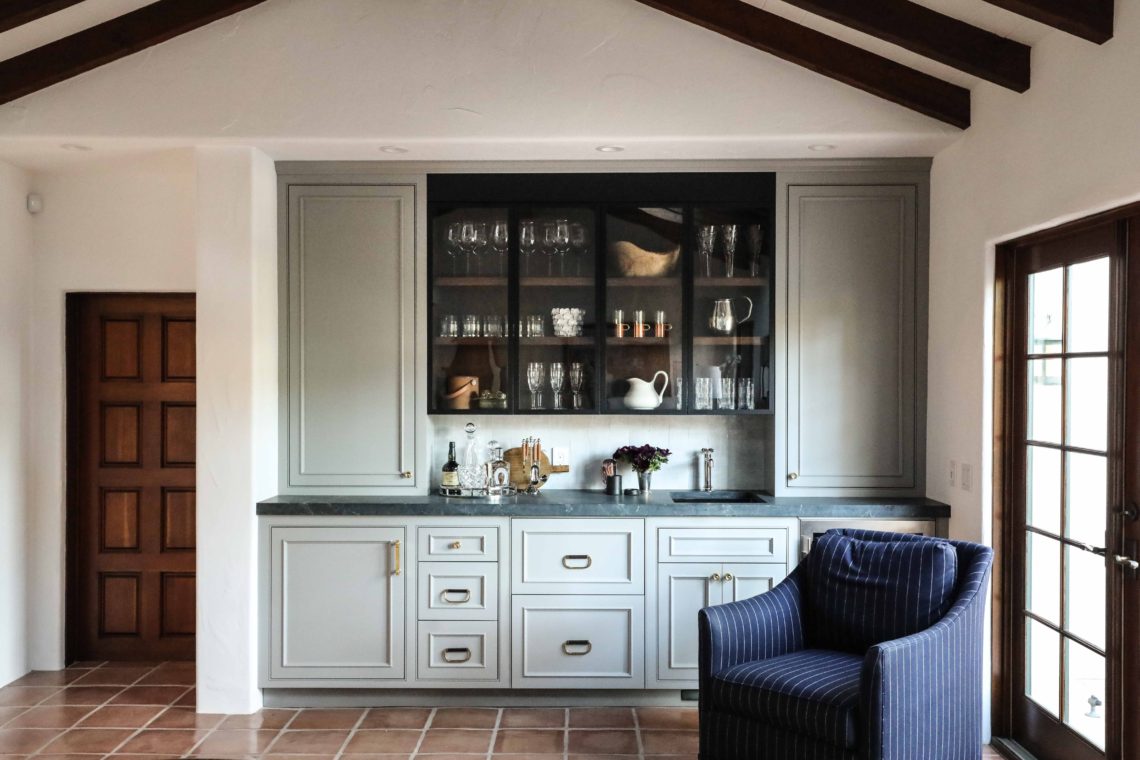
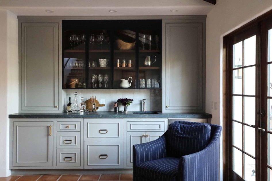
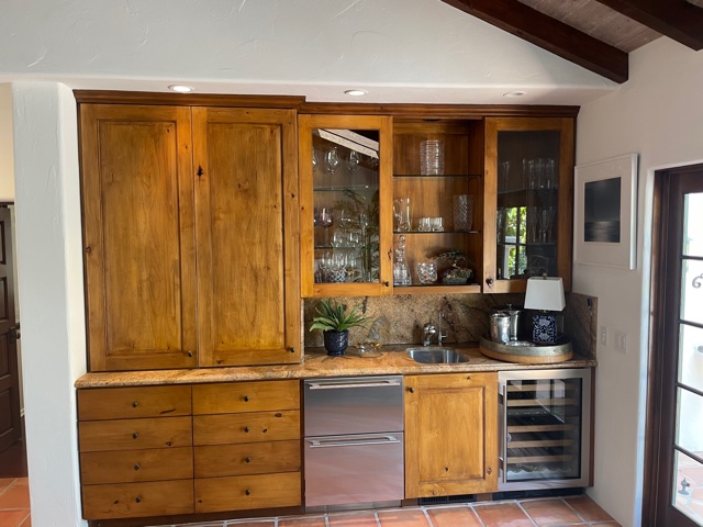
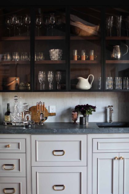
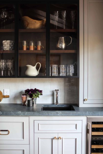
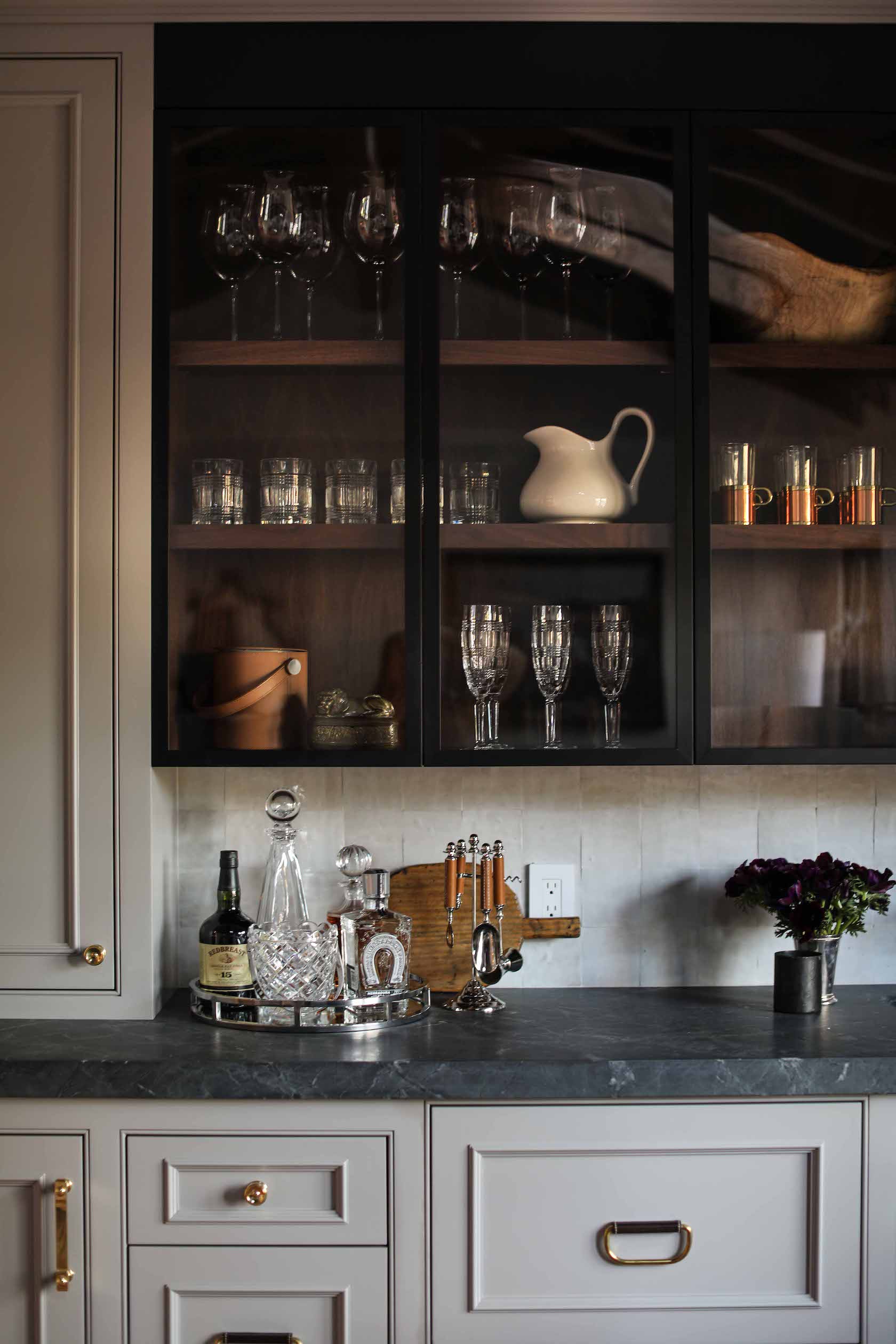
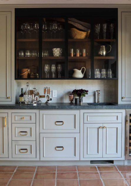
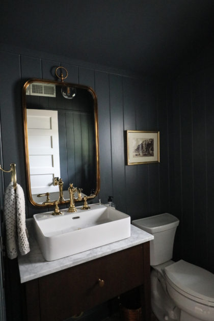
There will be more reveals to come for our Carmel-by-the-Sea project, but we couldn’t wait to show you the butler’s pantry, the first finished space! Let’s start with a before & after.
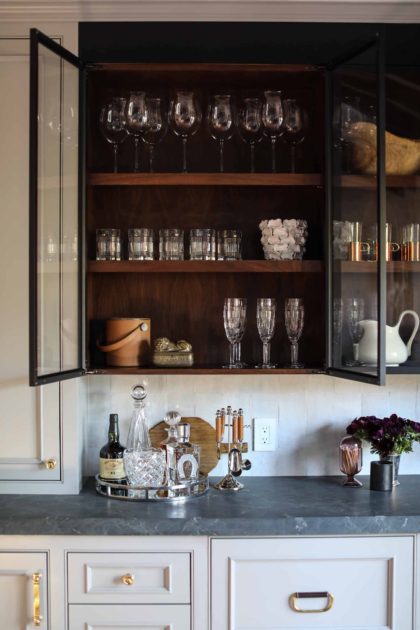
This Spanish-style home allowed us to stretch our wings a bit, as it is not a common form of architecture in the Chicagoland area. You’ll see more of those influences when the kitchen reveal comes, but there are hints of it here in the butler’s pantry. We wanted to stay true to this style, but brighten things up from the original cabinetry and finish choices. The light gray paint on the built-ins accomplishes this, but the dark stain inside the open top cabinets helps stay true to the style, and echos the dark ceiling beams.
These Waterworks leather and brass pulls are also at home in this architectural style. We sourced these gorgeous pulls in person during a visit to the Waterworks showroom in Chicago’s Merchandise Mart.
The handmade clay tile is a natural choice here, too. The uneven distribution of the material and variation in color from tile to tile gives great texture and depth to the backsplash.
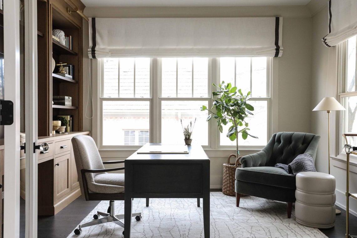
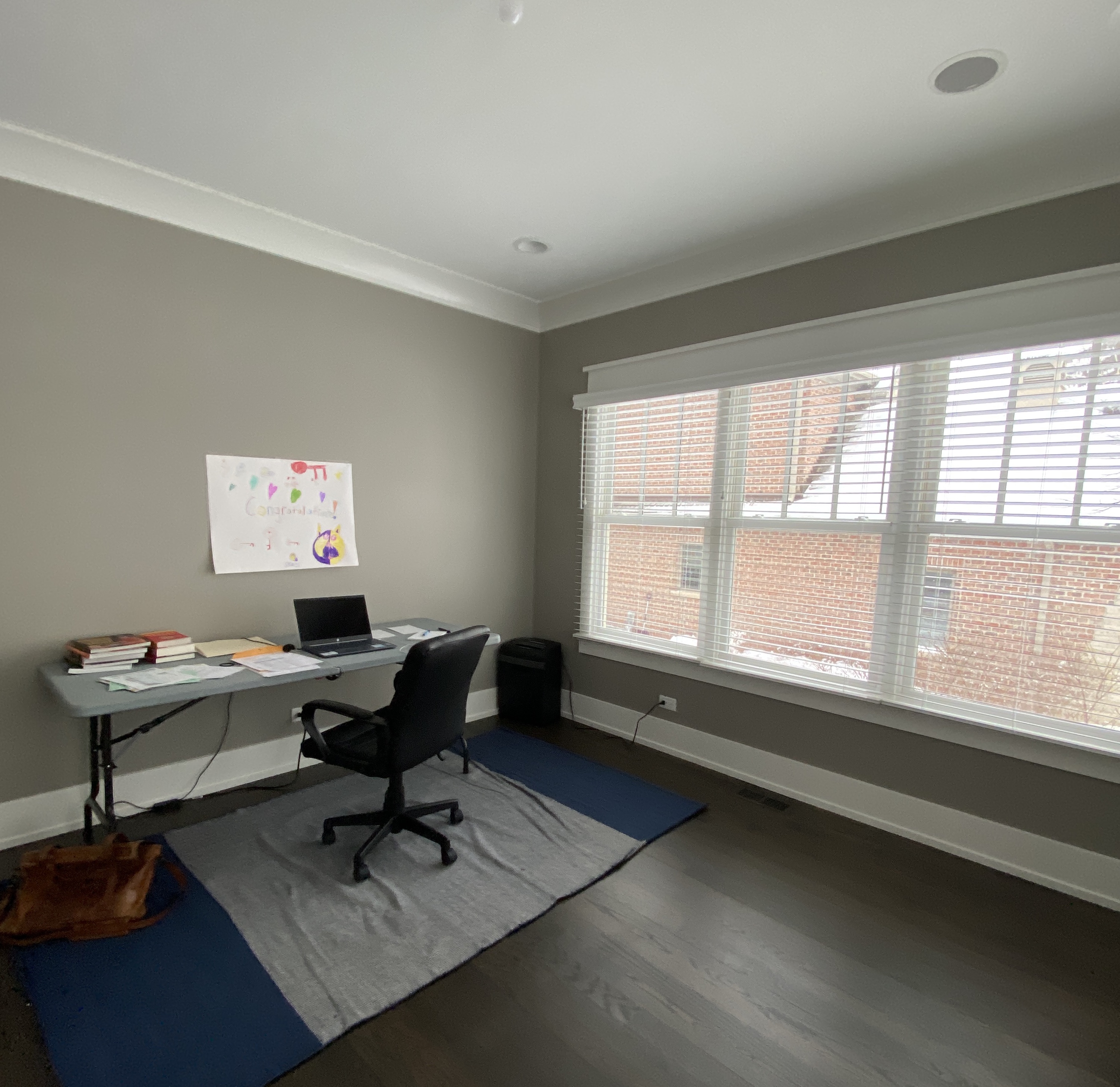
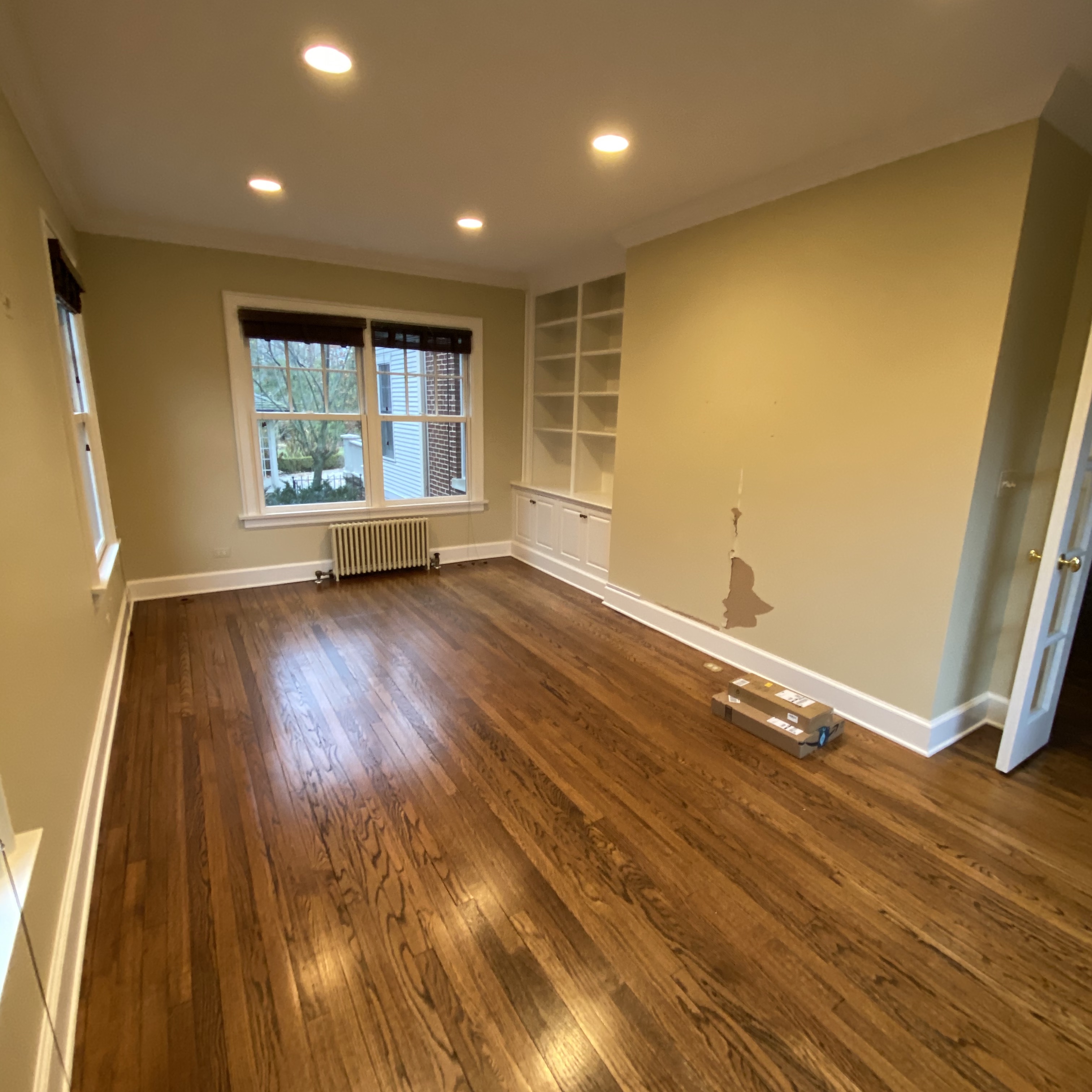
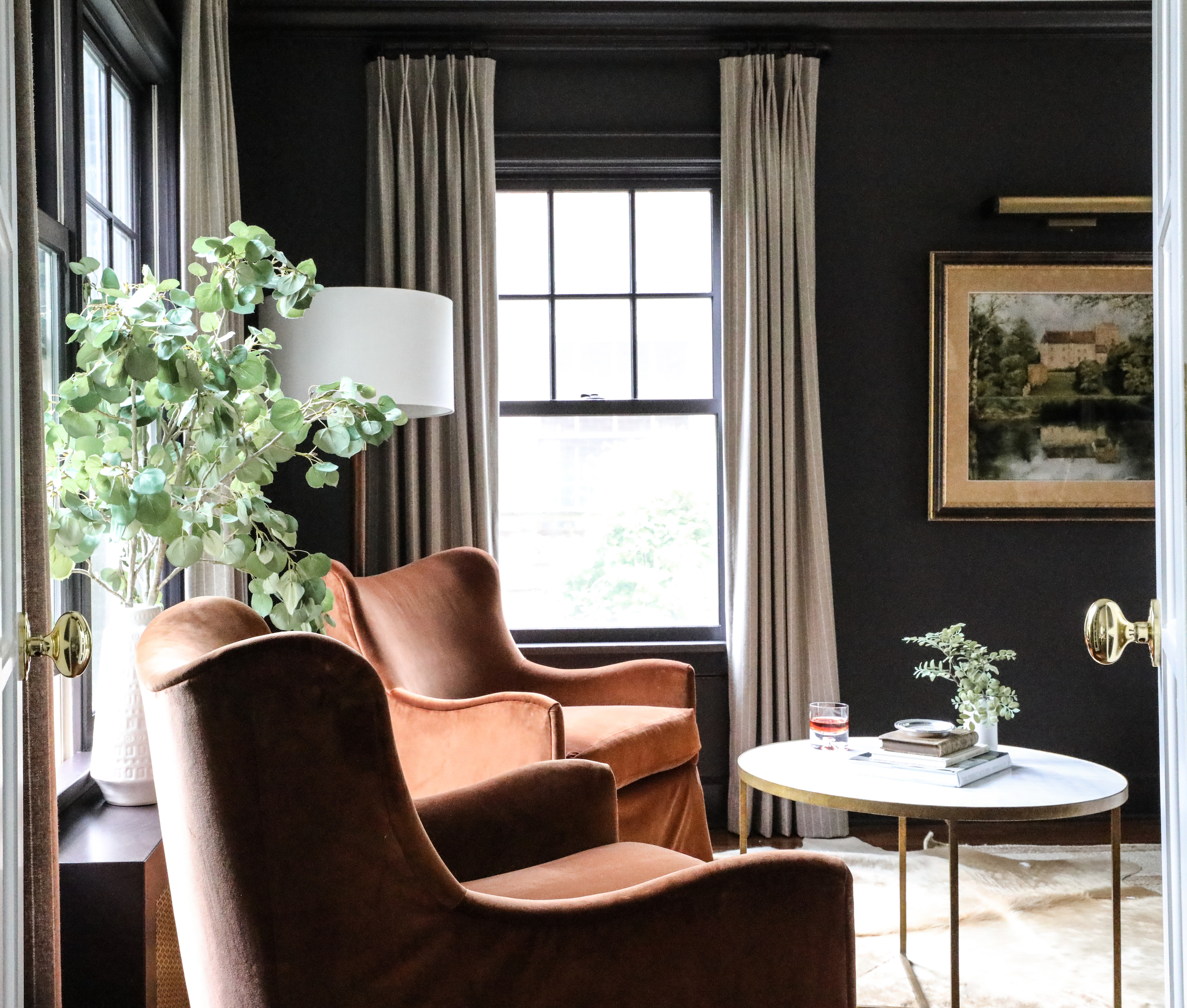
As you’ll see from the before photos, we started with a blank slate at the Glen Ellyn study. While that may seem daunting, our client had some specific ideas for what they wanted in the finished space that helped light the path. Bright, but masculine. Zoom friendly. And lots of built-ins for storage. (Plus a desk that doesn’t fold up!) With these elements in mind, we set about designing a study that would be both functional and beautiful.
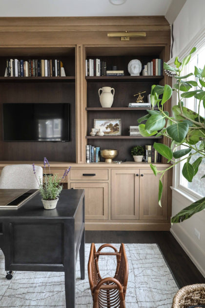
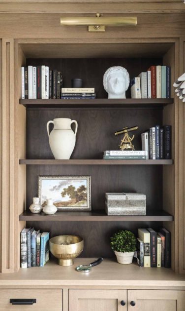
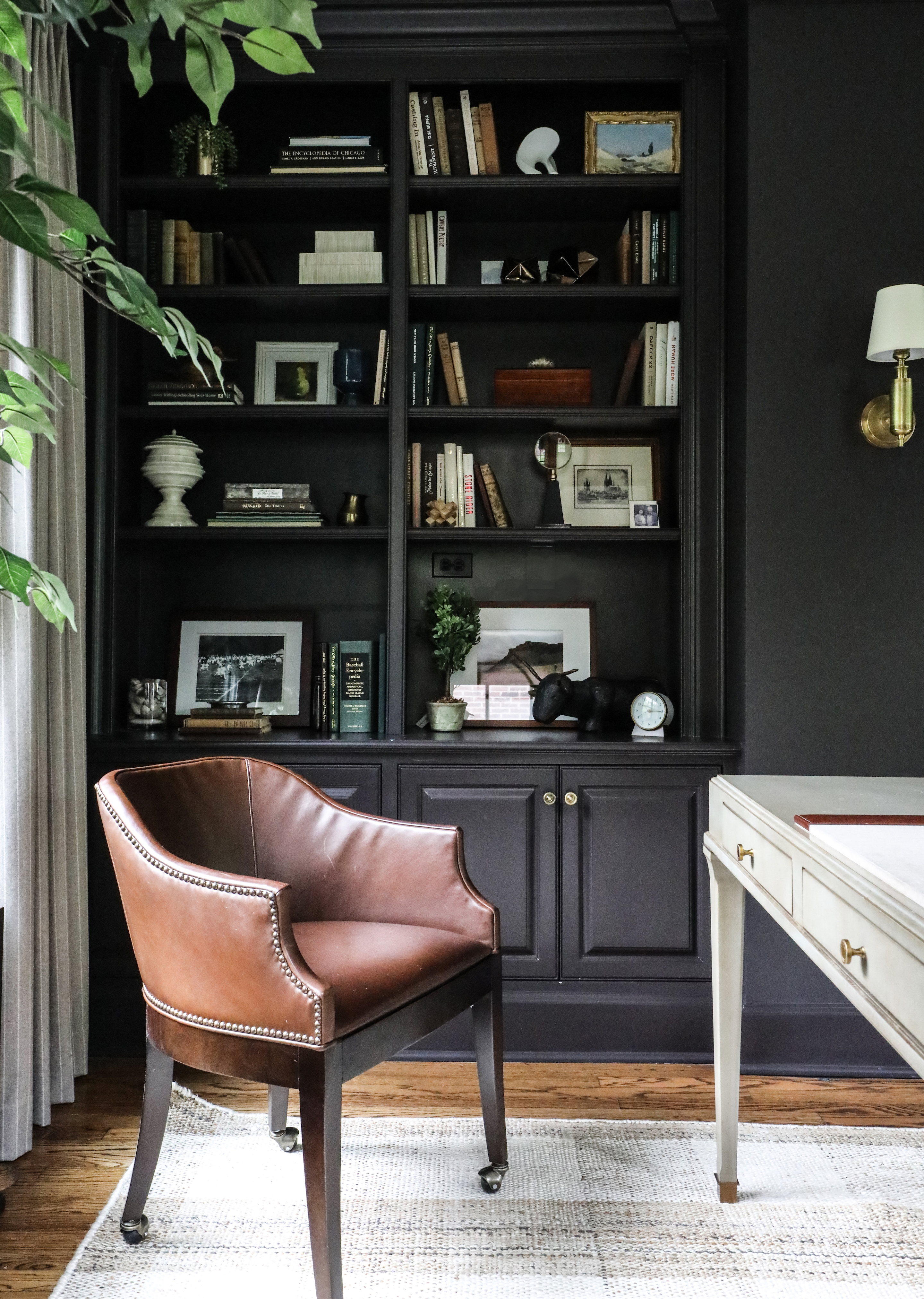
The mixed wood tones we chose for the built-ins fit a neutral color scheme while still lending interest and depth. The dark tone helps camouflage the television, now a common office fixture in the age of Zoom. We like the way the contrasting tones in the built-ins also complement the dark wood floors. Don’t they make a striking focal point for the room?
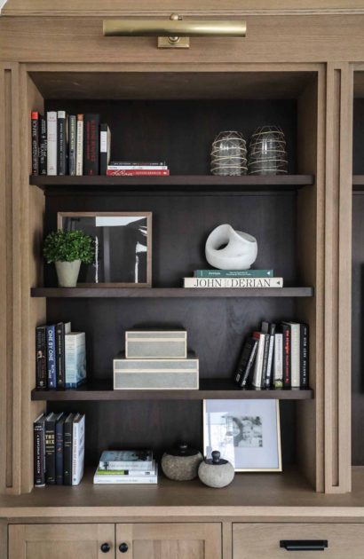
With plenty of cabinet and drawer storage below, there was room to get creative on the built-ins’ shelves, using a combination of the clients’ own books and art, plus some of Park & Oak’s favorites (we love a bust!).
A comfy chair for guests (or the occasional brain break) was a must. And lots of bright light means a plant will flourish here and help give life to the room. A light rug helps balance the dark wood floors, and a classic, unfussy roman shade finishes the room.
Check out the photo at the top of the post and see if you can spy the bar cart – the age of post-work cocktails needn’t end just because we work from home!
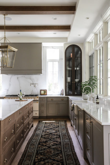
All renovation projects have unique and interesting details that keep us on our toes and make doing this work exciting and fun. But every so often, one comes along that stops us in our tracks. In this case, it only took three words: Frank Lloyd Wright.
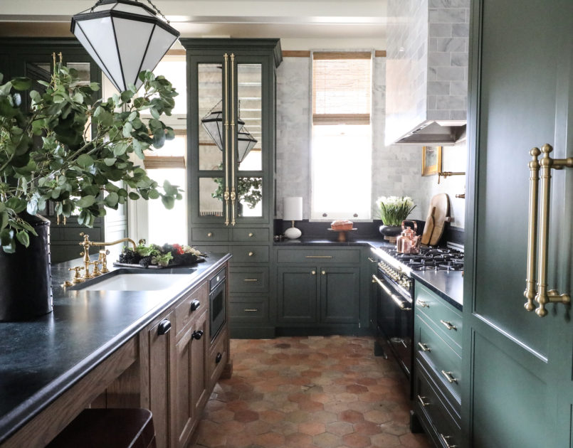
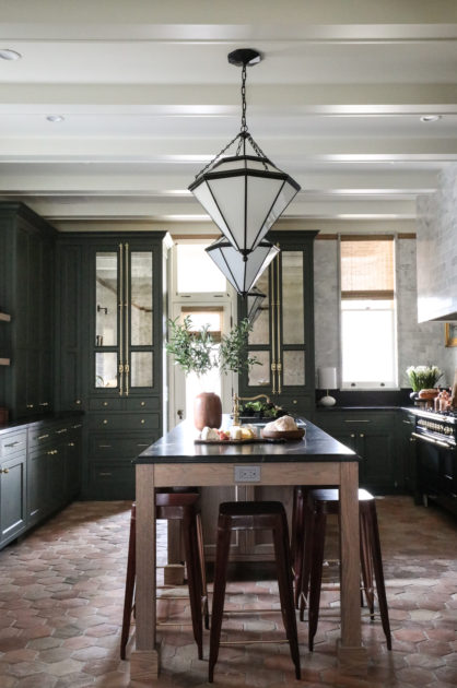
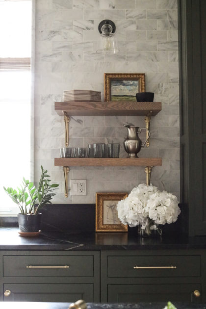
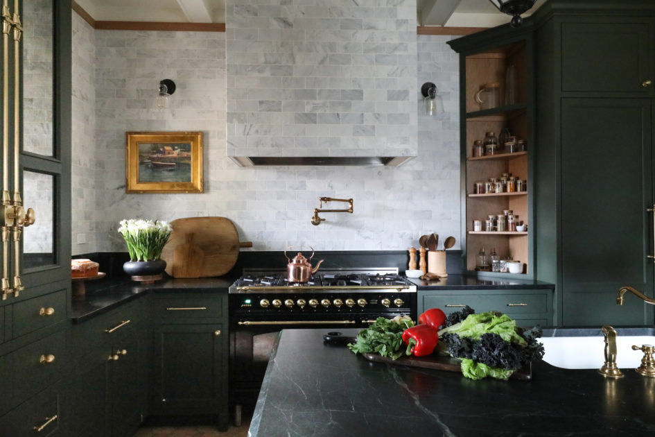
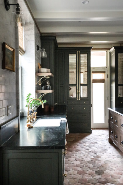
Frank Lloyd Wright is, of course, famed for his prairie-style “organic architecture,” particularly in this suburb of Chicago where he once resided and which boasts the largest number of Wright-designed or remodeled buildings in the world. Many Frank Lloyd Wright buildings are restored only under the strict guidelines of historical preservationists. But these clients approached us with a unique situation. Their home is an 1873 Victorian, with living spaces remodeled in 1908 by Wright, early in his career when one could still snag the eventual world-renowned architect for a small remodel job. Those areas — living room, family room, dining room — come with strict rules for remodels. But a renovation of the home’s original kitchen and butler’s pantry — untouched by Wright — had no strings attached.
The marriage of old and new is our bread and butter. And this project came with not only the instruction to echo the work of a great, famed architect, but also honor the original lines and details of a 19th century Victorian home. Our extensive research on both styles, and the team’s collaboration, produced the ideal end result: a liveable, modern-day kitchen and butler’s pantry, with thoughtful, discernible nods to both Frank Lloyd Wright and Victorian styles.
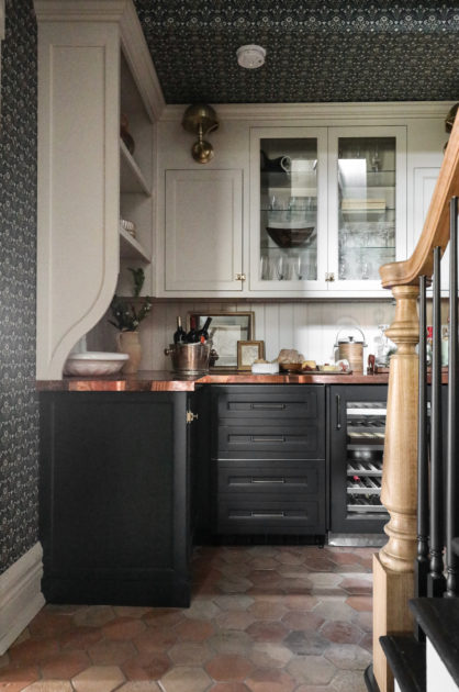
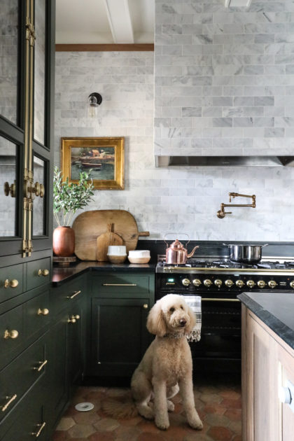
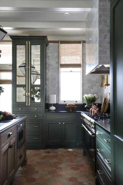
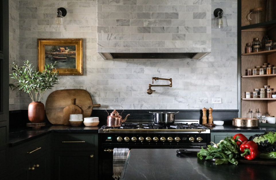
Terracotta floors give an immediate sense of the organic elements Wright embraced. They will age and patina beautifully over time. Horizontal lines are employed throughout the room to echo trim in the rooms Wright renovated, as well as his known affinity for the horizontal. While the light fixtures are not vintage, they are a nod to the angles of the arts & crafts, mission-style fixtures popular during Wright’s time.
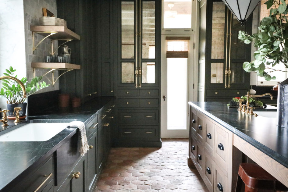
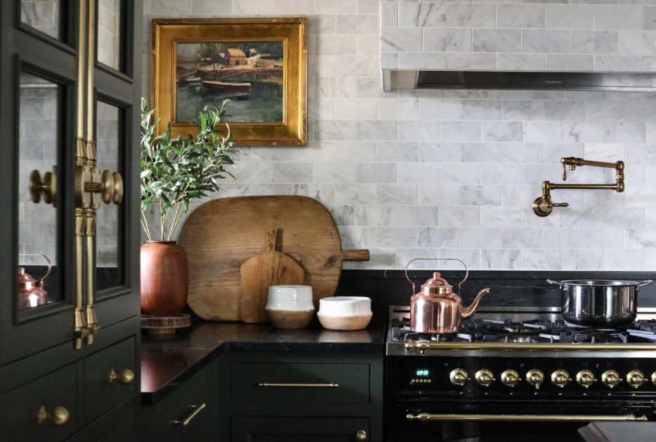
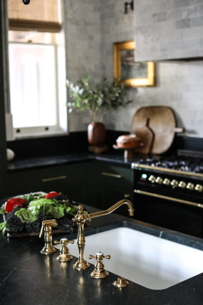
The unlacquered brass hardware and plumbing fixtures were intentionally selected to bring in the ornateness typical to a Victorian home, complete with Cremone bolts on the built-ins.
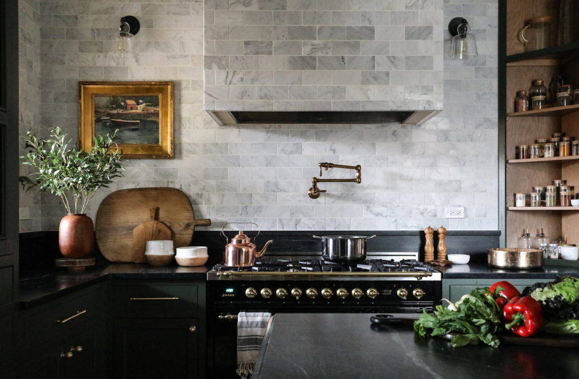
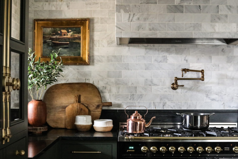
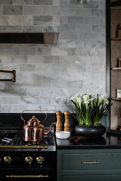
Soapstone counters will patina and age over time, and make the perfect topper for earthy, green cabinetry — all a nod to Wright’s desire to make interiors an extension of the outdoors. Honed Carrara subway tile wraps the hood and extends to the ceiling to balance the dark cabinetry and countertops with lightness and give the eye a place to rest.
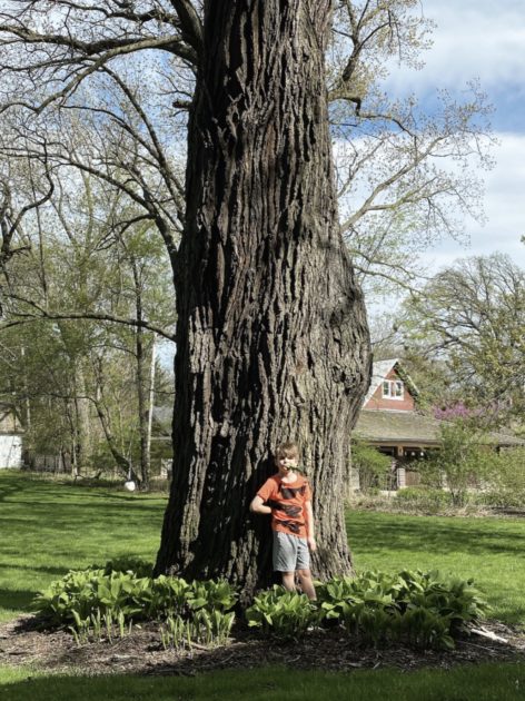
While the homeowners clean up after dinner, they can admire the 400 year burr oak outside the kitchen sink window. Experts consulted believe the tree was once part of an important native American trail.
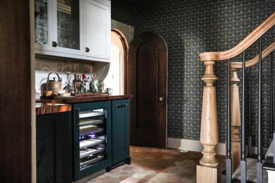
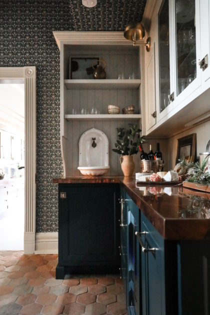
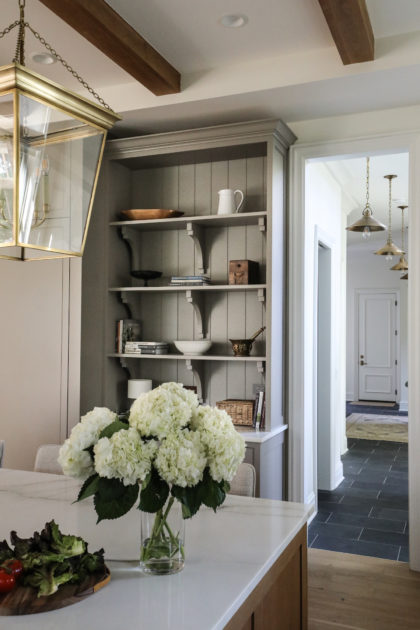
In the butler’s pantry, we continued the play between Frank Lloyd Wright’s masculine, organic influences, and the feminine ornateness of the Victorian period. The stain chosen for the baluster echoes the stain choices of Wright’s work, but we kept the deep, dark stain of the original 19th century arched door as contrast. The Morris & Co wallpaper is a classic, English floral, but the tight pattern has touches of the geometric, a mid-century staple. The waterspout may look like a pretty relic of the Victorian age, but is also fully functional, dispensing filtered water to fill pitchers for company. Copper countertops tie it all together.
Our clients recently purchased this beautiful Georgian circa 1912, and because the home was so well-built and designed (in fact, by the same architect who designed the village’s city hall), no major renovations were necessary. Instead, we delighted in breathing new life into the gathering spaces of the home.
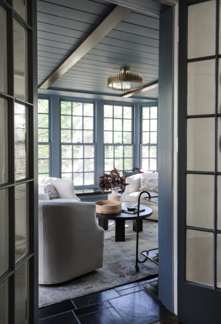
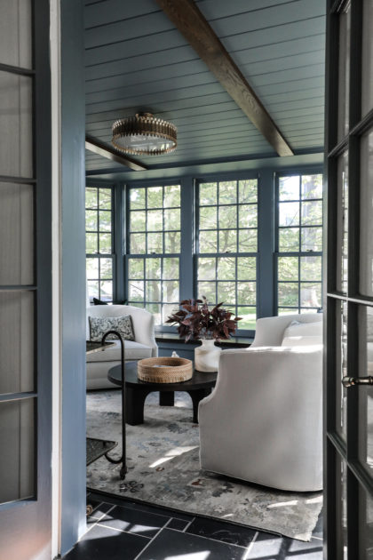
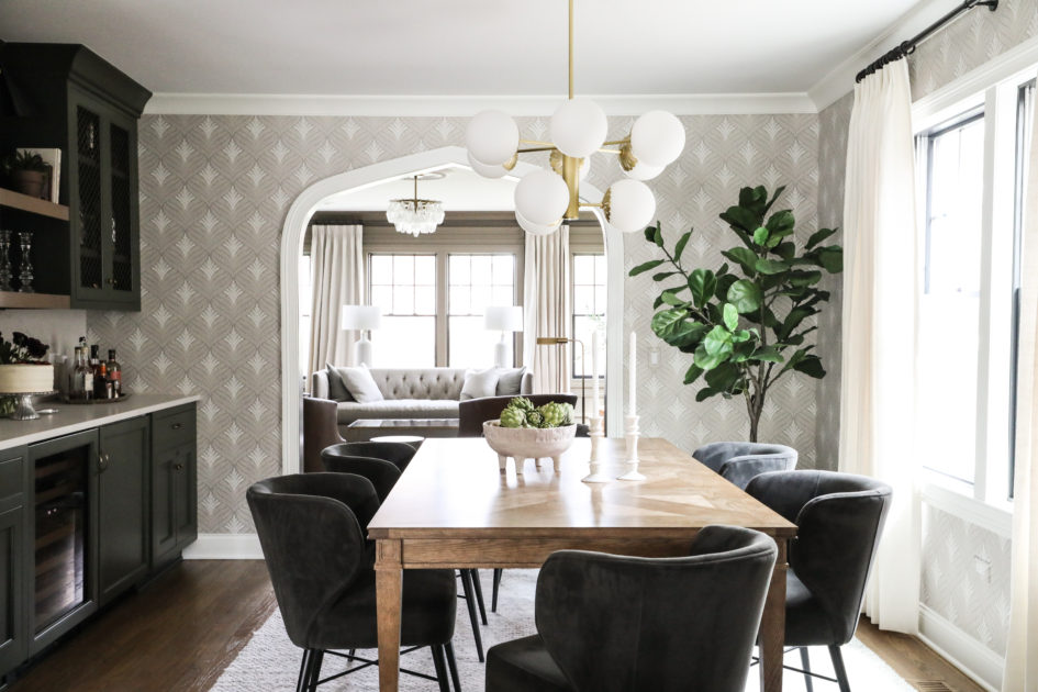
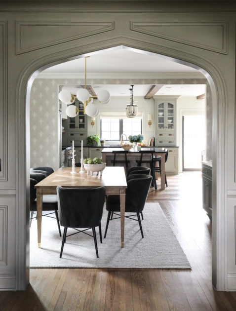
Three of those spaces–the breakfast nook, cocktail room and dining room–surround an exterior courtyard, bringing beautiful light into the home and providing ample opportunities for guests to wander in and out through multiple spaces during get togethers.
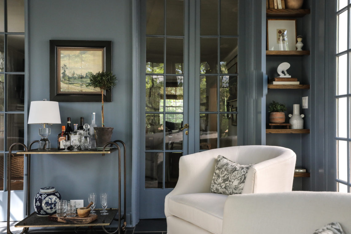
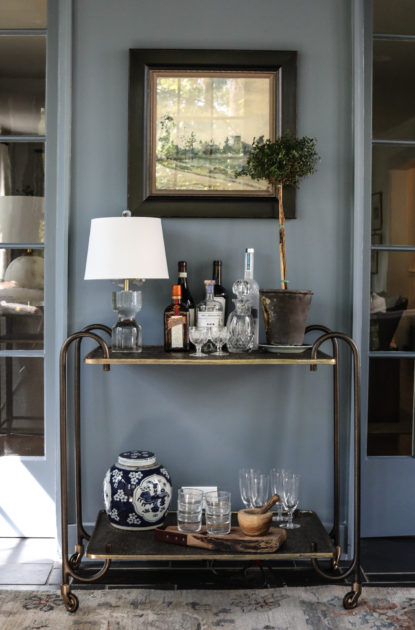
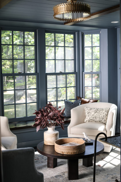
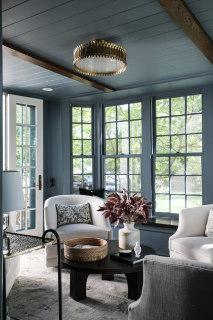
In the cocktail room–quickly becoming a Park & Oak signature–the abundant light allowed us to choose a mid-tone color for the walls, ceiling and trim, making the room cozy for conversation and libations without being gloomy. As a guest walks through the home, this little jewel box beckons from the back. The room is full of art and objects curated by the owner, an avid antique and vintage collector, and these personal touches help the room feel intentional for this family.
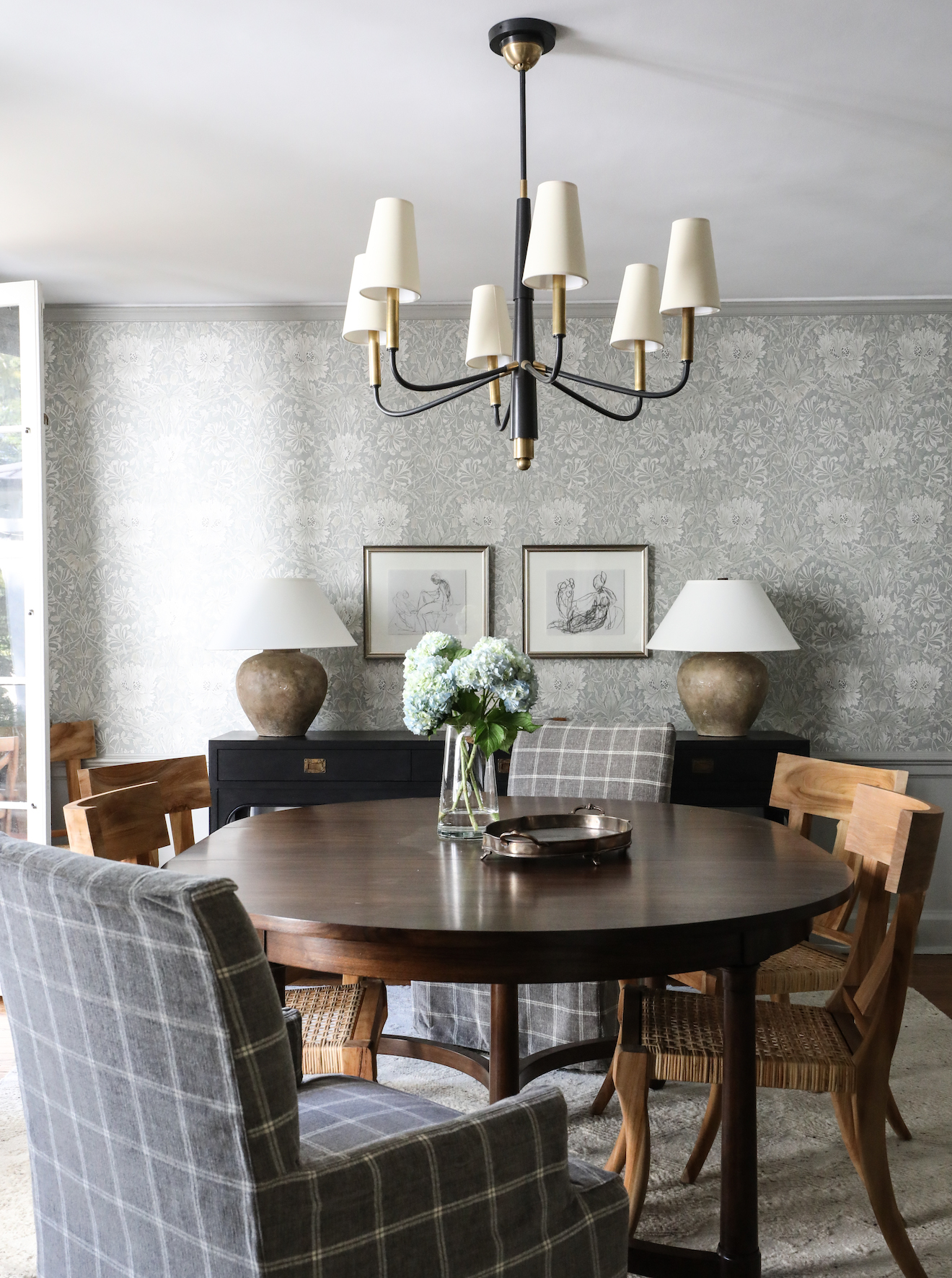
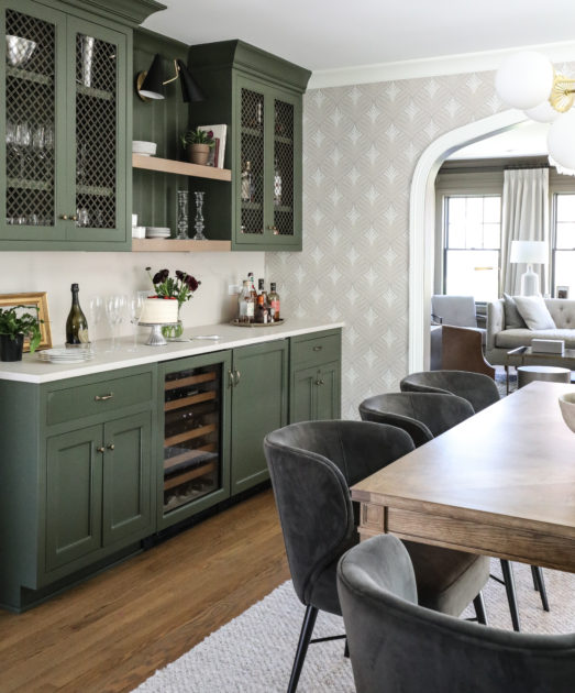
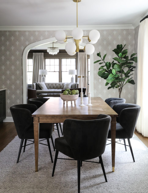
Our clients frequently entertain large groups, so the dining room includes an expandable table to seat extra guests. The Morris & Co. wallpaper gives a touch of elegance to the room, while the layering of natural and upholstered material for the chairs keeps the room from feeling too formal for this unfussy family.
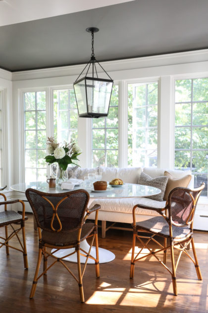
The breakfast nook is a hub of activity. To maximize comfort in this much-used space, we added an upholstered piece for lingering. (Performance fabrics work miracles for families!) The softness of the sofa pairs with the stone table and woven chairs for a space that has just the right balance of polish and practicality. Because this nook is offset by a cased opening, the dark ceiling helps delineate the space from the kitchen while also drawing special attention to it.
And finally, the family room includes a hanging gallery wall, intentionally designed so our client can rotate their art collection without the nuisance of holes in the wall.
One of our longstanding clients recently moved their growing family from a Chicago brownstone we helped outfit to a larger home in the suburbs. We consulted in the beginning stages of their new suburban build, which allowed us to direct choices for the bones of the home that reflect their unique needs and make their new home one-of-a-kind. We love seeing things come together from the ground up!
Here are a few of our favorite highlights:
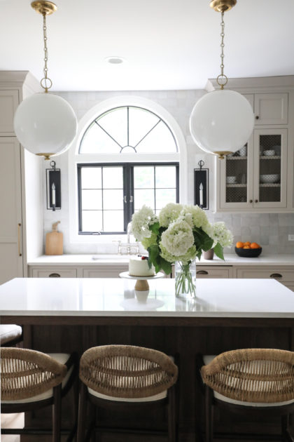
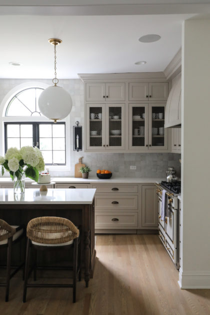
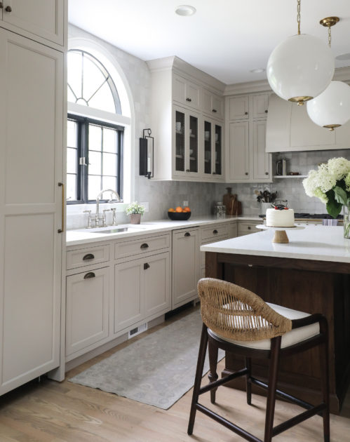
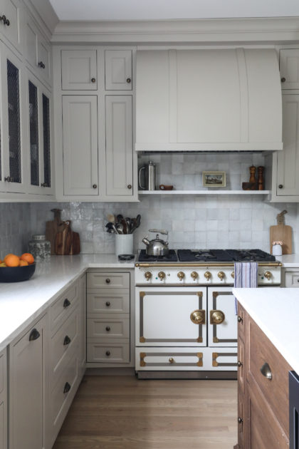
The original kitchen plans had windows only on the sink side, and while the light from these marble cased west-facing windows is gorgeous in the evening, alone it would have left the kitchen looking a bit dim in the early part of the day. Adding south-facing windows not only brought beautiful day-long natural light into the room, it made a great offset for the arched cabinets.
And speaking of those cabinets, being involved in the early stages of the build allowed us to mirror that same arch in the kitchen and dining room entryways…
Working with a repeat client has so many advantages. This particular client is an avid art collector with an incredible eye. We knew it would be important to highlight their enviable collection, and this guided many choices from the very beginning phases of the build. For example, the millwork in this soaring entry was measured to make space for specific pieces from the clients’ collection. Also, in the lofted second story of the entry – which was originally intended for built-in bookshelves – we created a gallery-style display instead to capitalize on another opportunity to showcase the collection. The family room includes some of the clients’ own vintage pieces, along with more beautiful artwork.
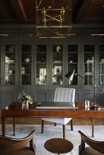
In their previous home, the client loved the moody office we’d created for them there, so we used it as inspiration for an even more dramatic version in the new home.
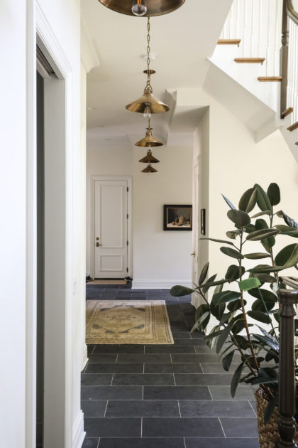
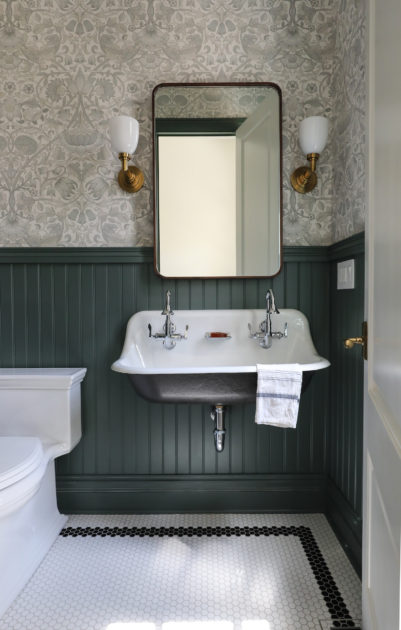
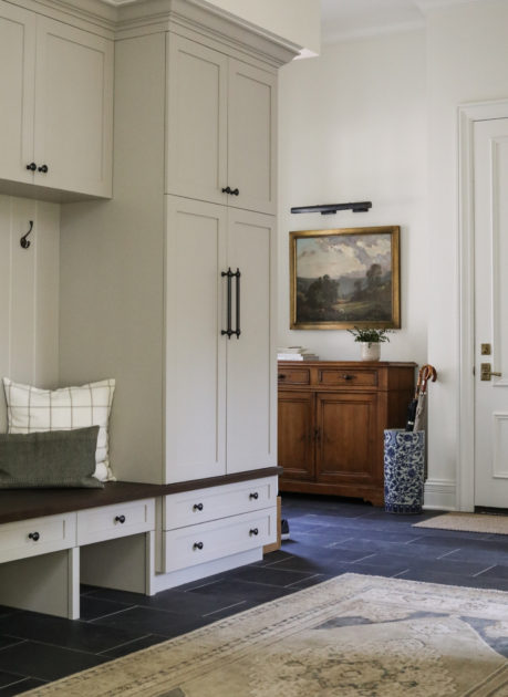
In the mudroom, the dark slate tile floor brings drama and practicality. High ceilings allowed us to add extra interest with hanging pendants. The clients’ own beautiful vintage chest was a perfect fit in the rear hall and another natural spot for gorgeous artwork. And check out the charming mudroom bath!
It can be tempting in a large renovation project to go down to the studs and start completely fresh. The sky’s the limit! Endless options! And sometimes, that is the right and logical choice. But often, there are elements of a home well-worth holding onto. Details that make a home unique and give it the patina of a beloved space.
In the first-floor renovation of this 1908 Hinsdale home, that element was the arched windows in the kitchen and library. Original to the home, these windows added so much special character, and were worth designing a renovation around. Changes we made to the home’s floorplan mean that both of these stunning windows are now visible to those seated in the home’s dining room. The windows echo each other and help tie together the spaces, as well as the history of the house, in a singular way. Even the barrel-shaped hood chosen for the range is a nod to these arched windows, and, according to the homeowners, one of the more commented-on details of the renovation by guests to the home.
The original kitchen in the 1908 Hinsdale home was smaller, with no center island. This family with three small children really wanted to add some additional space for everyday living. By relocating the powder room (originally where the range stands now), we gained enough space to add an island with seating for all three kiddos, plus one extra! Opening up this section of the first floor also means more comfortable mingling in the gathering spaces of the home. Our clients entertain their large families for many holidays, and having room for guests to roam was critical.
We love adding open front cabinets to a kitchen to let the eye see something different in a wall of cabinetry. In the Hinsdale kitchen, we added wire mesh to the open cabinets, which lends another layer of interest and variation.
The wall tile stretching from the range all the way around to the window adds sheen and reflects beautiful light throughout the room. It also further highlights the magnificent arched window.
We are always searching for ways to add function to form. Our clients are talented home cooks, so while this demure shelf above the range serves a design purpose by breaking up lines, it also provides a resting place for everyday cooking essentials like salt, pepper and olive oil. Plus, we always like a little art in the kitchen. The showstopper La Cornue stove anchors this section of the room.
And finally, having “borrowed” the old powder room space to add space to the kitchen, we tucked this new powder room into a little-used hallway and utility space.
From our Clients: The Park and Oak team was outstanding to work with on our recent home renovation! They were attuned to our design preferences and also did a tremendous job in helping us think creatively. With their suggestions we were able to retain the charm and character of our 1908 home, while also making it modern and functional for family living. We are so pleased with the result and would highly recommend them for design concepts, materials selection, and furnishings.
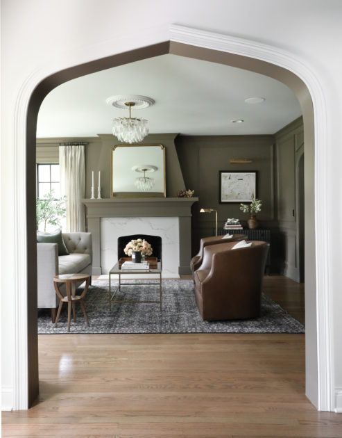
A few months ago, we revealed the kitchen and dining room of a carefully restored and renovated Tudor revival in Western Springs. Interior design life is full of supply chain and logistical challenges right now, so the living room of this project has been waiting patiently for its big debut. The time has come!
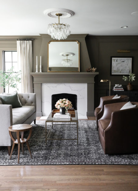
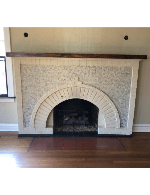
You can see in the before & after shots below that we carried a subtle arch into the fireplace to mirror the Tudor arches in the rest of the home. This is a seemingly small detail with big impact for tying the home together as one cohesive project. We also took the fireplace to the ceiling to make it a true focal point in the room. The furnishings chosen for the living room are timeless and classic (plus unfussy for a family with small children!) and the paint color serves as a grounding point for the wallpaper in the adjoining dining room.
Seeing a renovation like this come together in the final stages is one of the best parts of our job!
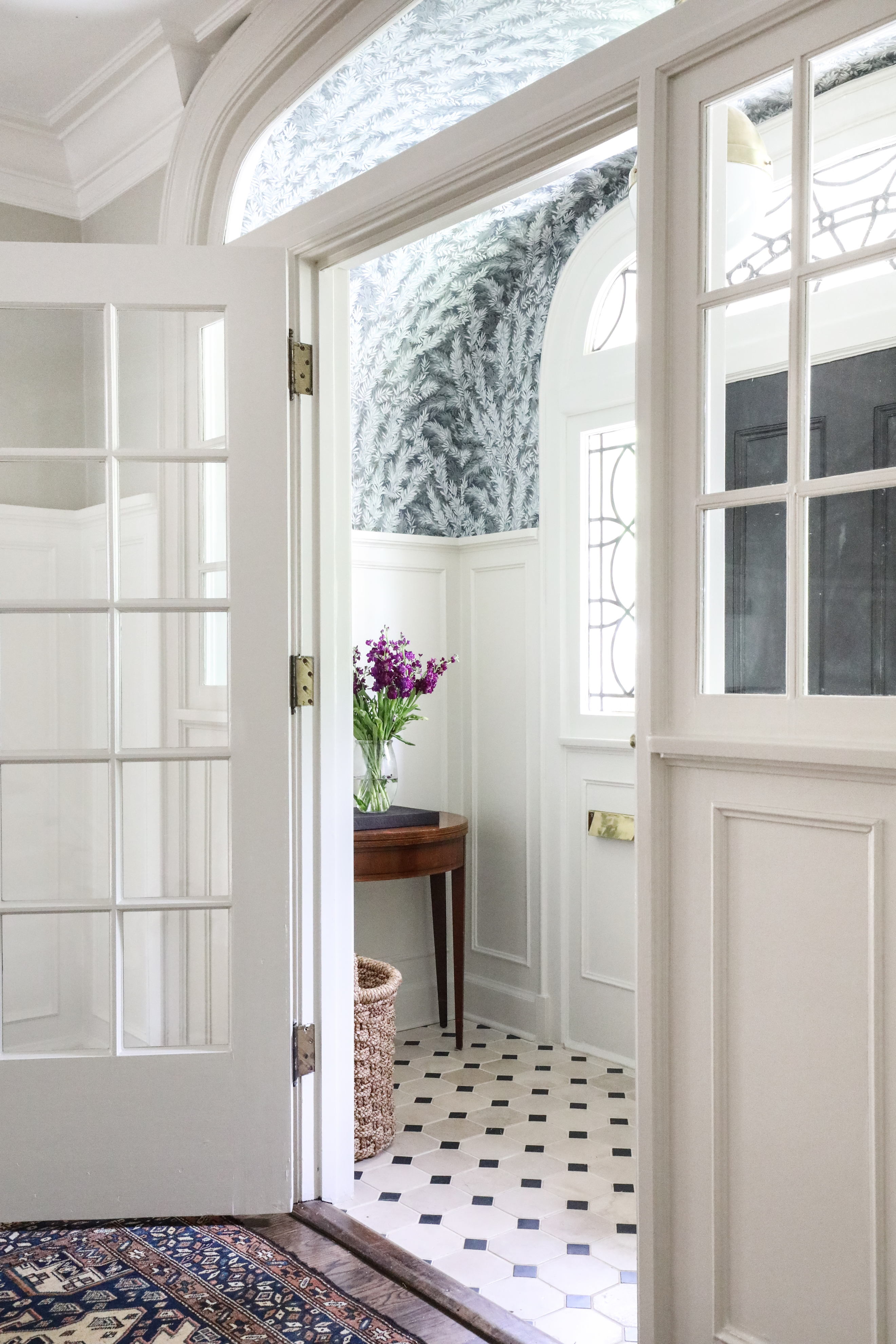
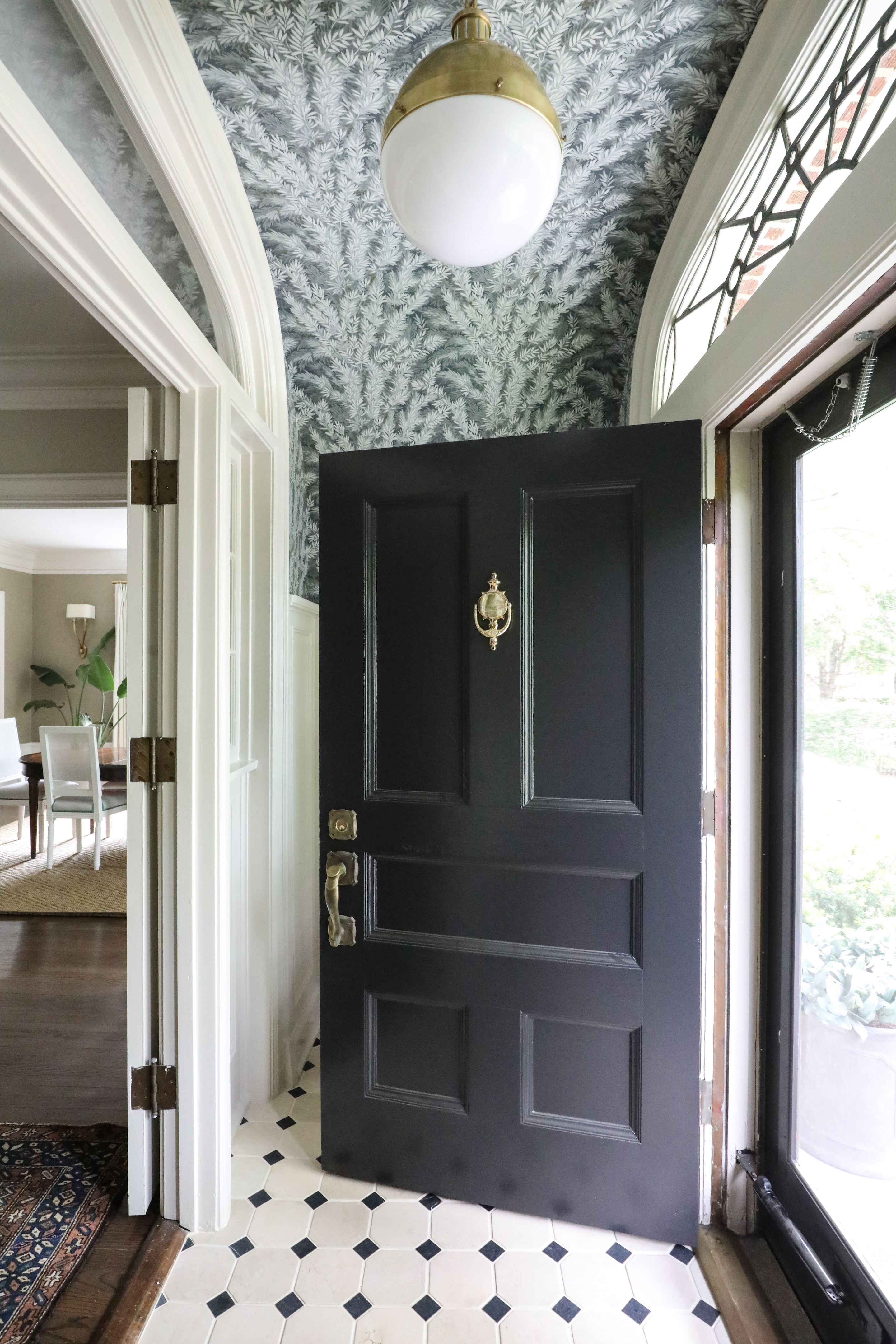
We’ve been visiting the 1920s a lot through our work lately and are really loving it. Having the opportunity to revive homes with so much inherent character and really highlight their unique features is so gratifying. In this 1922 Winnetka Georgian, you see how striking the effect can be when you take a moment to consider the details that make a home special and shine a spotlight on them. While thinking about how to best highlight the arch and the existing molding in the vestibule of this home, we studied some classic Georgian homes and really loved the way they incorporated botanicals and foliage in their designs. This wound up serving as the inspiration for the wallpaper that covers the stunning arched ceiling. Check out the before and after:
You barely noticed that arch before, right? And now it stands out as one of the defining features of the home. It was always there, waiting for its moment, and just needed a little attention. In addition to highlighting the arch in this vestibule and refreshing the paint colors, we added classic tumbled stone tile to the floor and a pendant light fixture with just the right touch of modern flair. The demi-lune table that our client already owned was a perfect fit to finish off this charming little space that every guest will get to experience.
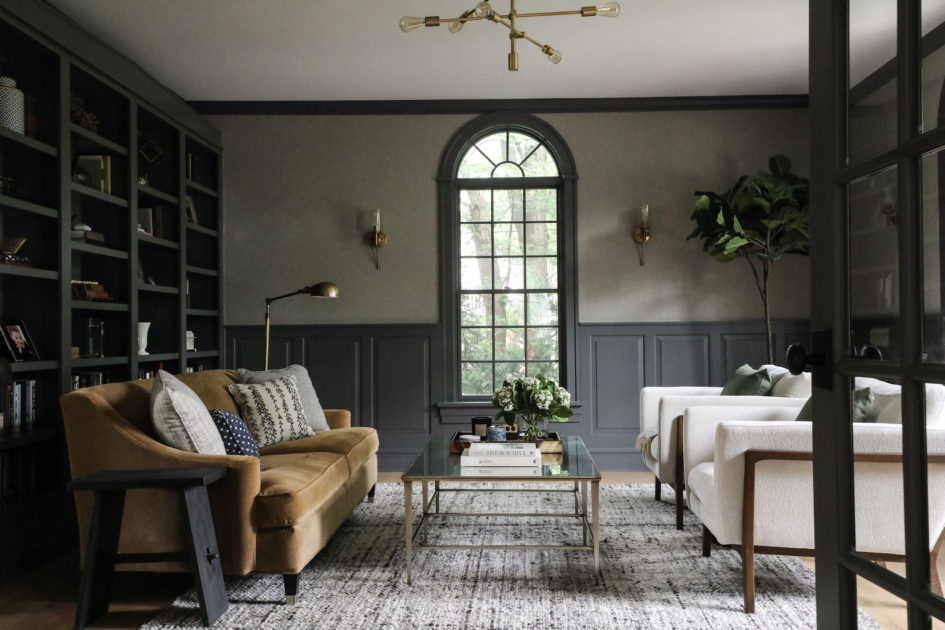
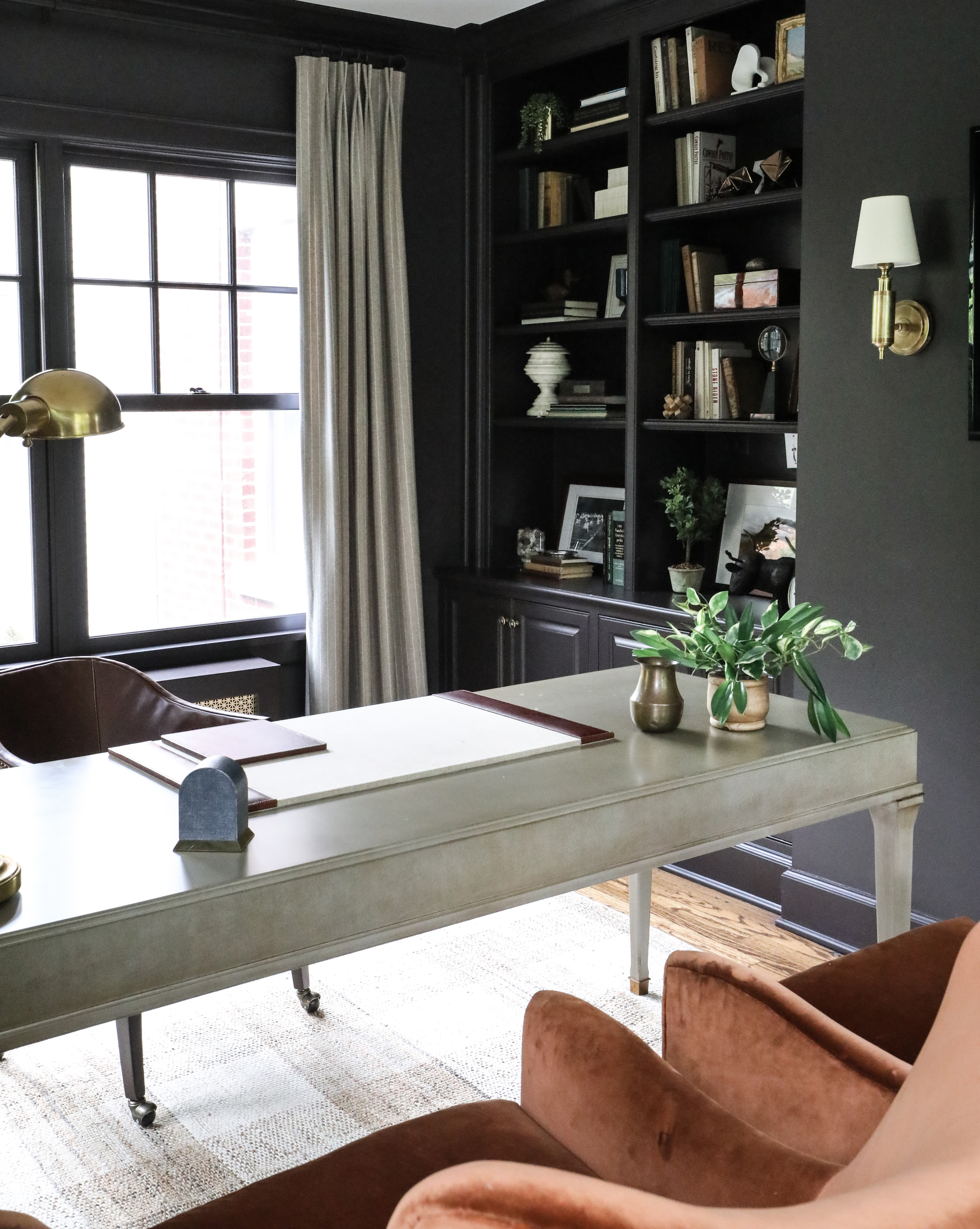
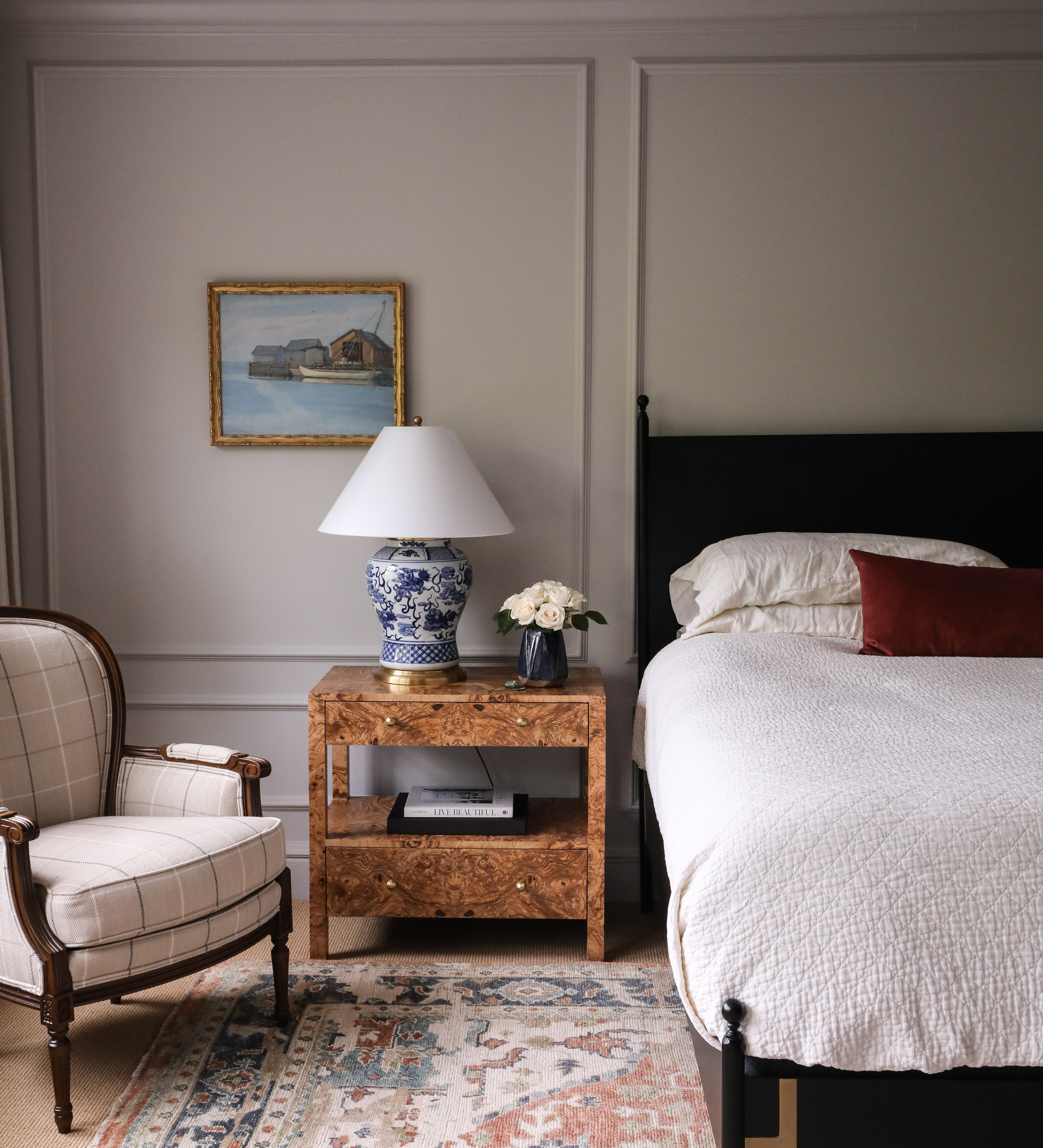
At the Winnetka Georgian we also made over the office space and master bedroom pictured below. We love a dark, moody office. Doesn’t it feel soothing to work in a space that envelops you? Rooms like this with plenty of natural light are prime candidates for indulging your dark side. We like to add sconces and lamps to be sure as winter evenings roll around there is still plenty of light. In the bedroom, we added molding to create consistency throughout the house, and, as always, mixed contemporary elements like the black steel bed with more traditional pieces like the elegant chair with carved wood legs. The delicate balance of styles will keep the decor in the home feeling fresh but will not put a time stamp on the work. Timeless. Classic. Always the goal for us at Park & Oak.
We’ll be working on additional spaces in this beautiful home in the coming months, so stay tuned for more updates! #POWinnetkaGeorgian
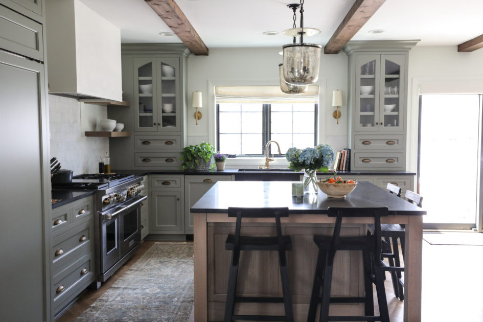
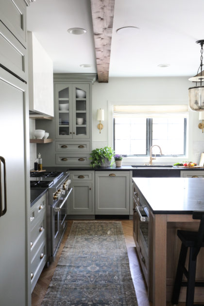
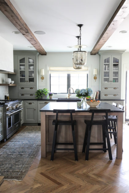
In the early 20th century, classic English architecture from the era of the Tudor dynasty experienced a revival in the suburban Midwest and Northeast United States. Many of these “Tudor Revival” homes survive still today, thanks to their durable construction and lasting curb appeal. Our clients’ 1923 Tudor in Western Springs is a classic example of this still sought after architectural style, with its steeply pitched double gable roof, brick exterior and arched entry. However, as with many older homes, this Tudor was ready for renovations to adapt the home for modern living.
Renovating a historic home carries some weight for us. We feel a responsibility to honor the intentions of the home’s original design. The exterior of a historic home shouldn’t reveal an interior that’s been wiped clean of all its characteristic elements. It was with this in mind that we set about designing a kitchen and dining space for this Tudor that would echo the elements making this style of architecture special. Staying true to the Tudor style was even more important in this particular project since one of the clients also grew up in a historic Tudor and has sentimental ties to the style.
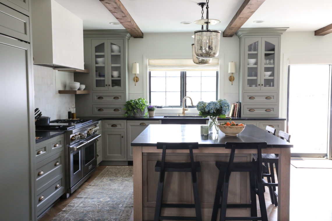
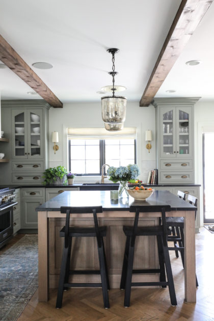
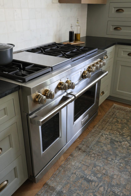
In the kitchen, we started by adding overhead beams, a defining feature of Tudor interiors. In the upper cabinets we added a slight arch, echoing the many arched entries and doorways of classic Tudor architecture. The soapstone island and counters give warmth to the room, and oh, those herringbone floors…one of our favorite details. Our clients are accomplished home cooks and frequent entertainers, so the large range and cabinetry that extends their storage into the dining space was a necessity. Above the range, a hood with clean, modern lines stays faithful to the Tudor style with its plastered finish, often the original wall material found in classic Tudors.
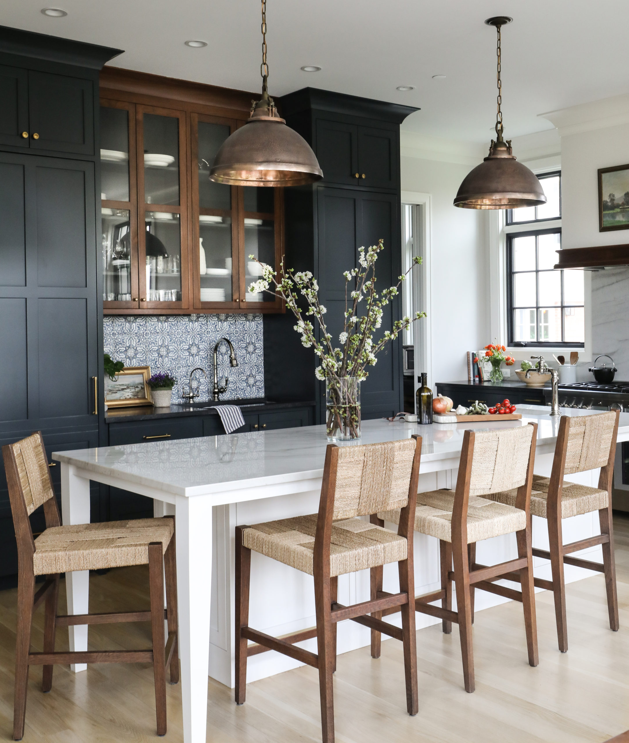
The dining room is the main eating area, so a seamless transition was essential and accomplished via a large entry. The bar cabinetry mimics the style from the kitchen, but here mesh glass inserts in the upper cabinets echo the leaded glass windows traditional to Tudor homes. And finally, that arch. So representative of the style it is often referred to as a “Tudor arch,” this is one of the defining features of the interior of the home and announces to visitors…welcome to our Tudor home.
From our wonderful clients:
“We knew the kitchen was going to be a place we’d spend a lot of time, both as a family and when entertaining. While working through the process of selecting cabinet colors, countertops and appliances, Park and Oak pushed us out of some comfort zones, and we are so thankful they did! It flows so well with the rest of our house and the more open layout. It definitely has a wow factor.”
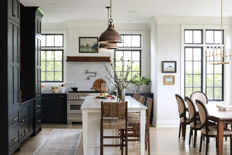
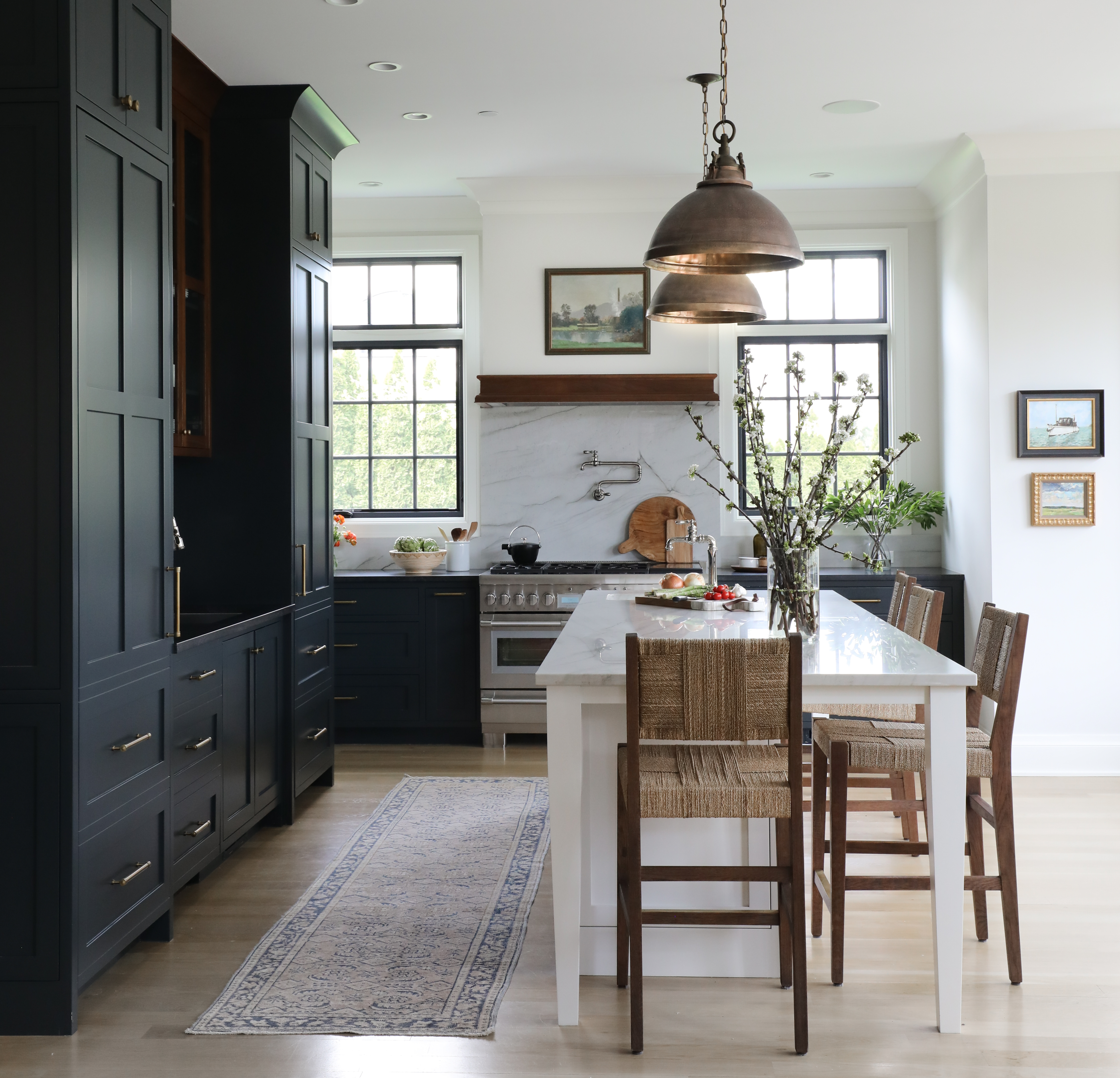
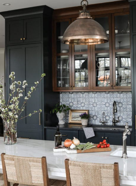
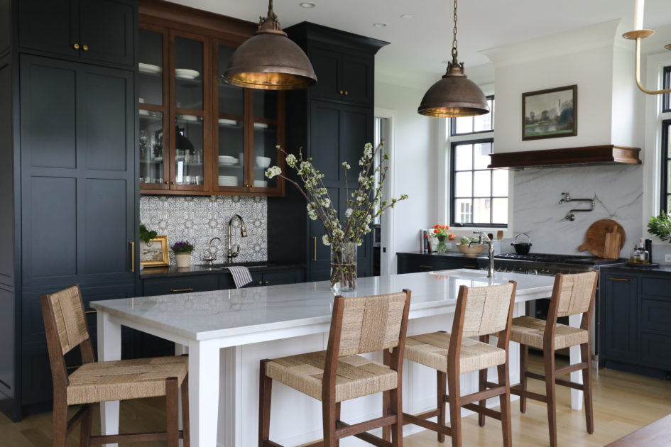
In any new build kitchen, part of the challenge and reward is in creating a space that has character. That doesn’t yell: “Look at me! I’m new!” Each design should also reflect the owner and take into consideration their unique needs and preferences. It’s in these details that a design comes to life and becomes more than just drawings on a page.
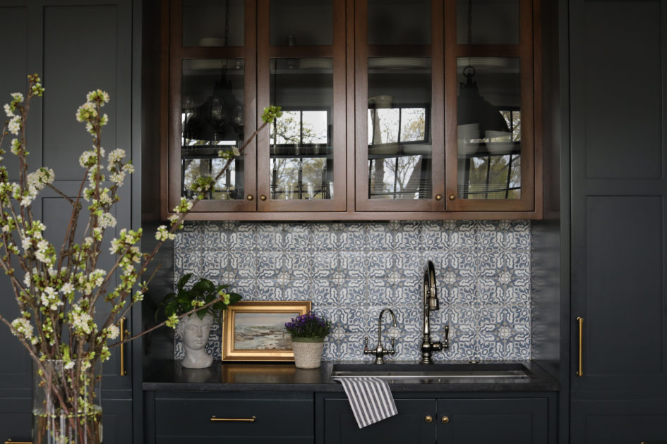
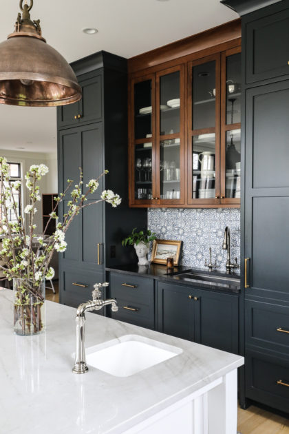
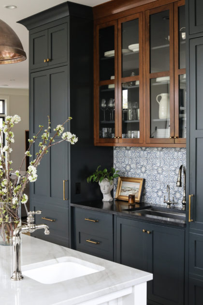
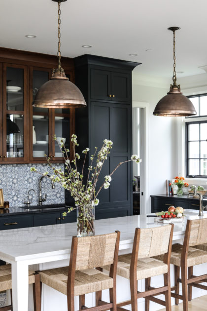
In the Park Ridge kitchen, our clients felt strongly about keeping the full-size sink off the island, but also really wanted the convenience of a prep sink. We love a little creative space planning, and the end result is a placement for both sinks that feels intentional, gives interest to the room and still meets our clients’ distinct needs. The location of the main sink along the back cabinet bank also gave us a great opportunity to highlight the beautiful Tabarka tile. Tabarka is renowned for their collections of terracotta tile that are formed, painted and glazed by hand. By locating the sink here and adding a pretty Kohler Artifacts faucet, focus will always come to this special tile.
To further highlight the area, we chose to stain the cabinets just above the tile in a higher sheen than their painted neighbors. This helps lend the look of an antique piece, and is also a striking backdrop for the copper island pendants, whose patina gives depth and warmth to the room.
These small details all come together to give this new kitchen a touch of old world character.